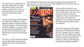
The magazine cover uses various design elements to grab attention and promote its content. Large, colorful fonts advertise the key stories on sex at age 40 and 39 new films. The masthead is edited with flames to match the theme of the featured film, Sweeney Todd. A central image of Johnny Depp prominently displays the main attraction of the issue. Additional text, colors, and placements of elements like the barcode and price are intentionally unusual to attract notice among other magazine features.
This is my second magazine analysis of a general movie magazine, promoting comedy film, 'Anchorman 2'. I analysed this in order to find out more about conventions of general movie magazines, in order to help me when creating my own magazine.
Welcome to TechSoup New Member Orientation and Q&A (May 2024).pdfTechSoup
In this webinar you will learn how your organization can access TechSoup's wide variety of product discount and donation programs. From hardware to software, we'll give you a tour of the tools available to help your nonprofit with productivity, collaboration, financial management, donor tracking, security, and more.
Students, digital devices and success - Andreas Schleicher - 27 May 2024..pptxEduSkills OECD
Andreas Schleicher presents at the OECD webinar ‘Digital devices in schools: detrimental distraction or secret to success?’ on 27 May 2024. The presentation was based on findings from PISA 2022 results and the webinar helped launch the PISA in Focus ‘Managing screen time: How to protect and equip students against distraction’ https://www.oecd-ilibrary.org/education/managing-screen-time_7c225af4-en and the OECD Education Policy Perspective ‘Students, digital devices and success’ can be found here - https://oe.cd/il/5yV
Palestine last event orientationfvgnh .pptxRaedMohamed3
An EFL lesson about the current events in Palestine. It is intended to be for intermediate students who wish to increase their listening skills through a short lesson in power point.
This is a presentation by Dada Robert in a Your Skill Boost masterclass organised by the Excellence Foundation for South Sudan (EFSS) on Saturday, the 25th and Sunday, the 26th of May 2024.
He discussed the concept of quality improvement, emphasizing its applicability to various aspects of life, including personal, project, and program improvements. He defined quality as doing the right thing at the right time in the right way to achieve the best possible results and discussed the concept of the "gap" between what we know and what we do, and how this gap represents the areas we need to improve. He explained the scientific approach to quality improvement, which involves systematic performance analysis, testing and learning, and implementing change ideas. He also highlighted the importance of client focus and a team approach to quality improvement.
Unit 8 - Information and Communication Technology (Paper I).pdfThiyagu K
This slides describes the basic concepts of ICT, basics of Email, Emerging Technology and Digital Initiatives in Education. This presentations aligns with the UGC Paper I syllabus.
Ethnobotany and Ethnopharmacology:
Ethnobotany in herbal drug evaluation,
Impact of Ethnobotany in traditional medicine,
New development in herbals,
Bio-prospecting tools for drug discovery,
Role of Ethnopharmacology in drug evaluation,
Reverse Pharmacology.
Basic phrases for greeting and assisting costumers
Magaziine analysis
1. The magazine website
‘empireonline.com’ doesn’t include
the ‘www’ as their target
demographic would have the skills
of computing and would know that
www isn’t needed to search a
website. The magazine is also
promoting their website.
’40’ and ‘ SEX!’ are both in bigger fonts.
This is to grab the attention of the
reader. The number 40 helps highlight
the subject of sex.
The barcode isn’t in its conventional
place of bottom right hand corner.
This buzzword is in a yellow circle in
order to stand out from other
features on the front cover.
The cover stories are in a list layout,
this is conventional for most
magazine front covers. It is also in a
white font to stand out against the
black background, as well as
matching the themed font on the
cover.
The masthead of ‘EMPIRE’ has been
edited to have flames round it. This
compliments the theme of the film
featured on the front cover. It also
tells the audience the genre of the
film as well as the name of the
magazine.
Like the barcode which would usually be placed
at the bottom right of the magazine, the price is
too placed in a unusual spot.
The main image uses the main
character of the film to promote the
film to the magazine. It clearly tells
the audience what the themes of the
film are.
2. ’Inside scoop’ and ‘starring’ are both in a
bold red font. This contrasts all the other
font colours on the cover as it was done
to catch the audiences attention.
’39 New films’ subtext is very bold and
large compared to other fonts on the
pages. The number is especially large to
impress the audience with how many
films are featured in the magazine. The
number is also in blue, like the
masthead. This makes it stand out from
other subheadings.
The central image is a shot of Johnny
Depp in his role that he plays in
‘Sweeney Todd’. He looks very
powerful and dangerous, just like his
role in the film. It is a very grey toned
image, which is brought to life with
the coloured text.
The subtext at the bottom advertises other actors and actresses that will feature in the
magazine. It is in a smaller font as the readers main focus is drawn to the masthead, central
image, ‘holiday movie preview’ and ‘39 new films’. ‘PLUS’ and ‘AND’ entices the audience as
it creates the effect that there are a lot of articles in the magazine, making it worth buying.
‘Holiday Movie Preview’ is the second
largest font on this front cover. This
anchorage text is also overlapping the dull
image of Johnny Depp to grab the readers
attention.
The masthead is found at the
central at the top of the
magazine. It informs the audience
what magazine it is.
‘Entertainment weekly’ is in a
bright blue font, which stands out
from the grey background. The
font is simple and easy to read.
‘Johnny Depp’ is in a large font as it is he
is the feature of the magazine. As he is
the USP of the film, as a big Hollywood
star, it attracts audiences such as fans and
film fanatics. The bright white writing
against the greys of his clothing enables
the text to stand out.
3. The cover line sets a sinister tone as
Hannibal is well known for being a
dark thriller. It gives a clue to the
audience what the film is about, as
those who haven't seen it will not
know that Hannibal eats other
humans.
The play on words ‘gore blimey’ lightens
the mood of the magazine, as well as
giving the audience a preview of what's
inside the magazine. The font of what's
inside the magazine is in white to stand
out against the black background. It is
also one of the first things the reader
will be drawn to due to the contrasting
colours.
The ‘Plus’ is in red to show the audience
they are getting their moneys worth,
followed by a list of actors featured in
the film.
The masthead tells the audience what type of magazine they are buying. This
copy especially is in red to run with the red and black theme of the front cover, as
well as matching the genre of the film.
‘Every new film reviewed’ is on a
yellow background to stand out from
the rest of the text on the cover. It also
entices the audience to buy the
magazine as it has so much to offer. It
is also placed at the top of the
magazine as it is one of the first things
the audience will read after reading
the masthead.
The central image uses half the page
space due to the lighting and tones on
the face. This gives room for subtexts
but also makes the image on Hannibal
stand out. His face has a shadow which
makes him appear threatening and
mysterious. His eye is red which gives
connotations of danger and blood.