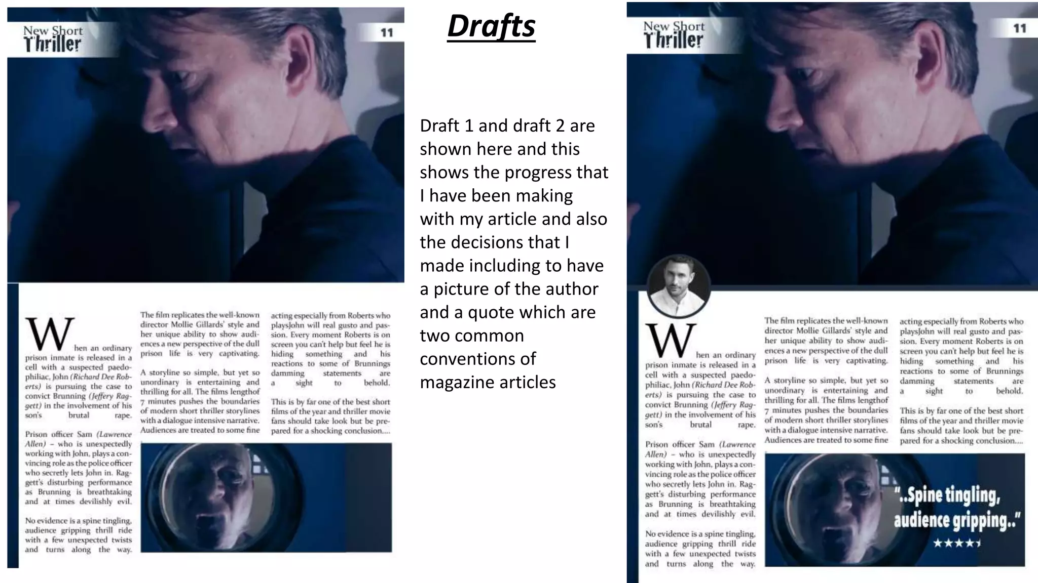
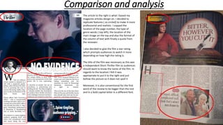
Drafts
Draft 1 and draft 2 are
shown here and this
shows the progress that
I have been making
with my article and also
the decisions that I
made including to have
a picture of the author
and a quote which are
two common
conventions of
magazine articles
Comparison and analysis
The article to the right is what I based my
magazine articles design on. I decided to
replicate features ( as circled) to make it more
professional and realistic. I copped the
location of the page number, the type of
genre words ( top left), the location of the
main image on the top and also the format of
the column of text with finally a quote from
the reviewer.
I also decided to give the film a star rating
which prompts audiences to watch it more
depending on how high the rating is.
The title of the film was necessary as this was
a independent Short Thriller film so audiences
should want to know the name of the film. In
regards to the location I felt it was
appropriate to put it to the right and just
bellow the picture so it does not spoil it
Moreover, it is also conventional for the first
word of the review to be bigger than the rest
and in a bold capital letter in a different font.

Poster Analysis

  • 1.
    Drafts Draft 1 anddraft 2 are shown here and this shows the progress that I have been making with my article and also the decisions that I made including to have a picture of the author and a quote which are two common conventions of magazine articles
  • 2.
    Comparison and analysis Thearticle to the right is what I based my magazine articles design on. I decided to replicate features ( as circled) to make it more professional and realistic. I copped the location of the page number, the type of genre words ( top left), the location of the main image on the top and also the format of the column of text with finally a quote from the reviewer. I also decided to give the film a star rating which prompts audiences to watch it more depending on how high the rating is. The title of the film was necessary as this was a independent Short Thriller film so audiences should want to know the name of the film. In regards to the location I felt it was appropriate to put it to the right and just bellow the picture so it does not spoil it Moreover, it is also conventional for the first word of the review to be bigger than the rest and in a bold capital letter in a different font.