What makes posterssuccessful:
• The title and/or tagline must be clear and easy to locate.
• Picture and colour present. Having pictures of the actors is sometimes
useful if that is the unique selling point. Depending on the poster and film
idea, having the name or faces of known actors may create a larger appeal,
and ensure a mass audience is targeted, but the film may also benefit from
selling the stroyline or the film’s concept (a house that’s haunted) helping
the audience understand whether the film is worth watching.
• Genre must be conveyed - if it’s a horror, colour and picture may be dark
and forboding, while a romance may have more placid images.
• The protagonist or the setting may be established in the poster.
3.
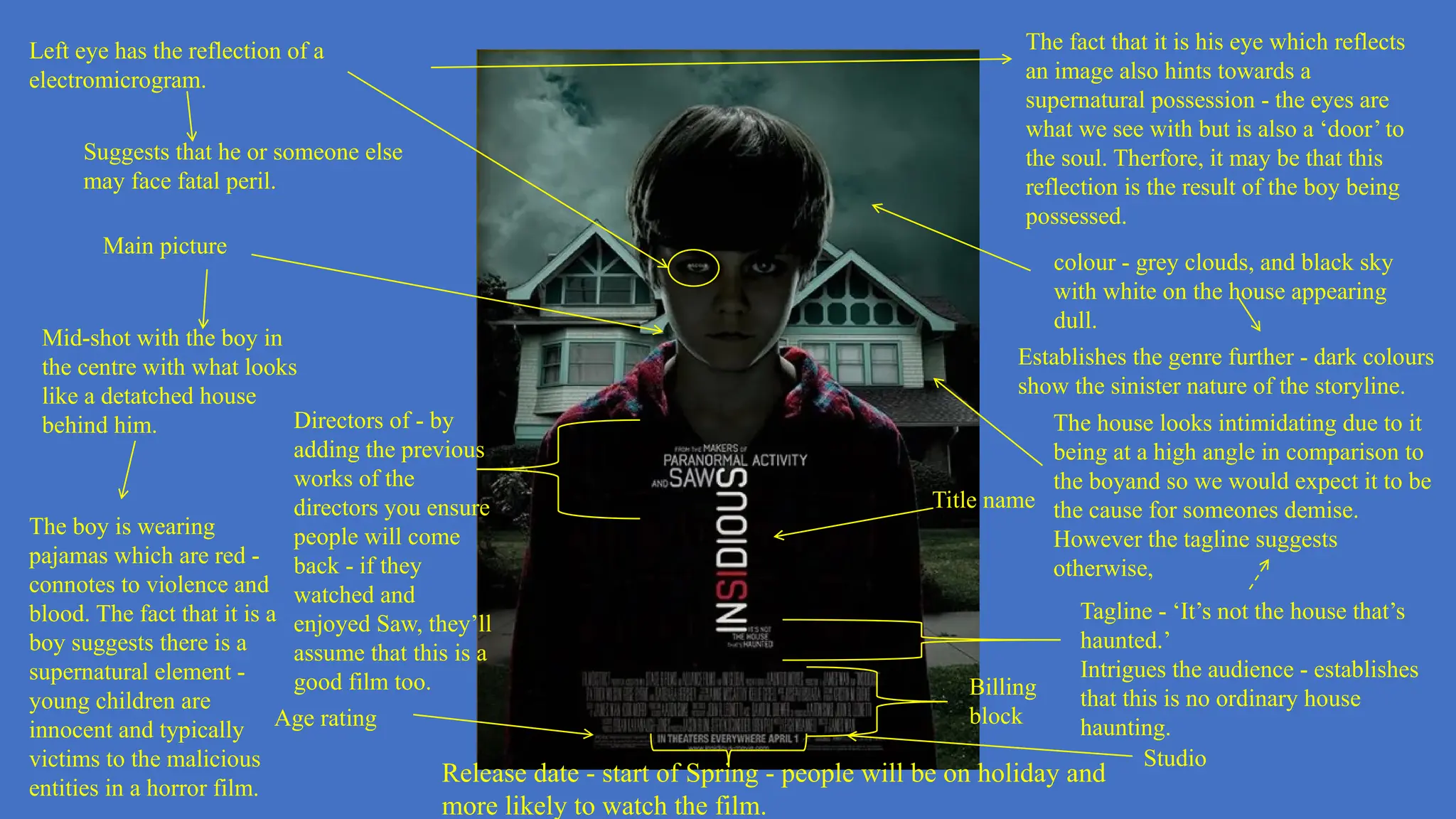
Main picture
Mid-shot withthe boy in
the centre with what looks
like a detatched house
behind him.
Left eye has the reflection of a
electromicrogram.
Suggests that he or someone else
may face fatal peril.
Title name
Tagline - ‘It’s not the house that’s
haunted.’
Intrigues the audience - establishes
that this is no ordinary house
haunting.
colour - grey clouds, and black sky
with white on the house appearing
dull.
The boy is wearing
pajamas which are red -
connotes to violence and
blood. The fact that it is a
boy suggests there is a
supernatural element -
young children are
innocent and typically
victims to the malicious
entities in a horror film.
The fact that it is his eye which reflects
an image also hints towards a
supernatural possession - the eyes are
what we see with but is also a ‘door’ to
the soul. Therfore, it may be that this
reflection is the result of the boy being
possessed.
Release date - start of Spring - people will be on holiday and
more likely to watch the film.
Billing
block
Establishes the genre further - dark colours
show the sinister nature of the storyline.
Directors of - by
adding the previous
works of the
directors you ensure
people will come
back - if they
watched and
enjoyed Saw, they’ll
assume that this is a
good film too.
Age rating
The house looks intimidating due to it
being at a high angle in comparison to
the boyand so we would expect it to be
the cause for someones demise.
However the tagline suggests
otherwise,
Studio
4.
Release date -released in
summer, when most people are
on holiday, going to be on
holiday, and so ensures a mass
audience can be reached.
Billing block
Main picture
Eyes are
dilated so
that they
appear
black.
Suggests that the person is possessed -
similar to Insidious, it is the eyes of the
character which show the abnormality
of the human. Hints to the supernatrual
element of the film.
Colour - black background. Rather than
having an image at the back, like the
house in the insidious, we only see the
main image.
This could be to emphasise the
storyline to the audience - it appears
that the images are coming from the
black background or being taken
over by it, further showing the genre
of the film - horror is often
spontaneous and hard to avoid, just
as darkness is inevitable when their
is an absense of light.
Hand at the top
left corner -
appears to be
covered in
symbols.
It’s positioned so that it appears
to be the one controlling the
character.
Directors of the
film.
Entices the viewers as a potential
audience - the hand poses questions as
we wonder what is the meaning of the
symbols and how it may have a
supernatural hold other the character.
Age rating
Hint of yellow from woman’s clothing. Contrasts the
black backgrond but could also into towadrs the futility
she will face - yellow connotes to benevolence and joy.
As there is so little yellow, this could suggest that
there will be little to avoid the hardship and she has
even less hope of surviving the horrors she’ll face.
Unlike Insidious and Us, the title name
and billing block is centred, not at the
bottom of the poster. seems a simple
change but due to the positioning it
seems as though the woman is speaking.
This could also hint towards the
supernatural threat - evil entities usually
cause irregularities in routine and daily
life, and this is what has seemed to do
with having the billing block and title
name in the centre and so shows that the
threat may be great in the film if it’s
causing just a ‘simple’ change in a film
poster.
Title name
5.
Title name
Billing
block
Age
rating
Studio
Main image
Theperson’s left
eye is the only
visible eye as they
seem to be taking
of a mask of what
seems to be a
replica of their
face.
Unlike talk to me and
Insidious, this hints
towards being a more
psychological horror.
The removing of
a mask suggests
that the events of
the film shows
the horrors of
oneself - it is not
an entity that is
causing
problems, but
something within.
Colour - black
background. This is
similar to Talk to Me
where it seems that
the protagonist is
coming out of the
darkness.
Director of the film
and his previous
work.
As with
Insidious, this
helps create
appeal - people
are more likely to
watch this film if
they see the
successes of the
director.
Black connotes to
shadows, peril and
the unknown.
Thus this appeals to a
potential audiencce as
the main picture poses
quesstions - why is the
face of the same
person being remove
as a mask.
Suggests that the
horror could be from
what hides in the dark;
as the black
background consumes
the main image -
leaves the viewers to
wonder what threat the
person poses - people
are more likely to
watch the film.
Red clothing -
similiar to the
pajamas the boy
is wearing in the
Insidious poster.
Connotes to
possible danger.
’Nightmare from the mind’
establishes the genre as
pyshcological and by calling
it a nightmare may
encourage an audience to
watch it as it poses the idea
that the film is horrifying yet
still dream-like.