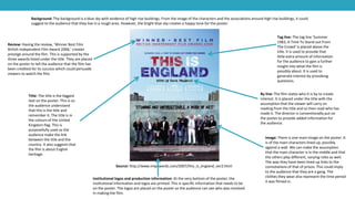
DETAILED FILM POSTER ANALYSIS
Source: http://www.impawards.com/2006/london_to_brighton.html
Title: The title is the boldest and
largest font on the poster. This is so
it stands out and the audience can
clearly see the name. This helps
advertise through word of mouth
because if the name is remembered
then people may talk about it.
Review: Having the review of ‘The Best British Film Of
The Century’ is eye catching and is a unique selling
point for the poster. This is because it is a positive
opinion from a critic that could persuade unsure
audiences to go and see the film. The star rating also
highlights how good people think the film is. Including
this on an advertising poster is common as it helps
promote the film. This is because it provides
supporting evidence that other people who have
already seen the film think it is good.
Image: There are many small
images on this poster which
is slightly uncommon. Most
posters normally have one
main image on them. Having
several images suggests that
the characters have to go on
a journey which fits with the
film title. This could
potentially be the reason for
having several images on the
poster.
Tag line: The tag line
‘Innocence has nowhere to
hide’ creates mystery as to
what happens in the film.
This is a necessary added
piece of information as
without it, it may leave the
audience confused as to
what type of film it is just
from the title.
Background: Having the background colour as white
allows the other pieces of information to stand out.
White also has the connotations of innocence which
matches the tagline. It suggests that the character is
innocent when on this journey.
Institutional logos and production information: The production information and
institutional logos appears on the bottom of the poster. Most commonly, every poster has
the logos of production on it and information about the institutions. This information may
also include the key actors who play a role in the film.
By line: The film poster has
who it was by written by the
title. This is a potential selling
point as if the audience see it
is by a director they like then
they may go and see the film
because of this. It is another
selling point used to reach
the widest audience possible.
Source: http://www.impawards.com/2007/this_is_england_ver2.html
Title: The title is the biggest
text on the poster. This is so
the audience understand
that this is the title and
remember it. The title is in
the colours of the United
Kingdom flag. This is
purposefully used so the
audience make the link
between the title and the
country. It also suggests that
the film is about English
heritage.
Review: Having the review, ‘Winner Best Film
British Independent Film Award 2006,’ creates
prestige around the film. This is supported by the
three awards listed under the title. They are placed
on the poster to tell the audience that the film has
been credited for its success which could persuade
viewers to watch the film.
Image: There is one main image on the poster. It
is of the main characters lined up, possibly
against a wall. We can make the assumption
that the main character is in the middle and that
the others play different, varying roles as well.
The way they have been lined up links to the
connotations of that of prison. This could imply
to the audience that they are a gang. The
clothes they wear also represent the time period
it was filmed in.
Tag line: The tag line ‘Summer
1983, A Time To Stand out From
The Crowd’ is placed above the
title. It is used to provide that
little extra amount of information
for the audience to gain a further
insight into what the film is
possibly about. It is used to
generate interest by provoking
questions.
Background: The background is a blue sky with evidence of high rise buildings. From the image of the characters and the associations around high rise buildings, it could
suggest to the audience that they live in a rough area. However, the bright blue sky creates a happy tone for the poster.
Institutional logos and production information: At the very bottom of the poster, the
institutional information and logos are printed. This is specific information that needs to be
on the poster. The logos are placed on the poster so the audience can see who was involved
in making the film.
By line: The film states who it is by to create
interest. It is placed under the title with the
assumption that the viewer will carry on
reading from the title and so then read who has
made it. The director is conventionally put on
the poster to provide added information for
the audience.
Source: http://www.impawards.com/intl/uk/2008/adulthood_xlg.html
Title: The title is the main
text on the page. There is
little other information on
this poster as the main focus
is on the image. This is the
sequel to KiDULTHOOD.
AdULTHOOD follows the
same pattern as the first film
with the second letter in the
title being lower case. This
could have potentially been
created to catch the eye and
grab the attention of the
audience. However, it could
also imply that in the film the
characters are trying to stand
out from the crowd by doing
something slightly different.
Review: This is a movie poster so contains much less
text than other promotional posters for the same film.
It does not display any reviews on this specific poster
as the focus is meant to be on the image of the
characters and the title of the film.
Image: The image is of the main characters
with the main protagonist in the centre.
They are dressed in hoodies and tracksuit
bottoms which creates the stereotypical
image of gangs, thus implying to the
audience that they are potentially
dangerous people. The way that the central
character is standing suggests that he has
the power in the group and is the leader.
The others are supporting him by crouching
down and sitting on the wall which suggests
that they are backing him up.
Tag line: The tagline for this
film is ‘After KiDULTHOOD
comes…’ This is used as an
introduction to the titles of
the film. Although, it also
follows the same pattern as
the first film which had the
tagline ‘Before adulthood
comes…’ This twist on the
original highlights to the
audience that it is a sequel.
Background: The background is of high rise buildings which suggests
that the film is based in a city. The fact that they are level with the top
of some of the buildings, and have the wall, implies that they are on a
rooftop somewhere. This, with the orange dark sky, creates the idea
of night time and dark surroundings. They could be spending the
nights on the street or see themselves as ‘owners of the city.’
Institutional logos and production information: The institutional logos and production
information is still on the poster. It is at the bottom of the poster where it is conventionally
placed. It tells the audience key information relating to the film.
By line: The by line ‘A Noel Clarke Film’ is
directly under the title. This is so the audience
can locate who it is by easily and quickly. It is
placed on the poster to gain interest to the
film.
Source: https://penweezy.wordpress.com/2012/11/05/poster-analysis/
Title: The title is in bold
white and is the largest text
on the screen. This is so it
stands out. Also, the ‘i’ is the
only letter not a capital. This
could imply that as they are
‘kids’ they still make
mistakes as so in the title. It
is also eye catching which
draws attention to the film.
Review: This poster has a review and
how many stars it was awarded. This is
at the top of the poster so it is clearly
visible to the audience. It has been
placed there as a selling point for the
film.
Image: The image is of all of the
characters against a wall, they are all
in a line and no one is in front or
behind each other. This is to suggest
that they are all main characters
within the film. The camera angle is
tilting up to them which gives the
characters power. They are wearing
hoodies which suggest that they are a
gang. This is supported by the fact that
the character on the far right is
holding a baseball bat which he could
use to terrorise the local community
with.
Tag line: The tagline ‘Before
adulthood comes…’ is used
as it is short and catchy, it
grabs the audiences
attention. It is also used as
an introduction to the title,
this is highlighted by the
ellipses ‘...’ It is used as a way
of introducing the film to the
audience so they then watch
the film.
Background: The background is a silhouette of a city which implies that this
is where they live. It also suggests that this is the setting for where the film
takes place. The wall is level with the roof tops which implies that they are
watching down on the town from a roof top.
Institutional logos and production information: The production information and
institutional logos are found at the bottom of the poster. They give key information to the
audience. It is used so that extra information relating to the film can be seen by the
audience before they watch the film.
By line: The by line is under the title. It tells the
audience who made the film. Informing the
audience of this is a selling point as some
viewers may be interested in the creators
previous work and then want to watch this one
as well.

Detailed Film Poster Analysis

  • 1.
  • 2.
    Source: http://www.impawards.com/2006/london_to_brighton.html Title: Thetitle is the boldest and largest font on the poster. This is so it stands out and the audience can clearly see the name. This helps advertise through word of mouth because if the name is remembered then people may talk about it. Review: Having the review of ‘The Best British Film Of The Century’ is eye catching and is a unique selling point for the poster. This is because it is a positive opinion from a critic that could persuade unsure audiences to go and see the film. The star rating also highlights how good people think the film is. Including this on an advertising poster is common as it helps promote the film. This is because it provides supporting evidence that other people who have already seen the film think it is good. Image: There are many small images on this poster which is slightly uncommon. Most posters normally have one main image on them. Having several images suggests that the characters have to go on a journey which fits with the film title. This could potentially be the reason for having several images on the poster. Tag line: The tag line ‘Innocence has nowhere to hide’ creates mystery as to what happens in the film. This is a necessary added piece of information as without it, it may leave the audience confused as to what type of film it is just from the title. Background: Having the background colour as white allows the other pieces of information to stand out. White also has the connotations of innocence which matches the tagline. It suggests that the character is innocent when on this journey. Institutional logos and production information: The production information and institutional logos appears on the bottom of the poster. Most commonly, every poster has the logos of production on it and information about the institutions. This information may also include the key actors who play a role in the film. By line: The film poster has who it was by written by the title. This is a potential selling point as if the audience see it is by a director they like then they may go and see the film because of this. It is another selling point used to reach the widest audience possible.
  • 3.
    Source: http://www.impawards.com/2007/this_is_england_ver2.html Title: Thetitle is the biggest text on the poster. This is so the audience understand that this is the title and remember it. The title is in the colours of the United Kingdom flag. This is purposefully used so the audience make the link between the title and the country. It also suggests that the film is about English heritage. Review: Having the review, ‘Winner Best Film British Independent Film Award 2006,’ creates prestige around the film. This is supported by the three awards listed under the title. They are placed on the poster to tell the audience that the film has been credited for its success which could persuade viewers to watch the film. Image: There is one main image on the poster. It is of the main characters lined up, possibly against a wall. We can make the assumption that the main character is in the middle and that the others play different, varying roles as well. The way they have been lined up links to the connotations of that of prison. This could imply to the audience that they are a gang. The clothes they wear also represent the time period it was filmed in. Tag line: The tag line ‘Summer 1983, A Time To Stand out From The Crowd’ is placed above the title. It is used to provide that little extra amount of information for the audience to gain a further insight into what the film is possibly about. It is used to generate interest by provoking questions. Background: The background is a blue sky with evidence of high rise buildings. From the image of the characters and the associations around high rise buildings, it could suggest to the audience that they live in a rough area. However, the bright blue sky creates a happy tone for the poster. Institutional logos and production information: At the very bottom of the poster, the institutional information and logos are printed. This is specific information that needs to be on the poster. The logos are placed on the poster so the audience can see who was involved in making the film. By line: The film states who it is by to create interest. It is placed under the title with the assumption that the viewer will carry on reading from the title and so then read who has made it. The director is conventionally put on the poster to provide added information for the audience.
  • 4.
    Source: http://www.impawards.com/intl/uk/2008/adulthood_xlg.html Title: Thetitle is the main text on the page. There is little other information on this poster as the main focus is on the image. This is the sequel to KiDULTHOOD. AdULTHOOD follows the same pattern as the first film with the second letter in the title being lower case. This could have potentially been created to catch the eye and grab the attention of the audience. However, it could also imply that in the film the characters are trying to stand out from the crowd by doing something slightly different. Review: This is a movie poster so contains much less text than other promotional posters for the same film. It does not display any reviews on this specific poster as the focus is meant to be on the image of the characters and the title of the film. Image: The image is of the main characters with the main protagonist in the centre. They are dressed in hoodies and tracksuit bottoms which creates the stereotypical image of gangs, thus implying to the audience that they are potentially dangerous people. The way that the central character is standing suggests that he has the power in the group and is the leader. The others are supporting him by crouching down and sitting on the wall which suggests that they are backing him up. Tag line: The tagline for this film is ‘After KiDULTHOOD comes…’ This is used as an introduction to the titles of the film. Although, it also follows the same pattern as the first film which had the tagline ‘Before adulthood comes…’ This twist on the original highlights to the audience that it is a sequel. Background: The background is of high rise buildings which suggests that the film is based in a city. The fact that they are level with the top of some of the buildings, and have the wall, implies that they are on a rooftop somewhere. This, with the orange dark sky, creates the idea of night time and dark surroundings. They could be spending the nights on the street or see themselves as ‘owners of the city.’ Institutional logos and production information: The institutional logos and production information is still on the poster. It is at the bottom of the poster where it is conventionally placed. It tells the audience key information relating to the film. By line: The by line ‘A Noel Clarke Film’ is directly under the title. This is so the audience can locate who it is by easily and quickly. It is placed on the poster to gain interest to the film.
  • 5.
    Source: https://penweezy.wordpress.com/2012/11/05/poster-analysis/ Title: Thetitle is in bold white and is the largest text on the screen. This is so it stands out. Also, the ‘i’ is the only letter not a capital. This could imply that as they are ‘kids’ they still make mistakes as so in the title. It is also eye catching which draws attention to the film. Review: This poster has a review and how many stars it was awarded. This is at the top of the poster so it is clearly visible to the audience. It has been placed there as a selling point for the film. Image: The image is of all of the characters against a wall, they are all in a line and no one is in front or behind each other. This is to suggest that they are all main characters within the film. The camera angle is tilting up to them which gives the characters power. They are wearing hoodies which suggest that they are a gang. This is supported by the fact that the character on the far right is holding a baseball bat which he could use to terrorise the local community with. Tag line: The tagline ‘Before adulthood comes…’ is used as it is short and catchy, it grabs the audiences attention. It is also used as an introduction to the title, this is highlighted by the ellipses ‘...’ It is used as a way of introducing the film to the audience so they then watch the film. Background: The background is a silhouette of a city which implies that this is where they live. It also suggests that this is the setting for where the film takes place. The wall is level with the roof tops which implies that they are watching down on the town from a roof top. Institutional logos and production information: The production information and institutional logos are found at the bottom of the poster. They give key information to the audience. It is used so that extra information relating to the film can be seen by the audience before they watch the film. By line: The by line is under the title. It tells the audience who made the film. Informing the audience of this is a selling point as some viewers may be interested in the creators previous work and then want to watch this one as well.