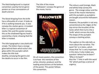
The blood dripping from the knife
has a silhouette of a man. It looks as
if he is walking towards you. It also
conveys the slasher genre. A masked
killer is a typical convention of
slasher film and this poster conveys
this as the shadowed figures head is
covered by a hand, showing that the
killer is masked.
The caption on the side tells us
more about the narrative. The
word ‘He’ is in italics, which
shows that ‘he’ is very important
in the story. It also makes you
question ‘where has he been?’
‘Why is he back?’
Also the ‘!’ links in with the word
‘He’ which portrays a sense of
urgency.
The title typography is very bold and
simple. The letters have a orange
glow behind them which echo's the
glow within the pumpkin which
makes the title look
deathly, conveying the genre and
the deaths to occur in the film.
The black background is a typical
convention used by horror genre
posters as it has connotations of
death and evil.
On all movie posters, the convention
is to have the mentions of the
writer, director, producer and the
leading actor/actress at the bottom
of the poster. This poster follows
this convention.
The title of the movie
‘Halloween’ conveys the genre of
the movie; horror.
The colours used (orange, black
and white) help convey the
genre. The orange colour and the
name of the movie intertwines
with the pumpkin as pumpkins
are bought around the Halloween
season.
However, the pumpkin is not very
conventional as the ridges at the
top mirror the knuckles of the
hand, which then turns into a
‘knife’ which mirrors the knife.
The shape of the pumpkin
conveys a slashing action.
The first thing we see is the half naked
woman. She was given the biggest
space in the poster suggesting that she
is the main character. Also, in the 50’s
when this movie was released, it was
very unusual to see a picture of a
woman in just a bra, this symbolizes the
male gaze. This is shown by the pose as
she is looking over she shoulder, giving
a sense of vulnerability.
The abstract shapes used came from
German Expressionism, where the sets
would be psychological landscapes
which would present their state of
mind. The poster also conveys the
broken mind of the killer.
The title ‘Psycho’ is in capital letters and
is slightly broken. This reflects the
killers mind as being ‘broken’ and
‘cracked’. This shows that the film is
unstable and has a dark
side, representing the genre of the film.
The colours used in the poster are
very pale, almost sickly. This reflects
the killers mind as being ‘sick/ill’. The
red tint creates a sense of danger
surrounding the characters. The
yellow and black form a dull
atmosphere and symbolises danger.
These colours make it hard to
recognise what genre the movie is as
it does not use typical colours (expect
for the black background).
The poster already showed that this is
an unusual film by the layout used
and the colours which portrays its
narrative by showing that this film is
unique.
The placement of the cast and
crew are in an unconventional
place, representing the film as
breaking the conventions of
horror.
When this movie was made, the
typical convention of a horror movie
was vampire, werewolves
etc…However, this movie changed
that convention and later on the style
was repeated in other horror movies.
This film shares some of the
conventions of slasher films as
there are a group of people
who are murdered one by one
by a psychotic killer.
Red and black is a typical
convention used knower days
for a horror movie poster. They
are both contrasting colours
and have connotations of
death, hell and blood. The
typography used has conveys
an electrical device which links
with the film. The red
typography helps convey a
sense of genre and narrative.
The poster shows that this is a
low budget film as there are
quotes at the top of the poster.
This is used as a marketing
strategy to help promote the
movie to a wider audience.
The video like picture shows
intertextuality of a YouTube
video creating a sense of
realism for the audience.
The picture itself is very clever
as your eyes go straight to the
bed where you see a couple
and the woman is pointing to
the door. Your eyes follow the
hand which is pointing to the
door where you see a shadow.
This conveys a sense of fear of
the unknown, which in todays
society is one of the greatest
fears. This picture gives a
sense of the tension making it
chilling.
The picture also a camera
picture from a video recorder.
This creates a sense of
actuality realism. The picture is
also in black and white which
to the audience looks a lot
more realistic then if the
picture was in colour.
The subtext under the title
says ‘DON’T SEE IT ALONE’.
This is a marketing technique
as they are saying that it is too
scary to see by yourself so take
someone to watch it with you.
As this was a low budget
movie (so the movie was not
shown in many places) at the
bottom there is an
advertisement where you can
bring the movie to your city.

Poster analysis

  • 1.
    The blood drippingfrom the knife has a silhouette of a man. It looks as if he is walking towards you. It also conveys the slasher genre. A masked killer is a typical convention of slasher film and this poster conveys this as the shadowed figures head is covered by a hand, showing that the killer is masked. The caption on the side tells us more about the narrative. The word ‘He’ is in italics, which shows that ‘he’ is very important in the story. It also makes you question ‘where has he been?’ ‘Why is he back?’ Also the ‘!’ links in with the word ‘He’ which portrays a sense of urgency. The title typography is very bold and simple. The letters have a orange glow behind them which echo's the glow within the pumpkin which makes the title look deathly, conveying the genre and the deaths to occur in the film. The black background is a typical convention used by horror genre posters as it has connotations of death and evil. On all movie posters, the convention is to have the mentions of the writer, director, producer and the leading actor/actress at the bottom of the poster. This poster follows this convention. The title of the movie ‘Halloween’ conveys the genre of the movie; horror. The colours used (orange, black and white) help convey the genre. The orange colour and the name of the movie intertwines with the pumpkin as pumpkins are bought around the Halloween season. However, the pumpkin is not very conventional as the ridges at the top mirror the knuckles of the hand, which then turns into a ‘knife’ which mirrors the knife. The shape of the pumpkin conveys a slashing action.
  • 2.
    The first thingwe see is the half naked woman. She was given the biggest space in the poster suggesting that she is the main character. Also, in the 50’s when this movie was released, it was very unusual to see a picture of a woman in just a bra, this symbolizes the male gaze. This is shown by the pose as she is looking over she shoulder, giving a sense of vulnerability. The abstract shapes used came from German Expressionism, where the sets would be psychological landscapes which would present their state of mind. The poster also conveys the broken mind of the killer. The title ‘Psycho’ is in capital letters and is slightly broken. This reflects the killers mind as being ‘broken’ and ‘cracked’. This shows that the film is unstable and has a dark side, representing the genre of the film. The colours used in the poster are very pale, almost sickly. This reflects the killers mind as being ‘sick/ill’. The red tint creates a sense of danger surrounding the characters. The yellow and black form a dull atmosphere and symbolises danger. These colours make it hard to recognise what genre the movie is as it does not use typical colours (expect for the black background). The poster already showed that this is an unusual film by the layout used and the colours which portrays its narrative by showing that this film is unique. The placement of the cast and crew are in an unconventional place, representing the film as breaking the conventions of horror. When this movie was made, the typical convention of a horror movie was vampire, werewolves etc…However, this movie changed that convention and later on the style was repeated in other horror movies. This film shares some of the conventions of slasher films as there are a group of people who are murdered one by one by a psychotic killer.
  • 3.
    Red and blackis a typical convention used knower days for a horror movie poster. They are both contrasting colours and have connotations of death, hell and blood. The typography used has conveys an electrical device which links with the film. The red typography helps convey a sense of genre and narrative. The poster shows that this is a low budget film as there are quotes at the top of the poster. This is used as a marketing strategy to help promote the movie to a wider audience. The video like picture shows intertextuality of a YouTube video creating a sense of realism for the audience. The picture itself is very clever as your eyes go straight to the bed where you see a couple and the woman is pointing to the door. Your eyes follow the hand which is pointing to the door where you see a shadow. This conveys a sense of fear of the unknown, which in todays society is one of the greatest fears. This picture gives a sense of the tension making it chilling. The picture also a camera picture from a video recorder. This creates a sense of actuality realism. The picture is also in black and white which to the audience looks a lot more realistic then if the picture was in colour. The subtext under the title says ‘DON’T SEE IT ALONE’. This is a marketing technique as they are saying that it is too scary to see by yourself so take someone to watch it with you. As this was a low budget movie (so the movie was not shown in many places) at the bottom there is an advertisement where you can bring the movie to your city.