Factual writing
Leaflets
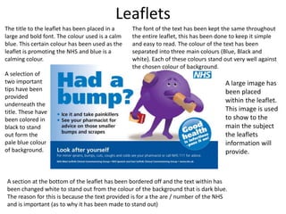
The title to the leaflet has been placed in a
large and bold font. The colour used is a calm
blue. This certain colour has been used as the
leaflet is promoting the NHS and blue is a
calming colour.
A selection of
two important
tips have been
provided
underneath the
title. These have
been colored in
black to stand
out form the
pale blue colour
of background.
A section at the bottom of the leaflet has been bordered off and the text within has
been changed white to stand out from the colour of the background that is dark blue.
The reason for this is because the text provided is for a the are / number of the NHS
and is important (as to why it has been made to stand out)
The font of the text has been kept the same throughout
the entire leaflet, this has been done to keep it simple
and easy to read. The colour of the text has been
separated into three main colours (Blue, Black and
white). Each of these colours stand out very well against
the chosen colour of background.
A large image has
been placed
within the leaflet.
This image is used
to show to the
main the subject
the leaflets
information will
provide.
Instruction manuals
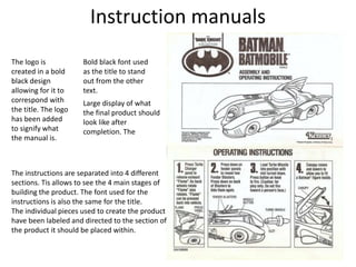
Bold black font used
as the title to stand
out from the other
text.
Large display of what
the final product should
look like after
completion. The
The instructions are separated into 4 different
sections. Tis allows to see the 4 main stages of
building the product. The font used for the
instructions is also the same for the title.
The individual pieces used to create the product
have been labeled and directed to the section of
the product it should be placed within.
The logo is
created in a bold
black design
allowing for it to
correspond with
the title. The logo
has been added
to signify what
the manual is.
How to guide
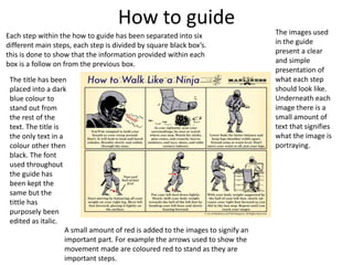
Each step within the how to guide has been separated into six
different main steps, each step is divided by square black box’s.
this is done to show that the information provided within each
box is a follow on from the previous box.
The title has been
placed into a dark
blue colour to
stand out from
the rest of the
text. The title is
the only text in a
colour other then
black. The font
used throughout
the guide has
been kept the
same but the
tittle has
purposely been
edited as italic.
The images used
in the guide
present a clear
and simple
presentation of
what each step
should look like.
Underneath each
image there is a
small amount of
text that signifies
what the image is
portraying.
A small amount of red is added to the images to signify an
important part. For example the arrows used to show the
movement made are coloured red to stand as they are
important steps.
Factual journalism
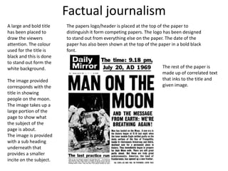
A large and bold title
has been placed to
draw the viewers
attention. The colour
used for the title is
black and this is done
to stand out form the
white background.
The image provided
corresponds with the
title in showing
people on the moon.
The image takes up a
large portion of the
page to show what
the subject of the
page is about.
The image is provided
with a sub heading
underneath that
provides a smaller
incite on the subject.
The papers logo/header is placed at the top of the paper to
distinguish it form competing papers. The logo has been designed
to stand out from everything else on the paper. The date of the
paper has also been shown at the top of the paper in a bold black
font.
The rest of the paper is
made up of correlated text
that inks to the title and
given image.

Factual writing

  • 1.
  • 2.
    Leaflets The title tothe leaflet has been placed in a large and bold font. The colour used is a calm blue. This certain colour has been used as the leaflet is promoting the NHS and blue is a calming colour. A selection of two important tips have been provided underneath the title. These have been colored in black to stand out form the pale blue colour of background. A section at the bottom of the leaflet has been bordered off and the text within has been changed white to stand out from the colour of the background that is dark blue. The reason for this is because the text provided is for a the are / number of the NHS and is important (as to why it has been made to stand out) The font of the text has been kept the same throughout the entire leaflet, this has been done to keep it simple and easy to read. The colour of the text has been separated into three main colours (Blue, Black and white). Each of these colours stand out very well against the chosen colour of background. A large image has been placed within the leaflet. This image is used to show to the main the subject the leaflets information will provide.
  • 3.
    Instruction manuals Bold blackfont used as the title to stand out from the other text. Large display of what the final product should look like after completion. The The instructions are separated into 4 different sections. Tis allows to see the 4 main stages of building the product. The font used for the instructions is also the same for the title. The individual pieces used to create the product have been labeled and directed to the section of the product it should be placed within. The logo is created in a bold black design allowing for it to correspond with the title. The logo has been added to signify what the manual is.
  • 4.
    How to guide Eachstep within the how to guide has been separated into six different main steps, each step is divided by square black box’s. this is done to show that the information provided within each box is a follow on from the previous box. The title has been placed into a dark blue colour to stand out from the rest of the text. The title is the only text in a colour other then black. The font used throughout the guide has been kept the same but the tittle has purposely been edited as italic. The images used in the guide present a clear and simple presentation of what each step should look like. Underneath each image there is a small amount of text that signifies what the image is portraying. A small amount of red is added to the images to signify an important part. For example the arrows used to show the movement made are coloured red to stand as they are important steps.
  • 5.
    Factual journalism A largeand bold title has been placed to draw the viewers attention. The colour used for the title is black and this is done to stand out form the white background. The image provided corresponds with the title in showing people on the moon. The image takes up a large portion of the page to show what the subject of the page is about. The image is provided with a sub heading underneath that provides a smaller incite on the subject. The papers logo/header is placed at the top of the paper to distinguish it form competing papers. The logo has been designed to stand out from everything else on the paper. The date of the paper has also been shown at the top of the paper in a bold black font. The rest of the paper is made up of correlated text that inks to the title and given image.