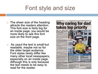
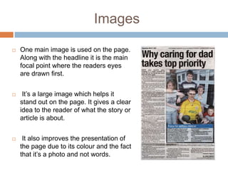
PETERBOROUGH TELEGRAPH
INSIDE PAGE ANALYSIS
Layout
    The Layout is simply and not cluttered. There
    are two main vertical columns, splitting the
    content neatly.


    The positioning of the heading at the top of the
    page draws the readers attention to look at that
    first and then everything else on the page.


    The large font size and its position makes it
    greatly stand out. The text and heading next to
    the photo shows relation to it.


    The Z eye line technique is strong here. The
    reader looks at the heading first then the image
    and finally the text. It forces the reader to look
    at everything on the page.
Colour

   Similar to the other two inside
    pages, colour is only tied to the
    images.

    The font and background are
    black and white, a common
    theme in all newspapers.
    Although there is a blue banner
    with a white heading in front of
    the image

   . This adds a touch of vibrancy to
    the page along with the colour
    portrayed by the image.
Font style and size

   The sheer size of the heading
    attracts the readers attention.
    This font size is fairly big for
    an inside page, you would be
    more likely to see this font
    size on the front page.

    As usaul the text is small but
    readable, maybe not so for
    the older target audience.
    Font styles rarely differ like
    many other local newspapers,
    especially on an inside page.
    Although this is only because
    the text needs to be easy to
    read for the reader.
Images

   One main image is used on the page.
    Along with the headline it is the main
    focal point where the readers eyes
    are drawn first.


    It’s a large image which helps it
    stand out on the page. It gives a clear
    idea to the reader of what the story or
    article is about.


    It also improves the presentation of
    the page due to its colour and the fact
    that it’s a photo and not words.

Peterborough telegraph inside page analysis

  • 1.
  • 2.
    Layout  The Layout is simply and not cluttered. There are two main vertical columns, splitting the content neatly.  The positioning of the heading at the top of the page draws the readers attention to look at that first and then everything else on the page.  The large font size and its position makes it greatly stand out. The text and heading next to the photo shows relation to it.  The Z eye line technique is strong here. The reader looks at the heading first then the image and finally the text. It forces the reader to look at everything on the page.
  • 3.
    Colour  Similar to the other two inside pages, colour is only tied to the images.  The font and background are black and white, a common theme in all newspapers. Although there is a blue banner with a white heading in front of the image  . This adds a touch of vibrancy to the page along with the colour portrayed by the image.
  • 4.
    Font style andsize  The sheer size of the heading attracts the readers attention. This font size is fairly big for an inside page, you would be more likely to see this font size on the front page.  As usaul the text is small but readable, maybe not so for the older target audience. Font styles rarely differ like many other local newspapers, especially on an inside page. Although this is only because the text needs to be easy to read for the reader.
  • 5.
    Images  One main image is used on the page. Along with the headline it is the main focal point where the readers eyes are drawn first.  It’s a large image which helps it stand out on the page. It gives a clear idea to the reader of what the story or article is about.  It also improves the presentation of the page due to its colour and the fact that it’s a photo and not words.