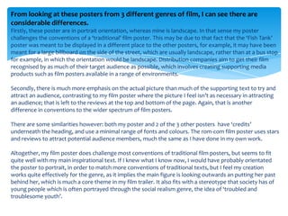
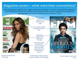
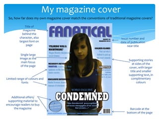
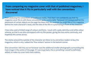
1) The film poster and magazine cover created by the student follow many conventions of real media products in their genres. Both utilize a limited color palette, minimal fonts, and emphasize key visual and textual elements like the title and credits.
2) However, the film poster challenges some conventions by having a landscape orientation rather than portrait. The magazine cover is also missing smaller supplementary images around the border.
3) Overall, the student was successful in researching conventions from example media and incorporating many of them into their own designs. Some small adjustments could better align with traditional formats.