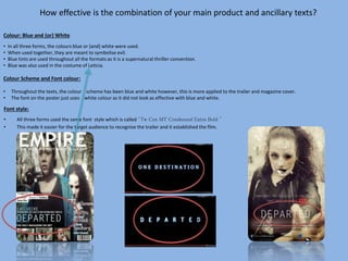
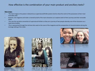
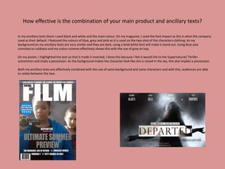
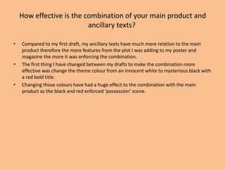
The document discusses the effectiveness of combining a main product with ancillary texts. It notes that the poster, trailer, and magazine used consistent fonts, colors, and imagery to tie them together and represent the supernatural thriller genre. Blue and white were used throughout to symbolize evil. Both ancillary texts featured the two main characters to explore their journeys, as in the trailer. The combination of matching design elements across the products helps audiences connect them and promote the main product.