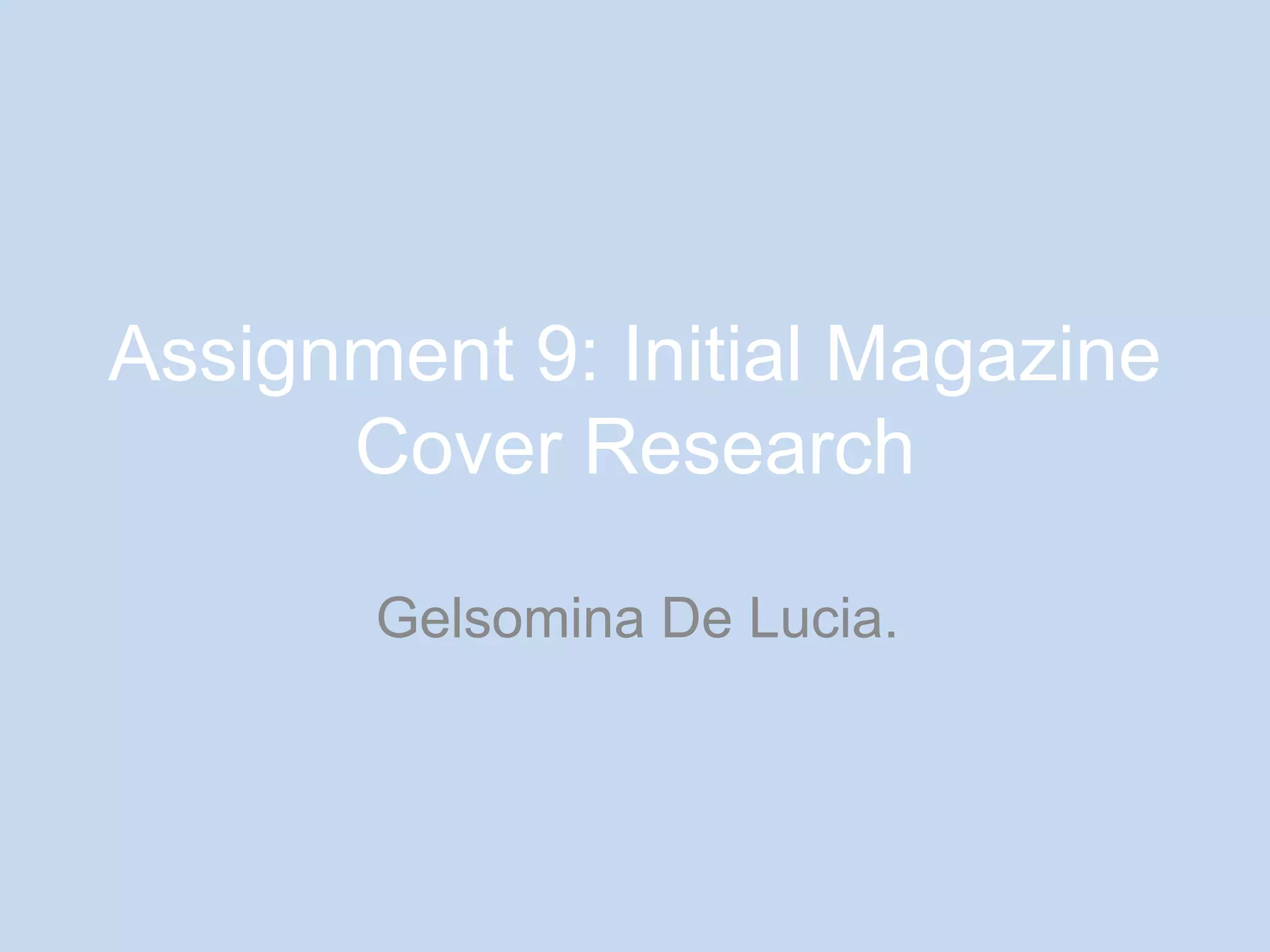
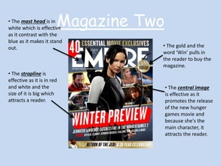
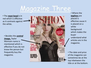
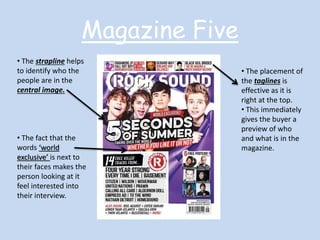
Assignment 9: Initial Magazine 
Cover Research 
Gelsomina De Lucia.
Magazine One • The mast head is 
placed at the top of 
the magazine. 
This is effective so 
so its audience can 
recognise it. 
• The slogan is effective 
because it makes its 
audience want to know 
what the preview is about. 
• The central 
image is of a mid 
shot of Will Smith. 
This immediately 
makes the 
audience 
understand who is 
mainly featured in 
the magazine. 
• The gaze is direct 
address as he is 
looking at the person 
buying the magazine. 
• The colour panel uses 
the same colours all over 
the cover. This colours 
can be either 
stereotypical to the film 
genre it is displaying or 
to the magazine itself.
• The mast head is in Magazine Two 
white which is effective 
as it contrast with the 
blue as it makes it stand 
out. • The gold and the 
word ‘Win’ pulls in 
the reader to buy the 
magazine. 
• The strapline is 
effective as it is in red 
and white and the 
size of it is big which 
attracts a reader. 
• The central image 
is effective as it 
promotes the release 
of the new hunger 
games movie and 
because she's the 
main character, it 
attracts the reader.
Magazine Three 
• The mast head is in 
red which is effective 
as it contrasts against 
the white. 
• Besides the central 
image, Taylor 
Momsen name is 
mentioned which is 
effective if you do not 
know the person but 
frequently buy the 
magazine. 
• Where the 
taglines are 
placed is 
effective cause it 
is placed on a 
white 
background 
which makes the 
buyer 
understand what 
articles are in the 
magazine. 
• The date and price 
of the magazine can 
sometimes be at the 
top inbetween the 
title or at the bottom.
Magazine Four • The mast head is 
effective because it 
takes up the half of the 
cover which makes the 
buyer quickly establish 
the title of the 
magazine. 
• The central image 
of Katy Perry 
establishes that the 
magazine is mainly 
about her. 
• The direct address and 
mid shot creates the 
image to be more intimate 
which is effective as it 
makes someone want to 
buy the magazine. 
• The colour panel all 
links together whether 
it be through text or 
outfit.
Magazine Five 
• The strapline helps 
to identify who the 
people are in the 
central image. 
• The fact that the 
words ‘world 
exclusive’ is next to 
their faces makes the 
person looking at it 
feel interested into 
their interview. 
• The placement of 
the taglines is 
effective as it is 
right at the top. 
• This immediately 
gives the buyer a 
preview of who 
and what is in the 
magazine.

Assignment 9

  • 1.
    Assignment 9: InitialMagazine Cover Research Gelsomina De Lucia.
  • 2.
    Magazine One •The mast head is placed at the top of the magazine. This is effective so so its audience can recognise it. • The slogan is effective because it makes its audience want to know what the preview is about. • The central image is of a mid shot of Will Smith. This immediately makes the audience understand who is mainly featured in the magazine. • The gaze is direct address as he is looking at the person buying the magazine. • The colour panel uses the same colours all over the cover. This colours can be either stereotypical to the film genre it is displaying or to the magazine itself.
  • 3.
    • The masthead is in Magazine Two white which is effective as it contrast with the blue as it makes it stand out. • The gold and the word ‘Win’ pulls in the reader to buy the magazine. • The strapline is effective as it is in red and white and the size of it is big which attracts a reader. • The central image is effective as it promotes the release of the new hunger games movie and because she's the main character, it attracts the reader.
  • 4.
    Magazine Three •The mast head is in red which is effective as it contrasts against the white. • Besides the central image, Taylor Momsen name is mentioned which is effective if you do not know the person but frequently buy the magazine. • Where the taglines are placed is effective cause it is placed on a white background which makes the buyer understand what articles are in the magazine. • The date and price of the magazine can sometimes be at the top inbetween the title or at the bottom.
  • 5.
    Magazine Four •The mast head is effective because it takes up the half of the cover which makes the buyer quickly establish the title of the magazine. • The central image of Katy Perry establishes that the magazine is mainly about her. • The direct address and mid shot creates the image to be more intimate which is effective as it makes someone want to buy the magazine. • The colour panel all links together whether it be through text or outfit.
  • 6.
    Magazine Five •The strapline helps to identify who the people are in the central image. • The fact that the words ‘world exclusive’ is next to their faces makes the person looking at it feel interested into their interview. • The placement of the taglines is effective as it is right at the top. • This immediately gives the buyer a preview of who and what is in the magazine.