
Recommended
More Related Content
What's hot
What's hot (20)
Viewers also liked
Viewers also liked (10)
Similar to Evaluation question 2
Similar to Evaluation question 2 (20)
More from lilywilkinson
More from lilywilkinson (20)
Evaluation question 2
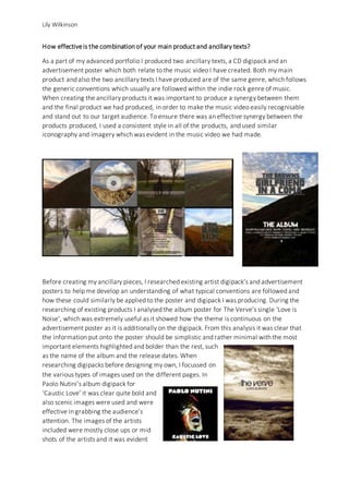
- 1. Lily Wilkinson How effectiveis the combination of your main product and ancillary texts? As a part of my advanced portfolio I produced two ancillary texts, a CD digipack and an advertisement poster which both relate to the music video I have created. Both my main product and also the two ancillary texts I have produced are of the same genre, which follows the generic conventions which usually are followed within the indie rock genre of music. When creating the ancillary products it was important to produce a synergy between them and the final product we had produced, in order to make the music video easily recognisable and stand out to our target audience. To ensure there was an effective synergy between the products produced, I used a consistent style in all of the products, and used similar iconography and imagery which was evident in the music video we had made. Before creating my ancillary pieces, I researched existing artist digipack’s and advertisement posters to help me develop an understanding of what typical conventions are followed and how these could similarly be applied to the poster and digipack I was producing. During the researching of existing products I analysed the album poster for The Verve’s single ‘Love is Noise’, which was extremely useful as it showed how the theme is continuous on the advertisement poster as it is additionally on the digipack. From this analysis it was clear that the information put onto the poster should be simplistic and rather minimal with the most important elements highlighted and bolder than the rest, such as the name of the album and the release dates. When researching digipacks before designing my own, I focussed on the various types of images used on the different pages. In Paolo Nutini’s album digipack for ‘Caustic Love’ it was clear quite bold and also scenic images were used and were effective in grabbing the audience’s attention. The images of the artists included were mostly close ups or mid shots of the artists and it was evident
- 2. Lily Wilkinson that various techniques had been used such as the rule of thirds, therefore it was something which I put into consideration when shooting the images for my digipack. It was important that the images used related to the music video we had produced, in order to create a synergy between the two. To ensure this we took photos from the location where we filmed the music video, as we believed the location was a good reflection of the alternative/indie rock genre. We followed the generic layouts of both ancillary products created, so they looked as realistic and professional as possible. In relation to the poster the positioning of the text was fairly basic and placed in the centre in order to stand out and make it easy to read, and the most important information was positioned at the top followed by the other less significant information which is positioned towards the bottom of the page. For the digipack, I replicated the heading which had been used on the advertisement poster to maintain a consistent house style. Additionally, I kept the typography and style exactly the same, as well as how it was positioned. This is effective as it means that the text used is instantly related to the bands album release, and the audience will know that all of the items are all related. To ensure the digipack I produced looked professional, I positioned the track listing for the album on the back page of the digipack in a vertical column, as this is a traditional and effective way of positioning the text.