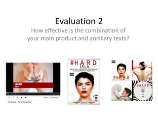
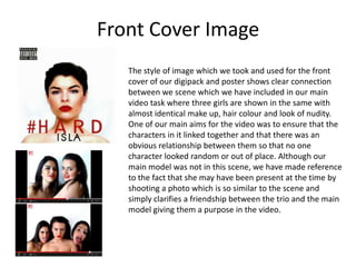
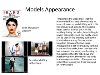
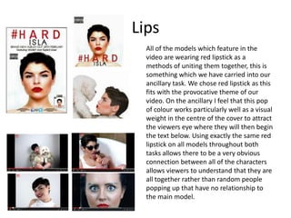
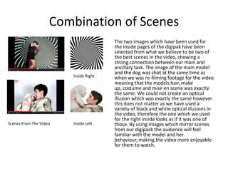
The document discusses the connection between a main video product and two ancillary texts, a digipack and poster. It summarizes that the front cover image of the ancillary texts clearly connects to a scene in the video by showing three girls with identical looks. Throughout both the video and ancillary texts, the main model maintains a consistent rebellious style with provocative clothing and nudity. Red lipstick is used on all models in both pieces to unite them. The same font is used for all text to ensure consistency. The same striking front cover image is used on both the digipack and poster to make the product more memorable. Scenes from the video are featured inside the digipack to show a strong connection
Our A2 Media evaluation question 1 for A2 Media Studies Coursework. In what way does our media product use, develop and challenge forms and conventions or real media products. This was created with Harriett Thomas
Explore the multifaceted world of Muntadher Saleh, an Iraqi polymath renowned for his expertise in visual art, writing, design, and pharmacy. This SlideShare delves into his innovative contributions across various disciplines, showcasing his unique ability to blend traditional themes with modern aesthetics. Learn about his impactful artworks, thought-provoking literary pieces, and his vision as a Neo-Pop artist dedicated to raising awareness about Iraq's cultural heritage. Discover why Muntadher Saleh is celebrated as "The Last Polymath" and how his multidisciplinary talents continue to inspire and influence.
2137ad Merindol Colony Interiors where refugee try to build a seemengly norm...luforfor
This are the interiors of the Merindol Colony in 2137ad after the Climate Change Collapse and the Apocalipse Wars. Merindol is a small Colony in the Italian Alps where there are around 4000 humans. The Colony values mainly around meritocracy and selection by effort.
2137ad - Characters that live in Merindol and are at the center of main storiesluforfor
Kurgan is a russian expatriate that is secretly in love with Sonia Contado. Henry is a british soldier that took refuge in Merindol Colony in 2137ad. He is the lover of Sonia Contado.
Hadj Ounis's most notable work is his sculpture titled "Metamorphosis." This piece showcases Ounis's mastery of form and texture, as he seamlessly combines metal and wood to create a dynamic and visually striking composition. The juxtaposition of the two materials creates a sense of tension and harmony, inviting viewers to contemplate the relationship between nature and industry.
2. Front Cover Image
The style of image which we took and used for the front
cover of our digipack and poster shows clear connection
between we scene which we have included in our main
video task where three girls are shown in the same with
almost identical make up, hair colour and look of nudity.
One of our main aims for the video was to ensure that the
characters in it linked together and that there was an
obvious relationship between them so that no one
character looked random or out of place. Although our
main model was not in this scene, we have made reference
to the fact that she may have been present at the time by
shooting a photo which is so similar to the scene and
simply clarifies a friendship between the trio and the main
model giving them a purpose in the video.
3. Models Appearance
Throughout the video I feel that the
main model has a very obvious style in
terms of make up and clothing which fits
her attitude and actions. The model is
never seen as bare as she is in the
ancillary during the video, her clothing is
always provocative and her nudity which
can be seen in the ancillary pushes the
boundaries one step further in the
transition between the two tasks.
Although she is not wearing any clothing
in the ancillary tasks, I feel that her style
has remained the same; emphasising to
the audience that the rebellious and
mischievous ways they see in the video
is a true representation of her persona
rather than looking like it has been put
on for the video.
Look of nudity in
ancillary.
Revealing clothing
in the video.
4. Lips
All of the models which feature in the
video are wearing red lipstick as a
methods of uniting them together, this is
something which we have carried into our
ancillary task. We chose red lipstick as this
fits with the provocative theme of our
video. On the ancillary I feel that this pop
of colour works particularly well as a visual
weight in the centre of the cover to attract
the viewers eye where they will then begin
the text below. Using exactly the same red
lipstick on all models throughout both
tasks allows there to be a very obvious
connection between all of the characters
allows viewers to understand that they are
all together rather than random people
popping up that have no relationship to
the main model.
5. Text
In addition to using images to connect
our products together we have ensured
that the font we have used is the same
throughout both of our ancillary tasks to
ensure consistency throughout them. We
have only used one font for all of the text
as it is a simple sans serif which is easy to
read and uncomplicated, similar to the
feel good message we are portraying
with out video. In addition to this, the
font used for ancillary is very similar to
the one which we used for the opening
title banner and ‘turn it up’ text on the
video. Although the rest of the titles we
included on the video were hand
written, they were still written in a sans
serif format which was similar to the
computer generated font.
Final font from research
6. Two Ancillary Pieces
We have ensured that there is connection between
the two ancillary pieces we have created by using
the same image on both the front cover of the
digipak and the poster. Not only did we do this due
to it being such as striking image, with the lips as a
strong visual drawing you into the middle of the
image. Through research I also found that this is
popular technique which many artists have recently
used in order to make the album they are
promoting more memorable.
7. Inside Her Head
When researching the style of digipack which would
be most appropriate for our own product we was
instantly attracted to the close up shot of the front
and back of the models head. Not only did this
appeal to us for the proactive and open look which it
would enable us to give the digipack which reflects
our video. But also when the digipack is put together
the digipack is a representation of her head, the
front being her face and the reverse being the back
of her head with everything in between being the
‘what goes on inside her head’. Due to the video
being such as personal account of her life and
antics, suggesting that opening the digipack would
be like opening up her mind is very accurate.
8. Combination of Scenes
Scenes From The Video
Inside Right
Inside Left
The two images which have been used for
the inside pages of the digipak have been
selected from what we believe to be two of
the best scenes in the video, showing a
strong connection between our main and
ancillary task. The image of the main model
and the dog was shot at the same time as
when we was re-filming footage for the video
meaning that the models hair, make
up, costume and mise en scene was exactly
the same. We could not create an optical
illusion which was exactly the same however
this does not matter as we have used a
variety of black and white optical illusions in
the video, therefore the one which we used
for the right inside looks as if it was one of
those. By using images which mirror scenes
from our digipack the audience will feel
familiar with the model and her
behaviour, making the video more enjoyable
for them to watch.