How effective is the combination of your main product and ancillary texts?www.demimottrama2mediablog.blogspot.com
TitleThe title of the documentary, radio advert and print advert is all 'LOL', which links all three together, and identifies them as being for the same product.The title of our products gives the audience an idea of what the documentary is about, and also gives the audience the idea that the documentary may be quite fun and different. The title also helps to appeal to our target audience, teenagers, as ‘LOL’ is ‘text language’, so it will attract our chosen segment.
Voice-OverThe same voice-over in the documentary is also the same voice-over that is used in the radio advert. This links the two products together, and also relates the audience to both products, and make them more aware of the theme. The voice-over used is very calm, friendly and happy, which represents the overall feel of the documentary, but may also make the viewer feel more relaxed when watching/listening.The voice-over also gives the audience a sense of familiarity with the documentary and the person narrating, which may make them feel more comfortable, and more likely to be interested in our products.
SloganThe same slogan 'Tickle your funny bone!' is used on both the radio advert and the print advert, which helps to link the two together, and keep the same theme within different types of media.This slogan is very fun and tongue-in-cheek, very much like our documentary itself, so this helps to convey a certain theme and feel to the potential audience as to what our product is.
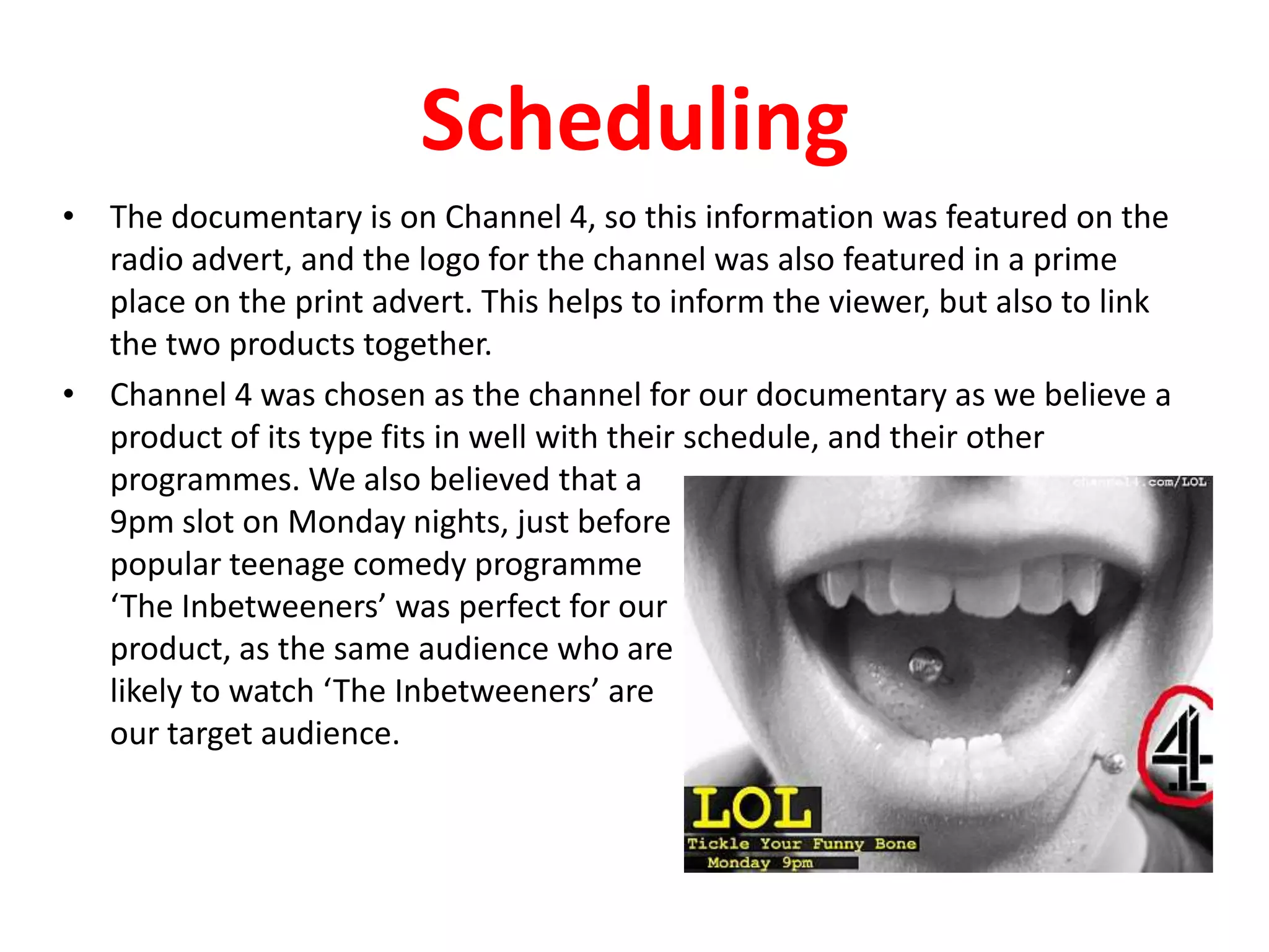
SchedulingThe documentary is on Channel 4, so this information was featured on the radio advert, and the logo for the channel was also featured in a prime place on the print advert. This helps to inform the viewer, but also to link the two products together.Channel 4 was chosen as the channel for our documentary as we believe a product of its type fits in well with their schedule, and their other programmes. We also believed that a 9pm slot on Monday nights, just before popular teenage comedy programme ‘The Inbetweeners’ was perfect for ourproduct, as the same audience who arelikely to watch ‘The Inbetweeners’ areour target audience.
ClipsThe same interviews and vox-pops in the documentary are also featured in the radio advert, which helps to link the two products together, but also give the viewer an idea what the documentary is going to contain before they actually watch it.Featuring some of the initial clips from the documentary in the radio advert helps the viewer to make up their mind as to whether or not they want to watch it, as well as keeping them intrigued and wanting to know more.
ImageThe image used in the print advert is of a teenager laughing, which gives many connotations of the documentary.The documentary is about laughter, so the person laughing on the print advert shows the audience what the programme will be about, without actually saying it.The fact that the photo is of a teenager hints at the target audience for our documentary, and who we believe the programme will appeal to. The teenager also has facial piercing’s, which may make it more relatable and intriguing for the audience.The image is very fun, young and unique, which helps to convey an initial feel and theme for our documentary.
GraphicsThe graphics used throughout are always very simple and understated, but are also the same in each product.All graphics used in the documentary are very simple, as to not defer from the actual footage.The graphics on the print advert are also very simple, and are yellow to attract the audience’s attention, the same as the documentary.The same, simple font is also used throughout, to help link the products together.
ThemesAll three products are very bright and happy, which helps to convey a similar theme throughout.Yellow writing (yellow titles and captions in the documentary and yellow titles on the print advert) is used throughout, which we found out to be our target audience’s favourite colour. We made sure to use this throughout to appeal to the audience, but also keep up the ‘bright and happy’ feel of our products.The theme of teenagers is very apparent throughout our products, as teenagers appear often in the interviews, as well as appearing on the print advert, which helps to reinforce our target audience.

2

  • 1.
    How effective isthe combination of your main product and ancillary texts?www.demimottrama2mediablog.blogspot.com
  • 2.
    TitleThe title ofthe documentary, radio advert and print advert is all 'LOL', which links all three together, and identifies them as being for the same product.The title of our products gives the audience an idea of what the documentary is about, and also gives the audience the idea that the documentary may be quite fun and different. The title also helps to appeal to our target audience, teenagers, as ‘LOL’ is ‘text language’, so it will attract our chosen segment.
  • 3.
    Voice-OverThe same voice-overin the documentary is also the same voice-over that is used in the radio advert. This links the two products together, and also relates the audience to both products, and make them more aware of the theme. The voice-over used is very calm, friendly and happy, which represents the overall feel of the documentary, but may also make the viewer feel more relaxed when watching/listening.The voice-over also gives the audience a sense of familiarity with the documentary and the person narrating, which may make them feel more comfortable, and more likely to be interested in our products.
  • 4.
    SloganThe same slogan'Tickle your funny bone!' is used on both the radio advert and the print advert, which helps to link the two together, and keep the same theme within different types of media.This slogan is very fun and tongue-in-cheek, very much like our documentary itself, so this helps to convey a certain theme and feel to the potential audience as to what our product is.
  • 5.
    SchedulingThe documentary ison Channel 4, so this information was featured on the radio advert, and the logo for the channel was also featured in a prime place on the print advert. This helps to inform the viewer, but also to link the two products together.Channel 4 was chosen as the channel for our documentary as we believe a product of its type fits in well with their schedule, and their other programmes. We also believed that a 9pm slot on Monday nights, just before popular teenage comedy programme ‘The Inbetweeners’ was perfect for ourproduct, as the same audience who arelikely to watch ‘The Inbetweeners’ areour target audience.
  • 6.
    ClipsThe same interviewsand vox-pops in the documentary are also featured in the radio advert, which helps to link the two products together, but also give the viewer an idea what the documentary is going to contain before they actually watch it.Featuring some of the initial clips from the documentary in the radio advert helps the viewer to make up their mind as to whether or not they want to watch it, as well as keeping them intrigued and wanting to know more.
  • 7.
    ImageThe image usedin the print advert is of a teenager laughing, which gives many connotations of the documentary.The documentary is about laughter, so the person laughing on the print advert shows the audience what the programme will be about, without actually saying it.The fact that the photo is of a teenager hints at the target audience for our documentary, and who we believe the programme will appeal to. The teenager also has facial piercing’s, which may make it more relatable and intriguing for the audience.The image is very fun, young and unique, which helps to convey an initial feel and theme for our documentary.
  • 8.
    GraphicsThe graphics usedthroughout are always very simple and understated, but are also the same in each product.All graphics used in the documentary are very simple, as to not defer from the actual footage.The graphics on the print advert are also very simple, and are yellow to attract the audience’s attention, the same as the documentary.The same, simple font is also used throughout, to help link the products together.
  • 9.
    ThemesAll three productsare very bright and happy, which helps to convey a similar theme throughout.Yellow writing (yellow titles and captions in the documentary and yellow titles on the print advert) is used throughout, which we found out to be our target audience’s favourite colour. We made sure to use this throughout to appeal to the audience, but also keep up the ‘bright and happy’ feel of our products.The theme of teenagers is very apparent throughout our products, as teenagers appear often in the interviews, as well as appearing on the print advert, which helps to reinforce our target audience.