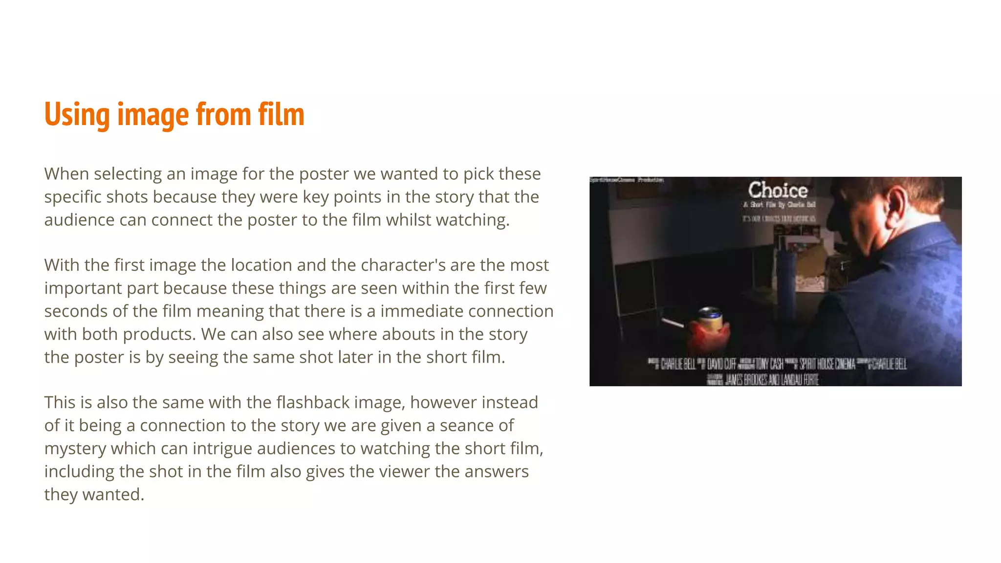
Evaluation Question 2
How effective is the combination
of your main product and ancillary texts?
Print Product - Poster
Our poster print product is extracted straight
from the short film itself. We decided to do
this instead of creating a completely new
image and design to draw a closer connection
between the poster and film, that way the
audience can connect the character's in the
shot, the location and colours more clearly
rather than having to create new imagery
which can cause confusion if not done
correctly.
We were inspired by some other short film
such as “Brenda” which uses a image writhing
the film as their film poster.
We also included a title, small caption and
credits so that the audience can establish that
it is a short film and are given a name to
connect to the film.
Using image from film
When selecting an image for the poster we wanted to pick these
specific shots because they were key points in the story that the
audience can connect the poster to the film whilst watching.
With the first image the location and the character's are the most
important part because these things are seen within the first few
seconds of the film meaning that there is a immediate connection
with both products. We can also see where abouts in the story
the poster is by seeing the same shot later in the short film.
This is also the same with the flashback image, however instead
of it being a connection to the story we are given a seance of
mystery which can intrigue audiences to watching the short film,
including the shot in the film also gives the viewer the answers
they wanted.
Print Product - magazine article
As well as a poster we also created a magazine
article based on the design of the style of empire
magazine using Photoshop.
There were a lot of things we included to make this
a convincing magazine article as well as using text,
colours and images to connect both media's.
Pictures were the most important thing to
connecting both media's so again we chose to take
shots from the film and a range them in a way that
was visually pleasing and suitable for the viewer,
we did this by placing the images relatively close to
one another rather than spreading them across
the page,this was so it didn't interfere with the
written text in anyway.
With colour we also wanted it to be
connected so the viewer would be reminded
of the short film and the article through the
related colours, this is why we chose yellow,
from the largest picture, blue for “Eric’s” suit
and black so it stood out to create a border
around the article. These colours helped
amplify certain areas of the article, drawing
attention to areas that the veiled would be
most interested in.
Text in the article
For the article we wanted to include text about the
production, inspirations and work put into the film as
well as giving the reader some insight into the story. Our
original idea was to write about the story and explain it
but we thought that from a writer's point of view we
would want to explain our film in process rather than the
film because it would spoil the film's story pushing
people away from watching it. We also included a
inspirations spot where we listed the inspirations for the
film as a way for people to get an idea on other medias
the the project is like. We placed this at the edge of the
page rather than the middle for it to be read last, leaving
the main article covering left to right.

A2 Media Evaluation - Question 2 Print Artifacts

  • 1.
    Evaluation Question 2 Howeffective is the combination of your main product and ancillary texts?
  • 2.
    Print Product -Poster Our poster print product is extracted straight from the short film itself. We decided to do this instead of creating a completely new image and design to draw a closer connection between the poster and film, that way the audience can connect the character's in the shot, the location and colours more clearly rather than having to create new imagery which can cause confusion if not done correctly. We were inspired by some other short film such as “Brenda” which uses a image writhing the film as their film poster. We also included a title, small caption and credits so that the audience can establish that it is a short film and are given a name to connect to the film.
  • 3.
    Using image fromfilm When selecting an image for the poster we wanted to pick these specific shots because they were key points in the story that the audience can connect the poster to the film whilst watching. With the first image the location and the character's are the most important part because these things are seen within the first few seconds of the film meaning that there is a immediate connection with both products. We can also see where abouts in the story the poster is by seeing the same shot later in the short film. This is also the same with the flashback image, however instead of it being a connection to the story we are given a seance of mystery which can intrigue audiences to watching the short film, including the shot in the film also gives the viewer the answers they wanted.
  • 4.
    Print Product -magazine article As well as a poster we also created a magazine article based on the design of the style of empire magazine using Photoshop. There were a lot of things we included to make this a convincing magazine article as well as using text, colours and images to connect both media's. Pictures were the most important thing to connecting both media's so again we chose to take shots from the film and a range them in a way that was visually pleasing and suitable for the viewer, we did this by placing the images relatively close to one another rather than spreading them across the page,this was so it didn't interfere with the written text in anyway. With colour we also wanted it to be connected so the viewer would be reminded of the short film and the article through the related colours, this is why we chose yellow, from the largest picture, blue for “Eric’s” suit and black so it stood out to create a border around the article. These colours helped amplify certain areas of the article, drawing attention to areas that the veiled would be most interested in.
  • 5.
    Text in thearticle For the article we wanted to include text about the production, inspirations and work put into the film as well as giving the reader some insight into the story. Our original idea was to write about the story and explain it but we thought that from a writer's point of view we would want to explain our film in process rather than the film because it would spoil the film's story pushing people away from watching it. We also included a inspirations spot where we listed the inspirations for the film as a way for people to get an idea on other medias the the project is like. We placed this at the edge of the page rather than the middle for it to be read last, leaving the main article covering left to right.