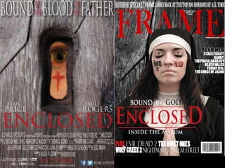
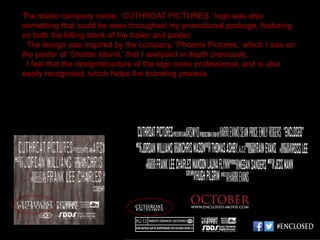
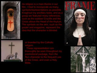
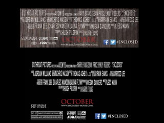
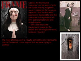
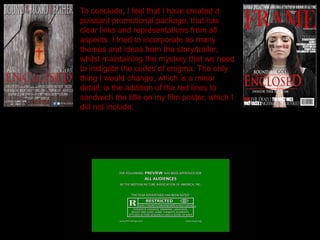
How effective is the combination of
your main product and ancillary
texts?
After creating our finished trailer, we had to make sure that there were
clear links, such as themes and characters, between the trailer and
the two ancillary tasks, the film poster and magazine cover. This
would aid to producing an efficacious promotional package.
The film title, ‘Enclosed,’ featured on all of my products, and I made sure
that the font/colour was the same on each, as I felt that this would brand our
film, making it more conventional for marketing purposes.
We also added lines which sandwich the title. This is common to have
some sort of design for film titles, and this can be seen in the trailer and on
my magazine cover.
Using the same logo for my products allows them to be easily recognised
as related, and are obviously linked with each other.
The studio company name, ‘CUTHROAT PICTURES,’ logo was also
something that could be seen throughout my promotional package, featuring
on both the billing block of the trailer and poster.
The design was inspired by the company, ‘Phoenix Pictures,’ which I saw on
the poster of ‘Shutter Island,’ that I analysed in depth previously.
I feel that the design/structure of the logo looks professional, and is also
easily recognised, which helps the branding process.
As religion is a main theme in our
film, I tried to incorporate as many
symbols/representations as possible
throghout my ancillary tasks, and as a
group we featured many references,
such as the outdoor Crucifix and the
Cross above the Head of the Asylum.
The symbols on the skin, such as the
poster and magazine, represent the
idea that the character is blinded
or branded by the Catholic
religion.
These representation can
thoroughly be seen throughout my
promotional package, from the
Nun character to the frequent use
of the Cross, and even a Holy
Bible.
The billing block and date of release was something that I made sure was
identical throughout my promotional package, for obvious reasons. This was
also time effective, as once I had spend around two hours creating the billing
block for my poster, I could then transfer that to the trailer.
The date of October is used throughout, and extra features, such as the
small logos and the social networking icons were also used on both billing
blocks to keep consistency.
The film website was also identical, as otherwise it would be completely
unconventional.
Cecilia, the Nun/Nurse
character, can be seen in both
the trailer and my magazine
cover. I chose her for my cover
because I find her the most
prominent, memorable, and the
character that represents our
film, both promotionally and
storyline-wise.
I also used the same
background image for the
poster and the magazine cover,
because I found it
the most effective, as it is visually stimulating and represents
the old fashioned, horror asylum that we were trying to
portray.
To conclude, I feel that I have created a
puissant promotional package, that has
clear links and representations from all
aspects. I tried to incorporate as many
themes and ideas from the story/trailer,
whilst maintaining the mystery that we need
to instigate the codes of enigma. The only
thing I would change, which is a minor
detail, is the addition of the red lines to
sandwich the title on my film poster, which I
did not include.

Evaluation Question 2

  • 1.
    How effective isthe combination of your main product and ancillary texts? After creating our finished trailer, we had to make sure that there were clear links, such as themes and characters, between the trailer and the two ancillary tasks, the film poster and magazine cover. This would aid to producing an efficacious promotional package.
  • 4.
    The film title,‘Enclosed,’ featured on all of my products, and I made sure that the font/colour was the same on each, as I felt that this would brand our film, making it more conventional for marketing purposes. We also added lines which sandwich the title. This is common to have some sort of design for film titles, and this can be seen in the trailer and on my magazine cover. Using the same logo for my products allows them to be easily recognised as related, and are obviously linked with each other.
  • 5.
    The studio companyname, ‘CUTHROAT PICTURES,’ logo was also something that could be seen throughout my promotional package, featuring on both the billing block of the trailer and poster. The design was inspired by the company, ‘Phoenix Pictures,’ which I saw on the poster of ‘Shutter Island,’ that I analysed in depth previously. I feel that the design/structure of the logo looks professional, and is also easily recognised, which helps the branding process.
  • 6.
    As religion isa main theme in our film, I tried to incorporate as many symbols/representations as possible throghout my ancillary tasks, and as a group we featured many references, such as the outdoor Crucifix and the Cross above the Head of the Asylum. The symbols on the skin, such as the poster and magazine, represent the idea that the character is blinded or branded by the Catholic religion. These representation can thoroughly be seen throughout my promotional package, from the Nun character to the frequent use of the Cross, and even a Holy Bible.
  • 8.
    The billing blockand date of release was something that I made sure was identical throughout my promotional package, for obvious reasons. This was also time effective, as once I had spend around two hours creating the billing block for my poster, I could then transfer that to the trailer. The date of October is used throughout, and extra features, such as the small logos and the social networking icons were also used on both billing blocks to keep consistency. The film website was also identical, as otherwise it would be completely unconventional.
  • 9.
    Cecilia, the Nun/Nurse character,can be seen in both the trailer and my magazine cover. I chose her for my cover because I find her the most prominent, memorable, and the character that represents our film, both promotionally and storyline-wise. I also used the same background image for the poster and the magazine cover, because I found it the most effective, as it is visually stimulating and represents the old fashioned, horror asylum that we were trying to portray.
  • 10.
    To conclude, Ifeel that I have created a puissant promotional package, that has clear links and representations from all aspects. I tried to incorporate as many themes and ideas from the story/trailer, whilst maintaining the mystery that we need to instigate the codes of enigma. The only thing I would change, which is a minor detail, is the addition of the red lines to sandwich the title on my film poster, which I did not include.