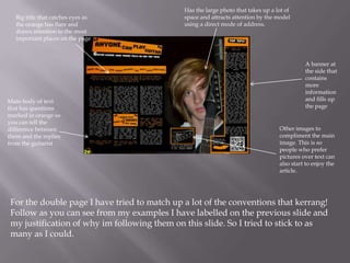
In what ways does your media
product use, develop or challenge
forms and conventions of real media
products?





The Genre I used for my magazine to follow was rock/metal and there are many
conventions for this genre including:
A more personal experience with the user
Darker colour scheme usually (Heavy use of black)
More pictures than text
More of a rugged look and not that formal

I tried to stick to as many conventions about the genre while trying to give it my own
twist by changing a few things that would not take away from the home style such as :

Trying to have a more unique colour scheme with my magazine and carry on the
theme throughout the issue

Trying to make it so it seemed rugged but it had a organized style to it anyway so
it had the rock magazine „rugged‟ look but you know where to look first and it had
order to it so everything is not just put anywhere

Tried to have a colour style that was dark and bright at the same time due to the
contrast of the black and orange which I like
Big title that attracts lots of attention
and takes up a large space this is going
against normal music magazine
conventions because it goes over the
page crease.

A large image on one
of the pages that takes
up a large area.
Usually a picture of
the band or the singer
which is arguably the
most important
member of the band.

Little side panel that
has lots of
information on it,
This helps the page
get fleshed out and
look more full.

Very powerful
images that
scream “Look at
me” when you
turn the page,
helps draw
readers in. An
effective way of
this is having
direct eye
contact with the
reader of the
magazine.
A collection of photo‟s over text as
its more engaging to the reader of
the target age of Kerrang! which is
teenagers also they are black and
white so they do not take away
from the main image and title
Big title that catches eyes as
the orange has flare and
draws attention to the most
important places on the page

Main body of text
that has questions
marked in orange so
you can tell the
difference between
them and the replies
from the guitarist

Has the large photo that takes up a lot of
space and attracts attention by the model
using a direct mode of address.

A banner at
the side that
contains
more
information
and fills up
the page

Other images to
compliment the main
image. This is so
people who prefer
pictures over text can
also start to enjoy the
article.

For the double page I have tried to match up a lot of the conventions that kerrang!
Follow as you can see from my examples I have labelled on the previous slide and
my justification of why im following them on this slide. So I tried to stick to as
many as I could.
The contents logo is
always up in the top
left of the page
because that is where
you look first. It‟s also
a bright colour so it
stands out more on
the dark background
and it highlights the
important bits of the
contents page.

I large photo that takes up most of the page
and features and artist that is familiar in the
genre.

Editors note including a picture of the
editor, this brings a more personal feeling
to the magazine as you are in touch with
the editor

Here we have
something that
splits up the
picture from
the text and
tells the reader
what is on this
page

At the bottom
you have a whole
host of content
that has been
presented using
small sub
headings
The title of
my contents
page and also
the date and
issue number
of the
magazine

Editors note
from the
main editor
and also a
picture of
the team
having
dinner
Pictures help
advertise the
articles on
different pages,
a range has
been included

The social part where the magazine informs the reader how
to get hold of them on Facebook and Twitter which is
important for a rock magazine.
A big main image
that has something
to do with rock and
has something to
the article (Ties in
with page 12)
The middle of the page
split up which separates
the big picture from the
news section which
informs the reader
where everything is

Little mini headings
for the 3 main
category's in a rock
magazine the
review tab, news
tab and the
competition/swag
tab
Big title that
clearly
displays what
magazine it is.
This catches
eyes and its
easy to find
what you are
looking for
Main image that is engaging
and interesting, usually
something to do with the
sub title

Banner at the bottom
to make the bottom
of the page feel
finished. Also tells
reader what else is
inside

Banner at the top with
photos and telling people
what else is in the
magazine.

Has a large sub
title that explains
what's a feature in
the magazine.
Usually something
interesting and eye
catching.

Includes white box
including price and the
bar code for the product
This is the banner, Its simple but helps the
page look better. It also includes some of
the features of this issue of the magazine
Main heading,
This is big and
stands out from
the black and
would hopefully
catch eyes as
orange on black is
eye catching.
Here is my pug which
has a competition on
it which ties in with
the main image and
may also entice
people to buy the
magazine
Big title that
has a artist
featured
inside on the
cover

Its got the white box
with the bar code
and the price of the
magazine + the date
and issue number
Main image that
takes up most of
the page and
attracts
attention
through direct
mode of address
and the crazy
colours

Smaller collection
of pictures down
here to show what
else is in the
Banner/Footer at the bottom to help finish magazine and fill
it up a bit
the page and make it look more finished
and full, this is also a massive convention
for most magazines






I think that I have followed the conventions of a
rock magazine which is pretty unique from most
magazines well as I can see similarities between
my magazine and Kerrang!
I also think that I put my own twist on a lot of
things to give a fresh and unique look to a
magazine that I think people my age and into rock
and metal would like.
My ultimate goal was to try and catch eyes with
the colour scheme and I think with the contrast of
black and white I achieved this as everyone I have
asked said it catches their eyes very effectively so I
think the bold look of most rock magazines was
captured in my work.

Question 3

  • 1.
    In what waysdoes your media product use, develop or challenge forms and conventions of real media products?
  • 2.
        The Genre Iused for my magazine to follow was rock/metal and there are many conventions for this genre including: A more personal experience with the user Darker colour scheme usually (Heavy use of black) More pictures than text More of a rugged look and not that formal I tried to stick to as many conventions about the genre while trying to give it my own twist by changing a few things that would not take away from the home style such as :  Trying to have a more unique colour scheme with my magazine and carry on the theme throughout the issue  Trying to make it so it seemed rugged but it had a organized style to it anyway so it had the rock magazine „rugged‟ look but you know where to look first and it had order to it so everything is not just put anywhere  Tried to have a colour style that was dark and bright at the same time due to the contrast of the black and orange which I like
  • 3.
    Big title thatattracts lots of attention and takes up a large space this is going against normal music magazine conventions because it goes over the page crease. A large image on one of the pages that takes up a large area. Usually a picture of the band or the singer which is arguably the most important member of the band. Little side panel that has lots of information on it, This helps the page get fleshed out and look more full. Very powerful images that scream “Look at me” when you turn the page, helps draw readers in. An effective way of this is having direct eye contact with the reader of the magazine. A collection of photo‟s over text as its more engaging to the reader of the target age of Kerrang! which is teenagers also they are black and white so they do not take away from the main image and title
  • 4.
    Big title thatcatches eyes as the orange has flare and draws attention to the most important places on the page Main body of text that has questions marked in orange so you can tell the difference between them and the replies from the guitarist Has the large photo that takes up a lot of space and attracts attention by the model using a direct mode of address. A banner at the side that contains more information and fills up the page Other images to compliment the main image. This is so people who prefer pictures over text can also start to enjoy the article. For the double page I have tried to match up a lot of the conventions that kerrang! Follow as you can see from my examples I have labelled on the previous slide and my justification of why im following them on this slide. So I tried to stick to as many as I could.
  • 5.
    The contents logois always up in the top left of the page because that is where you look first. It‟s also a bright colour so it stands out more on the dark background and it highlights the important bits of the contents page. I large photo that takes up most of the page and features and artist that is familiar in the genre. Editors note including a picture of the editor, this brings a more personal feeling to the magazine as you are in touch with the editor Here we have something that splits up the picture from the text and tells the reader what is on this page At the bottom you have a whole host of content that has been presented using small sub headings
  • 6.
    The title of mycontents page and also the date and issue number of the magazine Editors note from the main editor and also a picture of the team having dinner Pictures help advertise the articles on different pages, a range has been included The social part where the magazine informs the reader how to get hold of them on Facebook and Twitter which is important for a rock magazine. A big main image that has something to do with rock and has something to the article (Ties in with page 12) The middle of the page split up which separates the big picture from the news section which informs the reader where everything is Little mini headings for the 3 main category's in a rock magazine the review tab, news tab and the competition/swag tab
  • 7.
    Big title that clearly displayswhat magazine it is. This catches eyes and its easy to find what you are looking for Main image that is engaging and interesting, usually something to do with the sub title Banner at the bottom to make the bottom of the page feel finished. Also tells reader what else is inside Banner at the top with photos and telling people what else is in the magazine. Has a large sub title that explains what's a feature in the magazine. Usually something interesting and eye catching. Includes white box including price and the bar code for the product
  • 8.
    This is thebanner, Its simple but helps the page look better. It also includes some of the features of this issue of the magazine Main heading, This is big and stands out from the black and would hopefully catch eyes as orange on black is eye catching. Here is my pug which has a competition on it which ties in with the main image and may also entice people to buy the magazine Big title that has a artist featured inside on the cover Its got the white box with the bar code and the price of the magazine + the date and issue number Main image that takes up most of the page and attracts attention through direct mode of address and the crazy colours Smaller collection of pictures down here to show what else is in the Banner/Footer at the bottom to help finish magazine and fill it up a bit the page and make it look more finished and full, this is also a massive convention for most magazines
  • 9.
       I think thatI have followed the conventions of a rock magazine which is pretty unique from most magazines well as I can see similarities between my magazine and Kerrang! I also think that I put my own twist on a lot of things to give a fresh and unique look to a magazine that I think people my age and into rock and metal would like. My ultimate goal was to try and catch eyes with the colour scheme and I think with the contrast of black and white I achieved this as everyone I have asked said it catches their eyes very effectively so I think the bold look of most rock magazines was captured in my work.