The document summarizes how the media product uses, develops, and challenges conventions of real media. Specifically:
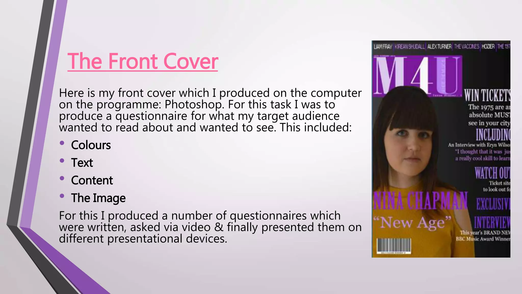
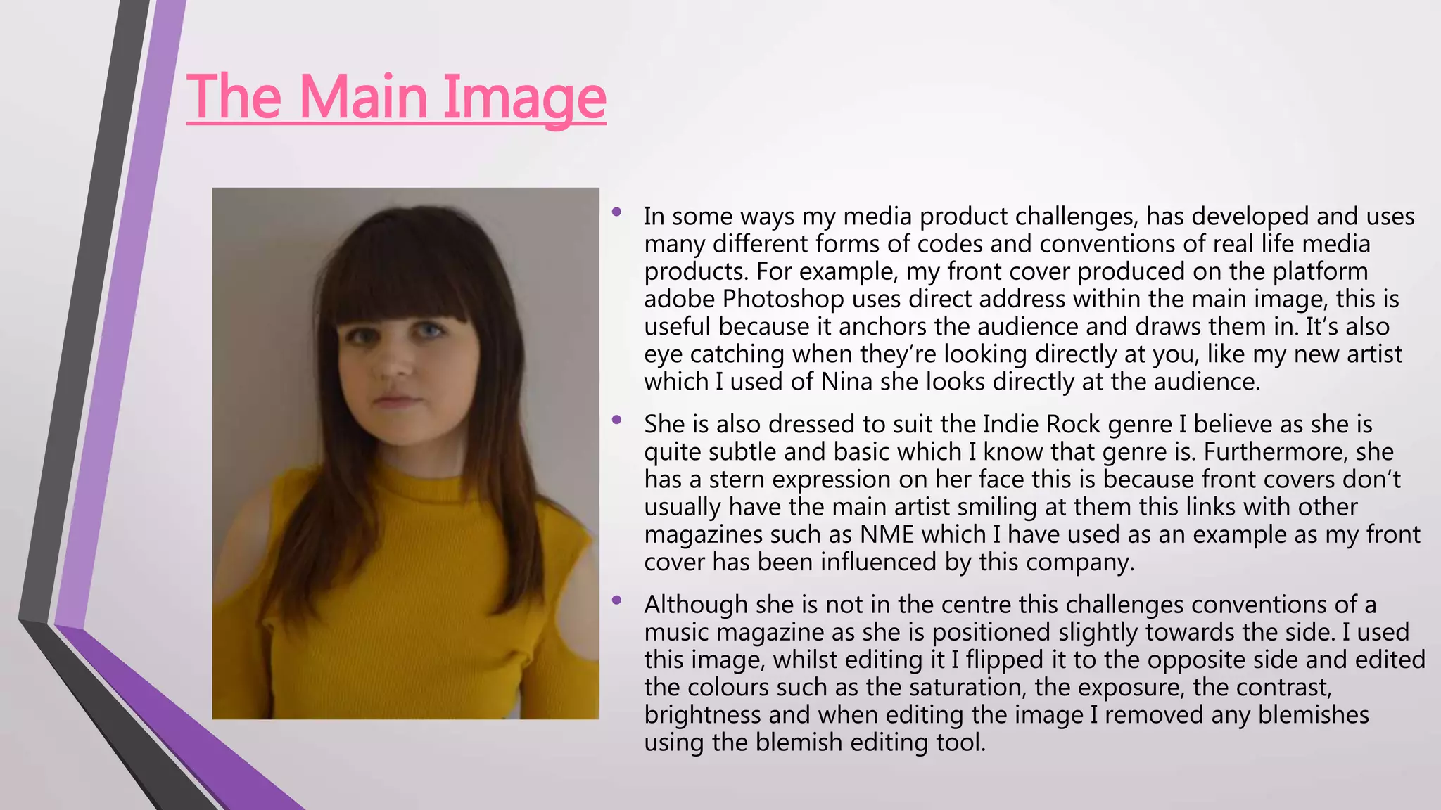
- The front cover uses direct address of the main image and eye-catching colors, but challenges conventions by positioning the image off-center.
- The double page spread features a large dominant main image and easy-to-read layout inspired by other magazines, but develops the product by changing image and text colors.
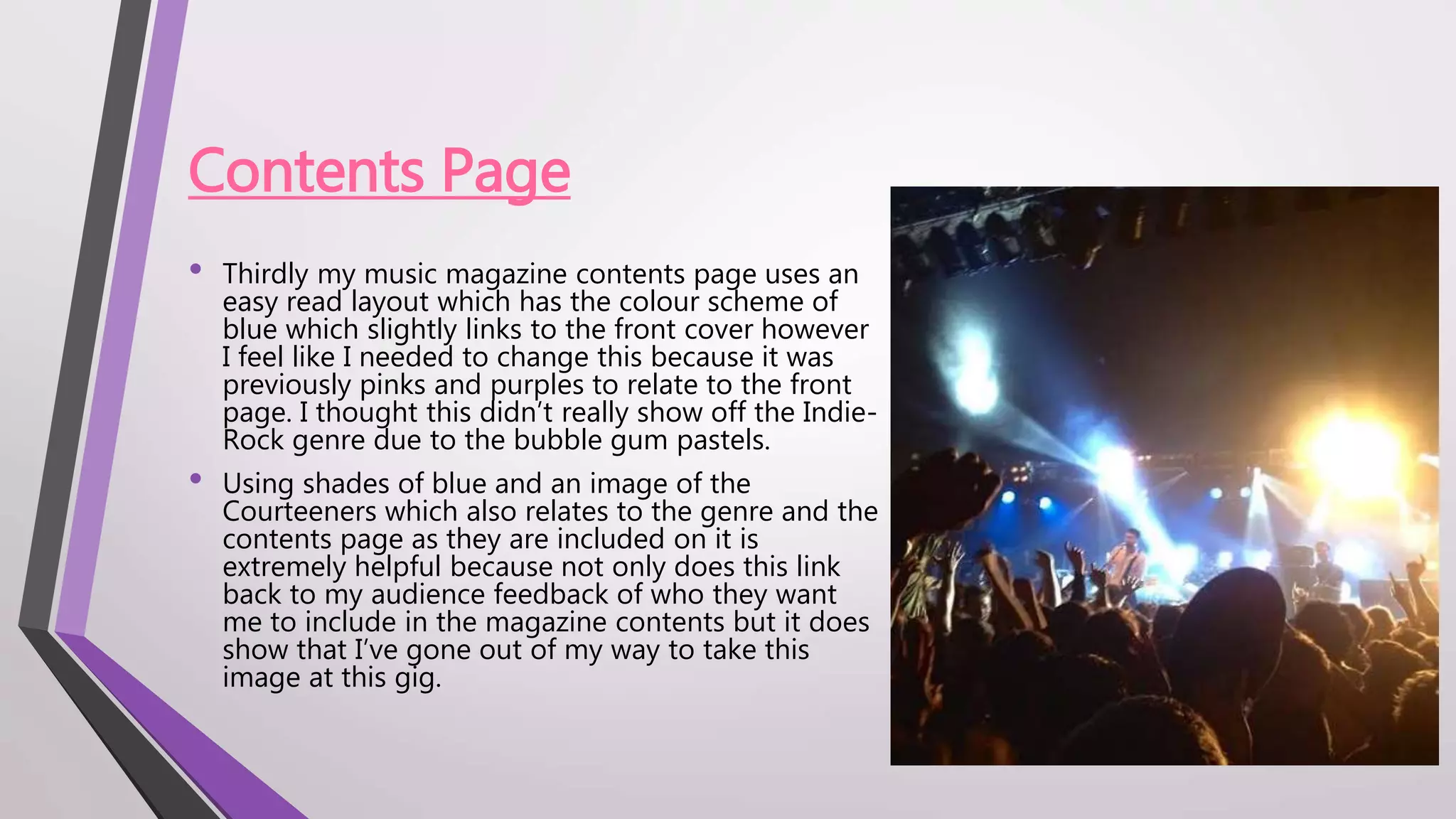
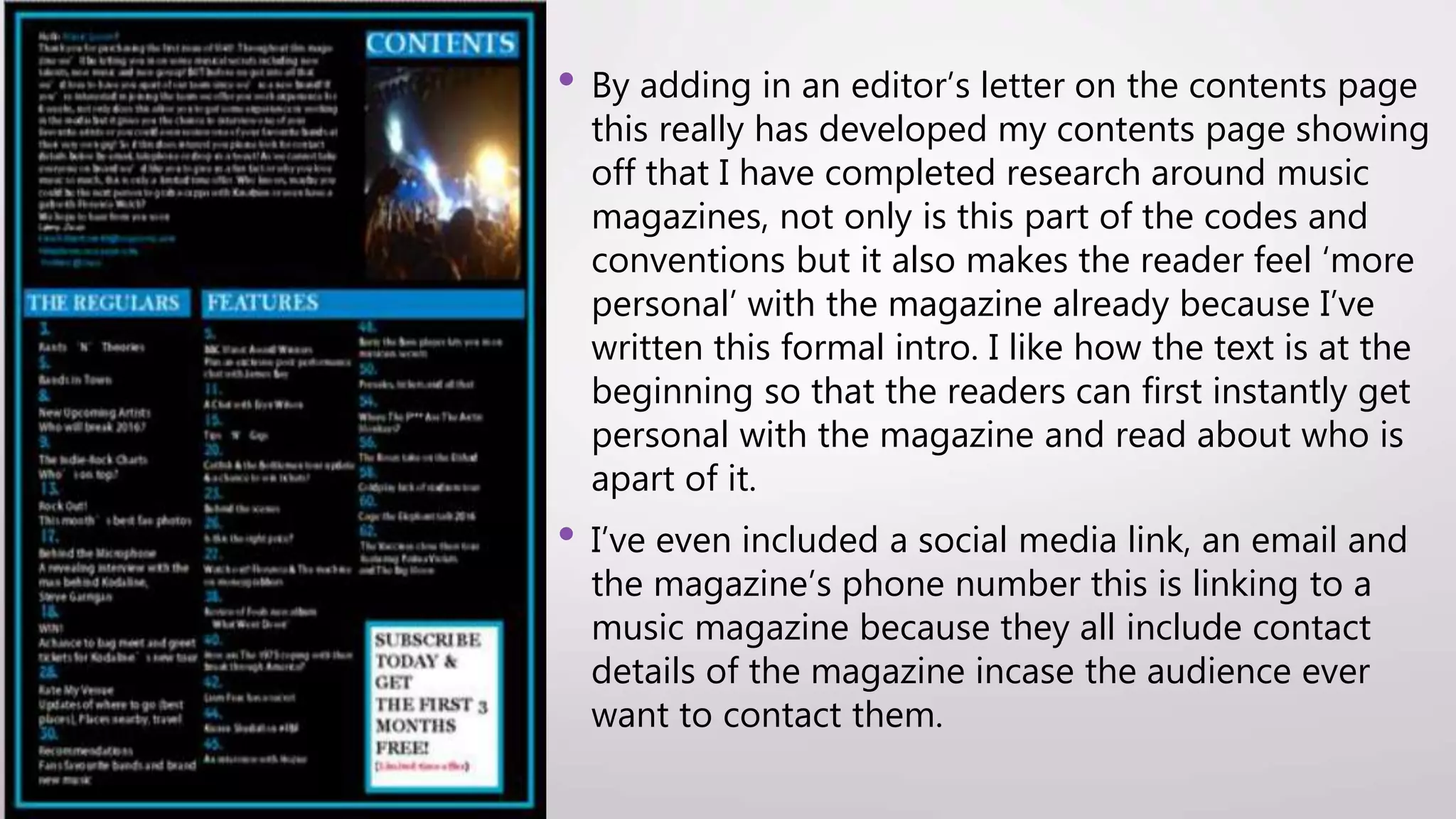
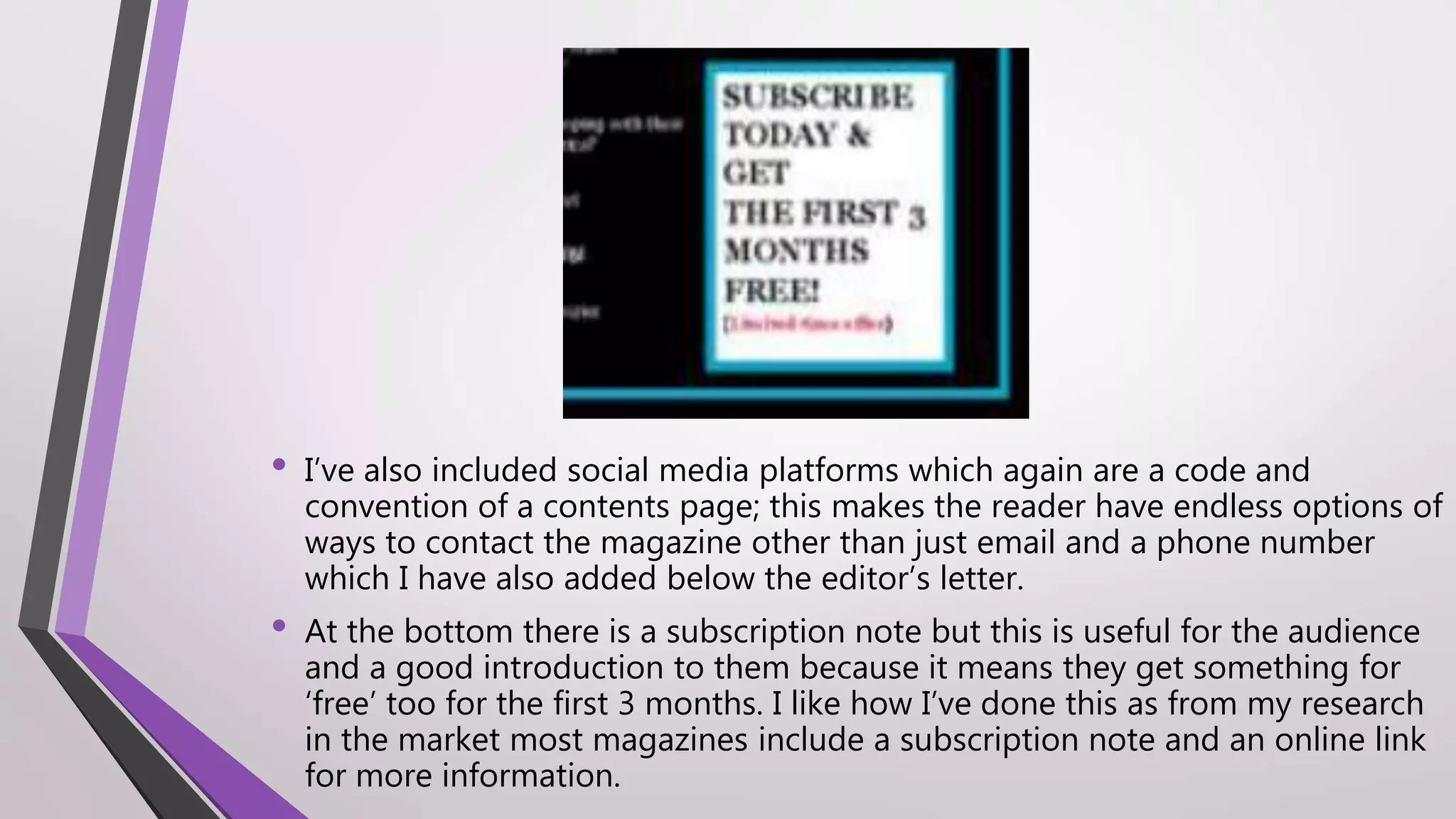
- The contents page uses relevant images and colors linked to the genre, includes contact details and social links as per conventions, but develops the product by adding an editor's letter and subscription note.