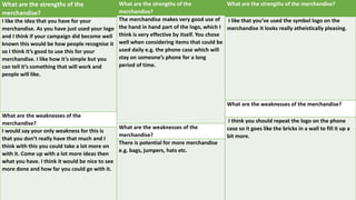
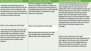
Feedback -
Evaluation
Task 7: Evaluation
You should evaluate your progress
during the project. Your evaluative work
will demonstrate a sophisticated
understanding of devices and
techniques that you used during the
project.
You will make an accurate and critically
objective assessment of your own
achievement with detailed reference to
extensive examples taken from your
work.
You will also make critical comparisons
of your own work with current practice.
Evaluation (cont):
Questions to answer are:
• Are your finished pieces fit for their intended purpose?
• Do they communicate your message clearly?
• Are they appropriate for your target audience?
• Compare and contrast your original intentions with the
outcomes you arrived at.
• How effective are the techniques you have used?
• Is the content effective?
• What impact do you think your advertising campaign will
have on the public?
• What are the technical and aesthetic qualities of your
work?
What are the strengths of the additional
material?
I like your website design I think it really
does go well with your other designs that
you have made. You also have a nice colour
scheme going with the fact that you have
stuff mainly black and white then you have
this crazy colourful design going. So, I think
this is something that you should have
focused on more.
What are the weaknesses of the additional
material?
I would say the only weakness I really have
is your posters. As I don’t think that the egg
poster really goes with this theme you have
going on. I think the best poster for you to
have used is your peace one. As this seems
to go well with the rest of your design work
more than others. Due to the fact it seems
to follow the colour scheme with the crazy
designs on.
What are the strengths of the additional material?
your website is good and easy to understand. Its
easy to navigate and nice to look at.
What are the weaknesses of the additional
material?
I think you should use one of the colourful images
at the bottom of the website as the background
and get rid of the symbol logo at the top and use
the space better there’s a lot of blank space that
ruins the look of the website.
What are the strengths of the additional
material?
The website is well structured and looks
easy to use. There is a section for pretty
much all the necessary details. I also really
like how you have used the space in the
middle to include extra detail which might
peak people’s interests. This section also
encourages others to become involved
with the ‘join our activities’.
What are the weaknesses of the additional
material?
Could have included some text below the
pictures, just to get rid of blank space. You
could have also included a contact page to
make it look more professional.
My feed back for the website was very constructive its given me pointers to design a better website. For example a critic said to instead have all
the white space in the background, add an image like the ones at the bottom as the background. I think this could be a good thing to try out and
experiment. I myself think the white space looks good because it makes all the images and text standout and it as simplicity to the website. The
colorful images in my opinion remove it from being a boring simplistic website to something that’s eye catching and smart, instead of messy.
Another critic said they liked the look and they liked the fact that I had key text In the center of the page. I agree because as you look at the page
your eyes get diverted to the middle straight at the text.
I believe my website delivers everything it needs to it includes style, information, merchandise, social media links and images of my campaign in
action. It achieves as much as other campaigns I have looked at does, for example the ‘Kick it out’ racism campaign has their key bits of
information in the middle and it also has tabs and the logo in the top right corner. I have just made mine easier to read and I have made the
website more aimed at everyone then just using dark masculine colours like kick it out has. I think my website is very inviting and fun, I believe it
connects with my target audience as it is colorful and different. It includes pictures of activity's involving children so when schools get in contact
with the campaign they can see we do a lot of fun activity's to get the younger generation involved. If you stop racism at a young age it will push
for less racism.
The techniques I have used when designing my website was using lots of bright colours to make my website stand out and to invite the viewer
with positive vibes. I have also included a poster I have made that has a big impact as it talks about how black and white people are the same
inside. This adds an interesting aspect to my page that will grab the viewers attention. I have also included a shop to add increased revenue to the
campaign. This also raises awareness to my campaign as people will be wearing the brand and it spreads awareness to those who are unaware of
the cause. My website over all is very positive there is no negative aspects as I just want people to be happy when they are going about my page
and reading up on the campaign. I have also included an achievements tab, this shows that we are making a difference and that we are pushing
for positivity and a non racist future. I have also included a tab that is labeled ‘help the cause’ this is so the viewer can jump right in and get
involved.
What are the strengths of the
merchandise?
I like the idea that you have for your
merchandise. As you have just used your logo
and I think if your campaign did become well
known this would be how people recognise it
so I think it’s good to use this for your
merchandise. I like how it’s simple but you
can tell it’s something that will work and
people will like.
What are the weaknesses of the
merchandise?
I would say your only weakness for this is
that you don’t really have that much and I
think with this you could take a lot more on
with it. Come up with a lot more ideas then
what you have. I think it would be nice to see
more done and how far you could go with it.
What are the strengths of the
merchandise?
The merchandise makes very good use of
the hand in hand part of the logo, which I
think is very effective by itself. You chose
well when considering items that could be
used daily e.g. the phone case which will
stay on someone’s phone for a long
period of time.
What are the weaknesses of the
merchandise?
There is potential for more merchandise
e.g. bags, jumpers, hats etc.
What are the strengths of the merchandise?
I like that you’ve used the symbol logo on the
merchandise it looks really atheistically pleasing.
What are the weaknesses of the merchandise?
I think you should repeat the logo on the phone
case so it goes like the bricks in a wall to fill it up a
bit more.
The feed back on my merchandise was very constructive its given me new idea’s to think about for example one of critic's said I could design
more merchandise. I think this is a good idea as it would add more variation to my shop, this would increase revenue. They like the designs for
the t-shirt and the idea that my design is on a phone case. A critic said the phone case is a good idea because it stays on your phone for a long
time. This is good because lots of people will see it on the phone, this increases awareness on the campaign.
I think my designs if my target audience fits well because they designs are stylish, colorful and it contains the logo. I have made different logo
design variations that go on the clothes on the phone case. I think this makes your T-shirt and phone case different then just the normal logo.
Show racism the red card is a campaign to help stop racism. The t shirts they have designed look really dull and they don’t have much colour too
them. On my t shirts they have the colorful logo that in my opinion are a lot more exciting and interesting then just a plain t shirt with a dull font
on it.
I designed my tee shirts like I did because this type of design is very popular amongst the fashion industry. I wanted to design a tee shirt that was
in fashion and that’s appealing to most people. If I design a tee shirt that had a design on it that was too different to standard tee shirt designs
then my merchandise wouldn’t be as popular.
Here are the different logo designs that will go on the t-shirts and phone cases.
What are the strengths of the logo?
I really like the symbol logos they are
really effective the pop of colour from the
overlay and its easy to understand. I like
the word logo as it is very easy to blend in
a poster so it doesn’t look out of place and
the black and white works well.
What are the weaknesses of the logo?
I don’t like the word logo as much as the
symbol logo as if very plain but with the
symbol logos give everything a pop of
colour so you could do all your posters in
black and white with the pop of colour
from the logo and it would be really
effective.
What are the strengths of the logo?
You have managed to include different
versions of the logo and there is evidence of
development. You have also shown good use
of experimenting with colours. I also really like
how bold the logo is, especially for a logo
about such a big cause.
What are the weaknesses of the logo?
Had you been given more time; you could
have thought about experimenting with
different fonts and evidencing that.
What are the strengths of the logo?
I like the hand shaking logos I like as they have a
common them running through them, but the
colour designs that you have used aren’t too
bright either. There not distracting they work well
with the logo idea you have chosen. I also like the
fact that these logos go well with your peace
poster. Then your other logo I think has been
designed very well, as it looks simple but its goes
well with the campaign you have done. As I think
the fact you have this play on black and white is a
really good idea and it works well as you haven’t
just focused on the black aspect of your
campaign.
What are the weaknesses of the logo?
I don’t think you have that many weaknesses for
your logos as I like that you have a theme with
them. They have also been designed well so I
think for your logos in my opinion I can’t see
anything that you could improve with them.
Logo
The feedback on my logo was very positive. The critics said they liked my logos and the fact that I have different colour variations
of the hand shaking symbol. I think its good idea because when people look at my design they will recognize the hand shake
symbol, but the patters and colours will be different. This is so its not boring to look at once you’ve seen it before on a website or
on a item of clothing. I am very happy with this feed back as it means I am on the right path. The only thing I could say I’d
improve on myself Is to design more hand shaking logo designs with different patterns on.
I think my logo stands out more then a lot of campaigns logos out there. For example ’show racism the red card’ and ‘kick it out’
these campaigns have dull straight forward designs. I wanted my logo to stand out next to them and to interest the viewer into
my campaign. I also like my design on the ‘Unite stop racism’ banner as I have used the colours black and white to symbolize
black and white cultures. I did this to create a symbolic design that would be remember and that has a meaning behind it. I think
the logo banner and the hand shaking symbol work really well. Another good point is that its not In your face its smart,
professional and the hands shaking symbol adds colour and interest.
What are the strengths of the campaign posters?
I think the strengths of the posters is that you have go
straight to the point. You can tell what it is they are about
very easily and you don’t have anything distracting you from
the point they are trying to get across. With your first
posters, I think it has more of a humour side to it and it
doesn’t seem as serious as the topic normally is. Your next
poster I like how you have that little bit of colour in it that
pops out. But the colour doesn’t distract you from what the
poster is telling you as it is subtle. I also like the crumpled
paper look as it brings more to the posters and doesn’t make
it look so simple. Your next poster I like how it is simple and
just has a simple colour scheme of the two colours.
What are the weaknesses of the campaign posters?
I would say the weaknesses for your posters is that they are
all different. You don’t seem to have a theme with them. As I
feel like especially the poster in the middle you could’ve
done a few more in this style. An I think that way it would be
nice and at least then you wold have more of a theme going.
Then another weakness is your first poster with the black
and white so the picture doesn’t really come across like it
should. As you can’t tell too much that the eggs are different
colour or even the same colour so I feel like it does lose
meaning a little.
What are the strengths of the
campaign posters?
I like the second and third poster as
they are simple but effective. The
second one is really nice the type is
consistent and easy to understand
and I love the symbol for peace in the
middle with the graffiti overlay it’s
nice to have the pop of colour.
What are the weaknesses of the
campaign posters?
The first poster is hard to understand
at first you have to really concentrate
which not a lot of people will do so I’d
stay with the second and third poster
the only thing about them is the
second one doesn’t have your logo.
What are the strengths of the campaign
posters?
The posters are all very different and don’t
follow a common colour scheme, which I think
is better than using the same, monotone
colours. I especially like how they aren’t all
about the same thing and are all very different
to each other. However, they still all link in really
well with the cause.
What are the weaknesses of the campaign
posters?
If you were to do more posters, you could think
about including statistics for racism in the UK. I
also think the use of the quote from Mandela is
very effective and could be used again within
another poster but from a different icon.
posters
The feed back on my posters was very helpful, over all it was quite positive but it have received some negative feed
back also. A critic mentioned that my posters don’t work together and that I don’t have a theme running through
them. I agree my posters are all different but they all include my logo and I think them being so different is better
as it is less boring. Another critic mentioned that they liked the fact that they are different but still are all linked to
the same cause. I agree with this as I think they are all different but all have a meaningful impact and that’s what I
was aiming for.
I think my posters are good, there are areas for improvement. A a critic mentioned that they didn’t have a theme. I
wanted them to all be different but to link them I could add that paper crumpling effect I used on my second one
to all my posters to link them up slightly. Over all I think the posters do the job they are all eye-catching, interesting
and meaningful. If you look at this poster I have looked at from Nike you can see they have written In big letters
’stand up’ and ‘speak up’. This is very impactful and its aiming to stop racism. If you look at my work you can see
that I used powerful vocabulary like ‘ Unite stop racism’ I wanted mine to be as impactful as Nikes here but I
wanted to add colour and more interest. As Nikes poster has a picture of a footballer and some bracelets. I thought
this was quite boring as it is monochrome. If you look at my second poster you can see that I use that paper
crumple effect and I also added the word peace in Japanese's to have that impact that you are learning a different
culture instead of being racist about it.
On my first poster I added a quote from one of the most inspirational people to ever live, nelson Mandela. This will
capture peoples eye and they will take the quote onboard as it is said by such an iconic man. My third poster
includes a quote from twitter. This poster is more aimed at the people that use social media a lot, they will
understand this as it involves twitter and just an average user tweeting out some sense. Also that tweet got more
then 100k favorites and retweets so if some one who saw that tweet sees this on the side of a building or on a bus
stop they can relate to it. Lastly I wanted my bus poster to be simple but powerful. I wanted it to include my logo
and my slogan ’unite stop racism’. I only wanted this because a bus moves quite quickly and I wanted to get my
point across fast before the bus as moved on.
Evaluation
Evaluation

Evaluation

  • 1.
  • 2.
    Task 7: Evaluation Youshould evaluate your progress during the project. Your evaluative work will demonstrate a sophisticated understanding of devices and techniques that you used during the project. You will make an accurate and critically objective assessment of your own achievement with detailed reference to extensive examples taken from your work. You will also make critical comparisons of your own work with current practice. Evaluation (cont): Questions to answer are: • Are your finished pieces fit for their intended purpose? • Do they communicate your message clearly? • Are they appropriate for your target audience? • Compare and contrast your original intentions with the outcomes you arrived at. • How effective are the techniques you have used? • Is the content effective? • What impact do you think your advertising campaign will have on the public? • What are the technical and aesthetic qualities of your work?
  • 3.
    What are thestrengths of the additional material? I like your website design I think it really does go well with your other designs that you have made. You also have a nice colour scheme going with the fact that you have stuff mainly black and white then you have this crazy colourful design going. So, I think this is something that you should have focused on more. What are the weaknesses of the additional material? I would say the only weakness I really have is your posters. As I don’t think that the egg poster really goes with this theme you have going on. I think the best poster for you to have used is your peace one. As this seems to go well with the rest of your design work more than others. Due to the fact it seems to follow the colour scheme with the crazy designs on. What are the strengths of the additional material? your website is good and easy to understand. Its easy to navigate and nice to look at. What are the weaknesses of the additional material? I think you should use one of the colourful images at the bottom of the website as the background and get rid of the symbol logo at the top and use the space better there’s a lot of blank space that ruins the look of the website. What are the strengths of the additional material? The website is well structured and looks easy to use. There is a section for pretty much all the necessary details. I also really like how you have used the space in the middle to include extra detail which might peak people’s interests. This section also encourages others to become involved with the ‘join our activities’. What are the weaknesses of the additional material? Could have included some text below the pictures, just to get rid of blank space. You could have also included a contact page to make it look more professional.
  • 4.
    My feed backfor the website was very constructive its given me pointers to design a better website. For example a critic said to instead have all the white space in the background, add an image like the ones at the bottom as the background. I think this could be a good thing to try out and experiment. I myself think the white space looks good because it makes all the images and text standout and it as simplicity to the website. The colorful images in my opinion remove it from being a boring simplistic website to something that’s eye catching and smart, instead of messy. Another critic said they liked the look and they liked the fact that I had key text In the center of the page. I agree because as you look at the page your eyes get diverted to the middle straight at the text. I believe my website delivers everything it needs to it includes style, information, merchandise, social media links and images of my campaign in action. It achieves as much as other campaigns I have looked at does, for example the ‘Kick it out’ racism campaign has their key bits of information in the middle and it also has tabs and the logo in the top right corner. I have just made mine easier to read and I have made the website more aimed at everyone then just using dark masculine colours like kick it out has. I think my website is very inviting and fun, I believe it connects with my target audience as it is colorful and different. It includes pictures of activity's involving children so when schools get in contact with the campaign they can see we do a lot of fun activity's to get the younger generation involved. If you stop racism at a young age it will push for less racism. The techniques I have used when designing my website was using lots of bright colours to make my website stand out and to invite the viewer with positive vibes. I have also included a poster I have made that has a big impact as it talks about how black and white people are the same inside. This adds an interesting aspect to my page that will grab the viewers attention. I have also included a shop to add increased revenue to the campaign. This also raises awareness to my campaign as people will be wearing the brand and it spreads awareness to those who are unaware of the cause. My website over all is very positive there is no negative aspects as I just want people to be happy when they are going about my page and reading up on the campaign. I have also included an achievements tab, this shows that we are making a difference and that we are pushing for positivity and a non racist future. I have also included a tab that is labeled ‘help the cause’ this is so the viewer can jump right in and get involved.
  • 6.
    What are thestrengths of the merchandise? I like the idea that you have for your merchandise. As you have just used your logo and I think if your campaign did become well known this would be how people recognise it so I think it’s good to use this for your merchandise. I like how it’s simple but you can tell it’s something that will work and people will like. What are the weaknesses of the merchandise? I would say your only weakness for this is that you don’t really have that much and I think with this you could take a lot more on with it. Come up with a lot more ideas then what you have. I think it would be nice to see more done and how far you could go with it. What are the strengths of the merchandise? The merchandise makes very good use of the hand in hand part of the logo, which I think is very effective by itself. You chose well when considering items that could be used daily e.g. the phone case which will stay on someone’s phone for a long period of time. What are the weaknesses of the merchandise? There is potential for more merchandise e.g. bags, jumpers, hats etc. What are the strengths of the merchandise? I like that you’ve used the symbol logo on the merchandise it looks really atheistically pleasing. What are the weaknesses of the merchandise? I think you should repeat the logo on the phone case so it goes like the bricks in a wall to fill it up a bit more.
  • 7.
    The feed backon my merchandise was very constructive its given me new idea’s to think about for example one of critic's said I could design more merchandise. I think this is a good idea as it would add more variation to my shop, this would increase revenue. They like the designs for the t-shirt and the idea that my design is on a phone case. A critic said the phone case is a good idea because it stays on your phone for a long time. This is good because lots of people will see it on the phone, this increases awareness on the campaign. I think my designs if my target audience fits well because they designs are stylish, colorful and it contains the logo. I have made different logo design variations that go on the clothes on the phone case. I think this makes your T-shirt and phone case different then just the normal logo. Show racism the red card is a campaign to help stop racism. The t shirts they have designed look really dull and they don’t have much colour too them. On my t shirts they have the colorful logo that in my opinion are a lot more exciting and interesting then just a plain t shirt with a dull font on it. I designed my tee shirts like I did because this type of design is very popular amongst the fashion industry. I wanted to design a tee shirt that was in fashion and that’s appealing to most people. If I design a tee shirt that had a design on it that was too different to standard tee shirt designs then my merchandise wouldn’t be as popular.
  • 8.
    Here are thedifferent logo designs that will go on the t-shirts and phone cases.
  • 9.
    What are thestrengths of the logo? I really like the symbol logos they are really effective the pop of colour from the overlay and its easy to understand. I like the word logo as it is very easy to blend in a poster so it doesn’t look out of place and the black and white works well. What are the weaknesses of the logo? I don’t like the word logo as much as the symbol logo as if very plain but with the symbol logos give everything a pop of colour so you could do all your posters in black and white with the pop of colour from the logo and it would be really effective. What are the strengths of the logo? You have managed to include different versions of the logo and there is evidence of development. You have also shown good use of experimenting with colours. I also really like how bold the logo is, especially for a logo about such a big cause. What are the weaknesses of the logo? Had you been given more time; you could have thought about experimenting with different fonts and evidencing that. What are the strengths of the logo? I like the hand shaking logos I like as they have a common them running through them, but the colour designs that you have used aren’t too bright either. There not distracting they work well with the logo idea you have chosen. I also like the fact that these logos go well with your peace poster. Then your other logo I think has been designed very well, as it looks simple but its goes well with the campaign you have done. As I think the fact you have this play on black and white is a really good idea and it works well as you haven’t just focused on the black aspect of your campaign. What are the weaknesses of the logo? I don’t think you have that many weaknesses for your logos as I like that you have a theme with them. They have also been designed well so I think for your logos in my opinion I can’t see anything that you could improve with them.
  • 10.
    Logo The feedback onmy logo was very positive. The critics said they liked my logos and the fact that I have different colour variations of the hand shaking symbol. I think its good idea because when people look at my design they will recognize the hand shake symbol, but the patters and colours will be different. This is so its not boring to look at once you’ve seen it before on a website or on a item of clothing. I am very happy with this feed back as it means I am on the right path. The only thing I could say I’d improve on myself Is to design more hand shaking logo designs with different patterns on. I think my logo stands out more then a lot of campaigns logos out there. For example ’show racism the red card’ and ‘kick it out’ these campaigns have dull straight forward designs. I wanted my logo to stand out next to them and to interest the viewer into my campaign. I also like my design on the ‘Unite stop racism’ banner as I have used the colours black and white to symbolize black and white cultures. I did this to create a symbolic design that would be remember and that has a meaning behind it. I think the logo banner and the hand shaking symbol work really well. Another good point is that its not In your face its smart, professional and the hands shaking symbol adds colour and interest.
  • 12.
    What are thestrengths of the campaign posters? I think the strengths of the posters is that you have go straight to the point. You can tell what it is they are about very easily and you don’t have anything distracting you from the point they are trying to get across. With your first posters, I think it has more of a humour side to it and it doesn’t seem as serious as the topic normally is. Your next poster I like how you have that little bit of colour in it that pops out. But the colour doesn’t distract you from what the poster is telling you as it is subtle. I also like the crumpled paper look as it brings more to the posters and doesn’t make it look so simple. Your next poster I like how it is simple and just has a simple colour scheme of the two colours. What are the weaknesses of the campaign posters? I would say the weaknesses for your posters is that they are all different. You don’t seem to have a theme with them. As I feel like especially the poster in the middle you could’ve done a few more in this style. An I think that way it would be nice and at least then you wold have more of a theme going. Then another weakness is your first poster with the black and white so the picture doesn’t really come across like it should. As you can’t tell too much that the eggs are different colour or even the same colour so I feel like it does lose meaning a little. What are the strengths of the campaign posters? I like the second and third poster as they are simple but effective. The second one is really nice the type is consistent and easy to understand and I love the symbol for peace in the middle with the graffiti overlay it’s nice to have the pop of colour. What are the weaknesses of the campaign posters? The first poster is hard to understand at first you have to really concentrate which not a lot of people will do so I’d stay with the second and third poster the only thing about them is the second one doesn’t have your logo. What are the strengths of the campaign posters? The posters are all very different and don’t follow a common colour scheme, which I think is better than using the same, monotone colours. I especially like how they aren’t all about the same thing and are all very different to each other. However, they still all link in really well with the cause. What are the weaknesses of the campaign posters? If you were to do more posters, you could think about including statistics for racism in the UK. I also think the use of the quote from Mandela is very effective and could be used again within another poster but from a different icon.
  • 13.
    posters The feed backon my posters was very helpful, over all it was quite positive but it have received some negative feed back also. A critic mentioned that my posters don’t work together and that I don’t have a theme running through them. I agree my posters are all different but they all include my logo and I think them being so different is better as it is less boring. Another critic mentioned that they liked the fact that they are different but still are all linked to the same cause. I agree with this as I think they are all different but all have a meaningful impact and that’s what I was aiming for. I think my posters are good, there are areas for improvement. A a critic mentioned that they didn’t have a theme. I wanted them to all be different but to link them I could add that paper crumpling effect I used on my second one to all my posters to link them up slightly. Over all I think the posters do the job they are all eye-catching, interesting and meaningful. If you look at this poster I have looked at from Nike you can see they have written In big letters ’stand up’ and ‘speak up’. This is very impactful and its aiming to stop racism. If you look at my work you can see that I used powerful vocabulary like ‘ Unite stop racism’ I wanted mine to be as impactful as Nikes here but I wanted to add colour and more interest. As Nikes poster has a picture of a footballer and some bracelets. I thought this was quite boring as it is monochrome. If you look at my second poster you can see that I use that paper crumple effect and I also added the word peace in Japanese's to have that impact that you are learning a different culture instead of being racist about it. On my first poster I added a quote from one of the most inspirational people to ever live, nelson Mandela. This will capture peoples eye and they will take the quote onboard as it is said by such an iconic man. My third poster includes a quote from twitter. This poster is more aimed at the people that use social media a lot, they will understand this as it involves twitter and just an average user tweeting out some sense. Also that tweet got more then 100k favorites and retweets so if some one who saw that tweet sees this on the side of a building or on a bus stop they can relate to it. Lastly I wanted my bus poster to be simple but powerful. I wanted it to include my logo and my slogan ’unite stop racism’. I only wanted this because a bus moves quite quickly and I wanted to get my point across fast before the bus as moved on.