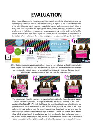
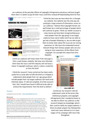
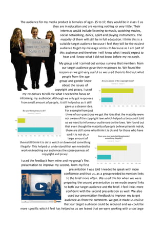
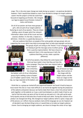
The document provides an evaluation of media products created for a campaign about copyright awareness. It summarizes that the evaluator's website, posters, and Twitter account were clearly linked through shared logos, slogans, colors, and target audience. Feedback was gathered through surveys and presentations which helped improve the work. The target audience was refined to specifically focus on females ages 15-17. The products were created to raise awareness of copyright issues among this group and provide education on related topics.
The document summarizes the work the author has done over 5 months for a campaign brief from Copyright Heroes. The author created 3 media products - a Twitter account, website, and posters - that are clearly linked to each other and the brief through shared slogans, logos, colors, and targeting of teenage girls aged 13-17. The author believes their products effectively conveyed the campaign's message about the dangers of illegal downloading and copyright infringement. For future work, the author notes the group should have managed their time better and spent less time planning and more developing high-quality products.
Tom evaluated his logo and poster designs for a social media campaign promoting equality and respect. For his logo, he included many symbols representing different beliefs and identities to include everyone. Some felt the megaphone shape clearly conveyed that everyone has a voice, while others did not recognize the shape. His original logo design was confusing while his final design looked more professional. For his posters, Tom aimed to spread a positive message of respect, though some felt there was too much text. His original idea of photographing a puzzle was not possible, so he used Photoshop instead. Overall, he worked to improve his designs based on feedback but noted limitations from not using shock value like other campaigns.
The document discusses the development of a social action campaign promoting LGBTQ rights. The creator aimed to design pieces that were striking, simple, and conveyed the campaign's message clearly without room for confusion. This included refining an initial pun-based logo to instead feature bright colors and the phrase "Just Be U." Feedback indicates the pieces communicate support for LGBTQ individuals and normalize diverse identities while educating audiences.
The document summarizes research on the primary audience for a music video and related products. It finds that the target audience is primarily female under 35 who prefer indie/acoustic music. This information will influence the video's narrative, imagery, and actors to appeal more to women. The audience also prefers to watch music videos on YouTube and wants the video to have a narrative plot, good actors, and costumes. They are most interested in a love story or message-focused storyline. This provides guidance on how to create the video and related products to appeal to this audience.
What have i learnt from my audience feedbackElianaMedalie
1. The document discusses audience feedback received from a questionnaire and interviews about a music video and single release. Key findings included that the audience preferred an illustrative narrative that matched the song lyrics visually and wanted the video shot in a forest/field setting.
2. Based on the feedback, the artist decided to use screenshots from the video on the digipak and include both the artist and another person shown in the video on the packaging despite some suggestions otherwise. Testing with friends found the digipak to look professional and appealing to the intended genre.
3. For the website, the artist took inspiration from other popular artists' sites in designing an effective homepage that tied together the single, video, and digipak
What have i learnt from my audience feedbackElianaMedalie
1. The document discusses audience feedback the author received from a questionnaire and interviews about a music video and single they were producing. Key findings from the feedback included that the audience preferred an illustrative narrative that matched the song lyrics visually and for the video to be shot in a forest/field setting.
2. Based on the feedback, the author decided to use screenshots from the video for the digipak cover in order to relate it back to the narrative in the video. They also included images of both the artist and another person to represent that most of the video shots included both of them, while still promoting the artist as a solo act.
3. For the website, the author took inspiration from other artists'
The strategies used in the film campaign included creating 3 platforms: a social media page, trailer, and posters. A trailer was released halfway through the campaign to maintain interest. The social media page was used to tease the poster and trailer to build anticipation. Posters were released around Halloween to target the typical horror film audience. Feedback on the campaign suggested improving discoverability of posts with hashtags and links and increasing engagement on the social media page.
Tom created a logo, posters, and merchandise for a campaign promoting interfaith week at his college. The logo features many symbols representing different beliefs and identities to show that everyone has a voice. Feedback was that the purpose was clear but the shape of the symbols was not. The posters suggest respecting others and getting along, fitting their purpose. One response liked a poster. Professional posters may be more effective with powerful imagery or text. The merchandise was made fashionable to appeal to students but was criticized for being too simple without explaining the campaign well. The campaign materials are appropriate as they inform people about the interfaith week event at the college.
This document provides a summary of several logos and websites that provide online safety information for children, teens, and parents. Several key points are made about effective design elements:
- Logos that use bright, eye-catching colors and universal designs appeal to both male and female audiences. Imagery like smartphones and social media icons signal the topic.
- Websites with varied activities, games and interactive elements help keep young audiences engaged versus just text. Navigation is clear and easy to use.
- Sections for different age groups adjust the level of information and design style appropriately, using simpler designs for younger kids.
- Videos on cyberbullying and online safety grab attention through their use of animation and portrayal
Ellie Marsh created several products for a social action campaign about sexual harassment in the workplace. She made posters, leaflets, keyrings, bags, and banners with consistent branding featuring a logo and color scheme. Ellie sought feedback on whether her pieces clearly communicated the message of empowering victims and informing them of their rights and options. Survey responses indicated that most people understood the message, while one poster could be improved by making the text more legible. Ellie designed her products specifically for her target audience of young women aged 19-25 who may experience harassment.
Ellie Marsh created several products for a social action campaign about sexual harassment in the workplace. She made posters, leaflets, keyrings, bags, and banners with consistent branding featuring a logo and color scheme. Ellie surveyed peers about whether her posters clearly communicated the message, and most respondents said yes and could identify that the message was about speaking up about harassment. However, one respondent said the text was difficult to read against the dark background at times. Overall, Ellie aimed her campaign's products at young women aged 19-25 who may be targets of harassment, using appropriate imagery, facts, and advice to fit this audience.
The document summarizes the process of creating a film opening for a romantic comedy genre film. Key points include:
- Researching conventions of film openings to understand common elements to include.
- Choosing an unconventional title sequence to grab audience attention.
- Using dialogue from the beginning to engage the audience and set up the plot.
- Representing aspects of young people's lives to appeal to the target audience.
- Learning about technologies like iMessage and social media that aided the production process.
The techniques used in Ellie Dawson's campaign to raise awareness of domestic violence against men were effective. She purposefully made her posters look dark and dull to grab attention but also make people imagine the experience of victims. Some posters featured a man with a black eye to emphasize abuse of men. The simple yet clear logo and merchandise design promoted the message while encouraging people to wear the items. The campaign aimed to challenge perceptions that men cannot be victims and that abuse is less serious or common for men. Feedback from surveys helped shape the focus on addressing lack of support and challenging stigma around male victims speaking out.
Evaluation Question III: What Have You Learned From Your Audience Feedback?aimeelee12
Aimee conducted extensive audience research at multiple stages of her filmmaking process, from developing the initial synopsis to designing the film poster and review. This included surveys to identify the key demographics of her target audience as young, white, educated females aged 16-24. She adapted elements of her film like the main character and distribution platform based on this research. Additional research was done during the writing process to refine details and get feedback on potential endings. Aimee also researched audience preferences for film reviews and posters to design those elements accordingly. Her iterative research approach helped strengthen the film story and make related materials more accessible and appealing to her target viewers.
The document provides an evaluation of a social media campaign focused on raising awareness of the negative effects of overusing technological media. It summarizes the logo, merchandise, posters, and videos created for the campaign. It evaluates whether the pieces fit their intended purpose of raising awareness, clearly communicate the message, and are appropriate for the target audience. The evaluation finds that most of the pieces accomplish the goals but some could be improved, such as making the t-shirts more commercially viable and increasing video quality. The campaign was effective at changing some individuals' habits but had limited overall impact given the growing use of technology worldwide.
The document discusses the author's advertising campaign posters for a homeless charity. The author created 3 posters with similar color schemes and layouts that convey the message that homelessness can be hidden and isn't always obvious. One poster shows a street to represent homelessness, another shows a house, and another shows an abandoned train station. The posters have the word "home" faded into them to represent how homelessness can be difficult to see. The author aimed to create eye-catching posters that raise awareness of homelessness without using negative imagery.
The document discusses the construction of a website for a charity aimed at helping people quit smoking. It describes some of the design choices made, including using photos taken by the creator and having the charity name repeated on each page rather than a logo. It discusses using conventions like consistent layouts but also challenging conventions by not including a logo. The creator aims to provide organized, easy to read information on the site. The target audience is identified as 30-35 year old smokers, but it is realized photos and videos used actually represent younger people. Distribution is considered through the NHS and advertising agencies. The technology of Photoshop, Illustrator and iWeb are used and lessons are learned about properly editing photos, branding, usability and gaining
The document provides feedback from surveys on a festival poster. Two respondents preferred the masthead and background images on the poster. Additional questions determined that respondents liked the lights behind the masthead and various colors used. A later survey found the poster as appealing as the inspiration poster. Suggestions to add more social media promotion were also provided.
The document summarizes feedback from 10 people on various marketing materials for a magazine called "Leicestershire Living". Overall, the feedback was positive for a questionnaire and magazine pages, while responses were more mixed for a double-page spread, billboard poster, and radio advertisement. Some suggestions included using more consistent images across materials, focusing more on layout for the double-page spread, and making the radio advertisement tone more "edgy" to better engage listeners.
Social media strategies for small business notes pagesAntoinette Raynes
This document provides an overview of social media and how businesses can utilize various social media platforms. It begins with definitions of social media from different sources and discusses how social media allows for conversations and relationship building. Examples are given of companies using YouTube, Facebook, Twitter, and LinkedIn effectively. Setting up business pages on these sites and using applications, videos, discussions and other features are outlined. The key benefits for businesses are increasing customer reach, generating sales and profits through social connections. The conclusion emphasizes starting small with one platform and having conversations to build relationships.
The document provides an analysis of a campaign poster, website, and campaign advert.
The campaign poster uses composition, color scheme, scaling, and typography to focus attention on Barack Obama and communicate his message.
The website for a London cycling campaign achieves its goals through composition, color, navigation, grid structure, and imagery. It provides information interactively.
The campaign advert uses composition, lighting, color, scaling, semiotics, and typography to explore gender issues humorously and empower female viewers. It incorporates genre, ideology and brand identity through its upbeat style.
The document discusses how audience feedback helped the creator improve their advertising campaign for a horror film. Key points:
- Feedback from peers and classmates helped shape the campaign to appeal to different people.
- A survey of the target audience (ages 15-24) informed choices like the setting, characters, and desire to see the villain.
- Feedback improved early designs of the poster, magazine cover, and film trailer by recommending a scary close-up image and adding sound/editing to the trailer.
- Revisions based on feedback made the text more readable in the poster and improved colors in the magazine cover.
- The audience feedback was vital in helping create a realistic and effective campaign that would
The document summarizes key learnings from audience feedback gathered during the production of a documentary. Some of the main findings included that the target audience of 11-19 year olds preferred a female voiceover narrator, liked the inclusion of statistics and facts, and felt there was too much pressure from teachers and parents to achieve good grades. The filmmakers incorporated this feedback by choosing a female narrator and including facts and a discussion of generational differences in perceptions of pressure. Additional feedback on early cuts of the film helped improve areas like audio levels and scene transitions.
The document discusses an advertising campaign created for a charity called SASH that helps prevent homelessness among young people aged 16-25. The creator believes their campaign fits the charity's brief and is fit for purpose. They designed posters with appealing layout, text, and language to target the 16-24 demographic. While the campaign communicates the message clearly, the creator notes some additions could have improved reaching more people in need. Both the imagery featuring peers and simple language make the campaign appropriate for the dual target audiences of young people and potential volunteers of any age. The final campaign blended concepts from initial ideas of positive and negative messaging to take a serious yet stylized approach.
The campaign poster summarizes is for Barack Obama's 2008 presidential campaign. It features an image of Obama with text including "Be the Change" and the inauguration date of January 20, 2009. The colors blue, red and white were used to represent the US flag and create an eye-catching design. The poster uses bold fonts and imagery of the White House to promote Obama and the upcoming inauguration.
The document compares the design elements and messaging of web, poster, and TV campaigns about mental health. All three use sans serif fonts and have a main focal point - the poster features Obama's face, the TV ad features a woman, and the web page emphasizes text. However, the formats differ in their use of color, level of interactivity, and ability to include movement and audio. The poster uses bright colors to attract attention while the TV ad incorporates different camera angles and sound. Overall, the campaigns aim to reduce stigma around mental illness and convey that support is available.
Y12 unit 3 media production evaluation (Your Times, Your Life)Noah Gee
Noah Gee undertook research including an online survey and focus group to inform his planning of a youth culture website targeted at boys aged 12-18. He found that sport, music, and entertainment were most popular interests. His website design was inspired by Vice UK, incorporating social media sharing. Noah encountered difficulties executing his plans without templates or coding experience. He overcame problems by changing colors. The finished website aimed to appeal to readers through interesting celebrity profiles, focusing on positive representations of young people and their achievements. However, Noah recognized weaknesses in his time management and organization during the project.
This document outlines a campaign to raise awareness about illegally downloading films and music among teenagers aged 15-17. The campaign will use social media accounts and a series of posters to promote the importance of the film and music industries and educate youth on the issues with illegally obtaining content given so many currently use illegal downloads.
The document discusses the target audience for a new product. The primary audience is males and females ages 15 to 24 because they are most interested in new films and looking for new content as older films are easily accessible. The opening of the film features two female characters ages 16-17 to appeal to this target demographic and help them relate to the characters. The target audience would likely be in education, an apprenticeship, or have a part-time job and come from social classes E to C1.
El documento proporciona una lista de productos de oficina, accesorios, textiles, tecnología y cestas de Navidad con sus descripciones y precios. La lista incluye artículos como carpetas, libretas, bolígrafos, paraguas, ropa, productos electrónicos y cestas con alimentos como jamón, queso, vino y dulces.
This document defines and provides examples of different types of sound that can be used in films, including diegetic sound that comes from within the scene, non-diegetic sound added in post-production, crescendos that build suspense, diminuendos that signal a threat has passed, and sforzandos used to emphasize a shock or scare. Examples are given from films like Psycho, Jaws, The Godfather, and CSI to illustrate each type of sound technique.
This document discusses the design and analysis of reinforced concrete beams according to ACI code. It covers the objectives, design parameters, analysis procedures, and design steps for singly, doubly, and T-beams. Key points include:
- The objectives are to understand ultimate strength design, gain concepts for analyzing singly, doubly, and T-beams, understand design procedures, and know which beam type to consider based on the situation.
- Design parameters include strength reduction factor phi, maximum reinforcement ratio, and serviceability factors like deflection and crack width.
- Analysis of beams involves calculating factored loads, determining moment capacity, and checking if capacity exceeds factored moment.
- Design steps include load calculation,
The document discusses what the author has learned from audience feedback in creating their movie poster, magazine, and trailer. They conducted research into existing social realist film audiences to determine the target age group and interview subjects. Questionnaires with target demographics provided feedback on desired themes, trailer length, and importance of trailers influencing viewership. Peer feedback on initial drafts suggested making text on the poster and magazine cover easier to read with a lighter color. Feedback on the trailer recommended adding louder, more intense music to build tension. Overall, audience feedback helped the author cater their final products more to their target audience's wants and needs to increase success.
The document discusses the development of a social action campaign promoting LGBTQ+ rights. The creator aimed to design pieces that were striking, simple, and conveyed the campaign's message clearly without room for confusion. Based on feedback, the initial logo idea was refined to be more appropriate and sensitive. Overall, the techniques used were effective at creating shareable graphics that raise awareness of the issue in an accessible way.
Rachel evaluates her work for an organization promoting mental health awareness among youth aged 11-18. She finds that her infographic poster providing information on various mental illnesses is appropriate for its target audience due to its calm colors, simple layout, and pictures. However, it may be too difficult for younger viewers aged 11-14. Her LGBTQ+ awareness posters asking a question are also appropriate due to their minimal text and use of bright colors to attract children. While one blue and white poster may appeal more to older viewers, the multi-colored version grabs younger audiences. Rachel receives feedback that her organization's logo clearly communicates its message of mental health but that the bus advertisement could be improved by correcting a spelling error.
The document provides an evaluation of the author's research, planning, and execution of a campaign to challenge stigma surrounding rape culture. Regarding research, the author looked at other organizations' work to gain ideas and inspiration, and conducted a survey to understand their target audience. For planning, the author created a timeline but did not stick to it closely. Mock-ups and mind maps helped in planning final pieces. The campaign purpose was to challenge stigma and raise awareness, and the author's work fits this purpose well. While the target audience was primarily 16+, content was appropriate and professional without being patronizing. Messaging clearly communicated the stigma surrounding rape culture through direct, simple visuals and text.
Audience feedback helped the creator make changes to their media products to better target their intended audience. Researching existing social realist films and conducting a questionnaire provided insight into the target demographics interests like gang culture and modern issues. The trailer length, inclusion of social media links, and use of violence in the poster were adjusted based on feedback. Additional interviews gave more perspective on engaging real-life issues. Peer reviews highlighted needed text clarity changes. Final feedback confirmed the products would appeal to the target audience and meet social realist genre conventions.
Through questionnaires and focus groups with their target audience of females aged 16-35, the group learned that their audience enjoys supernatural and possession horror films. They found that elements like scary fonts, the use of a blue ribbon theme, and creepy edited images were effective in engaging their audience. Most of the feedback on their promotional materials was positive, praising the scary and unsettling feel, though some suggested toning down the image editing slightly. Overall, the audience seemed persuaded to watch the film based on the promotional packages.
The document discusses feedback received from the target audience of teenagers aged 13-25 for a new music product. Members of the target audience provided positive feedback on the narrative concept for a music video, finding it exciting. Questionnaires were also used to understand what the target audience likes and wants, revealing interest in the proposed products. Constant feedback during the production process helped shape the products to better appeal to the target audience.
The document discusses methods used to gather target audience feedback for a music video project, including focus groups and questionnaires. It analyzes the effectiveness of these methods and identifies areas for improvement. Specifically, focus groups provided useful insights but could have benefited from more participants with media knowledge. Questionnaires had mixed success due to some irrelevant questions and would have been better conducted digitally. Overall, the feedback informed changes to the narrative and representation, but conducting additional focus groups throughout the process may have further strengthened the project.
The document summarizes the results of a questionnaire given to the target audience for a pop music artist's upcoming digipak and magazine advertisement. Key findings include that the majority of respondents were female, aged 16-25, unemployed or students, and white. For the digipak, respondents preferred sans serif writing, full body or medium shot images of the artist, and having both the track list and a main image as focal points. For the magazine ad, respondents said the main image should be the focal point. The artist should be depicted wearing a party dress or high-waisted jeans and a crop top.
The media product challenges conventions of real music magazines by making the finished product as plausible as possible using high quality products. The front cover uses conventions like barcodes and prices to appear real.
The media product represents younger social groups as the raw, edgy title and font style appeal to younger audiences. The content and images used also target younger readers.
The media product would likely be distributed by major magazine publishers like Bauer or NatMags due to its clean cut, new look appealing to a variety of demographics.
Question 3: What have you learned from your audience feedback?DavidDenn96
The document discusses various methods used to collect feedback from their target audience during the creation of marketing products for an indie rock band. These methods included qualitative one-on-one interviews, quantitative surveys, presenting draft ideas to their class, and receiving individual feedback on draft products from other students. The feedback helped them understand that their target audience was mainly interested in social media integration and tour dates, and had shifted to digital content over physical packaging. It also revealed issues with an ambitious music video concept that needed to be scaled back.
The document contains Ryan Goldsmith's responses to questions about an advertising campaign created to raise awareness of homelessness. Ryan believes the campaign is fit for purpose because it focuses solely on raising awareness of help available to the homeless. While the designs use common charity approaches, Ryan thinks including images of people participating in activities would better appeal to the target age group. Ryan also feels the campaign clearly communicates its message about helping the less fortunate through consistent branding and focusing on the cause. However, adding personal thoughts could make the information feel more genuine. Overall, Ryan thinks the techniques and content are effective at raising awareness but could be improved by including more success stories and images relevant to the target audience of 16-24 year olds.
The document discusses audience feedback collected from a survey about various media productions. It summarizes that the survey found the respondent's preferred genre was indie and they accessed music through streaming services. Feedback indicated the music video's narrative was the weakest aspect and the print productions successfully conveyed a brand identity but could have made the album cover image clearer. Going forward, the respondent would put more emphasis on the narrative and refine the print productions based on the feedback received.
Audience feedback is essential for creating successful media products that appeal to target audiences. The author created questionnaires and conducted face-to-face interviews to gather feedback at the beginning and throughout the process. This provided important insights into audience preferences for colors, styles, and content. Feedback allowed the author to improve draft products and ensure the final music video, magazine advert, and digipak met the needs and tastes of the target rock and pop audience.
This document analyzes the results of Ella Potton's second audience survey about preferences for music videos, album artwork, and advertising. Some key findings include:
1) Pop, alternative, and indie remain the most preferred genres of music. Respondents preferred a retrospective visual style and specific lighting/color schemes for music videos.
2) YouTube and Spotify are the primary platforms for viewing music videos and listening to alternative/indie music.
3) NME magazine was seen as more relevant than Rolling Stone for advertising due to targeting a younger audience.
4) Pastel, bold, and complementary color schemes were found to be more interesting for album artwork and advertisements.
The document describes the results of a survey conducted with 50 students between ages 11-19 about their music preferences and consumption habits. The survey found that hip hop, R&B and pop were the most popular genres. Most respondents listened to music daily and watched music videos, being drawn by word of mouth, the artist, and music videos/images on websites. While few bought full albums, preferred prices were £5-15. Artists and music videos were cited as the most important and enticing parts of websites. The survey aimed to help tailor a music video and accompanying materials to 16-19 year old audiences.
Georgina created an anti-bullying campaign called "Help Beat Bullying". Her logo uses visual hierarchy to emphasize the words "beat" and "bullying". For her poster, she used a calligram shaped like a fist with the word "STOP" to convey the message that bullying needs to end. Georgina believes her clear and simple designs effectively communicate the seriousness of bullying to her target audience of school-aged children. Overall, she thinks her campaign will have a positive impact by raising awareness and encouraging people to tackle bullying.
Changing the Story - Using Social Media in Library Customer ServicesRob Wannerton
Rob Wannerton discusses innovative forms of feedback at Brunel University Library. He describes the library's previous formal feedback system using paper forms as feeling slow, procedural, and biased towards capturing only negative feedback. Over time, the library has shifted towards more open dialogue on social media platforms like Twitter, Facebook, Pinterest, and Instagram. This allows the library to engage more openly with students, get their input on decisions, and respond more quickly to their needs or requests for help.
The document discusses a student's media studies evaluation of a magazine they created. The magazine uses conventions from real music magazines such as featuring an artist prominently on the cover and using a color scheme of red and black. The target audience is identified as teenagers aged 16-19 who are interested in indie and rock music. Techniques like informal language and pictures of indie bands and styles were used to attract this audience. In creating the magazine, the student learned skills with Photoshop and how to construct a media product to represent a particular social group.
This document evaluates Annie Sullivan's media magazine product. It discusses conventions used such as layout, article types, language and pictures. It examines how the product represents teenagers through colors, articles and language. The document suggests the product would be distributed by a large media institution. The target audience is identified as 15+ who enjoy indie and mainstream music. Questionnaires helped attract this audience through article topics and competitions. Fireworks and camera skills were developed through the process of constructing the product. Progression from the preliminary task involved improved Fireworks skills and design techniques.
This slide is special for master students (MIBS & MIFB) in UUM. Also useful for readers who are interested in the topic of contemporary Islamic banking.
The simplified electron and muon model, Oscillating Spacetime: The Foundation...RitikBhardwaj56
Discover the Simplified Electron and Muon Model: A New Wave-Based Approach to Understanding Particles delves into a groundbreaking theory that presents electrons and muons as rotating soliton waves within oscillating spacetime. Geared towards students, researchers, and science buffs, this book breaks down complex ideas into simple explanations. It covers topics such as electron waves, temporal dynamics, and the implications of this model on particle physics. With clear illustrations and easy-to-follow explanations, readers will gain a new outlook on the universe's fundamental nature.
ISO/IEC 27001, ISO/IEC 42001, and GDPR: Best Practices for Implementation and...PECB
Denis is a dynamic and results-driven Chief Information Officer (CIO) with a distinguished career spanning information systems analysis and technical project management. With a proven track record of spearheading the design and delivery of cutting-edge Information Management solutions, he has consistently elevated business operations, streamlined reporting functions, and maximized process efficiency.
Certified as an ISO/IEC 27001: Information Security Management Systems (ISMS) Lead Implementer, Data Protection Officer, and Cyber Risks Analyst, Denis brings a heightened focus on data security, privacy, and cyber resilience to every endeavor.
His expertise extends across a diverse spectrum of reporting, database, and web development applications, underpinned by an exceptional grasp of data storage and virtualization technologies. His proficiency in application testing, database administration, and data cleansing ensures seamless execution of complex projects.
What sets Denis apart is his comprehensive understanding of Business and Systems Analysis technologies, honed through involvement in all phases of the Software Development Lifecycle (SDLC). From meticulous requirements gathering to precise analysis, innovative design, rigorous development, thorough testing, and successful implementation, he has consistently delivered exceptional results.
Throughout his career, he has taken on multifaceted roles, from leading technical project management teams to owning solutions that drive operational excellence. His conscientious and proactive approach is unwavering, whether he is working independently or collaboratively within a team. His ability to connect with colleagues on a personal level underscores his commitment to fostering a harmonious and productive workplace environment.
Date: May 29, 2024
Tags: Information Security, ISO/IEC 27001, ISO/IEC 42001, Artificial Intelligence, GDPR
-------------------------------------------------------------------------------
Find out more about ISO training and certification services
Training: ISO/IEC 27001 Information Security Management System - EN | PECB
ISO/IEC 42001 Artificial Intelligence Management System - EN | PECB
General Data Protection Regulation (GDPR) - Training Courses - EN | PECB
Webinars: https://pecb.com/webinars
Article: https://pecb.com/article
-------------------------------------------------------------------------------
For more information about PECB:
Website: https://pecb.com/
LinkedIn: https://www.linkedin.com/company/pecb/
Facebook: https://www.facebook.com/PECBInternational/
Slideshare: http://www.slideshare.net/PECBCERTIFICATION
বাংলাদেশের অর্থনৈতিক সমীক্ষা ২০২৪ [Bangladesh Economic Review 2024 Bangla.pdf] কম্পিউটার , ট্যাব ও স্মার্ট ফোন ভার্সন সহ সম্পূর্ণ বাংলা ই-বুক বা pdf বই " সুচিপত্র ...বুকমার্ক মেনু 🔖 ও হাইপার লিংক মেনু 📝👆 যুক্ত ..
আমাদের সবার জন্য খুব খুব গুরুত্বপূর্ণ একটি বই ..বিসিএস, ব্যাংক, ইউনিভার্সিটি ভর্তি ও যে কোন প্রতিযোগিতা মূলক পরীক্ষার জন্য এর খুব ইম্পরট্যান্ট একটি বিষয় ...তাছাড়া বাংলাদেশের সাম্প্রতিক যে কোন ডাটা বা তথ্য এই বইতে পাবেন ...
তাই একজন নাগরিক হিসাবে এই তথ্য গুলো আপনার জানা প্রয়োজন ...।
বিসিএস ও ব্যাংক এর লিখিত পরীক্ষা ...+এছাড়া মাধ্যমিক ও উচ্চমাধ্যমিকের স্টুডেন্টদের জন্য অনেক কাজে আসবে ...
This presentation was provided by Steph Pollock of The American Psychological Association’s Journals Program, and Damita Snow, of The American Society of Civil Engineers (ASCE), for the initial session of NISO's 2024 Training Series "DEIA in the Scholarly Landscape." Session One: 'Setting Expectations: a DEIA Primer,' was held June 6, 2024.
Strategies for Effective Upskilling is a presentation by Chinwendu Peace in a Your Skill Boost Masterclass organisation by the Excellence Foundation for South Sudan on 08th and 09th June 2024 from 1 PM to 3 PM on each day.
it describes the bony anatomy including the femoral head , acetabulum, labrum . also discusses the capsule , ligaments . muscle that act on the hip joint and the range of motion are outlined. factors affecting hip joint stability and weight transmission through the joint are summarized.
Introduction to AI for Nonprofits with Tapp NetworkTechSoup
Dive into the world of AI! Experts Jon Hill and Tareq Monaur will guide you through AI's role in enhancing nonprofit websites and basic marketing strategies, making it easy to understand and apply.
A workshop hosted by the South African Journal of Science aimed at postgraduate students and early career researchers with little or no experience in writing and publishing journal articles.
How to Manage Your Lost Opportunities in Odoo 17 CRMCeline George
Odoo 17 CRM allows us to track why we lose sales opportunities with "Lost Reasons." This helps analyze our sales process and identify areas for improvement. Here's how to configure lost reasons in Odoo 17 CRM
Assessment and Planning in Educational technology.pptxKavitha Krishnan
In an education system, it is understood that assessment is only for the students, but on the other hand, the Assessment of teachers is also an important aspect of the education system that ensures teachers are providing high-quality instruction to students. The assessment process can be used to provide feedback and support for professional development, to inform decisions about teacher retention or promotion, or to evaluate teacher effectiveness for accountability purposes.
Assessment and Planning in Educational technology.pptx
Media evaluation
1. EVALUATION
Over the past five months I have been working towards completing a brief given to me by
the campaign Copyright Heroes. I have been working in a group to try and meet the needs
of the brief. My three media products, my website, twitter and posters are clearly linked in
many ways. One way is that the logo appears on all posters, one large one at the top and a
smaller one at the bottom, it appears on various pages on my website and it is the 'profile
picture' on my twitter. Our same slogan and contact details also appears on all products, at
the bottom of my posters, on the contact us page on our website and in our bio on twitter.
I feel that the three of my posters are clearly linked to each other as well as they contain the
same slogan, contact details, logo, house style and layout but also the images which appear
on every poster include images of teenage girls and some are on more than one poster
which make it easier to see that they are from the same campaign.
The posters that the other members of my group have made also follow the same layout,
colours and similar pictures. The target audience for each of our products is the same,
teenage girls of ages 15-17. I think that having the same target audience helps to make our
products clearly linked and I think it is clear that all of our products are aimed at the same
audience because we have used the same colour scheme throughout and we have used the
same language which is aimed at the younger audiences. Also on our posters I think it helps
show a link between each of ours because we have used similar style background images
and in most posters there are girls who feature on more than one poster. I feel that we have
made a connection to Copyright Heroes from the brief because we have hopefully informed
2. our audience of the possible effects of copyright infringement and piracy and have taught
them that it is better to pay for their music and films instead off downloading them for free.
I think the best way we have done this is through
our website. Our website was the only way we
could get a large amount of information across to
our audience. I believe that Copyright Heroes are
well known by a small percentage of people which
will continue to grow. I think our twitter account is
a key reason we have been recognised because
most people from the age group in our target
audience have social media and if we are able to
get lots of people following us, we are able to get
them to know more about the issue we are raising
awareness to. We have also retweeted several
relevant things from famous people who are also
trying to raise awareness of the effects from
copyright. For example this tweet from One
Republic.
I think our audience will listen more if the message is
from a well-known celebrity. We have also informed
them how the music and film industry will not have a
future if copyright continues which is what is asked for
us from the brief.
I think the research I have carried out has been really
useful for us to be able to fulfil the brief as it helped us
understand what people from our age group which
include people from my target audience still need to be
informed about. If I did not complete all of the research
that I did, I would have found it difficult to be able to
achieve the requirements from the brief as before I
carried out my research I did not
understand some of the terms (like
intellectual property and copyright
infringement) that I needed to know to
be able to inform my audience so the
research helped my knowledge which I
then used to notify my target audience. I
think my whole project has followed the
brief and I have referred to it in most
stages of my campaign with clear links
throughout.
3. The audience for my media product is females of ages 15 to 17, they would be in class E as
they are in education and are earning nothing or very little. Their
interests would include listening to music, watching movies,
social networking, dance, sport and playing instruments. The
majority of them will still be in full education. I think this is a
suitable target audience because I feel they will be the easiest
audience to get my message across to because as I am part of
this audience and therefore I will know what I would expect to
hear and I know what I did not know before my research.
My group and I carried out various surveys that members from
our target audience gave their responses to. We found the
responses we got very useful as we used them to find out what
people from the age
group and gender knew
about the issues of
copyright and piracy. I used
my responses to tell me what I needed to focus on
informing my audience. Althoughwe only got responses
from small amount of people, it still helped us as it still
gave us a clearer idea.
For example from just
three of our questions we got the idea that the majority were
not aware of the copyrightlawswhichhelpedusbecause it told
us we needtoinformour audienceson the laws. We found out
that eventhoughthe majorityof people believe piracyisnotok,
there are still some who think it is ok and for those who have
said it is not ok, a
large amount of
themstill think it is ok to watch or download something
illegally. This helped us understand that we needed to
work on teaching our audiences the consequences of
copyright and piracy.
I used the feedback from mine and my group’s first
presentation to improve my second. From my first
presentation I was told I needed to speak with more
confidence and that us, as a group needed to mention links
to the brief more often. We used this for when we were
preparing the second presentation as we made several links
to both our target audience and the brief. I feel I was more
confident with the second presentation as well. We also
used our presentation feedback to improve my target
audience as from the comments we got, it made us realise
that our target audience could be reduced and we could be
more specific which I feel has helped us as we learnt that we were working with a too large
4. range. This is the only major change we made during our project. I am glad we decided to
however I feel it would have helped us more if we decided to change our target audience
sooner into the project so that we could have
focused on targeting just females. We changed
our logo to appeal to just females instead of
males and females.
On all of our posters we have many groups of
girls, who are part of our target audience
featuring on each of our posters. They are shown
holding a piece of paper which has relevant
information about some of the issues we have
covered, whether it’s the title, a tweet or a
definition. I think this is a good idea because it
tells our audience that there are people of the same gender and age groups who are
supporting the issues which may help to encourage them to help stop copyright and piracy.
The groups of girls are acting as the ‘heroes’ in our campaign as they
are helping to get the message across to others giving
them a positive representation. We have chosen to
represent them in this way because it tells the
audience that they can too, make a positive
difference.
On all of our posters, they follow the same layout and I
think we have made it clear that they are from the
same campaign. They have their own original looks to
them however the all
have similarities. They all feature our logo,
the striped top edge, black section at
the bottom with all of our information, the image with the
group of girls holding a piece of paper, bright colours and the
use of ‘bubble’ speech marks. They also have our slogan at the
top, our logo repeated at the bottom and our twitter and website
links.
I think that as a group we started off very organised however we found it hard to keep on
track nearer the end as it was more difficult as we had to be together during the production
of the website and posters because we had to make them have a clear link and we had to
work together on the website as it was a joint task between us which made it hard as we
had to find time when we were all free to meet up and work on it. We split up the work
fairly equally and we all did extra bits of work to help each other. During the creation of our
product we changed one thing. We changed our target audience which is quite a large part
of the process as it affects how our products look and the language we use etc however we
all decided it was the best thing to do as it would help us to make our target audience
clearer. Due to changing our target audience, we chose to change the colour of our logo
5. from the colour scheme of red and black to pink and black which we all preferred. I do not
think that we worked to time as we spent too much time on our research and we should
have saved up more time for our production as we left it quite late to start the production
of our website and posters.
We have decided that we will put our posters in schools because that is where everyone in
our target audience go, we will put them on toilet doors, in the corridors and in classrooms.
These are suitable places in a school because girls will see them if they pass them regularly.
We will also place some
posters at bus stops and in
shop windows. Although
these will be seen by a
smaller percentage, they will still be seen by many of our audience. We have decided to
leave posters in places where members of our target audience visit regularly in their free
time such as shopping centres and cinemas. We will have a link to our website on our
posters which will be seen where they are placed, in schools, shopping centres and cinemas
where lots of our target audience will see it and they can easily copy the link down and visit
it. It will also be posted on our twitter account regularly. I think this will be the best place to
put our website link as the majority of
our target audience have social media
and will easily access the link.
I think me and my group worked as a
team very well. However when we were
working together we found it quite
difficult to focus and got very distracted
during lesson time but we got everything completed in the end. I think I made quite a large
contribution to our project, the main pieces of work I did for our group were the brainstorm
for what products we were going to make, the prezi for the conventions of our campaign,
the pros and cons for our idea, our logo designs, the prezi and
script for our 2nd presentation, our final ideas, several pages in
our website including the reducing the issue, our research and
contact us and the movie/clip for our website. We also split
the main production up as we all produced 3 posters each and
at least 3 pages on our website. Overall I think all of us pulled
our weight in the production and research for our campaign
because we all put a lot of work into what we did.
Overall what I think went well in our project is the link
between our posters, twitter and website with the bright
colours and pictures we have used. I think this went well
because it helps to show we are from the same campaign and we would be easily
recognisable. I also think that we listened to our audience feedback with the surveys and
feedback from our presentations. I feel we have done this because we completely changed
our idea after listening and reviewing our feedback from our second presentation which
6. lead to changing our target audience which meant adapting our logo and how we presented
our whole campaign. I think our presentation is a strength but we should think about how
we manage our time next time. What alsowentwell wasusworkingasa team as eventhoughwe
fell alittle behindonthe production,we all gotonreallywell,gotonwiththe workwe had to do but
also agreed and listened to everyones opinions and ideas.
I think that for us as a group we found it difficult to manage our time. To improve next time
we should set deadlines to when we need certain parts of the project completed. This way
we would not spend too much time on the research tasks and would have enough time to
complete the production on time. Next time I also think we should decide who is doing what
before we start so that all of us have equal amounts of input to the project.