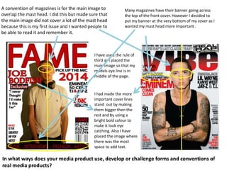
The document discusses conventions used in magazine cover design. It explains that the main image on the cover slightly overlaps the masthead to draw attention but not cover too much of it for a first issue. It also discusses placing the banner at the bottom instead of the top of the cover to make the masthead more prominent. Grid techniques like the rule of thirds are used to position the main image and models' eye lines. Larger, bolder text is used to make important lines stand out.