The document discusses how the media product uses, develops, and challenges conventions of real indie magazines.
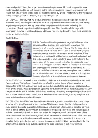
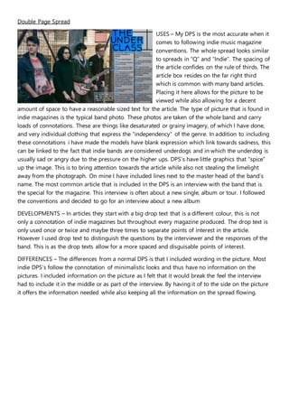
It uses conventions like separation of information and photos on the contents page. On the double page spread, it follows conventions like placement of the article box and inclusion of a band interview.
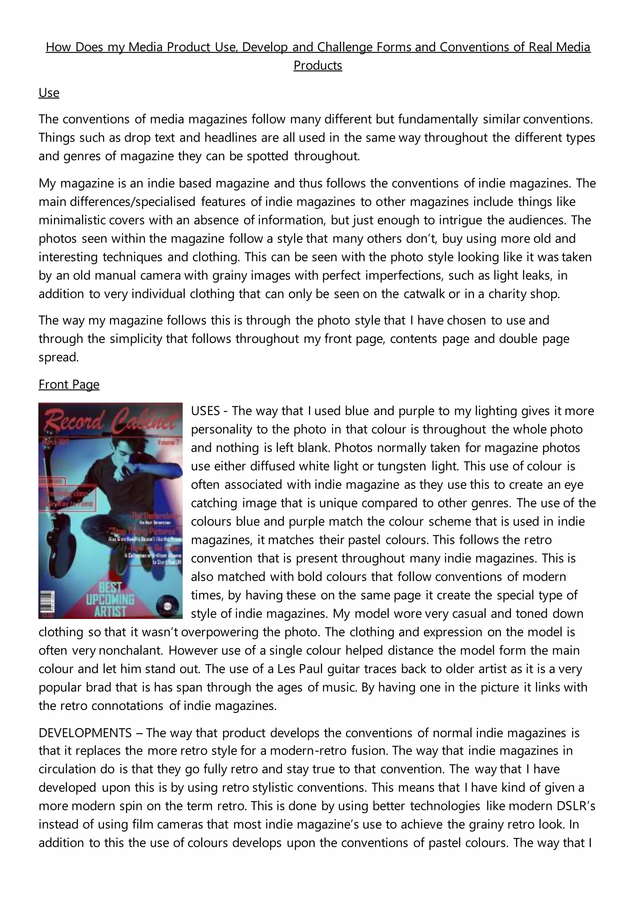
It develops conventions by giving the cover and photos a more modern, stylized look while retaining retro elements. The contents photo is more artistic with obvious editing.
It challenges conventions by filling the cover with more information instead of keeping it minimal. The contents page includes less information and graphics for an air of mystery. Words are included in the double page spread photo instead of keeping it minimalistic.


