This document provides an evaluation of a student's media studies portfolio project creating a magazine called "Club Classics".
The student summarizes how their magazine uses conventions from the magazine "Classic Pop" to make it seem more realistic. They replicated aspects of "Classic Pop" like layout, color scheme, and name.
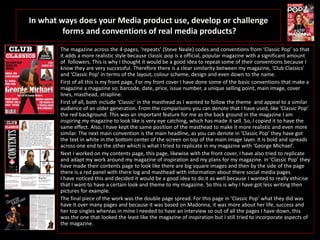
The student then analyzes specific pages of their magazine, explaining how they developed the front cover, contents page, and double page spread to mimic conventions from "Classic Pop".
For the front cover, they copied elements like the masthead position, main headline style and color scheme. For the contents page, they replicated the use of large square images and side panel. The double page spread was less


![Evaluation: [Music Magazine]](https://cdn.slidesharecdn.com/ss_thumbnails/evaluation-musicmag-110203122126-phpapp01-thumbnail.jpg?width=640&height=640&fit=bounds)


![Media%20 evaluation%20questions[1]](https://cdn.slidesharecdn.com/ss_thumbnails/media20evaluation20questions1-120302063519-phpapp01-thumbnail.jpg?width=640&height=640&fit=bounds)


