Katherine created a music magazine called "Dropout" to fulfill a media studies assessment. She drew inspiration from the layout and conventions of "Clash Magazine." Katherine represented the target demographic of 16-25 year olds and those in socioeconomic category E through affordable pricing and content. She incorporated codes like colored text and images to attract her intended audience. Producing preliminary tasks helped Katherine improve her Photoshop skills and create a professional final product that demonstrated her creative abilities.
RMD24 | Retail media: hoe zet je dit in als je geen AH of Unilever bent? Heid...BBPMedia1
Grote partijen zijn al een tijdje onderweg met retail media. Ondertussen worden in dit domein ook de kansen zichtbaar voor andere spelers in de markt. Maar met die kansen ontstaan ook vragen: Zelf retail media worden of erop adverteren? In welke fase van de funnel past het en hoe integreer je het in een mediaplan? Wat is nu precies het verschil met marketplaces en Programmatic ads? In dit half uur beslechten we de dilemma's en krijg je antwoorden op wanneer het voor jou tijd is om de volgende stap te zetten.
Falcon stands out as a top-tier P2P Invoice Discounting platform in India, bridging esteemed blue-chip companies and eager investors. Our goal is to transform the investment landscape in India by establishing a comprehensive destination for borrowers and investors with diverse profiles and needs, all while minimizing risk. What sets Falcon apart is the elimination of intermediaries such as commercial banks and depository institutions, allowing investors to enjoy higher yields.
Taurus Zodiac Sign_ Personality Traits and Sign Dates.pptxmy Pandit
Explore the world of the Taurus zodiac sign. Learn about their stability, determination, and appreciation for beauty. Discover how Taureans' grounded nature and hardworking mindset define their unique personality.
Attending a job Interview for B1 and B2 Englsih learnersErika906060
It is a sample of an interview for a business english class for pre-intermediate and intermediate english students with emphasis on the speking ability.
Affordable Stationery Printing Services in Jaipur | Navpack n PrintNavpack & Print
Looking for professional printing services in Jaipur? Navpack n Print offers high-quality and affordable stationery printing for all your business needs. Stand out with custom stationery designs and fast turnaround times. Contact us today for a quote!
Cracking the Workplace Discipline Code Main.pptxWorkforce Group
Cultivating and maintaining discipline within teams is a critical differentiator for successful organisations.
Forward-thinking leaders and business managers understand the impact that discipline has on organisational success. A disciplined workforce operates with clarity, focus, and a shared understanding of expectations, ultimately driving better results, optimising productivity, and facilitating seamless collaboration.
Although discipline is not a one-size-fits-all approach, it can help create a work environment that encourages personal growth and accountability rather than solely relying on punitive measures.
In this deck, you will learn the significance of workplace discipline for organisational success. You’ll also learn
• Four (4) workplace discipline methods you should consider
• The best and most practical approach to implementing workplace discipline.
• Three (3) key tips to maintain a disciplined workplace.
Putting the SPARK into Virtual Training.pptxCynthia Clay
This 60-minute webinar, sponsored by Adobe, was delivered for the Training Mag Network. It explored the five elements of SPARK: Storytelling, Purpose, Action, Relationships, and Kudos. Knowing how to tell a well-structured story is key to building long-term memory. Stating a clear purpose that doesn't take away from the discovery learning process is critical. Ensuring that people move from theory to practical application is imperative. Creating strong social learning is the key to commitment and engagement. Validating and affirming participants' comments is the way to create a positive learning environment.
Skye Residences | Extended Stay Residences Near Toronto Airportmarketingjdass
Experience unparalleled EXTENDED STAY and comfort at Skye Residences located just minutes from Toronto Airport. Discover sophisticated accommodations tailored for discerning travelers.
Website Link :
https://skyeresidences.com/
https://skyeresidences.com/about-us/
https://skyeresidences.com/gallery/
https://skyeresidences.com/rooms/
https://skyeresidences.com/near-by-attractions/
https://skyeresidences.com/commute/
https://skyeresidences.com/contact/
https://skyeresidences.com/queen-suite-with-sofa-bed/
https://skyeresidences.com/queen-suite-with-sofa-bed-and-balcony/
https://skyeresidences.com/queen-suite-with-sofa-bed-accessible/
https://skyeresidences.com/2-bedroom-deluxe-queen-suite-with-sofa-bed/
https://skyeresidences.com/2-bedroom-deluxe-king-queen-suite-with-sofa-bed/
https://skyeresidences.com/2-bedroom-deluxe-queen-suite-with-sofa-bed-accessible/
#Skye Residences Etobicoke, #Skye Residences Near Toronto Airport, #Skye Residences Toronto, #Skye Hotel Toronto, #Skye Hotel Near Toronto Airport, #Hotel Near Toronto Airport, #Near Toronto Airport Accommodation, #Suites Near Toronto Airport, #Etobicoke Suites Near Airport, #Hotel Near Toronto Pearson International Airport, #Toronto Airport Suite Rentals, #Pearson Airport Hotel Suites
As a business owner in Delaware, staying on top of your tax obligations is paramount, especially with the annual deadline for Delaware Franchise Tax looming on March 1. One such obligation is the annual Delaware Franchise Tax, which serves as a crucial requirement for maintaining your company’s legal standing within the state. While the prospect of handling tax matters may seem daunting, rest assured that the process can be straightforward with the right guidance. In this comprehensive guide, we’ll walk you through the steps of filing your Delaware Franchise Tax and provide insights to help you navigate the process effectively.
What is the TDS Return Filing Due Date for FY 2024-25.pdfseoforlegalpillers
It is crucial for the taxpayers to understand about the TDS Return Filing Due Date, so that they can fulfill your TDS obligations efficiently. Taxpayers can avoid penalties by sticking to the deadlines and by accurate filing of TDS. Timely filing of TDS will make sure about the availability of tax credits. You can also seek the professional guidance of experts like Legal Pillers for timely filing of the TDS Return.
Premium MEAN Stack Development Solutions for Modern BusinessesSynapseIndia
Stay ahead of the curve with our premium MEAN Stack Development Solutions. Our expert developers utilize MongoDB, Express.js, AngularJS, and Node.js to create modern and responsive web applications. Trust us for cutting-edge solutions that drive your business growth and success.
Know more: https://www.synapseindia.com/technology/mean-stack-development-company.html
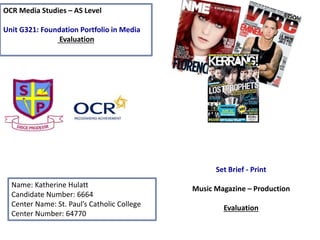
1. OCR Media Studies – AS Level
Unit G321: Foundation Portfolio in Media
Evaluation
Name: Katherine Hulatt
Candidate Number: 6664
Center Name: St. Paul’s Catholic College
Center Number: 64770
Set Brief - Print
Music Magazine – Production
Evaluation
2. In what ways does your Media product use, develop
or challenge forms and conventions of real media
products?
• Within the music magazine I created throughout the pages it ‘repeats’ (Steve Neale) codes and
conventions from ‘Clash magazine’. The issue I chose of ‘Clash magazine’ that I used for my
magazine of inspiration was the issue that featured ‘The 1975’. The reason why I chose this
particular issue was because the main feature (The 1975) I wanted to incorporate within my
magazine and it also linked nicely with my genre of music that I wanted my magazine to be which is
alternative/indie pop. This photo of Matt Healy of the issue of ‘Clash’ was in colour and my images
of the front of my magazine of ‘DropOut’ was in colour, therefore I ‘repeated’ this convention to
make my ‘DropOut’ look similar to this particular issue of ‘Clash’. Following on from this, I also
‘repeated’ where I placed my main headline which was In the middle and replaced the main story
name from ‘working on a dream’ to ‘the road to success’. Additionally, the masthead on ‘Clash’ is
spread out and I have done that on my magazine ‘Dropout’. Below I have inserted my magazine of
inspiration, ‘Clash’ front cover and my magazine ‘Dropout’ front cover. This connotes how I have
used conventions effectively from existing media products. However, I didn’t want to make my
magazine the exact same as ‘Clash’ therefore my magazine does ‘challenge’ some conventions that
would be in a typical indie pop magazine, for example, I have ventured out and used burnt red
colour instead of the trypcial colours used in a magazine like black and white. The reasoning I used
a burnt red colour within my magazine is to attract the ‘pass along’ audience more.
3. How does your media product
represent particular social groups?
• In my opinion, the denotation of the representation is the ‘E’ category of the socio-
economic needs table; (Unemployed, students, pensioners and casual workers).
This is because my target audience of my magazine is for younger age ranges such
as the 16-25 year olds of todays society. This means that the type of people that
will be reading this magazine would be ‘stereotypically’ students, people in casual
work or the unemployed. This means that my magazine I have created appeals to
my audience profile because of the 16-25 age group. Because of the category my
magazine my magazine needs to be affordable so even the unemployed can afford
my magazine. My magazine will be the price of £1.00 for a month and then will go
up to £1.50 which is a very affordable price for all the types of people within the
‘E’ category. Following on from this, the burnt red colour in throughout my
magazine will attract my target audience and ‘pass along’ readers as it’s an
appealing colour to the eye. This magazine will be especially attracted to the
unemployed as these readers can ‘divert’ (Blumer and Katz) from there everyday
problems and routine and have the chance to read and enjoy my magazine and
build ‘personal relationships’ from the artists so this can give them inspiration to
find work.
4. What kind of media institution (Publisher)
might distribute your media product and
why?
• From the research that was completed pre-production, I would envisage
that ‘Bauer Media Group’ may publish ‘Dropout magazine.’ This is because
this publishing group has not only published very successful lifestyle
magazine such as; ‘Closer, Grazia and Heat’ but very successful music
magazines such as; ‘Q, Kerrang and Mojo’. This would be good for the
publicity of my magazine as they are a reliable and successful publishing
group. My magazine of inspiration ‘Clash’ publisher is ‘Music Republic
LTD’ but they are not as big as ‘Bauer’ so my magazine wouldn’t get as
much publicity. I have done a range of research regarding ‘Bauer Media
Group’ and it has some similarities to ‘clash’ even though ‘Bauer’ is not its
publisher. This is because ‘Clash’ is an Indie pop magazine and the music
magazines that ‘Bauer’ have produced are also of that genre. ‘Clash’
magazine also ‘signifies’ (De Saussure) that the genre of my magazine will
appeal to this publisher as this is the kind of magazine that they are
looking to publish, considering that my magazine is of the same genre of
the music magazines they produce as previously stated.
5. Who would be the audience for your
media product and why?
Hartley’s seven subjectivities
According to Hartley’s seven subjectivities, the age of my audience 16-25 class ‘E’ people of society. This
is shown through the low pricing of my magazine and a special opening offer of £1 for the first
month, this will make sure that the people of the ‘E’ class will be able to afford my magazine. The
target gender for my magazine is not specific its for both male and females who are into the
indie/alternative types of music and the magazine features things that will relate to both genres.
The stereotypical ethnicity for my magazine is White British Male and Females.
Katz’ Uses & Gratifications theory
According to Katz’ Uses & Gratifications theory, the audience can ‘personally identify’ themselves within
the articles of the magazine. When the 1975 started to make music they were unemployed
students but have now made It in the music industry. This is how the audience can ‘personally
identify’ and help them ‘divert’ from everyday problems. My contents page is welcoming and the
editorial informs the reader everything within the current issue and upcoming issues.
Maslow’s Hierarchy of needs
According to Maslow’s hierarchy of needs, my audience are identified as ‘social climbers’. This means
that when reading this magazine they will take inspiration from the artists within the issues of
‘DropOut’ and want to aspire to be like them. This therefore means my audience will read my
magazine and aspire to do something within music if that’s their passion.
6. How did you attract/address your
audience?
• The Inclusion of codes and conventions such as featuring the burnt red
colour throughout my magazine rather than the standard colours of black
and white typically used throughout indie/alternative music magazines.
The pop of colour would attract the young audience which I am aiming my
magazine a. The use of font as well is different and ‘grungy’ so
automatically the audience will be aware of what music genre of my
magazine. Following on from this, another code and convention I have
used to attract and address my audience is the ‘puff promotion’ which is
directly linked with my main story, also the first months £1 addition will be
very popular as it will be saving my audience money. Finally, another code
and convention that I have included in my magazine to attract my target
audience is the images that I have used with thee magazine pages. The
images all relate to the stories in the magazine, therefore this means that
my stories attract my target audience as they are about the topics that
people of those ages would be interested in.
7. How did you attract/address your
audience?
• The Inclusion of codes and conventions such as featuring the burnt red
colour throughout my magazine rather than the standard colours of black
and white typically used throughout indie/alternative music magazines.
The pop of colour would attract the young audience which I am aiming my
magazine a. The use of font as well is different and ‘grungy’ so
automatically the audience will be aware of what music genre of my
magazine. Following on from this, another code and convention I have
used to attract and address my audience is the ‘puff promotion’ which is
directly linked with my main story, also the first months £1 addition will be
very popular as it will be saving my audience money. Finally, another code
and convention that I have included in my magazine to attract my target
audience is the images that I have used with thee magazine pages. The
images all relate to the stories in the magazine, therefore this means that
my stories attract my target audience as they are about the topics that
people of those ages would be interested in.
13. Analysing my Front Cover
Masthead-
The purpose of this masthead is
that it informs the audience of
what the magazine is and is the
first thing the pass along
audience look at as well the
image so it needs to stand out
clearly to the reader.
Strapline- This is what
persuades the audience to
buy the magazine. Thee
strapline is often catchy so
the reader remembers it
and encourages the
audience to purchase the
magazine.
Cover lines- these are
specifically used to
attract the target
audience, cover lines
have to be interesting so
it intrigues the audience
to buy the magazine
Social media- This is so the target
demographic can access the magazine
from a different format and can
suggest their ideas for the content of
the magazine on the social networking
pages.
Puff/Promotion- this
convention is featured
in my magazine
because its an extra
feature to grab the
target audiences
attention and is a
specific USP to the
magazine.
Main image- this is
the main focus of
the magazine to the
target audience as
it’s the first thing the
audience see.
Main headline- this convention
is also used to attract the target
audience, because if they are
interested in the story then it
then persuades the audience to
buy the magazine so that they
can read that story, the main
headline is usually something
very interesting.
14. Analysing my Contents Page
Editorial- I have included
an editorial as it
welcomes the pass along
audience and helps them
feel at ease. It helps to
create a ‘personal
relationship’ (Katz) with
the target audience.
Screen grab of Magazine
page positioned in the
Center of the slide
(Remove the BLUE box once
placed in as well)
Masthead- this is carried on
from the front cover. This
helps the reader to feel a
sense of continently and the
pages then link together, this
use of ‘repeating’ (Steve
Neale) this convergence is
already existing in professional
magazines.
Image- the image is a small
indication to one of the
features/regulars are going
to be about. They can
visually imagine what the
story is going to be about.
Page numbers- this
kindly allows the
audience to see
clearly what pages
link to what story
which is a neat aspect.
Regulars/Features-
this gives a quick
idea to the target
audience what the
content of the
magazine is going to
be.
Social Media- is again
something I have ‘repeated’
(Steve Neale) from the front
cover. Its another reminder to
the audience how the can
access the magazine in another
format if they are in touch with
the media side of the magazine.
15. Analysing my Double Page spread
Interview
Quote- The quote is the most
interesting and eye catching
part of the interview, it is also
what attracts the reader to
read the interview.
Masthead- This has been
clearly repeated through
the pages that I have
created. It again creates
continuity between each
of the pages because the
masthead is clearly and
neatly shown.
Credits- this tells the reader the
people who assisting in the article, it
gives a professional- like touch to the
double page spread.
Convergence- This allows the reader
to access the article in different
formats.
Main headline- Clear establishment of
what/ who the magazine is about so the
reader knows before they start reading.
Following on from this, the summery is
used to clearly show what will be
covered in the interview.
Interview- the interview is based on one
subject and the sub questions are asked
around the topic. This gives the reader
information that they wanted to hear as its
usually ‘gossip’ ‘must know’ topics. By
reading about a certain artist/band allows
the reader to ‘personally identify’ (Katz) with
them as they feel as if they know them
16. Looking back at your Preliminary task,
what do you feel you have learnt in the
progression from it to the full product?
I feel that, having completed the preliminary task and learning
about the demands of this production process. Following on
from this, doing the preliminary task helped me to refresh my
memory on Photoshop from GCSE, so that therefore my final
product of my music magazine looked, organized, professional,
and to a good quality. I have learnt to use extended tools on
Photoshop that I previously didn’t know how to use. By doing
the preliminary task and the main task it gave me a chance to
show of my creative skills and what I previously learnt from
GCSE media, this meant I had a slight advantage to some of the
people in my glass who didn’t study media for GCSE or have
never used Photoshop.
Editor's Notes
Once Complete you MUST:
1) Ensure all slides are neatly and consistently (i.e Same Background/colour scheme) presented
2) You have filled in ALL the details (Name, Candidate number, Center number) on Slide 1
3) Check you have completed EVERYTHING you have been asked to complete
4) Remove this comment