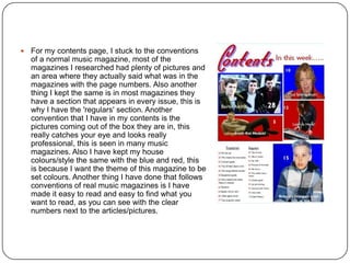
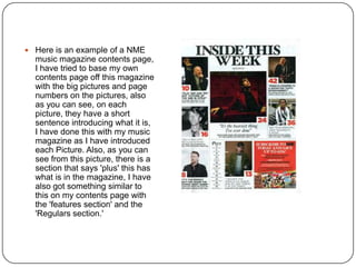
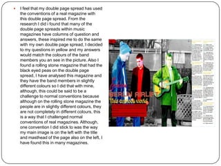
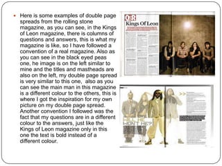
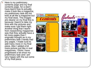
The document discusses how the media product, a music magazine, uses and challenges conventions of real magazines. It follows most conventions, such as using a masthead to identify the genre and target audience. The color scheme and layout are also similar to other music magazines. However, one convention challenged is placing cover lines on both sides of the magazine rather than just one side. The document also discusses the technologies learned from creating the magazine, such as using Photoshop to edit images and Publisher for layout. The creator feels their skills and understanding of magazine design improved from their preliminary task.