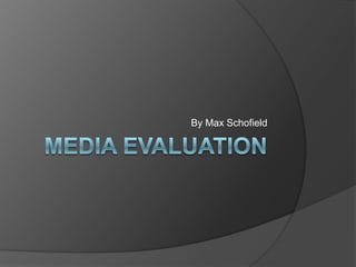
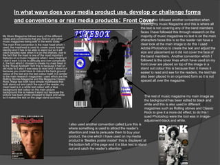
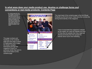
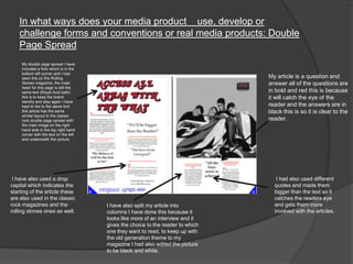
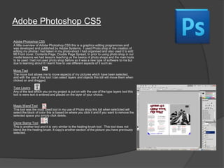
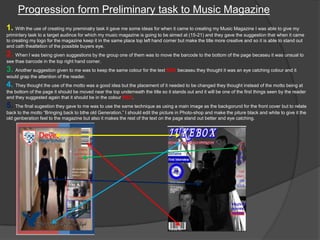
The document discusses how the author's music magazine product uses conventions of real music magazines.
It describes several design elements used that follow conventions, such as a masthead, cover lines placed above the main image, and no text covering faces on the cover. Photoshop was used to edit images to black and white to give an "old effect."
The contents page also uses conventions like page numbers and headings to help navigation. A website link is included to promote the brand online. Text formatting and layout of articles on inside pages similarly follow conventions of other magazines.
The document describes how the author's media product, a music magazine called Jukebox, uses conventions of real music magazines. It discusses design elements like the masthead, cover lines, and use of black and white photos on the cover and contents pages to mimic magazines like Rolling Stone. Photoshop was used to edit photos and layout the pages in Publisher. Feedback from test audiences informed changes between the preliminary task and full magazine, such as relocating the logo and barcode and keeping the eye-catching red text color. The author learned about magazine design conventions and technologies like Photoshop and Publisher in creating their media product.
The document discusses how the media product, a music magazine called Jukebox, uses conventions of real music magazines. It describes how the front cover uses conventions like a masthead, cover lines, and a lure to attract readers. The contents page also follows conventions like consistent branding and providing navigation. The double page spread similarly uses conventions from other magazines like columns, quotes, and a folio. The document also discusses how the product represents its target audience of older teenagers and younger adults interested in classic rock.
The document discusses how the author's music magazine product uses and develops conventions of real music magazines.
It describes several key conventions the product follows, including using a masthead with a distinctive font to create a strong brand identity, including "lures" like advertisements to attract readers, avoiding covering band members' faces with text, and placing cover lines above images in a prominent color.
The contents page, double-page spread, and other elements also follow conventions for layout, branding and design found in magazines like Rolling Stone and Classic Rock. The author learned to effectively use design software like Photoshop and Publisher to construct the magazine product.
Max Schofield discusses the creation of their music magazine "Jukebox". They followed conventions of real music magazines by including a masthead, organizing text and images, and using techniques like black and white photos. Photoshop was used to edit images and layer text. The target audience is older teenagers and young adults interested in classic rock. Key elements like the front cover and contents page were designed to attract this audience through bold colors, fonts, and band mentions. Through this project, Max learned skills in Publisher, Photoshop, and magazine design conventions.
The document discusses a media magazine created by the author for their target audience of young rock music fans aged 15-25. The magazine uses conventions from other music magazines like Kerrang and NME in its layout, but also challenges some conventions. For example, the main cover image looks away from the audience instead of directly at them. The magazine would be distributed by Bauer Media Publications, as they publish similar successful music magazines.
The document summarizes a student's project to create a rock music magazine called "Riot" using InDesign. The student aimed to challenge conventions of real music magazines in their design choices. For the front cover, they left more white space to draw the reader's eye. The contents page featured a large central photo and block of text rather than multiple images and text boxes. Audience feedback indicated the magazine appeared professional and effectively conveyed the rock music genre through its visual design and content.
The document summarizes the key things the author learned from constructing their media product, a music magazine. They learned about:
1) Design conventions for magazine covers, contents pages, and spreads from researching real magazines.
2) The importance of audience research to understand what would attract their target readership.
3) Digital skills like using Photoshop, InDesign, and iMovie to design, edit photos and record audio for the magazine.
4) The value of planning, research, and understanding conventions before beginning a media project.
The document provides an evaluation of the student's media coursework assignment to create a magazine. It summarizes the key ways the student's magazine both follows and challenges conventions of real music magazines in its design. This includes using layouts similar to Kerrang magazine but with unconventional color schemes and fonts. It also discusses how the content focuses solely on punk rock, representing that genre. Overall, the student learned important skills in using Photoshop and balancing conventions with original designs.
The magazine aims to engage with mod culture through its design elements that reference symbols of mod subculture like the Union Jack. These include the masthead, cover lines in red, white and blue, and a feature photo of a band member addressing the camera intensely. The double page spread continues these design elements and features a large photo of a band in black clothes against a background with graffiti, appealing to the aesthetic tastes of the target audience. The magazine targets males aged 18-45 interested in mod music, fashion, and lifestyle, especially those interested in reliving the mod revival era or passing the culture to younger generations.
The document provides details about the process of creating a dance music magazine as a media product. It describes conducting a survey to identify the target audience as mainly male aged 16-26 interested in dance music genres like house and acid house. Inspiration was taken from existing magazines like Mixmag in terms of design conventions. The magazine aims to appeal to its target audience through the cover star, articles and representing associated subcultures. It will be distributed monthly through an existing publisher and promoted at music festivals.
The document discusses the target audience and design choices for a music magazine. It aims the magazine at rock and emo fans from lower-income socioeconomic groups. Key design elements include a purple, black, and white color scheme; interviews with emo bands; and a similar style and tone to the magazine Kerrang. The target distribution partner would be a large media company like Time Warner that could promote the magazine across multiple platforms.
Ronan Beirne created a magazine aimed at teens and young adults interested in punk and heavy rock music. The magazine would feature band interviews, reviews of gigs and fashion related to the target audience's interests. Beirne refined their design skills using Photoshop and Publisher to create a magazine mock-up with a professional layout, including a cover featuring a rock musician, contents page and double page spread. Through repeated drafting, they improved the color scheme, images and structure to better address the niche audience.
Kerrang! is a rock music magazine published in the UK with a circulation of 44,013 and readership of 421,000. It targets younger readers aged 22 on average. The magazine covers various rock genres and ensures it appeals to readers interests in both mainstream bands and newer, undiscovered music. It also extends its brand through platforms like Kerrang! Radio and by partnering with music festivals.
NME is a music magazine published in the UK with a circulation of 33,875 and readership of 325,000. It targets a wide age range from 15-34 without focusing on either younger or older readers. The magazine provides up-to-date music news, reviews and listings. It extends its brand across
The document discusses a media studies coursework assignment evaluating a student's mock magazine. It provides details on the magazine's design elements, conventions used, target audience, and how it represents and attracts that audience. Specifically, it summarizes that the magazine draws inspiration from Kerrang magazine's style and targets young adult rock music fans, using formal language, fashion photography, and references to bands like Florence and the Machine to appeal to and represent that social group.
The document describes the process of designing and constructing a music magazine focused on jazz. Key details include choosing images and layouts to represent the chilled and relaxed themes of jazz. Text colors, placement of images and articles, and the overall design aim to target jazz audiences ranging from teenagers to older adults. Research was conducted on jazz music tribes and their interests to help attract the intended audience. Technologies like Photoshop and InDesign were used to edit images and produce the magazine layout. Lessons were learned around lighting, representation of music genres, and how professional magazines advertise artists. The overall goal was to challenge conventions of real music magazines while effectively marketing jazz music.
The student created a music magazine as their media product. They researched conventions of real music magazines and applied many of these to their own magazine to make it look professional and realistic, while also developing some conventions. The student evaluated how they attracted and addressed their target audience of 16-23 year olds interested in music through elements like eye-catching designs, relevant content, and representative imagery. Through this process, the student learned important skills in using technologies like Photoshop, blogging, and photography equipment to construct a high-quality media product.
This document summarizes Hannah Thomas's evaluation of her music magazine project. She discusses how her magazine uses conventions from real music magazines in its front cover, contents page, double page spread, representation of social groups, potential distribution, target audience, and technologies used. For the front cover, she models conventions like the magazine title, artist name, and featured articles from magazines like Q and NME. Her contents page similarly follows typical sectioning and formatting. She learned skills in Photoshop like layers, opacity, and text effects to make the magazine appealing. Her target audience is 15-20 year old girls interested in country music.
The document describes the design elements of a magazine cover and articles that are intended to appeal to and attract a target audience of 14-20 year olds interested in chart music. Key design elements highlighted include the use of bright colors, bold text, and prominent images to grab attention, as well as content focused on popular music artists, charts, and interviews to interest the target demographic. Market research informed the design approach to represent the interests of teenage readers.
This document discusses the process of designing and constructing a music magazine focused on jazz. Key details include choosing images and layouts to represent the chilled and relaxed themes of jazz, using colors like brown and faded textures throughout, and targeting an audience of jazz fans ranging from teenagers to older adults. Background research on jazz music tribes informed choices about the magazine's design, language, and how to attract different audiences. Technologies like Photoshop and InDesign were used to edit images and assemble the magazine. Lessons were learned about lighting, magazine conventions, and how to better target a specific audience.
1. The document discusses the evaluation of final media products created by the student for a school project.
2. It describes how the student's magazine front cover, contents page, and double page spread used conventions from real music magazines while also including some original and unconventional design elements.
3. The student learned about technologies like photo editing and magazine design through constructing their media products using programs like Fireworks and gained experience planning for audience and purpose.
1. The document discusses the process of creating a music magazine media product and what was learned. Conventions from real music magazines like layout and pictures were used as inspiration.
2. Unconventional aspects like the black and white color scheme and unique contents page design were incorporated. Techniques like band photos and article layouts matched real magazine conventions.
3. New skills with software like Fireworks and photo editing were developed, along with understanding magazine elements like targeting audiences and distribution channels. The process allowed for improved planning and use of conventions over the preliminary task.
The document provides details on how the author incorporated conventions from Kerrang magazine into their music magazine design. Some key points:
- The author used Kerrang's color scheme of black, red, and white for their masthead to make it eye-catching.
- They followed Kerrang's convention of placing the headline across the bottom of the front cover in white text for prominence.
- Research showed magazines typically have plugs flushed left or right, so the author aligned their plugs like Kerrang for a professional look.
- Photos on the contents page and using different fonts/sizes helped achieve Kerrang's grid structure and reference multiple articles.
Kerrang! is a magazine published by Bauer Media Group based in Germany with a circulation of 44,013 and readership of 421,000 people mostly aged 22. The magazine focuses on appealing to readers of all ages interested in different genres of rock music, both new and classic bands. In addition to the print magazine, Kerrang! has online platforms like radio and TV and hosts an annual music awards show. The magazine aims to educate readers and keep them informed on the biggest events in the rock music world each week.
The document describes changes made from the initial planning to the final product of a classical music magazine. Key changes included using a different font for the masthead to make it less overpowering, repositioning feature articles on the contents page to better fit the genre, and changing the double page spread layout to look simpler and more reflective of classical music. Conventions of music magazines, like white backgrounds and cut-out images on the cover, were followed while some elements like including a violin challenged expectations. The target audience of 25-55 year olds from a middle-class background was researched based on similar magazines.
The document describes the process of creating a magazine front cover and contents page based on existing magazine templates. It discusses how conventions from the template magazines were used and developed. For the front cover, the main image style and positioning of text were similar to the template, while the cover model's pose and positioning of cover lines challenged conventions. The contents page largely followed the template layout but used only two colors instead of various colors. Overall, the document shows how the created magazine pieces both emulate and tweak conventions from the templates.
The document describes a magazine cover and contents page created as part of a media studies assignment. It analyzes various design elements used on the cover and contents page, such as colors, images, and text, and how they target a young audience interested in music charts. It also discusses conducting research to understand how to effectively engage the target demographic.
This document discusses Dynamics 365 solutions and components. It addresses whether managed and unmanaged solutions can be exported, how versions are formatted, how subjects and queues can be added to solutions, and how the publisher prefix is applied. Importing an unmanaged solution makes changes that cannot be undone.
This document discusses how self-esteem can be affected by others and provides strategies to improve self-esteem. It suggests having students move to different sides of the room based on whether statements make them feel positive or negative. Students are then asked to write down sentences that could improve someone's self-esteem and discuss how to identify low self-esteem and ways to help improve someone's self-esteem.
The document discusses the benefits of exercise for mental health. Regular exercise can help reduce anxiety and depression and improve mood and cognitive functioning. Exercising for at least 30 minutes three times per week is recommended to see these mental health benefits.
ความรูความเขาใจเกี่ยวกับสังคมไทย ดานสังคม วัฒนธรรม เศรษฐกิจ การเมือง มโนทัศนเกี่ยวกับชุมชน
การเปลี่ย นแปลง ปญหา การมีจิตสาธารณะ การดําเนิน ชีวิตตามหลักปรัช ญาเศรษฐกิจ พอเพีย งและแนว
ทางการพัฒนา การปรับตัวใหสอดคลองกับสถานการณในสังคม
Uderstanding and knowledge of Thai society regarding society, cultures, economics,
politics , concepts of community, changes, problems, public mind , a living followed a
Sufficiency Economy philosophy and Development principles, well adaptation to social
situations.
This document discusses various techniques for effective communication, including verbal communication through speaking, lip reading, and sign language. It also addresses written communication using letters, emails, reports, and emoticons. Barriers to effective communication mentioned include language barriers, noise, lack of concentration, physical barriers like distance between parties, poor equipment, staff shortages, and distractions. Systems design faults like lack of training and unclear organizational structure can also impede communication, as can different languages, psychological factors, and physiological states.
This document discusses various techniques for effective communication, including verbal communication through speaking, lip reading, and sign language. It also addresses written communication using letters, emails, reports, and emoticons. Barriers to effective communication mentioned include language barriers, noise, lack of concentration, physical barriers like distance between parties, poor equipment, staff shortages, and distractions. Systems design faults like lack of training and unclear organizational structure as well as psychological and physiological states of receivers are also listed as potential barriers.
This document discusses various techniques for effective communication, including verbal communication through speaking, lip reading, and sign language. It also covers written communication using letters, emails, reports, and emoticons. Barriers to effective communication mentioned include language barriers, noise, lack of concentration, physical barriers like distance between parties, poor equipment, staff shortages, and distractions. Systems design faults like lack of training and unclear organizational structure can also impede communication, as can different languages, psychological factors, and physiological states.
Presentasi ini membahas tentang tes kemampuan berbahasa tulis yang meliputi menyusun paragraf berdasarkan gambar, bentuk-bentuk wacana, dan tingkatan tes kemampuan membaca dan menulis. Tes kemampuan membaca mencakup tingkat ingatan hingga evaluasi, sedangkan tes menulis meliputi menyusun alinea, menulis berdasarkan rangsangan, hingga menulis berdasarkan tema tertentu.
This document summarizes the key aspects of a music magazine project created by Jasmine Bearman. The magazine follows conventions of real music magazines by including cover lines, features, a masthead, and a central image reflecting the genre. It also includes typical contents like double page articles with large pictures and written articles. The project represents adult rock/blues fans in a non-stereotypical way. Bauer Media would be likely to distribute the magazine as they produce similar magazines. The target audience is ages 16-31 from lower socioeconomic backgrounds who enjoy rock and blues music.
The document summarizes a student's evaluation of their music magazine project. The student discusses how they developed conventions of real music magazines in their design of a front cover, contents page, and double-page article spread. Key points included using consistent color schemes, fonts, large images, and layout elements like dates and prices found on real magazines. The student felt their final project better represented conventions compared to their preliminary task due to gaining more experience with design software and analyzing other magazines.
The document summarizes the process of creating a magazine from start to finish. It discusses researching conventions of music magazines, designing elements like the front cover, contents page, and articles. Photos were taken and edited in Photoshop. Feedback was gathered through surveys. The target audience is identified as teenage boys interested in genres like rap and R&B. Publishing bi-monthly was decided based on reader preferences. Skills in photography, design, and gathering feedback were improved throughout the process.
The document provides details about the process of creating a music magazine. It describes designing elements like the front cover, contents page, and articles. Conventions from other music magazines were researched and applied, like layout, fonts, and inclusion of photos, quotes, and page numbers. Feedback was gathered through surveys to help decisions. Skills with Photoshop and digital photography improved over iterations. The target audience was identified as teenage boys interested in genres like rap and R&B. Distribution through an existing media company was considered.
The document is an evaluation of a media product - a music magazine called "Ultimatum". It summarizes the key aspects of the magazine such as representing the rock genre through its use of color schemes. The target audience is described as rock fans who are teenagers as the magazine aims to appeal to both young audiences and allow older rockers to share knowledge. Nostalgia and references to both new and classic bands are used to attract readers. The process of constructing the magazine in programs like Photoshop and InDesign is also discussed.
The document discusses the planning and design process for a music magazine targeted towards rock and emo music fans. It aims its audience at working class youth between C2-E on the socioeconomic scale. Key elements included using purple, black, and white colors associated with rock music. Interviews with emo bands and a do-it-yourself emo band were included to appeal to readers. The magazine would be distributed by a company like Emap or Time Warner to reach a global rock music audience.
The document discusses pop music and media representation. It then provides details about how the author constructed their music magazine, including following conventions of real magazines, representing social groups, choosing a media institution for distribution, attracting their target audience of teenage girls and young women, and what they learned about technology from the process.
Rachel Hanson reflects on how her media product has progressed from her preliminary task. She notes several key improvements: her completed magazine uses more color, creative images, and follows magazine conventions better. Specifically, her front cover has clearer cover lines in distinct colors, her contents page is more organized and colorful, and her images show different locations and editing. Overall, her finished product looks more professional and follows magazine conventions for layout, fonts, and styles. She has learned skills like attracting audiences through design elements and showing creativity through adding more content.
The document provides an evaluation of a media product created by Elizabeth Brady. It summarizes how the product uses conventions from real magazines in its design, such as a consistent color palette and direct address of the audience in images. It also discusses how the product represents indie/alternative music fans through the artists and design featured. The target audience is identified as fans of this genre aged 13-29. Overall, the evaluation demonstrates how the product applies real-world magazine conventions while appealing to its intended readership.
This document discusses the design of a magazine called "Rock and Roll" and how it uses conventions from real music magazines. It begins by explaining how the designer studied magazines like Rolling Stone and NME to inform the layout and style. Key design elements discussed include using a black and white close-up image on the cover, a red masthead in the top right, and inclusion of articles, reviews, and a gig listing. Color schemes and fonts were chosen to represent the target audience and genre of soft rock music. Overall the document analyzes how the magazine design adheres to typical magazine conventions to create a realistic product.
The document discusses how the media product targets its audience through its use of conventions and representations. Specifically, it represents the social group of 15-25 year old metal fans by featuring a popular metal band and using fonts, language, and a color scheme commonly seen in metal magazines. It aims to attract this audience by addressing their interests in metal music and using exciting language and photos throughout the magazine that potential readers would find appealing.
The document describes the design elements and conventions used in a mock student-created magazine covering hip hop music. Key design elements include a masthead referencing a Jamaican reggae song, the use of direct eye contact in a portrait on the cover, main cover lines, placement of images and text following design principles. Color schemes, fonts and layouts are used to create visual interest and appeal while maintaining the style of other hip hop magazines. Both conventional design elements and some unconventional touches like mock Polaroids are incorporated.
The document describes a music magazine created by the author for an assignment. The magazine follows conventions of real music magazines in its layout, design and content. Specifically, it uses bright colors and includes sections like interviews and album reviews that are typical of music magazines. The author also learned new skills in photography, design software and publishing while creating the magazine.
The document summarizes an evaluation of a magazine coursework project. It discusses how the magazine challenges conventions through its pink color scheme and traditional layout. It represents a young male rock musician and aims to attract both female and male audiences aged 16-30 who are fans of rock music. Feedback was generally positive about the color scheme, images, and language appealing to the target audience, though the contents page could be improved. Microsoft Paint, Fireworks, and Publisher were used to create the magazine, and planning was found to be key.
The document discusses the process of creating a magazine cover, contents page, and center spread for an alternative rock magazine. The creator looked to MOJO magazine for inspiration on conventions and forms to emulate, such as using a large bold heading, placing cover lines and images prominently, and including pull quotes and photos on the contents page. The creator learned Photoshop and InDesign skills like removing backgrounds from images and laying out pages. Comparing the preliminary and final products, the creator felt they learned to make the magazine more professional through additional research and an audience focus.
The document provides an evaluation of a student's AS Media Studies coursework where they created a magazine cover using Adobe Photoshop CS5. The student undertook research into existing magazine covers to analyze conventions. They took photos needed and designed the cover in Photoshop using 13 layers. Key features included a medium close-up main image of a student to stand out. Overall, the student felt the final outcome was successful as it had typical magazine cover features and a layout similar to those analyzed during research. There are improvements that could be made but for a first attempt, it looks professional.
This magazine targets 15-20 year olds interested in rock/indie music. It uses a dark color scheme of black, grey, white and dark red throughout to match the genre. The front cover features the lead band and cover lines. The contents page highlights upcoming articles in dark red and grey. The double-page spread has a photo of the band member discussed in the lead article about a drummer revealing his drug addiction. The magazine aims to attract its target audience by covering their interests in music, festivals and celebrities' personal lives.
1. The document evaluates a music magazine created by the author.
2. Key aspects of the magazine discussed include using fonts and branding from real bands, incorporating photos taken at live performances, and including content relevant to the target teenage/young adult audience.
3. The author believes the magazine effectively represents the rock music genre through its dark color scheme, broken glass backgrounds, and topics covered. Distribution through Bauer Media is proposed due to their success and audience match.
1. The document evaluates a music magazine created by the author.
2. Key aspects of the magazine discussed include using fonts and designs from real bands, incorporating photos taken at live shows to represent the genre, and including content relevant to the target teenage/young adult audience.
3. The author believes Bauer Media would be a good distributor as it publishes similar magazines, has a good reputation, and would help advertise the magazine to the intended audience.
1. The document evaluates a music magazine created by the author.
2. Key aspects of the magazine discussed include using fonts and designs from real magazines, incorporating photos taken at live performances, and including profiles of popular bands that would appeal to the target teenage/young adult audience.
3. The author believes the magazine would be well-distributed by Bauer Media due to their success and reputation within the magazine industry, and their appeal to the target rock music fans audience.
The Unbelievable Tale of Dwayne Johnson Kidnapping: A Riveting Sagagreendigital
Introduction
The notion of Dwayne Johnson kidnapping seems straight out of a Hollywood thriller. Dwayne "The Rock" Johnson, known for his larger-than-life persona, immense popularity. and action-packed filmography, is the last person anyone would envision being a victim of kidnapping. Yet, the bizarre and riveting tale of such an incident, filled with twists and turns. has captured the imagination of many. In this article, we delve into the intricate details of this astonishing event. exploring every aspect, from the dramatic rescue operation to the aftermath and the lessons learned.
Follow us on: Pinterest
The Origins of the Dwayne Johnson Kidnapping Saga
Dwayne Johnson: A Brief Background
Before discussing the specifics of the kidnapping. it is crucial to understand who Dwayne Johnson is and why his kidnapping would be so significant. Born May 2, 1972, Dwayne Douglas Johnson is an American actor, producer, businessman. and former professional wrestler. Known by his ring name, "The Rock," he gained fame in the World Wrestling Federation (WWF, now WWE) before transitioning to a successful career in Hollywood.
Johnson's filmography includes blockbuster hits such as "The Fast and the Furious" series, "Jumanji," "Moana," and "San Andreas." His charismatic personality, impressive physique. and action-star status have made him a beloved figure worldwide. Thus, the news of his kidnapping would send shockwaves across the globe.
Setting the Scene: The Day of the Kidnapping
The incident of Dwayne Johnson's kidnapping began on an ordinary day. Johnson was filming his latest high-octane action film set to break box office records. The location was a remote yet scenic area. chosen for its rugged terrain and breathtaking vistas. perfect for the film's climactic scenes.
But, beneath the veneer of normalcy, a sinister plot was unfolding. Unbeknownst to Johnson and his team, a group of criminals had planned his abduction. hoping to leverage his celebrity status for a hefty ransom. The stage was set for an event that would soon dominate worldwide headlines and social media feeds.
The Abduction: Unfolding the Dwayne Johnson Kidnapping
The Moment of Capture
On the day of the kidnapping, everything seemed to be proceeding as usual on set. Johnson and his co-stars and crew were engrossed in shooting a particularly demanding scene. As the day wore on, the production team took a short break. providing the kidnappers with the perfect opportunity to strike.
The abduction was executed with military precision. A group of masked men, armed and organized, infiltrated the set. They created chaos, taking advantage of the confusion to isolate Johnson. Johnson was outnumbered and caught off guard despite his formidable strength and fighting skills. The kidnappers overpowered him, bundled him into a waiting vehicle. and sped away, leaving everyone on set in a state of shock and disbelief.
The Immediate Aftermath
The immediate aftermath of the Dwayne Johnson kidnappin
Odia New Web Series at your fingerprint.mikedanoffice
Stay ahead of the curve with the latest in Odia entertainment! Our Odia new web series promise an exciting blend of fresh narratives, talented performances, and engaging plots. Immerse yourself in the evolving world of Odia storytelling with our curated selection of cutting-edge web content. for more visit: https://aaonxt.com/series
Leonardo DiCaprio Super Bowl: Hollywood Meets America’s Favorite Gamegreendigital
Introduction
Leonardo DiCaprio is synonymous with Hollywood stardom and acclaimed performances. has a unique connection with one of America's most beloved sports events—the Super Bowl. The "Leonardo DiCaprio Super Bowl" phenomenon combines the worlds of cinema and sports. drawing attention from fans of both domains. This article delves into the multifaceted relationship between DiCaprio and the Super Bowl. exploring his appearances at the event, His involvement in Super Bowl advertisements. and his cultural impact that bridges the gap between these two massive entertainment industries.
Follow us on: Pinterest
Leonardo DiCaprio: The Hollywood Icon
Early Life and Career Beginnings
Leonardo Wilhelm DiCaprio was born in Los Angeles, California, on November 11, 1974. His journey to stardom began at a young age with roles in television commercials and educational programs. DiCaprio's breakthrough came with his portrayal of Luke Brower in the sitcom "Growing Pains" and later as Tobias Wolff in "This Boy's Life" (1993). where he starred alongside Robert De Niro.
Rise to Stardom
DiCaprio's career skyrocketed with his performance in "What's Eating Gilbert Grape" (1993). earning him his first Academy Award nomination. He continued to gain acclaim with roles in "Romeo + Juliet" (1996) and "Titanic" (1997). the latter of which cemented his status as a global superstar. Over the years, DiCaprio has showcased his versatility in films like "The Aviator" (2004). "Start" (2010), and "The Revenant" (2015), for which he finally won an Academy Award for Best Actor.
Environmental Activism
Beyond his film career, DiCaprio is also renowned for his environmental activism. He established the Leonardo DiCaprio Foundation in 1998, focusing on global conservation efforts. His commitment to ecological issues often intersects with his public appearances. including those related to the Super Bowl.
The Super Bowl: An American Institution
History and Significance
The Super Bowl is the National Football League (NFL) championship game. is one of the most-watched sporting events in the world. First played in 1967, the Super Bowl has evolved into a cultural phenomenon. featuring high-profile halftime shows, memorable advertisements, and significant media coverage. The event attracts a diverse audience, from avid sports fans to casual viewers. making it a prime platform for celebrities to appear.
Entertainment and Advertisements
The Super Bowl is not only about football but also about entertainment. The halftime show features performances by some of the biggest names in the music industry. while the commercials are often as anticipated as the game itself. Companies invest millions in Super Bowl ads. creating iconic and sometimes controversial commercials that capture public attention.
Leonardo DiCaprio's Super Bowl Appearances
A Celebrity Among the Fans
Leonardo DiCaprio's presence at the Super Bowl has noted several times. As a high-profile celebrity. DiCaprio attracts
Sara Saffari: Turning Underweight into Fitness Success at 23get joys
Uncover the remarkable journey of Sara Saffari, whose transformation from underweight struggles to being recognized as a fitness icon at 23 underscores the importance of perseverance, discipline, and embracing a healthy lifestyle.
Leonardo DiCaprio House: A Journey Through His Extravagant Real Estate Portfoliogreendigital
Introduction
Leonardo DiCaprio, A name synonymous with Hollywood excellence. is not only known for his stellar acting career but also for his impressive real estate investments. The "Leonardo DiCaprio house" is a topic that piques the interest of many. as the Oscar-winning actor has amassed a diverse portfolio of luxurious properties. DiCaprio's homes reflect his varied tastes and commitment to sustainability. from retreats to historic mansions. This article will delve into the fascinating world of Leonardo DiCaprio's real estate. Exploring the details of his most notable residences. and the unique aspects that make them stand out.
Follow us on: Pinterest
Leonardo DiCaprio House: Malibu Beachfront Retreat
A Prime Location
His Malibu beachfront house is one of the most famous properties in Leonardo DiCaprio's real estate portfolio. Situated in the exclusive Carbon Beach. also known as "Billionaire's Beach," this property boasts stunning ocean views and private beach access. The "Leonardo DiCaprio house" in Malibu is a testament to the actor's love for the sea and his penchant for luxurious living.
Architectural Highlights
The Malibu house features a modern design with clean lines, large windows. and open spaces blending indoor and outdoor living. The expansive deck and patio areas provide ample space for entertaining guests or enjoying a quiet sunset. The house has state-of-the-art amenities. including a gourmet kitchen, a home theatre, and many guest suites.
Sustainable Features
Leonardo DiCaprio is a well-known environmental activist. whose Malibu house reflects his commitment to sustainability. The property incorporates solar panels, energy-efficient appliances, and sustainable building materials. The landscaping around the house is also designed to be water-efficient. featuring drought-resistant plants and intelligent irrigation systems.
Leonardo DiCaprio House: Hollywood Hills Hideaway
Privacy and Seclusion
Another remarkable property in Leonardo DiCaprio's collection is his Hollywood Hills house. This secluded retreat offers privacy and tranquility. making it an ideal escape from the hustle and bustle of Los Angeles. The "Leonardo DiCaprio house" in Hollywood Hills nestled among lush greenery. and offers panoramic views of the city and surrounding landscapes.
Design and Amenities
The Hollywood Hills house is a mid-century modern gem characterized by its sleek design and floor-to-ceiling windows. The open-concept living space is perfect for entertaining. while the cozy bedrooms provide a comfortable retreat. The property also features a swimming pool, and outdoor dining area. and a spacious deck that overlooks the cityscape.
Environmental Initiatives
The Hollywood Hills house incorporates several green features that are in line with DiCaprio's environmental values. The home has solar panels, energy-efficient lighting, and a rainwater harvesting system. Additionally, the landscaping designed to support local wildlife and promote
The Future of Independent Filmmaking Trends and Job OpportunitiesLetsFAME
The landscape of independent filmmaking is evolving at an unprecedented pace. Technological advancements, changing consumer preferences, and new distribution models are reshaping the industry, creating new opportunities and challenges for filmmakers and film industry jobs. This article explores the future of independent filmmaking, highlighting key trends and emerging job opportunities.
From Teacher to OnlyFans: Brianna Coppage's Story at 28get joys
At 28, Brianna Coppage left her teaching career to become an OnlyFans content creator. This bold move into digital entrepreneurship allowed her to harness her creativity and build a new identity. Brianna's experience highlights the intersection of technology and personal branding in today's economy.
2. In what ways does your media product use, develop or challenge forms
and conventions or real media products: Front Cover
My Music Magazine follows many of the different
codes and conventions that you find on any other
music magazines being sold in the world today.
The main First convention is the mast head which I
used, the masthead is used to create yours brands
identity and it has to be able to stand out so it will
catch peoples eyes when it is on the shelves, due to
the fact that the mast is one of the most important
features on a music magazine when I was creating it
I didn‟t want it to be to difficulty and over complicate
it, the font which I choose to create my mast head in
is the „Royal Acidbath‟ font this is because it had on
old style to it also it was easy to read and it stood out
because you could have to colours the back ground
colour of the text and the text colour itself, it is similar
to the main research magazines I used which are the
Rolling Stones Magazine and the Magazine Classic
Rock, these two both have simple mastheads that
both stand out and catch the eye of the reader, my
mast head is in a white text colour with a blue
background text colour on the main picture
background this is makes it stand out because the
picture has been photo shopped to black and white
so it makes the text on the page stand out more. The rest of music magazine my main image as
the background has been edited to black and
white and this is also used in different
magazines such as Rolling stones and Classic
Rock to give it a more old effect, to do this I
sued Photoshop were the tool was in image-
adjustment-black and white.
I also used another convention called Lure this is
where something is used to attract the reader‟s
attention and tries to persuade them to buy your
product, the one which I have used on my media
product is „Beatles poster inside!‟ this is displayed at
the bottom left of the page and it is blue text to stand
out and catch the reader‟s attention.
I have also followed another convention when
creating my music Magazine and this is where all
the text is not covering any of the band members
faces I have followed this through research on the
majority of music magazines no text is on the main
characters faces this is so the reader can have a
clear look at the main image to do this I used
Adobe Photoshop to create the text and adjust the
size and placement so it did not cover the face of
the band members. Another convention which I
followed is the cover lines which have used on my
front cover are placed on top of the image in a
stand out colour this is because then it makes it
easier to read and see for the readers, the text has
also been placed in an organised form so it is not
spaced all over the magazine.
3. In what ways does your media product use, develop or challenge forms and
conventions or real media products: Contents Page
My Contents page didn‟t have
any changes to the theme of
the magazine a kept the main
house style colours (Blue,
white and red) these are used
on my front cover as well the
reason is used blue and white
because this relates to the
main band „The What‟ who‟s
logo is blue and white so the
colour scheme relates to the
main article I also use red
because this stands out and
catches the attention of the
reader.
The mast head of the contents page is the font (Royal
Acidbath) as the front cover I have done this to show the
strong brand identity in the magazine
The page numbers and
headings on the contents
page give this page a sense
of organization and it helps
the reader navigate
themselves through the
magazine if there is a
particular article they want to
read at the bottom of the
contents page
I have incorporated the magazine‟s website
so the reader can visits the website and then
it if they like the website then they might tell
friends and family then this spread the
brands name round viral marketing.
4. In what ways does your media product use, develop or
challenge forms and conventions or real media products: Double
Page Spread
My double page spread I have
included a folio which is in the
bottom left corner and I had
seen this on the Rolling
Stones magazine, the mast
head for this page is still the
same text (Royal Acid bath)
this is to keep the brand
identity and also again I have
kept to the to the same font
this article has the same
similar layout to the classic
rock double page spread with
the main image on the right
hand side in the top right hand
corner with the text on the left
and underneath the picture.
I had also used different
quotes and made them
bigger than the text so it
catches the readers eye
and gets them more
involved with the articles.
I have also split my article into
columns I have done this because it
looks like more of an interview and it
gives the choice to the reader to which
one they want to read, to keep up with
the old generation theme to my
magazine I had also edited the picture
to be black and white.
I have also used a drop
capital which indicates the
starting of the article these
are also used in the classic
rock magazines and the
rolling stones ones as well.
My article is a question and
answer all of the questions are
in bold and red this is because
it will catch the eye of the
reader and the answers are in
black this is so it is clear to the
reader.
5. How does your media product represent particular social
groups?
My magazine is aimed at an older audience and people
interested in the classic rock genre. So my product will represent
the type of audience I will relate and want to read my magazine.
For my main article on the double page spread I created a band
similar to one of the most famous classic rock bands in history
„The Who‟ and the band I created is called The What so I
captured them in black and white so it gave a old generation feel.
6. How does your media product represent particular social groups?
I gave it a old generation fell by dressing
my models in old clothes that would have
been wore in the time of The Who and the
Beatles e.g. Jeans shirt, t shirt bomber
coats long hair. An because of this theme
it gives the audience a laid back theme
and this is show in the type of music I
have decided to include in my magazine.
My magazine represents the teenagers to
younger adults it shows the male
characters as laid back cool characters
and it almost shows a higher class
representation.
7. How does your media product represent particular social groups?
My product clearly shows that the
chosen genre of the magazine is
Classic Rock and this is proven
with the use of mentioning bands
such as The Beatles and the Kinks
and dressing the band in older
style clothes.
8. What kind of media institution might distribute your media product
and why.
TeamRock is an international publisher they own one of the
most famous music magazines „Classic Rock‟. I would
choose this company this is because they own one of the
best music magazines and one of the best from the genre I
have chosen, they are very clever when it comes to
advertising and the content they include in the magazine
gets seen by a worldwide audience, this would help in the
aid of my publications because it is extra publicity it would
boost market sales and the popularity and it would changes
JUKEBOX into a brand and expand from just a music
magazine.
9. Who would be the audience for your media product?
The target audience which my music
magazine is going to aimed at is the older
teenagers to younger adults of 15-21 years
old; it will be aimed at both genders both
male and female, however it will be more
focused towards the male audience this is
because I believe the colour scheme and the
style of the magazine favours towards the
male side.
10. Who would be the audience for your media product?
The genre which my music magazine is going to be
about is Classic Rock so it will look at different
bands such as: Beatles, The Who, The Jam and the
Kinks etc. The price of my magazine is 4.99 this is
because of the content inside and would attract the
middle class and maybe the higher because of the
middle income. The name of my music magazine is
going to be called Jukebox the reason for this is
because it links in with my genre of classic rock old
type of music and it is also related to music to get
this name a created a mind map with name in the
middle and branched different ideas of it.
11. How did you attract and address your audience.
The front cover of my music
magazine is the main aspect
of my magazine because it is
the first thing the reader will
see so it needs to be able to
attract my audience. The
different kind of techniques
which I used to attract my
reader one of them is I used
the main image as the
background and edited it to be
black and white this then
makes it stand out because
the text will bounce of the
black and white background
and then this will make the
text stand out and then catch
the reader‟s
attention and tries to make them buy
it.
The puff which is also used relates to one of the bands on the front
cover and it is aimed at the fans of this genre (Classic Rock). In
the contents page I attracted the audience by making sure they get
enough information because this is important that they get learn
about the article and understand it, the way I did this is by making
it have bold captions and it had a contrasting colour scheme and in
the main image I included the contents mast head and this was the
same font as the front cover.
The mention of popular and famous
bands such as the Kinks and the
Beatles this will grab the attention of
the reader and they might want to find
out more because of the bands
mentioned. The language which is
used on the front cover is punchy and
imaginative and became of the red
and blue font colour it is striking and
eye catching.
12. What have you learnt about technologies from the
process of constructing this product?
The majority of my project (Music Magazine) was all produced with the use of a computer so I had to use
different pieces of software to produce this product the different pieces of software that I used was, Microsoft
Word, Microsoft Publisher and Adobe Photoshop CS5, these were all used in the creation of my media
product.
Microsoft Publisher
A little overview of Publisher this is a piece of soft ware this is in the higher ends of Microsoft office and this
application is an easy to use and is not as expensive as other Microsoft programmes and it focuses on small
business market which the firms do not have professional design software which is available for marketing
materials and other documents. Although it has a relatively small share on the market because this is
dominated by Adobe and others, Publisher has been less liked among the high end print shops compared to
desktop publishing applications. Microsoft Publisher was the main software tool which was used during the
creation of my media project, this software was used because it was the most accessible tool and easy tool to
use for the task we had been given. The reason why this was the most useful tool was because on the
software it sell it creates the layout of the pages as a magazine so it will have one single sheet then a double
for the double page spread then another single for the contents page.
13. Adobe Photoshop CS5
Adobe Photoshop CS5
A little overview of Adobe Photoshop CS5 this is a graphics editing programmes and
was developed and published by Adobe Systems. I used Photo shop in the creation of
editing my photos I had taken in my photo-shoot I had organised and also used it to edit:
Mt Front cover, Contents Page, Double Page Spread, In prior to using photo shop in our
media lessons we had lessons teaching us the basics of photo shops and the main tools
to be used I had not used photo shop before so it was a new type of software to me but
due to learning about it I learnt how to use different aspects of it such as:
Move Tool
The move tool allows me to move aspects of my pictures which have been selected,
and with the use of this tool I can select layers and objects this toll will move them when
clicked on and dragged.
Type Layers
Any of the text which you on my project is put on with the use of the type layers tool this
tool is were text is entered and placed on the layer of your choice.
Magic Wand Tool
This tool was the most used tool in my use of Photo shop this toll when sele3cted will
select the block of color this is based on where you click it and if you want to remove the
selected space you simply click delete.
Clone Stamp Tool
This is another tool and it is very similar to the healing brush tool. This tool does not
blend like the healing brush. It copy‟s another section of the picture you have previously
selected.
14. Blogger
Blogger is the main type of technology which was used
throughout my entire coursework in media I would use
this software to make posts to show my work, would
also use it to show my research and when it is all
completed there is a tool called labels which allows the
user to edit the post it to different sections so it makes
the blog more organised and this allows people to click
on the label and underneath will be the work in that
section listed below.
15. Looking back at your preliminary task, what do you feel you have
learnt in the progression from it to the full product?
The use of the preliminary product allowed me to get the use of Photoshop and learn how to use
the different tools in Photoshop and see how far I can go editing a picture and also editing text. It
gave me a idea of what my pages would look like with the use of Photoshop, it made me realise
that when it came to layering in Photoshop because if you wanted something on top of each other
so it requires tampering with the layers till they become correct, and I had to follow the normal
conventions of a music magazine and use the software to my advantage, with the use of the
preliminary task I get me the chance to use columns and the control this effect. I learnt about how
the use of white space has to be used I used a white background on my contents page and double
page spread this is used because the colour of the text I used stands out better and I learnt this
with the help from my preliminary text. This gave my magazine unique style and its own qualities.
In the making of my magazine (Jukebox) I had gained confidence and knowledge in creating it and
this is because I had gathered this knowledge when creating my preliminary task and trying to
make it the best it can be, an because of this it gave me an idea of my abilities‟ to show my taste
of what a music magazine should look like.
Inspiration for different
techniques used for
music magazine
16. Progression form Preliminary task to Music Magazine
1. With the use of creating my preminalry task it gave me some ideas for when it came to creating my Music Magazine I was able to give my
priminlary task to a target audince for which my music magazine is going to be aimed at (15-21) and they gave the suggestion that when it came
to creating my logo for the magazine keep it in the same place top left hand corner but make the title more creative and so it is able to stand out
and cath theattetion of the possible buyers eye.
2. When I was being given suggestions by the group one of them was to move the barcode to the bottom of the page becaseu it was unsual to
see thae barcode in the top right hand corner.
3. Another suggestion given to me was to keep the same colour for the text RED becaseu they thought it was an eye catching colour and it
would grap the attention of the reader.
4. They thought the use of the motto was a good idea but the placement of it needed to be changed they thought instead of the motto being at
the bottom of the page it should be moved near the top underneath the title so it stands out and it will be one of the first things seen by the reader
and they suggested again that it should be in the colour RED.
5. The final sugestion they gave to me was to use the same technique as using a main image as the backgorund for the front cover but to relate
back to the motto “Bringing back to bthe old Generation.” I should edit the picture in Photo-shop and make the piture black and white to give it the
old genberation feel to the magazine but also it makes the rest of the text on the page stand out better and eye catching.