Evaluation
Research
To begin my research I started by brainstorming my ideas that I had for this project. The ideas I
had were to create a virtual game going around York which would’ve similar concept to the game
Pokémon go. In the end I decided to create a cinemagraph that was based around nightlife in
York. I decided to have my cinemagraph based around nightlife because this project was to try
and attract a younger audience into York and from my research on the demographics york the
average person is aged around 41-43 years old so I thought if I promote nightlife then this will
attract my target audience into the town. I then went to look at the demographics for my project
and I think this was one of my strengths because as well as looking at secondary research I also
carried out my own primary research which helped me as I could find out more accurate
information that was exactly right for my project and this would allow me to understand my
audience. I did a mood board were I looked at different artists and their tour posters as well as a
mood board of york. This helped set the mood for the project and it would help the consumer
understand what my project would be like. Even though I couldn't find any concert cinemagraphs
I think it would of been worth just looking at ant advertisement cinemagraph and add this into
my research, I think that if I did that it would help my knowledge with the project and it would’ve
made it a lot better so if I was to do this again I would make sure I look at existing cinemagraphs.
Another thing I would d if I were to do this again would be to do some research on apps because I
didn’t research apps much as this idea came to me half way through the project so I completely
forgot to do research for this because at first I was just going to do a series of cinemagraphs.
Doing research for the app would have made my app look a lot more professional.
Planning
Some strengths of my planning was that looked into different font styles, I looked at different
color schemes and I looked into different products that already exist that relate to the products
that I am creating. This was a strength within my work because I evaluated the fonts and colors
schemes and explained what fonts would be good and why they would and and what fonts
wouldn’t be good and why .This helped me understand better which font to use and why to use
it. It helped my understand hat effect it would have on the audience and made me think as well
as it looking aesthetically pleasing it made me think will it work effectively with the consumer. I
think another strength of my planning is that I looked at existing posters and existing app logos
which helped me get a better understanding of the existing products and what I need to do to
make my product look professional however to make this even better I could of added more
detail into it and explain how it effects the audience. I think to make my work better I could’ve
looked and analyzed existing apps and screenshots of the apps to try and help develop my app
that I made and this would’ve made my app better because it allows me to look at different
products that already exist and understand what can do to make my app look professional and
like an existing product.
Time Management
In my opinion my time management was efferent as within the time given I was able to complete the
tasks that were set out. I didn't spend too much time on one task If I had more time I would’ve liked to
put more detail into my planning document and plan out my phone app and analyze some existing
phone apps. If I had more time I would try and develop my app into a working app that users can
download and make the app actually work. If I had more time I would of done some more experiments
for the app logo and also the app screenshots because then this would make me think about what I can
do better for my final product to improve my work and make it as professional as I can.When doing
each task for this project I allocated myself time for each projects so that I had a certain amount of
time to complete each task and if I had time left over then that allows me to spend more time on the
next task. This worked well for me because I could split my time up equally so I knew how much time I
had to complete the task so this meant that I didn’t spend too much time on a specific task and then
have to to rush the other tasks.
Technical Qualities
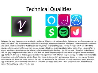
Between the apps there are some similarities and some differences. A main similarity that you can see from my app on the
left is that is that they all follow the conventions of app logos where the are simple and by this I mean they only use shapes
and letter. Another similarity is that they all use very simple color and they use a variety of bright which will attract the
young audience. A main difference from my app compared to these existing products is that on my it has 4 colors of grey,
green, purple and white in the color scheme rather than just having 2 colors. I did this because I thought it looked better
and the grey background makes it easy to read with the white font and purple outline whilst the green border make the
app stand out. If I were to do this again I think I would experiment with different shapes and try and add a york element to
the product instead of just using a letter. To do this I could design the York Minster using shapes or even try and design a
music venue and add some music notes to the app. This would allow the consumer to understand more about what the
app is about and would allow the consumer to know that the app is about York I think this would work more effective
rather than jut having a letter Y in the app.
Aesthetic Qualities
This is the app I created to go with my cinemagraphs it
has 3 pages to it which is the Home page , Explore page
and Win page. The create page is the page you go to
when you open the app. When you click this started this
opens up he camera and allows you to create your own
cinemagraph which then gives you the option to upload
this into the competition and you can win prizes. The
explore page is where you can view the cinemagraphs and
the win page is where you can enter the competition to
win deals around york. I think the Create page looks
aesthetically pleasing as it is very simple. It has a image of
an artist preforming and I have put a white overlay and
turned the opacity of this down as this makes it easier to
read the text
the win page I have included another image of and again put a white overlay in front of the image. I then added the offer
competitions that you can enter by using a font that is bold and easy to read and simple. I then added the brands logo next
to the text so that the consumer will recognize the brand and this will make them interact with the app. Think the page
looks professional with the logos, competition and the buttons but the navigation for the app at the top could have been
improved a this very simple and just simply black and white with a box around the word to let the consumer know what
page they’re on. I think if were to do this again I would change the buttons at the top and add more detail to them so they
don’t just look plain and simple. I would also experiment a bit more with different text and color schemes. I would also add
more pages to the app such as an event list and other features that I could get the audience to interact more with the app.
Audience Appeal
To make my cinemagraph appeal to the audience I have started by using the
background of the cinemagraph as a crowd at a concert. This relates to the
audience because my cinemagraph is promoting a music concert so having this
crowd there lets the consumer know that it relates to music. I have used a
Ariel font for the cinemagraph because the text is big and bold which means it
can easily be read and even easily be read from a distance. I added a red outer
glow to the text because it without it the cinemagraph looked very plain and
the red outer glow made it look more colorful so this will attract my target
audience. audience. I tried to stick to a simple color scheme of black white red
and blue because when I was doing my research I couldn’t find any concert
cinemagraphs so I decided to look at concert posters and base my cinemagraph
of the poster because in a sense they are very similar however a cinemagraph
is just presenting the information slightly different however one of the
conventions is they are mainly black and white so I thought that I would add
this element into my work by choosing to have the background in black and
white. This also allows the consumer to focus on the information about the
concert that is on the cinemagraph. I then had the cinemagraph transition from
one slide to another by a glitching effect. I chose this because as well as it
looking aesthetically pleasing when the consumer is walking past for example
and see this this will catch their opinion and this is another way to make my
product appeal to the audience. I then changed the slide and I changed the
photos so that it looks like the audience is moving about. With the app I made
this reflect to york by showing the cinemagraph on there so the consumer can
see this and know what events are coming up. Another way in which I made my
app appeal to the audience was by having a the win page as you could win
products that young people would use and consume such as the company's like
Peer Feedback 1
What did you like about the product ?
• I enjoyed that the products color scheme worked well together
• I think the logo looks smart and professional.
What would you improve about the product ?
• To improve this product you could add more detail to the logo rather than just
simply have a letter.
• Even though the color scheme works well another improvement would be to try
and have the color scheme of the product to reflect on the consumer.
Peer Feedback 2
What did you like about the product ?
• I like how the layout of the app
• I think you chose a good selection of images to use as the background on the app
and it looks good and works very well.
What would you improve about the product ?
• You could add more to the app because it looks very simple and plain
• Try and reflect the app to York more
Peer Feedback 2
What did you like about the product ?
• The cinemagraph is simple and has all the essential information needed
• The text is easy to read and the timing works well as it doesn’t transition too
quick or too slow
• What would you improve about the product ?
• An improvement you could make would be to make the product more colorful
• Cinemagrpah could have been longer
• Include images of York instead of the concert
Peer Feedback Summary
• What do you agree with from your peer feedback ?
From my peerfeedbak I do agree that first of all my app could reflect York more one
idea that I had in mine for if I do this again was to try and and use a well known york
attraction such as the minster and try and include that with music notes. I also agree
with the feedback I got from my app to make the app more detailed and if I had more
time I would add more pages to the app and again reflect this to York and have a guide
for what people can do and what events are coming up. I also agee that I could have
made my cinemagraoh more colorful and try and use different fonts to make it look
more interesting
• What do you disagree with from your peer feedback ?
From my peer feedback I disagree that with the cinemagraph I should of used images of
york instead of concert images. I disagree with this because the cinemagraph was a
product to promote the concert so therefore it is essential to use these images so that it
releates to the audience and the audience know what the event is.

Evaluation

  • 1.
  • 2.
    Research To begin myresearch I started by brainstorming my ideas that I had for this project. The ideas I had were to create a virtual game going around York which would’ve similar concept to the game Pokémon go. In the end I decided to create a cinemagraph that was based around nightlife in York. I decided to have my cinemagraph based around nightlife because this project was to try and attract a younger audience into York and from my research on the demographics york the average person is aged around 41-43 years old so I thought if I promote nightlife then this will attract my target audience into the town. I then went to look at the demographics for my project and I think this was one of my strengths because as well as looking at secondary research I also carried out my own primary research which helped me as I could find out more accurate information that was exactly right for my project and this would allow me to understand my audience. I did a mood board were I looked at different artists and their tour posters as well as a mood board of york. This helped set the mood for the project and it would help the consumer understand what my project would be like. Even though I couldn't find any concert cinemagraphs I think it would of been worth just looking at ant advertisement cinemagraph and add this into my research, I think that if I did that it would help my knowledge with the project and it would’ve made it a lot better so if I was to do this again I would make sure I look at existing cinemagraphs. Another thing I would d if I were to do this again would be to do some research on apps because I didn’t research apps much as this idea came to me half way through the project so I completely forgot to do research for this because at first I was just going to do a series of cinemagraphs. Doing research for the app would have made my app look a lot more professional.
  • 3.
    Planning Some strengths ofmy planning was that looked into different font styles, I looked at different color schemes and I looked into different products that already exist that relate to the products that I am creating. This was a strength within my work because I evaluated the fonts and colors schemes and explained what fonts would be good and why they would and and what fonts wouldn’t be good and why .This helped me understand better which font to use and why to use it. It helped my understand hat effect it would have on the audience and made me think as well as it looking aesthetically pleasing it made me think will it work effectively with the consumer. I think another strength of my planning is that I looked at existing posters and existing app logos which helped me get a better understanding of the existing products and what I need to do to make my product look professional however to make this even better I could of added more detail into it and explain how it effects the audience. I think to make my work better I could’ve looked and analyzed existing apps and screenshots of the apps to try and help develop my app that I made and this would’ve made my app better because it allows me to look at different products that already exist and understand what can do to make my app look professional and like an existing product.
  • 4.
    Time Management In myopinion my time management was efferent as within the time given I was able to complete the tasks that were set out. I didn't spend too much time on one task If I had more time I would’ve liked to put more detail into my planning document and plan out my phone app and analyze some existing phone apps. If I had more time I would try and develop my app into a working app that users can download and make the app actually work. If I had more time I would of done some more experiments for the app logo and also the app screenshots because then this would make me think about what I can do better for my final product to improve my work and make it as professional as I can.When doing each task for this project I allocated myself time for each projects so that I had a certain amount of time to complete each task and if I had time left over then that allows me to spend more time on the next task. This worked well for me because I could split my time up equally so I knew how much time I had to complete the task so this meant that I didn’t spend too much time on a specific task and then have to to rush the other tasks.
  • 5.
    Technical Qualities Between theapps there are some similarities and some differences. A main similarity that you can see from my app on the left is that is that they all follow the conventions of app logos where the are simple and by this I mean they only use shapes and letter. Another similarity is that they all use very simple color and they use a variety of bright which will attract the young audience. A main difference from my app compared to these existing products is that on my it has 4 colors of grey, green, purple and white in the color scheme rather than just having 2 colors. I did this because I thought it looked better and the grey background makes it easy to read with the white font and purple outline whilst the green border make the app stand out. If I were to do this again I think I would experiment with different shapes and try and add a york element to the product instead of just using a letter. To do this I could design the York Minster using shapes or even try and design a music venue and add some music notes to the app. This would allow the consumer to understand more about what the app is about and would allow the consumer to know that the app is about York I think this would work more effective rather than jut having a letter Y in the app.
  • 6.
    Aesthetic Qualities This isthe app I created to go with my cinemagraphs it has 3 pages to it which is the Home page , Explore page and Win page. The create page is the page you go to when you open the app. When you click this started this opens up he camera and allows you to create your own cinemagraph which then gives you the option to upload this into the competition and you can win prizes. The explore page is where you can view the cinemagraphs and the win page is where you can enter the competition to win deals around york. I think the Create page looks aesthetically pleasing as it is very simple. It has a image of an artist preforming and I have put a white overlay and turned the opacity of this down as this makes it easier to read the text the win page I have included another image of and again put a white overlay in front of the image. I then added the offer competitions that you can enter by using a font that is bold and easy to read and simple. I then added the brands logo next to the text so that the consumer will recognize the brand and this will make them interact with the app. Think the page looks professional with the logos, competition and the buttons but the navigation for the app at the top could have been improved a this very simple and just simply black and white with a box around the word to let the consumer know what page they’re on. I think if were to do this again I would change the buttons at the top and add more detail to them so they don’t just look plain and simple. I would also experiment a bit more with different text and color schemes. I would also add more pages to the app such as an event list and other features that I could get the audience to interact more with the app.
  • 7.
    Audience Appeal To makemy cinemagraph appeal to the audience I have started by using the background of the cinemagraph as a crowd at a concert. This relates to the audience because my cinemagraph is promoting a music concert so having this crowd there lets the consumer know that it relates to music. I have used a Ariel font for the cinemagraph because the text is big and bold which means it can easily be read and even easily be read from a distance. I added a red outer glow to the text because it without it the cinemagraph looked very plain and the red outer glow made it look more colorful so this will attract my target audience. audience. I tried to stick to a simple color scheme of black white red and blue because when I was doing my research I couldn’t find any concert cinemagraphs so I decided to look at concert posters and base my cinemagraph of the poster because in a sense they are very similar however a cinemagraph is just presenting the information slightly different however one of the conventions is they are mainly black and white so I thought that I would add this element into my work by choosing to have the background in black and white. This also allows the consumer to focus on the information about the concert that is on the cinemagraph. I then had the cinemagraph transition from one slide to another by a glitching effect. I chose this because as well as it looking aesthetically pleasing when the consumer is walking past for example and see this this will catch their opinion and this is another way to make my product appeal to the audience. I then changed the slide and I changed the photos so that it looks like the audience is moving about. With the app I made this reflect to york by showing the cinemagraph on there so the consumer can see this and know what events are coming up. Another way in which I made my app appeal to the audience was by having a the win page as you could win products that young people would use and consume such as the company's like
  • 8.
    Peer Feedback 1 Whatdid you like about the product ? • I enjoyed that the products color scheme worked well together • I think the logo looks smart and professional. What would you improve about the product ? • To improve this product you could add more detail to the logo rather than just simply have a letter. • Even though the color scheme works well another improvement would be to try and have the color scheme of the product to reflect on the consumer.
  • 9.
    Peer Feedback 2 Whatdid you like about the product ? • I like how the layout of the app • I think you chose a good selection of images to use as the background on the app and it looks good and works very well. What would you improve about the product ? • You could add more to the app because it looks very simple and plain • Try and reflect the app to York more
  • 10.
    Peer Feedback 2 Whatdid you like about the product ? • The cinemagraph is simple and has all the essential information needed • The text is easy to read and the timing works well as it doesn’t transition too quick or too slow • What would you improve about the product ? • An improvement you could make would be to make the product more colorful • Cinemagrpah could have been longer • Include images of York instead of the concert
  • 11.
    Peer Feedback Summary •What do you agree with from your peer feedback ? From my peerfeedbak I do agree that first of all my app could reflect York more one idea that I had in mine for if I do this again was to try and and use a well known york attraction such as the minster and try and include that with music notes. I also agree with the feedback I got from my app to make the app more detailed and if I had more time I would add more pages to the app and again reflect this to York and have a guide for what people can do and what events are coming up. I also agee that I could have made my cinemagraoh more colorful and try and use different fonts to make it look more interesting • What do you disagree with from your peer feedback ? From my peer feedback I disagree that with the cinemagraph I should of used images of york instead of concert images. I disagree with this because the cinemagraph was a product to promote the concert so therefore it is essential to use these images so that it releates to the audience and the audience know what the event is.