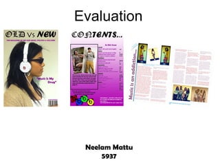
2. Why I chose To do a hip-hop and rap music magazine?...
I chose to do hip hop & rap genre because it is
the genre I am most interested in. I like the
controversy that hip hop and rap cause in the
music industry. Hip hop and rap music is the
music genre I am most passionate about and I
knew while creating the magazine I would put
in all of my effort. This magazine will appeal to
all the people I know, so knowing this I realised
that the hip hop& rap industry has a wide
audience so this would help make the
magazine work well.
In the magazine I chose to use a
female artist in the article I did so
because I think that female I chose to name my magazine “OldVsNew” this was
rappers need to be given more because I personally like the old school hip hop in
publicity and if the magazine comparison to the current hip hop music. Also in my
went into production I would use magazine I had a mix of the two so that the magazine
more female rappers. appeals to all readers. I included charts, artist
information and the name of my magazine would also
appeal to different readers.
3. 1.In what ways does your media product use, develop or challenge forms
and conventions of real media products?
Masthead
Sell line
Image
Cover Line
Lots of space
Barcode, Date and
Price
The source magazine cover was the inspiration for my magazine. Both the magazines have similar top heavy mastheads,
this helps show that the magazine is important and has some establishment. My magazine follows the dame conventions
of this source magazine as there is one central image that is used to attract all the audiences to the magazine. The basic
product information is on the magazine such as the barcode, date and price this will make the audience feel informed. The
sell line I have used is to make the audience feel like they are buying the best hip hop/rap music magazine out there by
including what the magazine is all about in it. Using only one cover line is risky but the issue is a feature issue so is aimed
at a target fan base, this can help bring people out of the target audience barrier to the magazine feature. This also make
the issue feel like it is exclusive, this will get the attention of the 16-22 year old target audiences.
4. Title (Contents)
Mini Article with
images
Subheadings
Simple Page
numbering
Subscription
information
The masthead on my magazine is a house style continuation from the cover page, this is because I feel that the
font co notates that the name of the magazine with the “OldVsNew.” The main image on the contents page is
similar to the XXL contents page, this is because in my magazine I use two fashion inspired images to write s small
article for that will continue on the page that is specified, I think that this helps to keep the audience interested and
also to add something unique to the page. The simple page numbering is a a typical convention of a real music
magazine. The subscription I have added to my music magazine is also a convention of a real music magazine
although not used in the above XXL magazine. I grouped the pages under subheading this is so that the reader
finds it easier to navigate around the page.
5. Images of
the artist I think that my double page spread is quite
similar to this Vogue magazine spread, even
though my genre is hip hop. The female
rapper I have in my double page spread is
posing in similar ways to the artist in the
Vogue magazine this makes my magazine
look very real. The 3 columns text I used also
follows the conventions of a real magazine,
and similarly to this Vogue spread I have one
page which has less text on it. I used images
that represent the artist in a good light and
relate to the article itself.
Picture caption
Attractive
Title
Byline
Picture credits
Text columns
6. 2.How does your media product represent
particular social groups?
The type of social group that the reader falls into is the
rebellious, outlaw and hip-hop category who express
themselves by the clothes they wear and how they act. To
represent this type of reader I used a mini article on the
contents page about fashion that will attract to that target
audience. I also advertise the headphones that the artist
featured on the cover is wearing, this is to entice the reader,
the reader as they will want to be like the artist featured in the
magazine.
Although I have tried to represent people of all ethnic I have used bright
backgrounds in my magazine the target audience reader for colours to represent
a hip hop magazine are those who are mainly from an the youth, which is
African/Caribbean decent this is because these are the areas the type of audience
where rap/ hip-hop music originates from. To make my who will want to
magazine appeal to the target audience to listen to the genre read my magazine.
of music I used people of similar descents to model for my
magazine cover. To ensure that I appeal to other audiences
too I used people of different descents on my contents page
and in the double page spread.
7. My magazine genre (hip-hop/rap) is typically
aimed at male readers. To overcome being
biased to one gender I featured a female artist
in the article and front cover. This represented
the female gender in my magazine. This helps
represent my magazine in a positive light as I
am appealing to a wide range of audiences.
I think my magazine represents people that
listen to the hip hop genre as the model on
the cover is wearing sunglasses which is
deemed as a ‘cool’ part of your image, this
also represents the type of people who listen
to hip hop. My cover represents people of
the listeners social group in a positive way
as there is nothing immoral or frowned upon.
My magazine also represents younger
people, I have done this by having an artist
who is 24 years old, this is not the typical
age of a successful rapper but would be
more appealing to the target audience as
they are of a similar age.
8. 3. What kind of media institution might distribute your
media product and why? Bauer Media Group has
many radio stations and
if they have a hip hop
magazine in publication
that is successful they
may decide to run a hip-
hop/ rap based radio
station which will
encourage more listeners
to buy the magazine.
Bauer Media Group
Bauer media group are an ideal distributer for my magazine as they have over 19 million person
customer base, although the media group do not currently have a hip hop genre magazine in
publication I believe Bauer media group are very capable of taking my magazine under their
wings for distribution.
Bauer media group currently publish magazines such as ‘Q’, ‘Kerrang’ and ‘Smash Hits,’ adding
a different genre to this media group will increase the customers who buy a Bauer media product.
This will be done as they have a circulation for selling over 35 million copies a week
internationally in 15 different countries.
My magazine is aimed at young adults and late teenagers, Bauer media group have a similar
customer base already so my magazine would also appeal to them.
For in-depth information on Bauer media and its http://www.bauermedia.co.uk
publications please follow the Link .
9. IPC media would be an ideal media institute to distribute my
magazine as they are the UK’s leading consumer magazine
and digital publishers. They sell over 350 million copies a
year, a institute as such would be perfect to use as they have
1 in three women a huge customer base to appeal to. Although currently they
and over 45% of do not publish any hip hop magazines they do have ‘NME’
UK’s men read an which has a ‘Britpop’ audience thus having my magazine
IPC media product,
that is over 27
would broaden IPC media followers. Also having a hip hop
million of the magazine would not interfere with the magazines they
population. already publish.
I have chosen to use IPC media to publish my magazine as I believe it is one of the more
established media institutes in the UK that would be able to take on a magazine such as mine.
IPC media has a lot of partnerships with supermarkets, this will ensure my magazine is well
marketed and can reach all of my target audience readers.
For in-depth information on IPC media and its
publications please follow the Link below.
http://www.ipcmedia.com
10. 4.Who would the audience be for your media product?
Age: 16-22
Social Group: C1 Manual Workers
My magazine targets the aspirers category in psychographic profiling,
these are people who want to be like the people included in the
magazine in this case like the artist featured in the magazine.
The target reader is interested in music news and varied artists from older times and in the
current news. In my research I found that the target audience like to read about different artists
not everyone picked one artist, the results proved that each reader liked different artists. I also
found that the target reader is someone who likes to read the charts and see which artists are in
concert at the moment.
The target audience will want to read my magazine as it features all the artists that people like
to listen to, I know this from my audience research. My magazine also features all that a good
hip-hop magazine should feature such as Charts, concerts, artist information, fashion and much
more.
HOWEVER: My magazine can The audience I
The reader likes to aimed for was one
go to concerts or appeal to a wide range of readers
out of the age or social class I that enjoy reading
underground gigs about the stories of
that artists they like have tried to target, There is
nothing on my cover, contents or the artists they listen
perform. They are to in my magazine I
rebellious and live article that restricts others from
reading them, this is a good way have included the
life according to success story of a
their music. to appeal to a wider audience and
gain a larger readership. ‘rap’ artist.
11. Links to the type of music, tv shows and films my target audience
would watch…
Tv Shows – Nick Cannons Wild n Out Films – Get Rich Or Die Trying
http://www.youtube.com/watch?v=U10H5ypZoLg http://www.youtube.com/watch?v=lrLEvrKywxY
Tv Shows – The Money And The Power Films – A Bronx Tale
http://www.youtube.com/watch?v=pZqdxYu0ZTI http://www.youtube.com/watch?v=1bkIqZfviXU
Music Videos – Nicki Minaj – Superbass
http://www.youtube.com/watch?v=4JipHEz53sU
Music Videos – Nicki Minaj – Superbass Music Videos – Nicki Minaj – Superbass
http://www.youtube.com/watch?v=P3oBZ4_TNys http://www.youtube.com/watch?v=vfhVbEaMQEg
12. 5. How did you attract/address your audience?
I used an current artist that The title of my magazine
my target audience will be “OldVsNew” attracts my
fans of target audience, this is
because during my
audience research I found
that the audience like to
read about old hip hop
news just as much as
current news.
To appeal to my target
audience I chose to shoot
the artist in headphones
that I knew would attract the
attention of the target
audience. Using a particular My target audience reader is one that
type of style on the cover is quite outspoken and rebellious,
model makes the magazine having this in mind using a cover line
fit into the genre of hip hop such as “Music Is My Drug” would
and catch the attention of catch the readers eye. The type of
the target audience. stories that feature in a magazine
affect the readers decision of actually
buying the magazine.
The person on the cover is
female, although this will
attract a lot of female To appeal to my target audience I chose to
readers I think that this will keep the cover very bare and minimal. This
also attract the males too. has worked in previous magazine I looked at
such as ‘The Source’.
13. I chose to use the images of
a male and a female in and To appeal to my target
commercial fashion style, I audience I used the same
did this so that I could have house style colour of purple
an article that would fit into but also have other colours
the magazine genre of hip on the cover to make it look
hop. interesting
The contents page is
I edited the images to look organised so I think that this
professional and edgy I will attract my target
think that this will attract the audience as they will have
audience too. no problems navigating
through my magazine
I have got a subscription I used a coloured
option at the bottom of the background on this page of
page, I think this will entice my magazine to make it
readers and may even look different to the cover,
make them subscribe to the this will make the magazine
magazine look more interesting
During my audience
research I found that my
audience wanted a balance
of both text and images so I
tried to have this in the
contents.
14. I chose to use images that I have put the picture To appeal to my target
were of the artist in a group credits on the corner of the audience I used two
of friends, I did this because page like a flash, this different colours on the text
my target audience regard makes it noticeable. to make it look more
friends as family so this will interesting.
attract them to the
magazine too.
An article that tells the I used a by-line to
reader about the artists introduce the article I
lifestyle and ambitions also think this will attract
includes what the artist is the readers.
releasing next.
I added a bold coloured title
for the article on the left
hand side of the first page, I chose to shoot the image
this will grab the readers on a plain background I
attention. think that this ties in with the
I edited the images to look
professional and edgy I cover and makes the reader
think that this will attract the feel a sense of house style
audience too. to the article.
15. What do you think of my front cover?
Excellent
Good
Bad
16. What did you think of my contents page?
Excellent
Good
Bad
17. What did you think of my double page spread/article?
Excellent
Good
Bad
18. 6. What have you learnt about technologies from the
process of constructing this product?
During the process of making my magazine for this main task I used a
few different technologies. I used Photoshop CS3 for my front cover
and also for my contents page. I used the program Adobe InDesign CS3
for my double page spread. I also used macromedia Fireworks for the
making of a logo.
19. The first thing I had to do was to place and edit my main image for the front cover.
So I had to open the file by
selecting file and place
I then selected the image
and began to edit it using
the tools.
20. I then had to add my masthead into the front cover.
So I had I selected the ‘T’ I then changed the fonts
button and wrote out my size and styles until I was
title happy
21. I then wanted to add a barcode
I wanted the barcode to be just the lines of black not a pure
image so I used the cut tool to take out any white to make it
transparent
22. Also In Photoshop I learnt how to play around with layers.
Linked Layers Moving the order of the
layers
23. For the cover I had to modify the headphones that the model was wearing as I could not get hold
of the ones I wanted.
To do this I used I made a circle and a rectangle
macromedia fireworks to and added them to the already
I used the circle tool to
make the logo from the bigger circles cut off any excess
create a circle with a black
headphones I wanted to and I had my logo I changed the
outline
use so that I could add it to colours to match as I went
the image I had. along.
24. The first thing I had to do was to get the double page up so that I
could start work on it.
So I had to open the file and
select 4 pages so that there
will be a double page for me
to work on.
25. I then had to add my title to double page spread I then changed the fonts
size and styles until I was
So I had I selected the ‘T’ happy, I also flipped it 90
button and wrote out my degrees so that it was on its
title side.
26. I then wanted to add the text I had already written out in word
To run over the text into the I selected the ‘t’ button
next page I used the box again and then pasted the
sign and clicked the text text into it.
onto the next page
27. I wanted to create a blue line to separate the title from the article.
So I had I selected the Line I then altered the
tool size/weight and colour of
the line till I was happy.
28. I wanted to add extra columns to the text
I selected number of
columns I needed and then
changed it on the page.
29. 7. Looking back at your preliminary task, what do you
feel you have learnt in the progression from it to the full
product?
Looking back at my preliminary task I can see that I
chose a completely different style this time. I feel that
I edited the image better in my main task than in the
preliminary task. As I have previously mentioned I
had to edit the headphones so they looked like a
brand of headphones which I couldn’t access at the
time, and I think that because I have edited the image
adding that logo and also the sunglasses it looks
better.
I also feel that my coverline on my music magazine
fits well around the image and looks more effective
than having it overriding the image.
On my preliminary task I think that I could have set the page out better although I used the ‘Magic C’ magazine
convention I think that the barcode looks too big and out of place in comparison to my main task product where the
barcode fits onto the page well.
I also believe that having a white background on my preliminary magazine made the page look boring and plain, and
from this i decided to use the background from the actual image.
30. Looking back at my preliminary task I
ensured that my images were taken in better
location so that I wouldn’t have to edit them
too much, the reason for this was because I
felt that on the preliminary contents page the
image was not edited well.
I think that my main task contents page is
much more realistic in comparison to the
previous one. I think that its organised well,
and the numbering, font and sizes are legible
and look great.
I also think that the preliminary task contents page is very bare even though there is a lot going on within the page. This
is the main reason for having a coloured background on the second contents page. I also added an advertisement to the
contents page so that it looked more professional and realistic, having it also link to the front cover (headphones that the
artist is wearing).
I think that having a masthead that has the same font style as the cover makes the magazine tie together, on my
preliminary task both the cover and contents page had different mastheads, this make the magazine not look realistic.
31. For the main task I made a front cover, contents page and a double page spread, in the preliminary task I
did not make a double page spread. In making the double page spread I have enhanced my skills by using
a different program called Adobe InDesign CS3. I was able to complete the double page spread using the
all of the skills I had gained from the preliminary task. I edited images, wrote text, positioned and sized
the text, added captions and also used different tools.