The document provides an evaluation of a preliminary task to design the cover and contents page of a college magazine.
The student summarizes how their design utilized conventions of real magazines, including using a masthead, cover lines, and prominent central image on the cover. For the contents page, they discuss using columns, subheadings and images but notes areas for improvement.
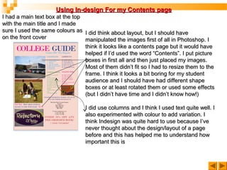
The student also reflects on learning about using software like Photoshop, InDesign and digital photography skills through this project. They recognize the importance of layout, image editing and design for effectively communicating information to readers.

![In what ways does your media product use, develop or challenge forms
and conventions of real media products?
THE FRONT COVER-SIMILARITIES
Masthead
Cover Lines
Dominant
Image [rule of
thirds] &
Plain
background
Block
separators
Barcode/
price/website](https://image.slidesharecdn.com/preliminaryevaluationexampleppt-121010043203-phpapp02/85/Preliminary-evaluation-example_ppt-2-320.jpg)