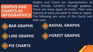
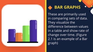
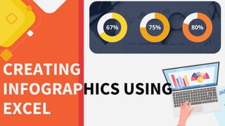
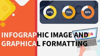
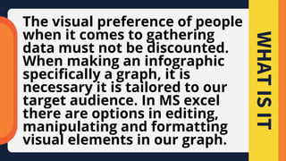
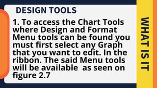
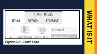
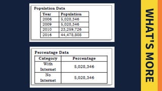
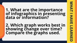
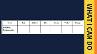
This document discusses how to create infographics using Microsoft Excel to better present information visually. It defines infographics as combining information and graphics to engage viewers and make understanding easier. The document provides instructions on making different graph types like bar graphs, line graphs and pie charts in Excel using sample sales data. It also covers formatting graph elements through options like changing styles. Activities at the end instruct the reader to create line graphs and pie charts from population data and do a color preference survey graph.


![LESSON 4.2-APPLIED PRODUCTIVITY TOOL (SLIDES) [Autosaved].pptx](https://cdn.slidesharecdn.com/ss_thumbnails/lesson4-240914022457-3f8d5026-thumbnail.jpg?width=640&height=640&fit=bounds)


![Etech. mitch. [autosaved]](https://cdn.slidesharecdn.com/ss_thumbnails/etech-190128010709-thumbnail.jpg?width=640&height=640&fit=bounds)
![[EMPOWERMENT TECHNOLOGIES]-ADVANCED PRESENTATION SKILLS](https://cdn.slidesharecdn.com/ss_thumbnails/et-advancedpresentationskills-211128024220-thumbnail.jpg?width=640&height=640&fit=bounds)


![[EMPOWERMENT TECHNOLOGIES] - ADVANCED WORD PROCESSING SKILLS](https://cdn.slidesharecdn.com/ss_thumbnails/lesson3-advancedwordprocessingskills2-211128024207-thumbnail.jpg?width=640&height=640&fit=bounds)