Download to read offline


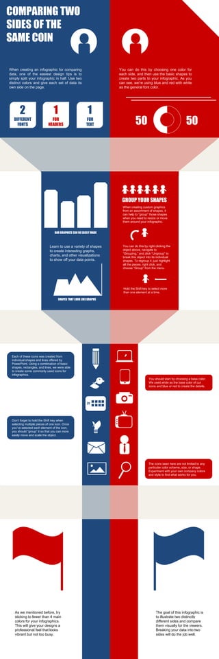
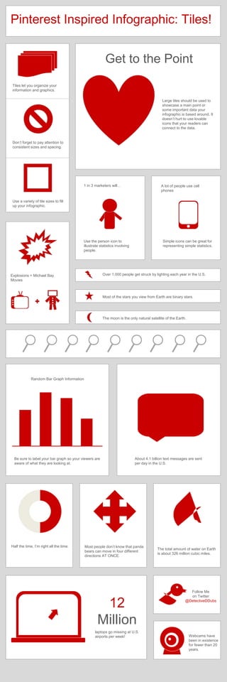


This document provides instructions for creating infographics in PowerPoint. It discusses using templates that include six fully customizable templates for building infographics in PowerPoint. It then covers essential tools for customizing the templates, including using color schemes, fonts, shapes, themes, and other design elements. The document provides numerous examples and tips for incorporating text, images, charts and graphs to present information in an engaging visual format using the basic tools in PowerPoint.


