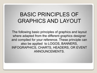
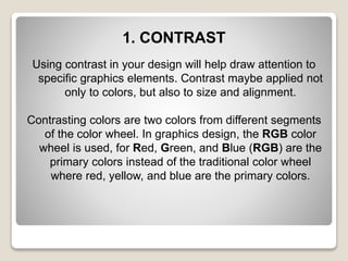
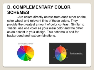
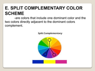
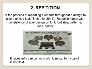
BASIC PRINCIPLES OF
GRAPHICS AND LAY OUT
VANESSA L. A.
KATLYN B. R.
MA. ELISA ANGELIKA S. M.
CHESTER LEE P. J.
BASIC PRINCIPLES OF
GRAPHICS AND LAYOUT
The following basic principles of graphics and layout
where adapted from the different graphics designer
and compiled for your reference. These principle can
also be applied to LOGOS, BANNERS,
INFOGRAPHICS, CHARTS, HEADERS, OR EVENT
ANNOUNCEMENTS.
1. CONTRAST
Using contrast in your design will help draw attention to
specific graphics elements. Contrast maybe applied not
only to colors, but also to size and alignment.
Contrasting colors are two colors from different segments
of the color wheel. In graphics design, the RGB color
wheel is used, for Red, Green, and Blue (RGB) are the
primary colors instead of the traditional color wheel
where red, yellow, and blue are the primary colors.
In graphic design, colors do not need to be on
opposite segments (Bear, 3.H., 2014) Take a look at
the examples below.
HELLOHELLO HELLOHELLO
<1> <2> <3> <4>
Examples 1 and 2 made used of two clashing colors
that when combined can be hurting to eyes, while
examples 3 and 4 made used of contrasting colors
that are just pleasing to the eyes. So, when choosing
the right color for your graphic design, use the
following color scheme that work together depending
on what your graphic needs. ( Cartwright, B.,2015)
A. Analogous Color Scheme
-Are formed by paring one main color with the
two colors directly next to it on the color wheel. Cartwright(2015
personally uses a this scheme
when designing images rather than info graphics
or bar charts.
B. MONOCHROMATIC COLOR
SCHEMES
-are colors with various shades and tints of one
hue in the color wheel.
C. TRIADIC COLOR SCHEME
-are colors that are equally placed in lines around
the color wheel. This scheme is great if you want contrast
but its over powering. To reduce it, use one as your
prevailing color and the other sin moderation. This scheme
is great in charts.
D. COMPLEMENTARY COLOR
SCHEMES
- Are colors directly across from each other on the
color wheel and relevant tints of those colors. They
provide the greatest amount of color contrast. Similar to
Triadic, use one color as your main color and the other
as an accent in your design. This scheme is bad for
background and text combinations.
E. SPLIT COMPLEMENTARY COLOR
SCHEME
-are colors that include one dominant color and the
two colors directly adjacent to the dominant colors
complement.
2. REPITITION
Is the process of repeating elements throughout a design to
give a unified look (Smith, M.,2014). Repetition goes with
consistency of your design on font, font size, patterns,
lines, colors.
It repeatedly use call outs with identical font size of
inside text.
3. PROXIMITY
Calls for related items to be grouped visually, creating less
clutter and making for a more organized layout ( Lazaris,
L.,2010) to implement proximity in your design, do the
following.
A. When there are several elements, add white space. The
image on the left is more visually appealing than the one on
the right. Write space can also mean empty space.
B. Related Items should be placed near to each other.
The text box on the left has related elements that were
not grouped together. The elements of the text box on the
right were put in one place which make it more pleasing.
117 Rizal Ave. Centro Cabagan, Isabela
i_Franz Internet Shop
117 Rizal Ave. Centro
Cabagan, Isabela

Basic Principles Of Graphics and Layout

  • 1.
    BASIC PRINCIPLES OF GRAPHICSAND LAY OUT VANESSA L. A. KATLYN B. R. MA. ELISA ANGELIKA S. M. CHESTER LEE P. J.
  • 2.
    BASIC PRINCIPLES OF GRAPHICSAND LAYOUT The following basic principles of graphics and layout where adapted from the different graphics designer and compiled for your reference. These principle can also be applied to LOGOS, BANNERS, INFOGRAPHICS, CHARTS, HEADERS, OR EVENT ANNOUNCEMENTS.
  • 3.
    1. CONTRAST Using contrastin your design will help draw attention to specific graphics elements. Contrast maybe applied not only to colors, but also to size and alignment. Contrasting colors are two colors from different segments of the color wheel. In graphics design, the RGB color wheel is used, for Red, Green, and Blue (RGB) are the primary colors instead of the traditional color wheel where red, yellow, and blue are the primary colors.
  • 4.
    In graphic design,colors do not need to be on opposite segments (Bear, 3.H., 2014) Take a look at the examples below. HELLOHELLO HELLOHELLO <1> <2> <3> <4> Examples 1 and 2 made used of two clashing colors that when combined can be hurting to eyes, while examples 3 and 4 made used of contrasting colors that are just pleasing to the eyes. So, when choosing the right color for your graphic design, use the following color scheme that work together depending on what your graphic needs. ( Cartwright, B.,2015)
  • 5.
    A. Analogous ColorScheme -Are formed by paring one main color with the two colors directly next to it on the color wheel. Cartwright(2015 personally uses a this scheme when designing images rather than info graphics or bar charts.
  • 6.
    B. MONOCHROMATIC COLOR SCHEMES -arecolors with various shades and tints of one hue in the color wheel.
  • 7.
    C. TRIADIC COLORSCHEME -are colors that are equally placed in lines around the color wheel. This scheme is great if you want contrast but its over powering. To reduce it, use one as your prevailing color and the other sin moderation. This scheme is great in charts.
  • 8.
    D. COMPLEMENTARY COLOR SCHEMES -Are colors directly across from each other on the color wheel and relevant tints of those colors. They provide the greatest amount of color contrast. Similar to Triadic, use one color as your main color and the other as an accent in your design. This scheme is bad for background and text combinations.
  • 9.
    E. SPLIT COMPLEMENTARYCOLOR SCHEME -are colors that include one dominant color and the two colors directly adjacent to the dominant colors complement.
  • 10.
    2. REPITITION Is theprocess of repeating elements throughout a design to give a unified look (Smith, M.,2014). Repetition goes with consistency of your design on font, font size, patterns, lines, colors. It repeatedly use call outs with identical font size of inside text.
  • 11.
    3. PROXIMITY Calls forrelated items to be grouped visually, creating less clutter and making for a more organized layout ( Lazaris, L.,2010) to implement proximity in your design, do the following.
  • 12.
    A. When thereare several elements, add white space. The image on the left is more visually appealing than the one on the right. Write space can also mean empty space.
  • 13.
    B. Related Itemsshould be placed near to each other. The text box on the left has related elements that were not grouped together. The elements of the text box on the right were put in one place which make it more pleasing. 117 Rizal Ave. Centro Cabagan, Isabela i_Franz Internet Shop i_Franz Internet Shop 117 Rizal Ave. Centro Cabagan, Isabela