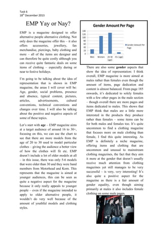
Task 6
18th December 2013

EMP Yay or Nay?
EMP is a magazine designed to offer
alternative people alternative clothing. Not
only does the magazine offer this – it also
offers
accessories,
jewellery,
fan
merchandise, piercings, baby clothing and
more – all of the items are designer and
can therefore be quite costly although you
can receive quite fantastic deals on some
items of clothing – especially during or
near to festive holidays.
I’m going to be talking about the idea of
representation that is shown in EMP
magazine, the areas I will cover will be:
Age, gender, social problems, presence
and absence, typical content, pictures,
articles,
advertisements,
cultural
conventions, technical conventions and
changes over time. I will also be talking
about the positive and negative aspects of
some of these topics.
Let’s start with age – EMP magazine aims
at a target audience of around 16 to 30+,
focusing on this, we can use the chart to
see that there are more models from the
age of 20 to 30 used to model particular
clothes – giving the audience a better view
of how the clothes will fit etc. EMP
doesn’t include a lot of older models at all
– in this issue, there was only 5-6 models
that were older than 30 and they were band
members from Motorhead and Korn. This
represents that the magazine is aimed at
younger audiences, this can be seen as
quite a negative aspect for the magazine
because it only really appeals to younger
people – even if the magazine intended to
apply to older alternative people, it
wouldn’t do very well because of the
amount of youthful models and clothing
styles.

There are also some gender aspects that
show the idea of representation: I think
overall, EMP magazine is more aimed at
males rather than females even though the
amount of items, page dedication and
content is almost balanced. From page 185
onwards, it’s dedicated to solely females
with a few other pages in the male section
– though overall there are more pages and
items dedicated to males. This shows that
EMP think that males are a little more
interested in the products they produce
rather than females – some items can be
for both males and females too. It’s quite
uncommon to find a clothing magazine
that focuses more on male clothing than
female, I find this quite interesting. As
EMP is definitely a niche magazine,
offering items and clothing that are
uncommon and unusual to mainstream
clothing magazines, the fact that they aim
it more at the gender that doesn’t usually
receive much attention from clothing
magazines yet still manages to be very
successful – is very, very interesting! It’s
also quite a positive aspect for the
magazine as there is a fair amount of
gender equality, even though aiming
primarily at males it also includes female
clothing on some male pages.
Task 6
18th December 2013

There are not many social problems
within EMP, but there are a few, such as:
there is a fair amount of swearing and
crude language on some of the items, the
clothes are quite dark and unique
compared to mainstream clothing and
some people wouldn’t entirely agree with
it, there are some rather revealing posters
and images of females and males that
would cause concern if younger audiences
were to see them and there are also some
quite horrific images and content on the
clothing that could potentially harm a very
young child’s mental state – it would scare
them.

We can see this in the graph – this also
shows the gender ratio more clearly. This
chart also shows that there are 11 more
pages dedicated to males than to females,
this also proves my point about the
magazine applying more to males, and it
also proves that this niche magazine is
different and unique to a lot of other
magazines.
This information can tell us a lot about
EMP Magazine: it applies to younger
audiences and both genders.

When looking at the presence and
absence of certain groups in EMP, there is
quite a large absence of elderly people –
the oldest person that was in this issue was
around 40+ and he was a band member
and not an actual model, there is a much
larger amount of younger models used
from the ages of around 18+.
(1 page = double spread)

The typical content that usually goes in to
EMP magazines consists of: items of
clothing, both male and female, mixed
gender accessories, posters, interviews
with bands (a different band each copy),
band albums both new and old and mixed
gendered jewellery. This is quite a positive
aspect for the magazine as it doesn’t just
make the newest items available but uses
the older items too – if you’ve been a fan
of a particular band for a long time and
you prefer older items, they’ll be pretty
much guaranteed to be in there which
means it will still appeal to older fans.
The pictures in EMP are in full HD, they
are clear and if the writing on a particular
image is too small to read, the writing size
is enhanced and made visible. The images
are equally spaced and large enough to
Task 6
18th December 2013

see/read with extra space for writing – the
images are also in a particular layout,
although it changes depending on what is
included on the page.
There is only 2 articles throughout the
whole magazine, one at the beginning: an
introductory article that explains what is
going to be in the magazine and what to
expect, there is also another article around
the middle of which is an interview
conducted with a particular band – the
band changes every time depending on
new albums.
There are not many advertisements
throughout, the only ones I could find
were ad’s that advertised EMP’s own
website and app for smart phones and
tablets. The other things it advertises is
new albums and CD’s and posters – these
include images of Korn and Motorhead.
This could symbolise that they are not in
partnership with other companies.
When looking at the cultural conventions
in EMP, the more gothic, horror designs
could be misunderstood by different
groups of people, for example: people
from different countries such as, Africa,
Germany, Spain – they might not even
know what ‘gothic’ is, also people from
different religious groups – they might see
some of the more disturbing images and
relate them with the devil – a lot of designs
include fire and curses that some groups
may disagree with. This can be quite
negative for the magazine, at first glance,
the front page of the magazine can be seen
as quite demonic and scary unless you
understand or know what it symbolises –
which is the new album for Motorhead in
this case; this can’t really be changed
however, EMP is a niche magazine and it

only applies to the fans that get what they
want from it.
When
looking
at
the
technical
conventions of EMP magazine, the
magazine is usually thick – around 200+
A4 pages long, each page packed with new
designs and old designs, there are some
smaller A5 magazines released during the
year with sale items etc. At first glance,
there is a lot more pictures than text –
when looking closer, the ratio of pictures
to text is around 1:1, with every image
there is writing accompanying it. Other
than the advertisements I’ve previously
talked about, there are no more.
-

Abygail Jones, 10/12/15

Emp yay or nay article

  • 1.
    Task 6 18th December2013 EMP Yay or Nay? EMP is a magazine designed to offer alternative people alternative clothing. Not only does the magazine offer this – it also offers accessories, jewellery, fan merchandise, piercings, baby clothing and more – all of the items are designer and can therefore be quite costly although you can receive quite fantastic deals on some items of clothing – especially during or near to festive holidays. I’m going to be talking about the idea of representation that is shown in EMP magazine, the areas I will cover will be: Age, gender, social problems, presence and absence, typical content, pictures, articles, advertisements, cultural conventions, technical conventions and changes over time. I will also be talking about the positive and negative aspects of some of these topics. Let’s start with age – EMP magazine aims at a target audience of around 16 to 30+, focusing on this, we can use the chart to see that there are more models from the age of 20 to 30 used to model particular clothes – giving the audience a better view of how the clothes will fit etc. EMP doesn’t include a lot of older models at all – in this issue, there was only 5-6 models that were older than 30 and they were band members from Motorhead and Korn. This represents that the magazine is aimed at younger audiences, this can be seen as quite a negative aspect for the magazine because it only really appeals to younger people – even if the magazine intended to apply to older alternative people, it wouldn’t do very well because of the amount of youthful models and clothing styles. There are also some gender aspects that show the idea of representation: I think overall, EMP magazine is more aimed at males rather than females even though the amount of items, page dedication and content is almost balanced. From page 185 onwards, it’s dedicated to solely females with a few other pages in the male section – though overall there are more pages and items dedicated to males. This shows that EMP think that males are a little more interested in the products they produce rather than females – some items can be for both males and females too. It’s quite uncommon to find a clothing magazine that focuses more on male clothing than female, I find this quite interesting. As EMP is definitely a niche magazine, offering items and clothing that are uncommon and unusual to mainstream clothing magazines, the fact that they aim it more at the gender that doesn’t usually receive much attention from clothing magazines yet still manages to be very successful – is very, very interesting! It’s also quite a positive aspect for the magazine as there is a fair amount of gender equality, even though aiming primarily at males it also includes female clothing on some male pages.
  • 2.
    Task 6 18th December2013 There are not many social problems within EMP, but there are a few, such as: there is a fair amount of swearing and crude language on some of the items, the clothes are quite dark and unique compared to mainstream clothing and some people wouldn’t entirely agree with it, there are some rather revealing posters and images of females and males that would cause concern if younger audiences were to see them and there are also some quite horrific images and content on the clothing that could potentially harm a very young child’s mental state – it would scare them. We can see this in the graph – this also shows the gender ratio more clearly. This chart also shows that there are 11 more pages dedicated to males than to females, this also proves my point about the magazine applying more to males, and it also proves that this niche magazine is different and unique to a lot of other magazines. This information can tell us a lot about EMP Magazine: it applies to younger audiences and both genders. When looking at the presence and absence of certain groups in EMP, there is quite a large absence of elderly people – the oldest person that was in this issue was around 40+ and he was a band member and not an actual model, there is a much larger amount of younger models used from the ages of around 18+. (1 page = double spread) The typical content that usually goes in to EMP magazines consists of: items of clothing, both male and female, mixed gender accessories, posters, interviews with bands (a different band each copy), band albums both new and old and mixed gendered jewellery. This is quite a positive aspect for the magazine as it doesn’t just make the newest items available but uses the older items too – if you’ve been a fan of a particular band for a long time and you prefer older items, they’ll be pretty much guaranteed to be in there which means it will still appeal to older fans. The pictures in EMP are in full HD, they are clear and if the writing on a particular image is too small to read, the writing size is enhanced and made visible. The images are equally spaced and large enough to
  • 3.
    Task 6 18th December2013 see/read with extra space for writing – the images are also in a particular layout, although it changes depending on what is included on the page. There is only 2 articles throughout the whole magazine, one at the beginning: an introductory article that explains what is going to be in the magazine and what to expect, there is also another article around the middle of which is an interview conducted with a particular band – the band changes every time depending on new albums. There are not many advertisements throughout, the only ones I could find were ad’s that advertised EMP’s own website and app for smart phones and tablets. The other things it advertises is new albums and CD’s and posters – these include images of Korn and Motorhead. This could symbolise that they are not in partnership with other companies. When looking at the cultural conventions in EMP, the more gothic, horror designs could be misunderstood by different groups of people, for example: people from different countries such as, Africa, Germany, Spain – they might not even know what ‘gothic’ is, also people from different religious groups – they might see some of the more disturbing images and relate them with the devil – a lot of designs include fire and curses that some groups may disagree with. This can be quite negative for the magazine, at first glance, the front page of the magazine can be seen as quite demonic and scary unless you understand or know what it symbolises – which is the new album for Motorhead in this case; this can’t really be changed however, EMP is a niche magazine and it only applies to the fans that get what they want from it. When looking at the technical conventions of EMP magazine, the magazine is usually thick – around 200+ A4 pages long, each page packed with new designs and old designs, there are some smaller A5 magazines released during the year with sale items etc. At first glance, there is a lot more pictures than text – when looking closer, the ratio of pictures to text is around 1:1, with every image there is writing accompanying it. Other than the advertisements I’ve previously talked about, there are no more. - Abygail Jones, 10/12/15