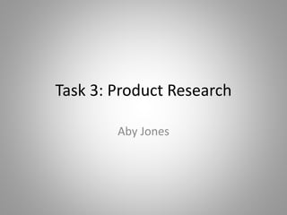
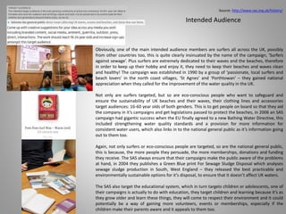
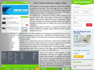
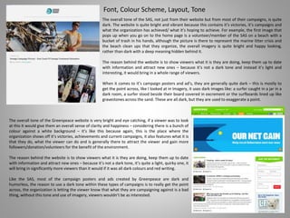
The Surfers Against Sewage organization uses a simple but eye-catching logo featuring dark and light blues in a wave shape to represent waves and their mission of protecting oceans. They sell a variety of branded merchandise on their website to raise funds. Their products use recycled and sustainable materials. They offer discounts to members to encourage support. SAS targets surfers, environmentalists, the general public, and students through educational programs to raise awareness of issues like pollution and promote behavior change and policy solutions. Their marketing uses powerful imagery and facts to get their message across in a visually striking way.
The SAS uses strong branding including a distinctive logo featuring a wave shape to promote awareness of their campaign against sewage pollution. Their branding incorporates both positive imagery like whales and negative imagery like plastic bags posing as sharks to draw attention. They target their messaging toward surfers but also educate children through materials using cartoons and games. The purpose is to both raise awareness and generate support through various mediums like posters, merchandise, and school programs. Facts and dramatic copy are included to legitimize the issues addressed and engage audiences emotionally.
The document discusses trends toward an increased outdoor lifestyle globally and in Thailand specifically. Some key points:
- More people are spending time outdoors for exercise, leisure activities, and travel as health and wellness have become priorities. Tourism and outdoor recreation spending has grown.
- In Thailand, there has been growth in outdoor restaurants and cafes, and activities like biking tours in Bangkok. Gardening has also become more popular.
- The document discusses opportunities for marketers in outdoor gear, sports brands, fashion, and adapting to preferences for mobile outdoor activities.
Students selected topics from the book "What Matters: The World's Preeminent Photojournalists and Thinkers Depict Essential Issues of Our Time" by David Elliot Cohen who maintains that "a single image still has the power to change the world." They reserached their topic, composed an interest statement about whay it mattered to them (and should matter to everyone), compiled images and URLs about the topic to post to a blog and facebook group page.
The document summarizes the logo, merchandise, and membership form the student designed for the charity organization Surfers Against Sewage. For the logo, the student used a typography technique with waves of different blue shades representing waves. Subtly, the word "against" takes the form of a fish. The merchandise includes new products like phone cases and surfboards, including a collaboration with a surfboard company. The membership form uses imagery and facts to encourage joining and support for protecting oceans from pollution.
Conventional marketing often ignores the wider context of culture. Not at Zambezi. We practice cultural planning - gathering cultural knowledge and insights in order to build brand equity by creating cultural currency.
The document defines a vegetarian as someone who does not eat meat, including red meat, white meat, or gelatin. It originated from religions like Hinduism, Buddhism, and Jainism that believe in nonviolence towards animals. Some famous historical vegetarians include Leonardo Da Vinci, George Bernard Shaw, and Mohandas Gandhi. Statistics show the number of vegetarians is rising, especially among children and young adults in the UK and US. Reasons for becoming vegetarian include health benefits, ethics around animal treatment, and environmental concerns. The document also discusses major vegetarian food brands and some non-vegetarian ingredients found in common foods.
The document discusses key considerations for effective page layout in publications. It emphasizes that the layout should be professional, easy to read, and aesthetically pleasing. Several conventions must be followed correctly, including margins, grids, spreads, columns, page numbers, and orientation. Devices like headlines, crossheads, cutouts, straplines, and pull quotes are also important to guide the reader and draw attention to key points. Ensuring the proper use of these various layout elements is essential for clear communication and an engaging reading experience.
The document discusses pre-production planning for a photography project focusing on food. It covers sources of funding, with the team deciding on self-financing. It also addresses scheduling, contingency planning, personnel, facilities, locations, model/location release forms, legal requirements, and relevant regulatory bodies like the ASA and CAP. The small team aims to keep costs low while effectively planning and executing their food photography production.
Can Designs is a company that designs and manufactures aluminum beverage cans. They offer a variety of can styles and customization options to meet their customers' branding and packaging needs. Their cans are durable and recyclable, helping beverage companies meet environmental sustainability goals.
Font Tests Where you can actually see the DifferencesTheJellehKed
This document discusses font tests conducted by Abygail Jones. Jones tested various fonts to determine readability and legibility across different font styles, sizes, and formats. The results of the font tests are not described in detail within this short document.
The band profile summarizes key details about the band The Big Channel including their name, age, album titles, genre, style, and contemporaries. The objectives section outlines goals to make the band nationally and globally recognized within a year by collaborating with other pop punk bands, selling 95,000-100,000 records in the first month, and gaining recognition through live performances and social media. The document provides information on targeting 16-25 year old females, using various media platforms like YouTube and magazines to promote the band, and selling merchandise to generate interest.
Market research and analysis are important functions of marketing that provide companies with information about customer needs, market size and trends, and competition. Market research methods include surveys, focus groups, and interviews to collect both primary and secondary data. A market analyst's role is to develop and implement analytics and reporting to help marketing campaigns be more effective. Marketing strategy involves analyzing internal and external factors like the marketing mix, customer and competitor analysis, and using this information to set goals and objectives. Advertising is also important for organizations as it communicates information to consumers about available brands and products in order to drive trial, continuity, brand switching, and switching back.
MusicMagpie had ambitious growth targets for 2013 and planned to raise awareness of its cash-for-CDs, DVDs, games and tech service through marketing and PR techniques. The target audience was 18-45 year olds. MusicMagpie utilized advertising including radio, TV, online and social media ads targeted at this demographic as well as magazine ads targeting similar interests to promote its brand and service. It also partnered with charities to raise money and awareness, helping to manage its public image positively.
Design for Advertising Task 5 ImprovedTheJellehKed
The document provides potential slogans, product names, drink names, and can design ideas for an energy drink brand. Some suggested slogans include "Party Hard, Stay Hydrated" and "Rock 'n' Roll can take it's Toll!". Product name ideas include "Bolt Energy", "Vigor Energy", and "Zip Energy". Drink name examples are "Cherry Bomb", "Potent Pizzazz", and "Orange Punch". Guidance is given on font styles, sizes, and placements for elements on the can design to maximize visibility and emphasis of the brand name and messaging.
I uploaded this a bit ago and its here again with even more 'creative' content than before. Enjoy.
I made every girl different and their perfect the way they are. people tell them that they're different and people are smart. You think you know beauty? Love? Trust me, you don't - I'm the one who created them - Bo Burnham as God
The document discusses branding and logos used by several environmental organizations, including Surfers Against Sewage, NRDC, WWF, and Trees for Cities. For each organization, 1-2 campaigns or pieces of merchandise are described in terms of imagery, intended audience, and purpose. The branding aims to raise awareness of environmental issues in an eye-catching way through shocking imagery and clear messaging. Logos incorporate symbolic imagery related to each organization's mission in an identifiable but not overly bold design.
This leaflet from the World Wildlife Fund (WWF) aims to educate the public about the dangers of shark finning and overfishing of sharks. It uses bold colors and imagery related to oceans to draw attention. Statistics and comparisons to historical events are provided to emphasize the scale of the problem and threat to shark species. The copy highlights how many shark species are endangered and that finning is the biggest threat sharks face. It encourages supporting WWF's campaign by joining, donating, or boycotting shark fin consumption to help address overfishing.
The document discusses several existing organizations that work to reduce ocean pollution and their advertising approaches. It analyzes Surfrider, which uses provocative imagery like a gun pointed at a sea animal to raise awareness. It also looks at Ondazul, which uses simple posters of people littering with consequences. Surfers Against Sewage focuses on images of surfers in polluted waters. WWF uses facts on posters with dark backgrounds. Greenpeace varies techniques, using both positive colors with negative messages or direct quotes. The client, Surfrider, was founded by surfers in 1984 and relies on donations and partnerships to fund campaigns addressing issues like beach litter and plastic pollution. Audience research showed people are aware of causes but
This document provides case studies and analyses of several social media and advertising campaigns focused on social issues. It summarizes the purpose, techniques, and impact of campaigns by Keep Britain Tidy to reduce littering, WWF to save the bluefin tuna, Cancer Research UK's "The Lump" campaign, a NAPCAN campaign on child abuse in Australia, and the Channel 4 "We're the Superhumans" campaign promoting the 2016 Paralympics. While the campaigns were generally well-received and raised awareness, the document notes that littering and child abuse issues remained problems, indicating the challenges of creating large-scale behavioral change through awareness campaigns alone.
The Surfers Against Sewage logo depicts a wave to represent what they are campaigning to save. The colors represent the sea, and the spiral shape symbolizes renewability. The informal logo suits their playful but important message.
The membership form uses images and quotes to promote joining and lists benefits like discounts and alerts. It outlines SAS's campaigns around sewage, waves, litter, climate change, research, education, and regional representatives.
The campaign poster presents surfing's lifespan as ending in 2013 to raise awareness of threats from sewage, litter, and development, urging people to sign their petition to protect waves.
The SAS hoody is made from recycled plastic bottles to help the environment. The
The document discusses the branding and marketing strategies of the Marine Conservation Society (MCS). It notes that the MCS logo features a dolphin and diver within a protective circle. It then analyzes some of the products and campaigns run by the MCS, including calendars, pins, cotton bags, and a program where children can "adopt" sea turtles. The document also discusses how the MCS aims to convey information to different audiences, including using simple language and images for children while providing more detailed information for adults.
- Surfers Against Sewage (SAS) uses various print advertisements such as posters and leaflets to raise awareness about waste and its harmful impacts.
- The posters and leaflets employ simple, bold imagery and text in colors that represent the ocean to clearly convey their message to different audiences.
- SAS's materials aim to both educate people and motivate behavior change through attention-grabbing negative imagery and messages about the consequences of waste and pollution.
This document contains summaries of several posters, logos, and marketing materials for the organization Surfers Against Sewage.
The first poster uses dark colors and imagery of surfboards in sand to depict the negative impact of sewage on beaches in a haunting way. Another poster takes a more humorous approach, showing a surfer covered in sewage to disgust viewers and raise awareness in a memorable way.
Logos for SAS include a simple, plain logo aimed at adults and an more image-heavy logo using whales and sea creatures to appeal to children. Merchandise like t-shirts promote the brand and raise awareness when worn.
Leaflets are used to both recruit new members and renew existing members.
This document outlines 5 ideas for a campaign by Surfers Against Sewage to raise awareness about marine litter.
Idea 1 focuses on photographs showing the actual damage of litter and images of SAS cleanup efforts, aimed at adults 16+. Idea 2 aims content at children, using cartoon animals disturbed by litter on membership forms, posters, and teddy bear merchandise.
Idea 3, also aimed at ages 15-30, uses animated photo shopped images of sea creatures constructed from litter. Idea 4 adapts the Jaws movie poster to depict a shark made of litter threatening a surfer.
Idea 5 targets fishing enthusiasts ages 17+ around how discarded fishing gear kills sea life and decreases fish populations. Each idea
This document summarizes various logos and merchandise from environmental organizations like Surfers Against Sewage (SAS). It describes the logos of SAS, WWF, Greenpeace, and the Green Party, noting design elements like colors, images, and fonts used. It then analyzes several merchandise items sold by SAS, including t-shirts, stickers, mugs, surf wax, surfboard bags, and baseball caps, explaining how their designs appeal to audiences like surfers and promote the SAS brand and mission.
The document discusses an advertising campaign created to raise awareness about climate change. It includes posters, bus advertisements, merchandise, and social media pages.
The posters use visuals of melting penguins and orcas to communicate that climate change is affecting these species. The bus ads show potential future effects of climate change, like fishing in the Thames. Merchandise items like mugs and shirts are designed to promote the campaign. Social media pages featuring a penguin mascot are meant to engage younger audiences.
Surveys found the campaign clearly communicated its message and audiences understood the effects of climate change. While most elements were effective, one mug design was considered too graphic and needed improvement. Overall, the campaign is aimed at informing
Surfers Against Sewage (SAS) uses graphic designs and logos to promote their mission of protecting oceans and waves. Their logo features a wave that is also an eye, representing surfers. They use shocking imagery like a surfboard in a grave to emphasize how pollution threatens surfing. SAS merchandise targets different audiences, like a feminine shirt promoting beach conservation and a darker shirt for men. SAS also produces educational materials and campaigns to teach children about ocean stewardship. Overall, SAS crafts consistent yet versatile branding to engage various supporters.
The document discusses the logos and branding strategies of two environmental campaigns - Surfers Against Sewage (SAS) and Greenpeace. SAS uses a simple blue wave logo to represent surfing and the ocean. They produce diverse, colorful merchandise featuring their logo to raise awareness and funds across different audiences. Greenpeace also uses a simple green-colored logo with their name to be easily recognizable. However, they do not produce their own merchandise, unlike SAS which strategically uses branded goods as part of their outreach.
This document provides ideas and plans for two marine litter awareness campaigns. The first focuses on the dangers of plastic bags to ocean life and aims to shock people into action through alarming images and text. The second targets children and aims to educate them about "mermaid tears" or plastic pellets through colorful, kid-friendly designs and school engagement activities. Both explore using merchandise sales to fund beach cleanups.
Sin eng-18 - kill of killer litter(form)sochinaction
This document provides details about a student project to raise awareness of and reduce killer litter in Singapore. It includes:
1) Information about the student group members and their school, Raffles Institution.
2) Details of their planned one-week action plan, including holding an exhibition at their school to educate others about killer litter, designing and posting awareness posters, and conducting more exhibitions.
3) Examples of the awareness poster they created and details of distributing it in their school and local HDB estates.
The group aims to educate others on the dangers of killer litter and encourage behaviors that reduce it through various awareness and educational activities.
The document provides ideas for a logo, membership form, campaign poster, and merchandise for an organization called Surfers Against Sewage (SAS).
For the logo, ideas include a wave incorporating an eye, surfboards overlapping to form a cross, or a surfer leaving an 'SAS' trail in water. For the membership form, ideas focus on attracting new members with imagery and concise information, or retaining current members by showing their impact.
Campaign poster ideas involve promoting a beach clean event, using shocking imagery and facts about litter impacts, or using hashtags on social media. Finally, merchandise ideas include badges, stickers, toys and clothing like t-shirts or hoodies targeted towards different audiences
The document discusses various products and marketing materials from environmental organizations Surfers Against Sewage (SAS), Greenpeace, and Friends of the Earth (FOE).
It analyzes a SAS t-shirt featuring marine litter, noting the environmentally friendly materials. It also examines SAS posters, including one using imagery of discarded surfboards to emphasize threats to waves. The document reviews Greenpeace logos and a campaign poster portraying future climate change. It also looks at FOE's online candle sales and a bee-focused campaign with bright, inviting design.
The document provides details about the development of a logo and branding for an organization called Surfers Against Sewage. It describes early logo concepts including using a surfboard or dolphins. Feedback was that the logos needed to be more complicated and say more about the organization. The final logo featured 3 dolphins in a brighter blue circle with writing above to make it recognizable. Further documents discuss merchandise like t-shirts, phone cases and mugs featuring the logo to promote the organization's campaigns against ocean pollution.
The document provides information about various camera settings that impact photographs, including aperture, shutter speed, ISO, white balance, and post-processing techniques. It includes sample photographs demonstrating the effects of different settings.
The aperture setting controls depth of field and is used in landscape and portrait photography. Shutter speed can freeze or blur motion, with faster speeds freezing action and slower speeds showing movement. ISO adjusts the camera's light sensitivity, with higher ISO allowing less light but risking more noise. White balance helps the camera understand color temperatures to accurately reproduce colors. Post-processing can refine images through cropping, levels/tones adjustments, dodging and burning, and modifying colors.
The document provides information about marketing, public relations, and their functions. It explains key concepts such as market research, market analysis, marketing strategy, advertising, brand promotion, and managing public relations messages. Examples are given for each concept to further illustrate them, such as how market research methods can be used, an analysis of the target market for a hypothetical bar, and positive publicity stunts companies have done.
1) Comedian Bo Burnham performed a song called "Repeat Stuff" that poked fun at Justin Bieber and the pop music industry.
2) During a show in Los Angeles, Burnham unknowingly performed the song for Bieber and his then-girlfriend Selena Gomez in the audience.
3) Though Bieber did not publicly respond, Burnham later apologized to him on Conan, while still implying that Bieber works for Satan based on lyrics in "Repeat Stuff."
Factual Writing Task 5 Long Response Mark 2TheJellehKed
Bo Burnham gained fame at a young age after one of his musical videos went viral on YouTube. Since then, he has had a successful career as a comedian and musician. Many fans discovered Burnham through his YouTube videos or through friends' recommendations. His special on Netflix also helped gain new fans. While some critics think Burnham's route to fame was illegitimate, his fans find him inspiring and feel he addresses real issues through his comedy. However, some of Burnham's jokes are considered too outrageous or offensive by fans. Nonetheless, his fans still greatly support his work and can cite many different favorite quotes from his various performances.
This document discusses comedian Bo Burnham and provides details about his career and comedy style. It notes that Burnham began his career by uploading comedy videos to YouTube at age 16, which went viral. Though he was accepted to Harvard, he chose to pursue a career in comedy. The document analyzes Burnham's unique comedy style, which incorporates music and challenges social norms by questioning things others wouldn't. It provides examples from his shows of twisting meanings in innocent stories to seem non-child friendly. The document concludes by discussing a finale from Burnham's recent show that left the audience questioning whether they truly know Burnham.
The document provides an evaluation of logo designs and a membership form created for Surfers Against Sewage (SAS). It discusses the intended purpose of relating the designs to surfing, coastlines, and the UK. It summarizes the techniques used to create each logo, including shapes, colors, fonts, and imagery. It also evaluates how effectively the designs communicate the message of SAS and how they compare to the organization's original logo. Finally, it discusses the membership form creation, ensuring it adheres to the intended purpose and is appropriate for the target 16-60 year old audience.
The document lists final products including a logo, poster, membership form, and merchandise. It contains a short list of items under "Final Products" with no additional details provided about each item.
This membership form is for the organization Surfers Against Sewage. It collects contact information for members such as name, address, phone numbers and payment details. It offers both direct debit and credit card payment options for annual membership fees starting at £18 for unwaged individuals and £30 for families. The form also provides space for optional donations and features the organization's branding and address at the bottom.
This document contains mood boards for different poster campaign ideas on the topics of marine litter, water quality, and toxic chemicals. For each campaign idea, the document provides color schemes, fonts, and images that set the visual tone. The colors, fonts and images focus on conveying dark, disturbing or contrasting themes that highlight the problems being addressed in a compelling way to draw viewers in. Some common elements across the boards include a mix of san-serif and serif fonts, photographs showing environmental issues or risks, and a focus on using visual design elements that remain clear and readable at different sizes. The mood boards are intended to help develop concepts for hard-hitting poster campaigns on these environmental topics.
The document discusses considerations for researching social action campaigns. It notes that three diverse campaign artifacts should be analyzed to cover different purposes, techniques, and impacts. Sensitive topics could elicit strong emotions, so care must be taken to avoid causing offense. Research challenges may include language barriers, difficulty finding campaign impacts, and ensuring information is factual to appeal to diverse audiences. Finished pieces could be distributed through various media like websites, buses, and trains to reach broad audiences. Funding issues for organizations like Surfers Against Sewage include reliance on multiple income sources so failure of one threatens others, and actions that damage reputation could reduce memberships and sponsorships.
Aims and Considerations for Social ActionTheJellehKed
The document discusses considerations for researching social action campaigns. It notes that three diverse campaign artifacts should be analyzed to cover different purposes, techniques, and impacts. Sensitive topics could bring strong emotions, so care needs to be taken. Potential problems include finding campaigns in English, quantifying impacts, unintentionally causing offense, and not finding examples for some issues. The finished research may be displayed online, at transportation hubs, or through mainstream media if a campaign gains traction. Funding issues for organizations like Surfers Against Sewage include reliance on multiple income sources so a problem in one area does not cause overall failure, and potential loss of support if campaigns do not have their intended effect or include unethical elements.
The document summarizes a case study about the campaign "Plant for the Planet". The campaign aims to raise global awareness about environmental damage and climate change by encouraging children worldwide to plant trees. It hopes to plant one million trees in every country to offset carbon emissions. The campaign creates and strengthens a global community focused on environmental issues. It uses simple advertisements featuring the organization's logo and the message "Every leaf traps CO2" along with a link to donate on their website. The goal is to infiltrate mainstream media and encourage children to take action by planting trees across the world.
Understanding clients and their requirements is key to marketing success. There are several techniques to understand clients, including putting oneself in their shoes, using customer data, and conducting satisfaction surveys. Understanding the market is also important to ensure business success through thorough research of competitors, potential customers, and gaps in the market. Tools like SWOT analysis, audience profiling, and the 4Ps of the marketing mix can help analyze the client/market. Holding events, endorsements, advertising, sponsorship, and merchandising are various marketing strategies that can raise brand awareness when done effectively.
Design for Advertising: The design Pro Forma ImprovedTheJellehKed
The document describes the process of developing an advertisement for an energy drink. It discusses:
- Creating different layers for the background, top curve, and bottom curve. Warping the curves and ensuring contrasting colors.
- Adding the front of the can design and text using different fonts. Adjusting text size and placement.
- Incorporating logos from online images and adjusting layers to blend colors. Adding special effects like shadows and glows.
- Frequently adjusting colors to make elements blend together better. Adding a gradient background to draw attention.
- Further refinements like changing text and image placements and colors. Adding actual product images.
The document summarizes the student's process of creating a fanzine article about comedian Bo Burnham. It describes 3 drafts of the article, with the word count decreasing with each draft. Feedback from the student's tutor helped improve the article. The student also created 2 layout designs for the fanzine article in InDesign. Overall, the student felt they effectively captured the style of fanzines and managed their time well on the project.
The document discusses guidelines for responsible journalism according to the National Union of Journalists (NUJ). It provides guidance on writing about different groups in a fair and unbiased manner to avoid offending readers or negatively portraying people. Journalists are advised to consider social and cultural backgrounds when writing about those with different experiences. The NUJ code of conduct consists of 12 guidelines including fact-checking, avoiding intrusion into private lives, and not producing discriminatory material. Journalists are also advised to consider alternative perspectives and ensure their work is objective, accurate, truthful and fair to maintain credibility.
This document contains summaries of different examples of magazine, tabloid, and fanzine layouts. For each layout type, there are multiple examples presented with descriptions of the fonts, colors, images, and positioning of elements on the page. The examples demonstrate variations in styles, from more formal and professional designs to simpler and more informal styles.
Task 3 - primary and secondary researchTheJellehKed
The summary provides a concise 3 sentence overview of the key points from the document. It states that the video is a challenge to the form of corporately owned pop stars who tell fans to feel good about themselves, which makes the fans love the celebrity and buy their media, while the same media is what made them feel bad about themselves. It also explains that the pop stars do this in a vague way aimed at the whole audience, and implies they are working for Satan.
During one of his shows, musical comedian Bo Burnham performed his song "Repeat Stuff" which pokes fun at Justin Bieber's music videos and lyrics. Burnham's song highlights issues with the media's influence on teenage girls' self-esteem and the cycle of celebrity obsession it creates. Though Bieber did not publicly respond, Burnham later apologized to him on Conan, saying it was not personal. Burnham uses satire and taboo topics in his comedy to make pointed critiques, though his on-stage persona is brash compared to his shy off-stage self. His performance took risks by criticizing pop music but seemed to land a punch that Bieber did not counter.
How to Manage Your Lost Opportunities in Odoo 17 CRMCeline George
Odoo 17 CRM allows us to track why we lose sales opportunities with "Lost Reasons." This helps analyze our sales process and identify areas for improvement. Here's how to configure lost reasons in Odoo 17 CRM
Physiology and chemistry of skin and pigmentation, hairs, scalp, lips and nail, Cleansing cream, Lotions, Face powders, Face packs, Lipsticks, Bath products, soaps and baby product,
Preparation and standardization of the following : Tonic, Bleaches, Dentifrices and Mouth washes & Tooth Pastes, Cosmetics for Nails.
Thinking of getting a dog? Be aware that breeds like Pit Bulls, Rottweilers, and German Shepherds can be loyal and dangerous. Proper training and socialization are crucial to preventing aggressive behaviors. Ensure safety by understanding their needs and always supervising interactions. Stay safe, and enjoy your furry friends!
Assessment and Planning in Educational technology.pptxKavitha Krishnan
In an education system, it is understood that assessment is only for the students, but on the other hand, the Assessment of teachers is also an important aspect of the education system that ensures teachers are providing high-quality instruction to students. The assessment process can be used to provide feedback and support for professional development, to inform decisions about teacher retention or promotion, or to evaluate teacher effectiveness for accountability purposes.
The simplified electron and muon model, Oscillating Spacetime: The Foundation...RitikBhardwaj56
Discover the Simplified Electron and Muon Model: A New Wave-Based Approach to Understanding Particles delves into a groundbreaking theory that presents electrons and muons as rotating soliton waves within oscillating spacetime. Geared towards students, researchers, and science buffs, this book breaks down complex ideas into simple explanations. It covers topics such as electron waves, temporal dynamics, and the implications of this model on particle physics. With clear illustrations and easy-to-follow explanations, readers will gain a new outlook on the universe's fundamental nature.
A Strategic Approach: GenAI in EducationPeter Windle
Artificial Intelligence (AI) technologies such as Generative AI, Image Generators and Large Language Models have had a dramatic impact on teaching, learning and assessment over the past 18 months. The most immediate threat AI posed was to Academic Integrity with Higher Education Institutes (HEIs) focusing their efforts on combating the use of GenAI in assessment. Guidelines were developed for staff and students, policies put in place too. Innovative educators have forged paths in the use of Generative AI for teaching, learning and assessments leading to pockets of transformation springing up across HEIs, often with little or no top-down guidance, support or direction.
This Gasta posits a strategic approach to integrating AI into HEIs to prepare staff, students and the curriculum for an evolving world and workplace. We will highlight the advantages of working with these technologies beyond the realm of teaching, learning and assessment by considering prompt engineering skills, industry impact, curriculum changes, and the need for staff upskilling. In contrast, not engaging strategically with Generative AI poses risks, including falling behind peers, missed opportunities and failing to ensure our graduates remain employable. The rapid evolution of AI technologies necessitates a proactive and strategic approach if we are to remain relevant.
How to Fix the Import Error in the Odoo 17Celine George
An import error occurs when a program fails to import a module or library, disrupting its execution. In languages like Python, this issue arises when the specified module cannot be found or accessed, hindering the program's functionality. Resolving import errors is crucial for maintaining smooth software operation and uninterrupted development processes.
A workshop hosted by the South African Journal of Science aimed at postgraduate students and early career researchers with little or no experience in writing and publishing journal articles.
Main Java[All of the Base Concepts}.docxadhitya5119
This is part 1 of my Java Learning Journey. This Contains Custom methods, classes, constructors, packages, multithreading , try- catch block, finally block and more.
2. http://www.sas.org.uk/shop/
Source: Logo and Branding
The logo for Surfers Against Sewage (SAS) is quite simple but still
eye catching, the use of bright and dark blue to form a wave shape
is quite clever and after reading what SAS stands for, it makes sense,
it also looks like there is an eye incorporated in to the design which
speaks volumes, the logo is essentially saying that the SAS watch
over the waves/the ocean.
When it comes to their website, they have a ‘shop’ section where
they sell a variety of different things with the SAS logo plastered on
almost every item. It ranges from clothes like: hoodies, body
warmers, jumpers, tank tops and tee’s to accessories like: lip wax,
surf board wax, surf board covers, beach supplies, ceramic cups,
logo stickers, a key finder, gift cards and other things in relation to
those.
They use their branding very widely, by selling a variety of different
items for quite good prices it would bring in a lot of profit and
funding, the sale of their merchandise will greatly increase the
amount of money they take in and use to help aid their cause.
Their products are mostly made of recycled items, like a recycled
bottle zip hoodie, organic tee’s, organic cotton windbreakers and
fairtrade clothing items too.
To further entice the consumers, there is a deal where supporters of
the organization and it’s campaigns get 10% off selected items with
a special code, the only way to receive this code was to join the SAS.
3. With most of their promotional images, there can either be a limited amount of
information included on them or there can be a lot, like we can see with the
difference between these two, rather different approaches to the SAS’s
promotional advertisement posters.
The first example (left) starts with: ‘What if the next wave never comes?’ with yet
another powerful photograph featured on the background. It includes the
companies logo at the top right of the page and information that tells the viewer
what is happening to the UK’s oceans and where they can go and what they can
do to save them.
The second example is quite different in comparison, it features the same
question as the first example, ‘what if the next wave never comes?’ but includes
a lot more copy after that. There is the logo which tells people who is running
the campaign, there is a lot more information and facts used to help viewers get
a better, yet still brief explanation of what SAS is doing. At the top of the poster,
it includes a slogan, ‘and you thought wearing a wetsuit sucked’ which is related
to the image of a person in a hazmat suit holding a surf board with a slight slump,
showing dismay.
Source: http://www.protectourwaves.org.uk/case-studies.php
Copy and use of Facts
The use of more information on both of these is very different, even though they
are both from the same company/organization, yet they are both still effective.
Then there is the example from Greenpeace, there is a limited amount of copy
but still enough to instill fear and make the viewers question what they originally
didn’t. The facts used are those found by Greenpeace themselves, this is a
reliable source of information and even though it’s quite a substantial amount of
text, it still gets the point across – whenever anything starts with: ‘Did you
know…’ it usually immediately interests the viewer.
When comparing these three examples, they all have significant differences, dark
and powerful, bright illustrations that get the point across with a powerful use of
imagery and an odd, enticing piece that pulls the viewer in just because of the
curiosity of seeing a vegetable in the form of an animal.
What all of these do have in common, is that they are all powerful, especially
when it comes down to the copy, even though there are small amounts or large
amounts, it still gets the point out to the viewers.
4. Imagery
There is a lot to talk about when it comes to the imagery used in some campaign posters, they use some
very interesting, if not disturbing techniques. The first example (top left) is quite a shocking image of a
surfer stuck in a jar with the companies slogan, ‘what if the next wave never comes?’ handwritten on the
label, the overall image is very dark, the context it’s in seems to be quite a desolate, run down location
which further adds to the creepy, dark effect they were going for. It really makes a powerful point that if
the ocean’s become too dirty, toxic or full of garbage, it can be harmful to humans, the use of the surfer
further exaggerates the point of the organization, ‘surfers against sewage’ and what they are trying to save.
The second example (second poster, top left) is a very dramatic change from the previous example, it’s full
of bright colours and information, as well as being an illustration as opposed to a dark photograph. It’s still
the same message, ‘what if the next wave never came?’ except this time instead of a surfer in a jar, it’s a
person in a hazmat suit riding the litter ridden waves on their surf board. Even though it seems quite
childish, who I’m assuming this is appealing to, it’s still a powerful image to portray to the public.
The third and fourth examples are what I find the most visually powerful, the first one (middle) features a
surfer stood beside his board, covered in excrement and tissue paper, so much so that there are no
features visible.
This is clearly getting the point of sewage being pumped in to the oceans across to the
public, and it’s a very effective one, it makes a viewer wonder if that’s what they are
covered in when they come out of the water which would encourage them to help clean
the ocean up. The second example (fourth poster, top right) features a man surrounded
by a green luminous glow, he also has a third leg whilst a sort of green goo covers the
surf board, this is clearly getting across the point that chemicals are being pumped in to
the oceans, not that this would actually happen to a human being but it still gets the
point across and whilst being quite terrifying, should encourage viewers to join the
cause just to prevent things like this actually happening.
The fifth example (top right) is a campaign poster from Greenpeace, it features
vegetables shaped in to insects and animals, including: peas in a pod shaped as a cricket,
carrots shaped in to a scorpion and a spring onion as a mantis. The message in this -
-Poster is that the DNA of animals and other unhealthy substances are found in modified
vegetables, plants and other products. This is quite a clever, captivating image, it’s very
simple consisting of a black background, a spotlight focused on the main subject and the
vegetable(s) shaped like the insect. It’s very simple, very intriguing and it easily entices a
viewer so they become interested and read the small print. It’s very different to the posters
SAS produce, but at the same time it’s very similar.
The last poster is from the organization, ‘The Big Ask’ it featured a polar bear who has shed
it’s fur and has it slung over it’s shoulder like a fashionable jacket whilst it’s under layer of
muscle is on show for all to see. The message in this is very clear, it’s showing that the
climate is warming up and it shows who and what it’s affecting. It also features the logo of
the company/organization. It’s a very horrific image, it definitely stands out and shocks the
viewer. This shocking image may just encourage a viewer to do something about it. It’s a
little more visually shocking than the images used for the SAS.
5. Intended Audience
Obviously, one of the main intended audience members are surfers all across the UK, possibly
from other countries too, this is quite clearly insinuated by the name of the campaign, ‘Surfers
against sewage’. Plus surfers are extremely dedicated to their waves and the beaches, therefore
in order to keep up their hobby and enjoy it, they need to keep their beaches and waves clean
and healthy! The campaign was established in 1990 by a group of ‘passionate, local surfers and
beach lovers’ in the north coast villages, ‘St Agnes’ and ‘Porthtowan’ – they gained national
appreciation when they called for the improvement of the water quality in the UK.
Not only are surfers targeted, but so are eco-conscious people who want to safeguard and
ensure the sustainability of UK beaches and their waves, their clothing lines and accessories
target audiences: 16-60 year olds of both genders. This is to get people on board so that they aid
the company in it’s campaigns and get legislations passed to protect the beaches, in 2006 an SAS
campaign had gigantic success when the EU finally agreed to a new Bathing Water Directive, this
included strengthening water quality standards and a provision for more information for
consistent water users, which also links in to the national general public as it’s information going
out to them too.
Again, not only surfers or eco-conscious people are targeted, so are the national general public,
this is because, the more people they persuade, the more memberships, donations and funding
they receive. The SAS always ensure that their campaigns make the public aware of the problems
at hand, in 2004 they publishes a Green Blue print For Sewage Sludge Disposal which analyses
sewage sludge production in South, West England – they released the best practicable and
environmentally sustainable options for it’s disposal, to ensure that it doesn’t affect UK waters.
The SAS also target the educational system, which in turn targets children or adolescents, one of
their campaigns is actually to do with education, they target children and learning because it’s as
they grow older and learn these things, they will come to respect their environment and it could
potentially be a way of gaining more volunteers, events or memberships, especially if the
children make their parents aware and it appeals to them too.
Source: http://www.sas.org.uk/history/
6. Purpose
Source: http://www.sas.org.uk/about/
The purpose of the SAS and companies/organizations alike, is to
target coastal environmental issues which includes things like: litter,
pollution from sewage, toxic chemicals, climate change, coastal
development and so on. They aim to protect the UK’s oceans or just
oceans in general so that everyone can enjoy it safely for a very long
period of time, they also aim to improve all of this by changing the
public behavior, government policies and so on.
The objectives are to: promote these problems, raise awareness for
the benefit of the public. To also provide education to the public in
the ‘conservation, protection, improvement and ecologically
sustainable management’ of marine environments, associated land,
shorelines and structures.
The SAS and organizations like them believe that the ocean, waves
and surf spots deserve to be a part of UK heritage and should
receive greater recognition and protection which can be achieved by
political debates and the introduction of new legislations. They work
hard to raise awareness for these natural resources, the
environment as well as ‘physical and geological factors that create
waves’.
To achieve this, they need to make the governments aware of these
issues that are affecting the oceans and beaches until new policies
are introduced that are in their favor.
Creating volunteering opportunities for people or communities, this
gets them involved in activities to save the seas, coastlines and
beaches and raises awareness through word of mouth
recommendation and so on.
Educating communities and the general public on sustainable
solutions that can protect waves, oceans and beaches – making sure
they educate them on solutions that are definitely achievable. Also
about the issues that affect the UK’s waves, oceans, beaches and
those who use it.
Promote their scientific, economic and health evidence that
supports their campaigns and efforts.
One of the campaigns SAS are currently running is an educational
system, it focuses on scientific reports and their most up-to-date
information that’s available to the general public, they produce
regular scientific reports that cover a range of environmental issues,
this goes from things like: marine litter (another campaign of theirs)
to coastal developments. They focus on current campaign areas for:
climate change, water quality, marine litter, toxic chemicals and so
on. It also talks about citizenship, shows students how they can have
a positive impact if they contribute to safeguarding fisheries, oceans,
waves and beaches.
Another campaign is ‘marine litter’ where the SAS ‘work at
community, corporate and government’ levels to ‘tackle the growing
tide of marine litter that washes up on UK beaches every year.’ they
create ‘SAS beach cleans’ which is rapidly rising in popularity, beach
cleans help to directly remove marine litter from the beaches and
raise awareness to the public. Some of their other initiatives include:
Return to the Offender, Think Before You Flush and Break the Bag
Habit; they create over 5,000 community beach cleans annually. One
of the posters used for the campaign is a surfer stood beside their
board, instead of a surfer though, it’s a figure made up of litter and
rubbish.
7. Font, Colour Scheme, Layout, Tone
The font used for SAS and other organizations like it are generally very simple, easy to read, san serif fonts, they all differ slightly but they all have that sort of basis. SAS
has quite a tall, bunched together font which is easy to follow and see in the variety of different sizes it’s found in, this includes the logo’s text, the sub heading and other
sub headings and links which takes you to other pages, things like their ‘campaigns’ list, which is the same, continuous font against a dark background, they’ve ensured
to use a font that’s easy to read in a variety of different contexts and settings. The only time there is a slight difference is headers for different campaigns, ‘the problem’
example came from their ‘Break The Bag Habit’ campaign, it’s significantly larger and bolder than the rest of the text and it’s in a different font which is still very easy to
read.
The font used for the Greenpeace advert is a lot like the SAS font, it’s thin, tall and bunched together, it’s still very clear and easy to read and follow. It’s also easy to read
in a variety of different sizes, as shown above – it’s also easy to read against a darker background. The logo for Greenpeace is a little different from the SAS one, it’s got a
font that sticks out against the rest of the copy on the page, it’s still a clear, easy to read font, it’s just bolder and it looks quite childish, or a little less professional than
the font used for the SAS logo.
The marine conservation society and friends of the earth organizations have very similar logo font, like the previous examples, they are simple, san serif fonts that are
easy to read and are used in a variety of different sizes with readability not affected. The only few differences being colour, size and obviously the different variation in
words and phrases.
The colour schemes for SAS and other environmental organizations websites vary depending on what
it’s focusing on, for Greenpeace the overall colour scheme is green, when picking a colour scheme, it’s
very important to link the colours to the thing that’s being focused on, as Greenpeace focus on
environmental abuse like climate change, defending oceans and protecting forests, they have chosen
green so that when a viewer looks at the name and the colour, they almost automatically think of
nature, wildlife and all things associated with it – this would probably be a main selling point if
Greenpeace wasn’t already quite a large organization because the green is so bright and enticing to
the viewer.
Friends of the Earth also use green for their logo, but not for their overall colour scheme, theirs is
actually a mix of colours, which are: green, blue and orange. This organization also deals with
environmental issues which is why using green as their logo colour is a good idea, as for the blue and
orange, I guess you could sort of link those to the environment too, the blue for the sea and the
orange for the sun – this is quite clever, you link them together almost without thinking about it, yet it
still seems like an odd choice of colours to use for this.
Marine Conservation Society also use a mixture of blue and orange in both their logo and as their
colour scheme for their website, there are a couple of reasons why they could have chosen orange
and blue as their main colours, especially for their logo which features a dolphin (blue) and a human
(orange) swimming side by side, this could be because fishermen generally wear orange suits so it’s
insinuating that or it’s showing the contrast betwixt the two. Either way it’s also a mixture of bright
colours against dark, therefore it will generate quite a bit of curiosity and attract the viewer.
Surfers Against Sewage have very cleverly picked their colour scheme, they have chosen a mixture of
dark and light blues, as their organization is dedicated to the protection over the oceans and
environmental issues, as people take in the imagery of the logo - the wave looking like an eye to
show the organization is keeping watch over the oceans – they will immediately associate it with the
ocean, this will further be accepted as they read what the organization is trying to do.
8. Font, Colour Scheme, Layout, Tone
The overall layout of the Surfers Against Sewage web page is pretty
simple, as soon as you’re navigated to the front page, a banner, asking
viewers to join the campaign and directly below that there is a news feed,
almost like Facebook – it’s filled with current campaigns, happenings and
victories as we can see at the side (left).
Further down the page is a set of links that take you to alternate pages or
part of the website, these include things like: ‘Take the pledge to prevent
single use bags from polluting the environment’, ‘See what events (like
beach cleans) are coming up near you…’ and so on.
Even further down is a darker part of the page, which asks ‘how do your
donations help?’ with a link to another part of the website where the
viewer can ‘learn more’ followed by a link to ‘useful links’ and a section
below that dedicated to supporting SAS, how to do it and why.
There is a button at the top, where, once pressed brings up a contents
page for the entire website, this includes things like: Issues i.e. toxic
chemicals, Campaigns i.e. water quality, Regions and Reps I.e. North
Ireland, How Can You Help? i.e. SAS membership, About SAS i.e.
Supporters and so on. When this contents page is brought down, it comes
up with Twitter, Facebook, Email and a search option – for the social
networking and email, it could be there to encourage viewers to share
what they’ve found or raise awareness, the search option is there to
navigate the pages.
I think that the overall layout it both complex and simple, it’s hard to
explain – it’s complexity lies within the contents page, it took me a few
moments to actually find one before realizing the option was at the top,
left of the page. The simplicity lies within the main page, the options
given are very straight forward and easy to understand with little or no
hassle or help, this is good for an organization like this, it’s aimed at ages
16-60, the easier the page is to navigate, the easier it is for a wide range
of ages to navigate it.
9. Font, Colour Scheme, Layout, Tone
The layout for the Greenpeace website is a little more complex
as opposed to the SAS’s. The home page acts as a number of
things, at the top of the page is the Greenpeace logo and the
opportunity to change the language of the copy on the page –
or change to the correct country someone is in.
It’s followed by a selection bar that a viewer would use to
operate where they were going to look next, it features:
‘home’, ‘What we do’, ‘What you can do’, ‘Community’, ‘Blog’,
‘Donate’, ‘Contact Us’ and then the option to like their page on
Facebook or follow them on Twitter, this acts as one form of
navigation.
Directly below that is a banner – or a series of banners – that
features different campaigns using a different variety of poster
designs and so on.
Below that is the latest updates on campaigns the organization has won or is
currently doing good or bad on, this – much like the the SAS’s website – is a lot
like the Facebook layout in the sense that it features an almost timeline, news
feed like design.
Beside this is a quick way to join the movement, it asks for the viewers: email
address, name, phone number, postcode, a current campaign they can donate
to and the a way to subscribe to the websites update via RSS or email.
At the bottom of the page, a form of contents lies – this features links to: what
the organization does, what a viewer can do, blogs, about the organization and
different social networking sites a viewer can follow them on.
Overall, the layout of the website is quite
professional and easy to navigate whilst still
being a little complex – as opposed to the SAS’s
site, it’s got a lot more featured on it’s front
page, there is definitely a lot more to click on
and go through, plus there is a very easy way to
join the organization and this would actually
generate more subscribers/donations.
10. Font, Colour Scheme, Layout, Tone
The overall tone of the SAS, not just from their website but from most of their campaigns, is quite
dark. The website is quite bright and vibrant because this contains it’s victories, it’s campaigns and
what the organization has achieved/ what it’s hoping to achieve. For example, the first image that
pops up when you go on to the home page is a volunteer/member of the SAS on a beach with a
bucket of trash in his hands, although the picture is there to represent the marine litter crisis and
the beach clean ups that they organize, the overall imagery is quite bright and happy looking,
rather than dark with a deep meaning hidden behind it.
The reason behind the website is to show viewers what it is they are doing, keep them up to date
with information and attract new ones – because it’s not a dark tone and instead it’s light and
interesting, it would bring in a whole range of viewers.
When it comes to it’s campaign posters and ad’s, they are generally quite dark – this is mostly to
get the point across, like I looked at in imagery, it uses dark images like: a surfer caught in a jar in a
dark room, a surfer stood beside their board covered in excrement or the surfboards lined up like
gravestones across the sand. These are all dark, but they are used to exaggerate a point.
The overall tone of the Greenpeace website is very bright and eye catching, if a viewer was to look
at this it would give them an overall sense of clarity and happiness – considering there is a bunch of
colour against a white background – it’s like this because again, this is the place where the
organization shows off it’s victories, achievements and current campaigns, it also features what it is
that they do, what the viewer can do and is generally there to attract the viewer and gain more
followers/donation/volunteers for the benefit of the environment.
The reason behind the website is to show viewers what it is they are doing, keep them up to date
with information and attract new ones – because it’s not a dark tone, it’s quite a light, quirky one, it
will bring in significantly more viewers than it would if it was all dark colours and red writing.
Like the SAS, most of the campaign posters and ads created by Greenpeace are dark and
humorless, the reason to use a dark tone within these types of campaigns is to really get the point
across, the organization is letting the viewer know that what they are campaigning against is a bad
thing, without this tone and use of imagery, viewers wouldn’t be as interested.