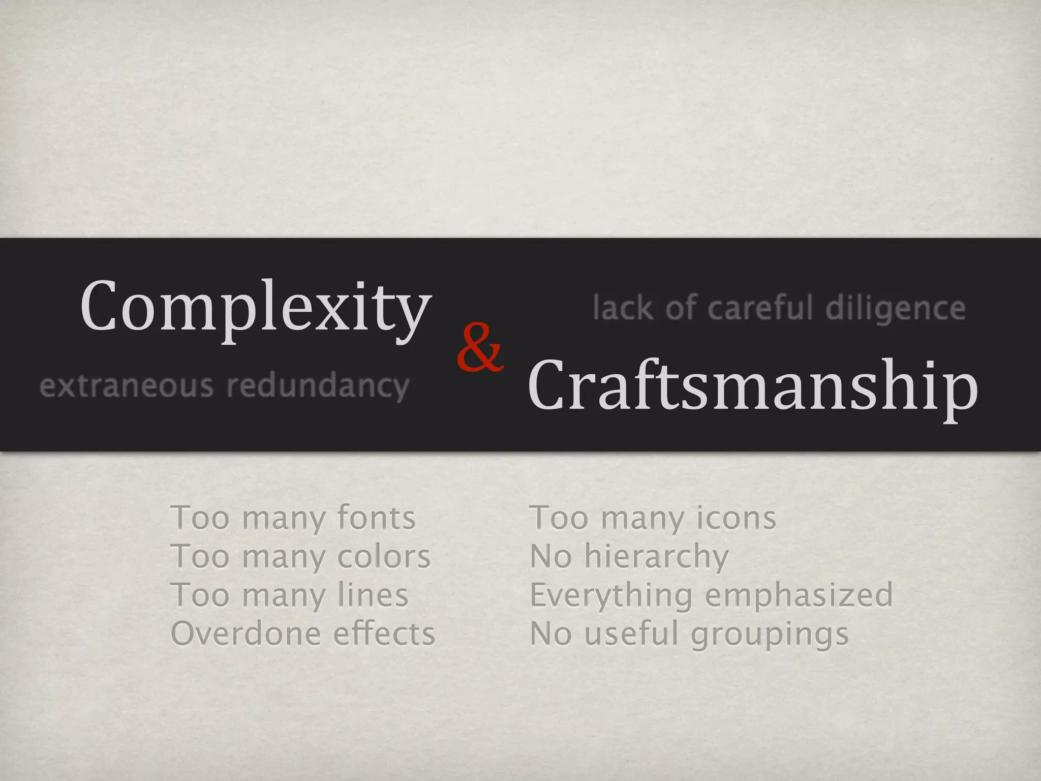
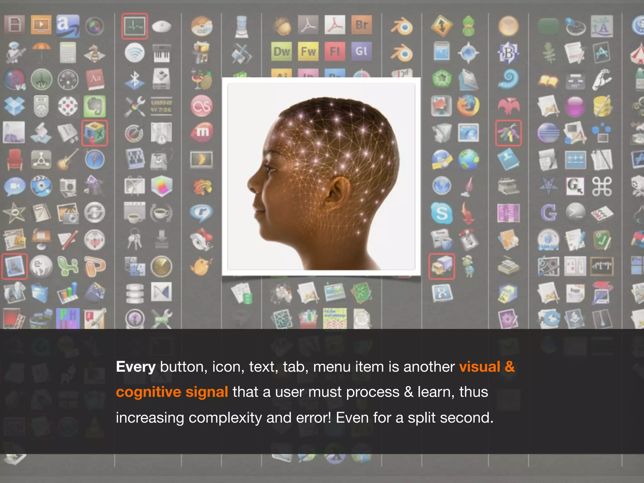
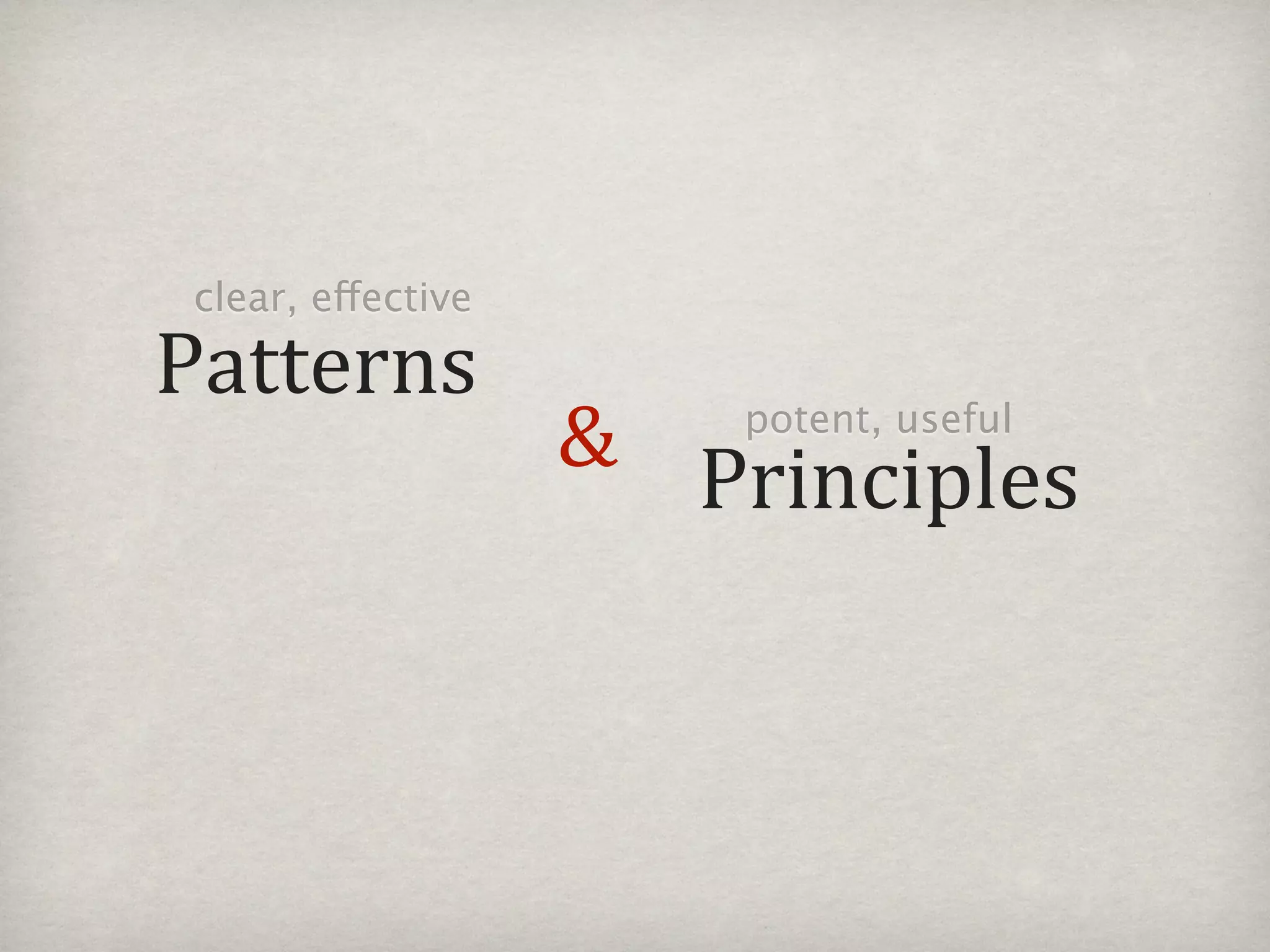
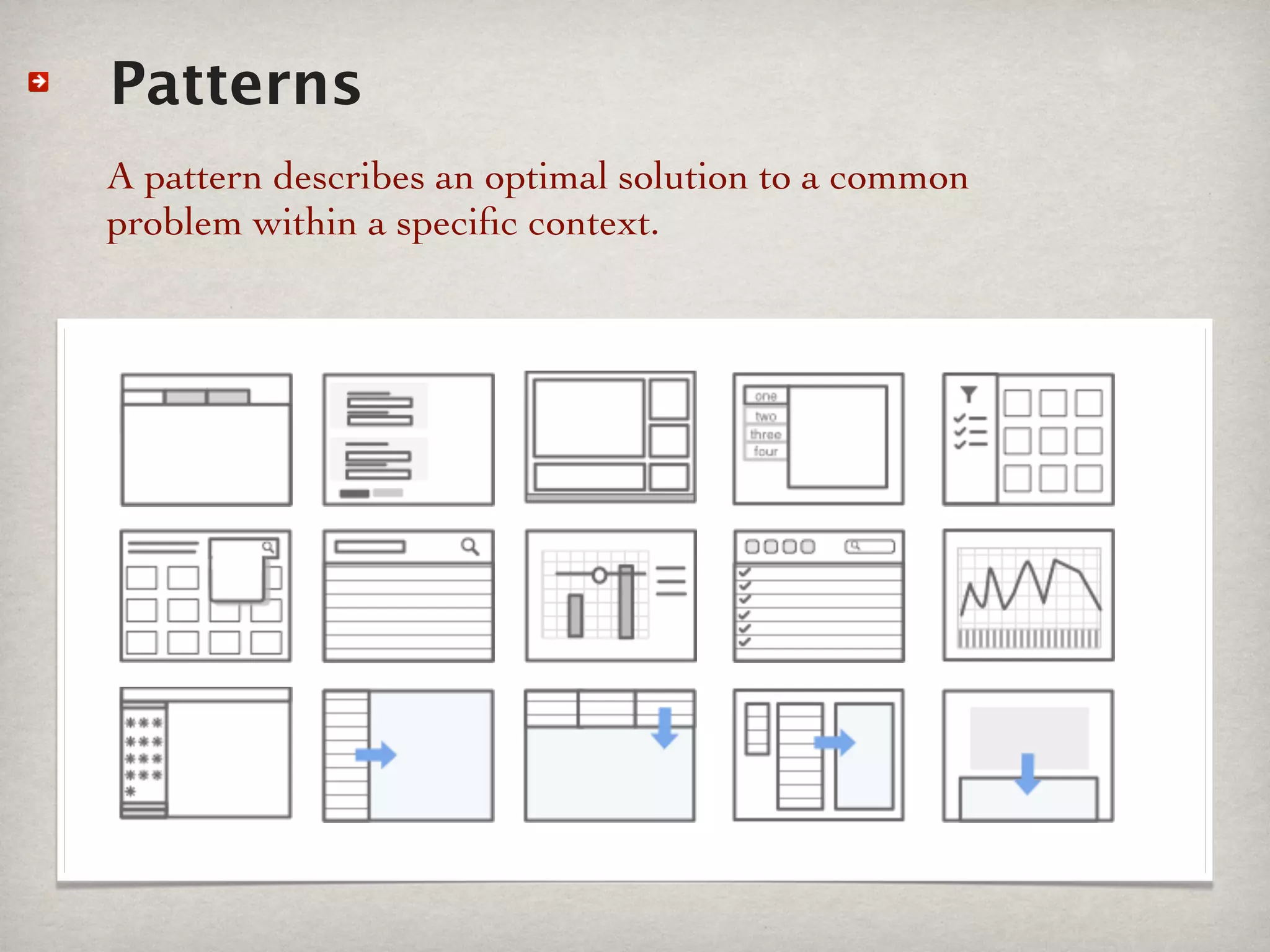
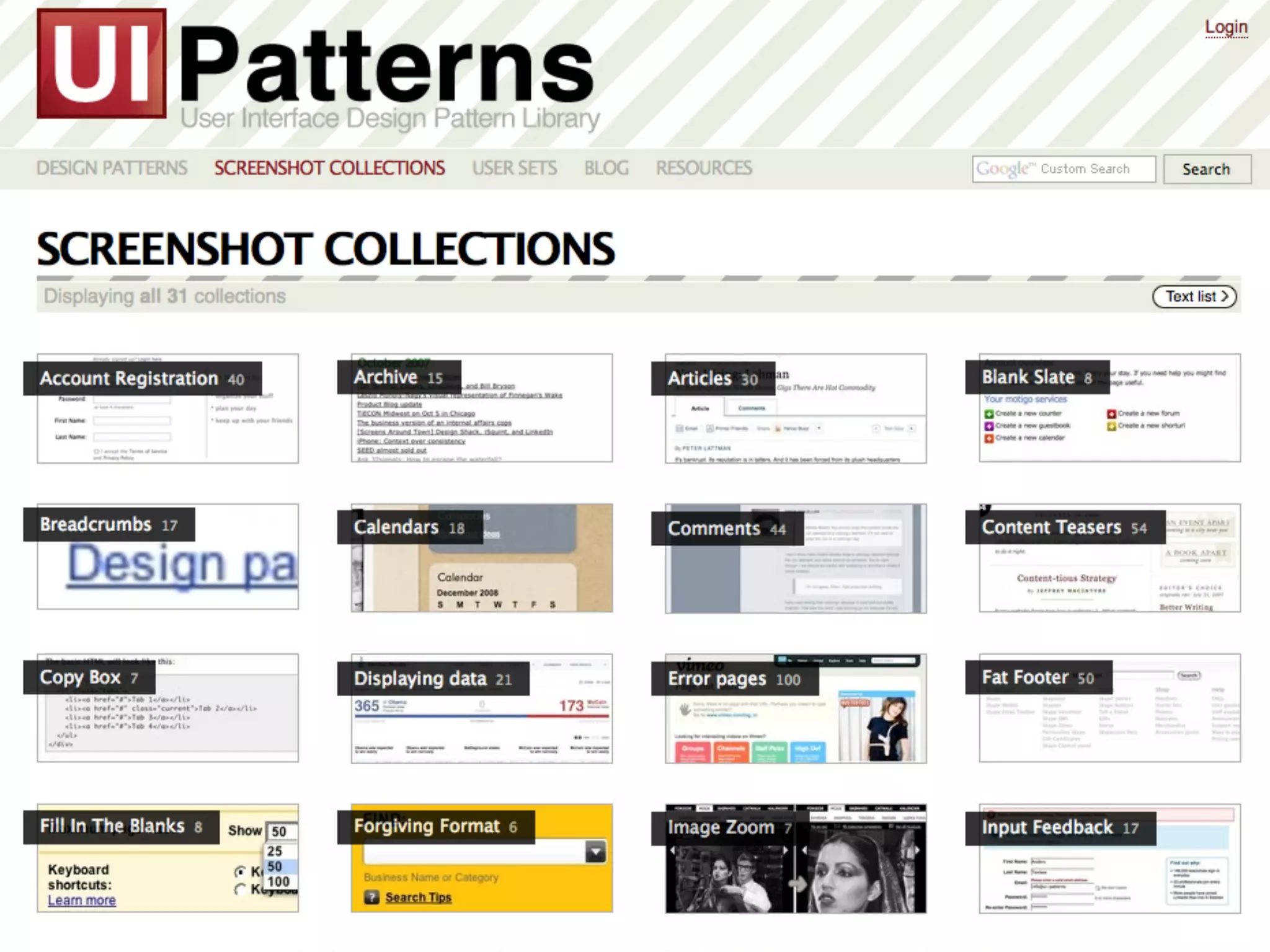
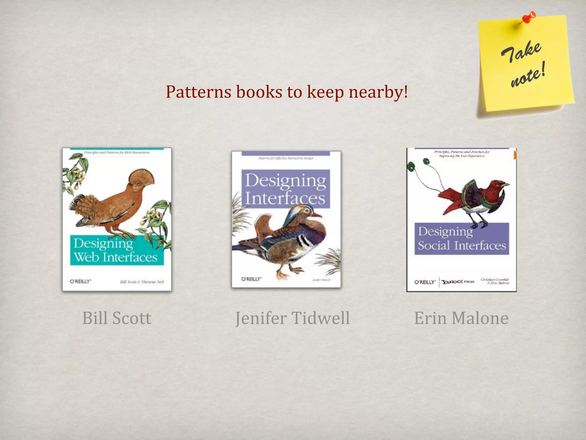
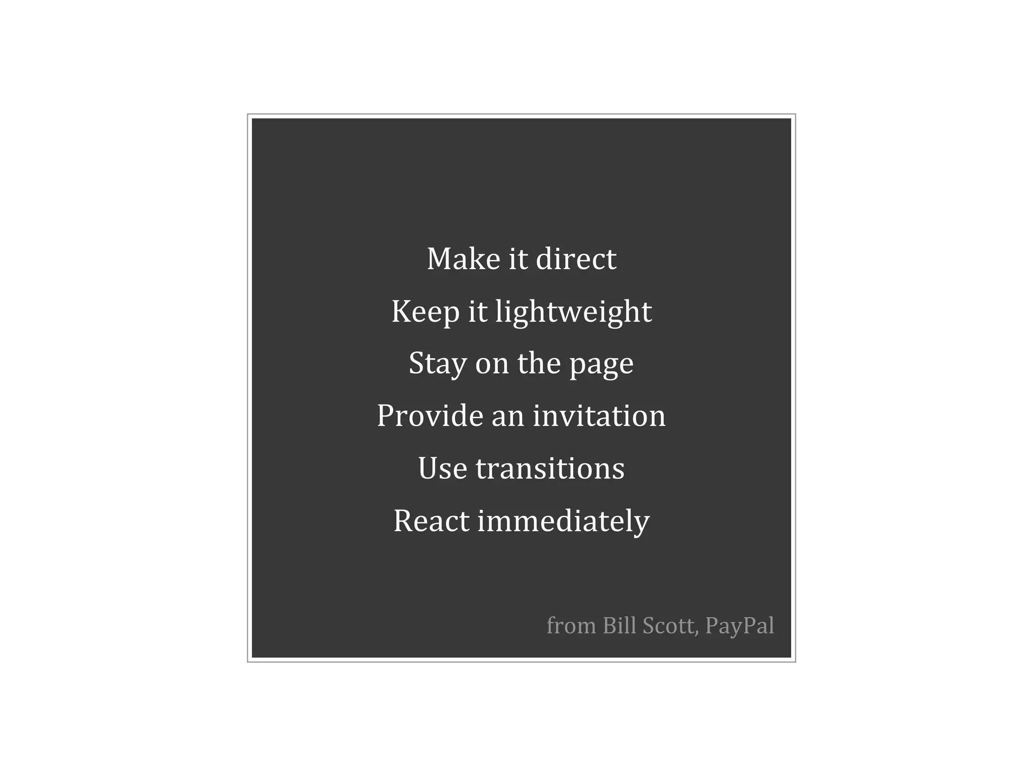
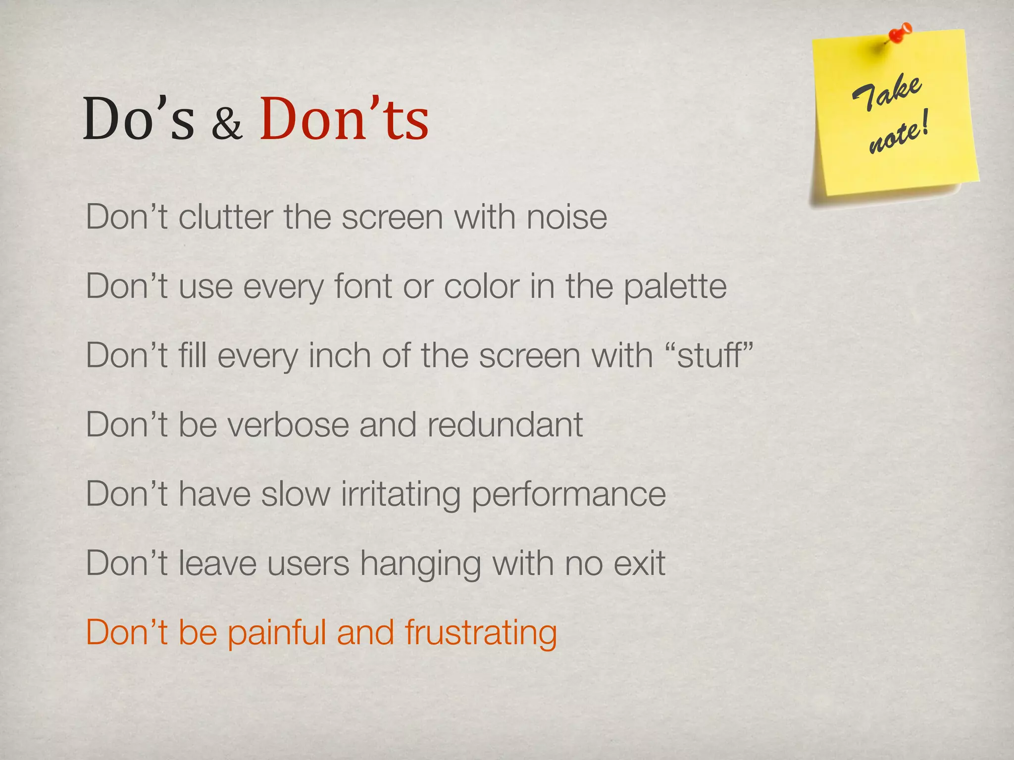
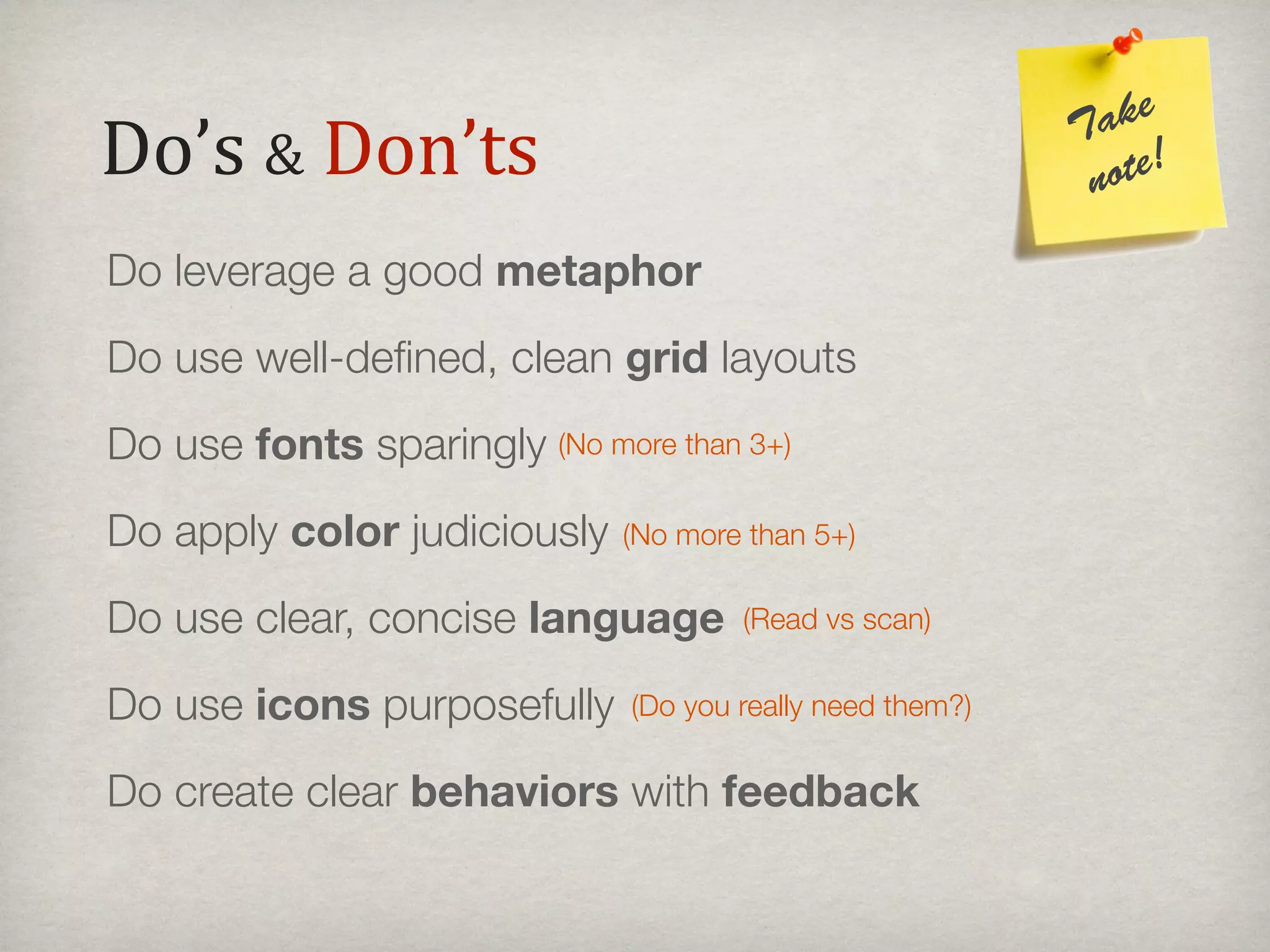
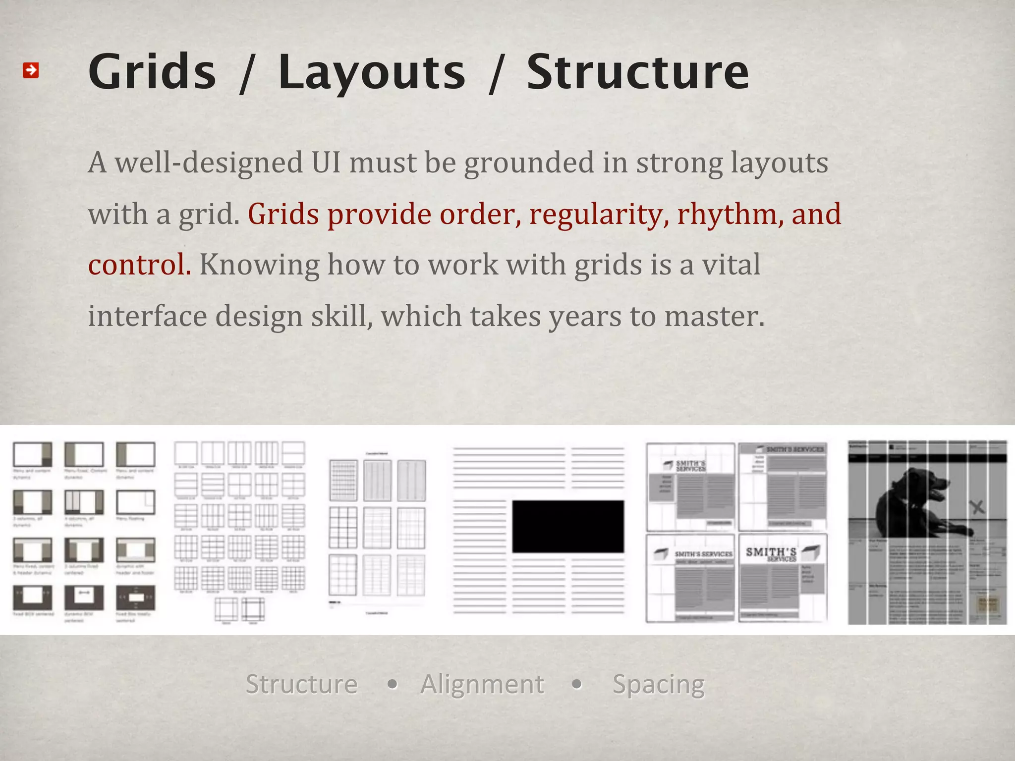
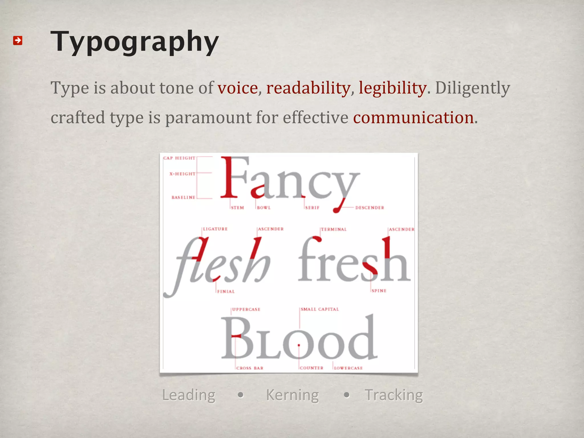
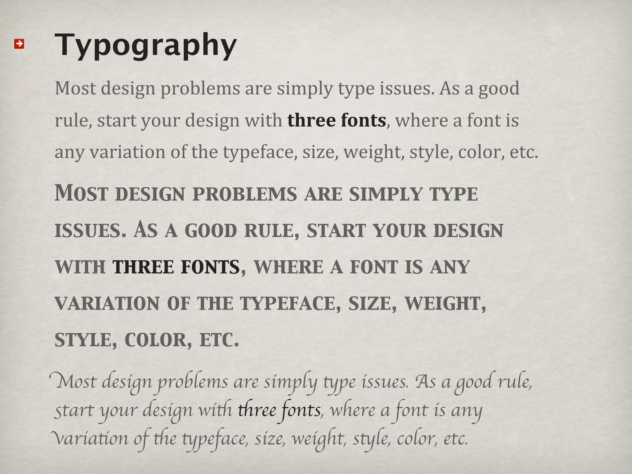
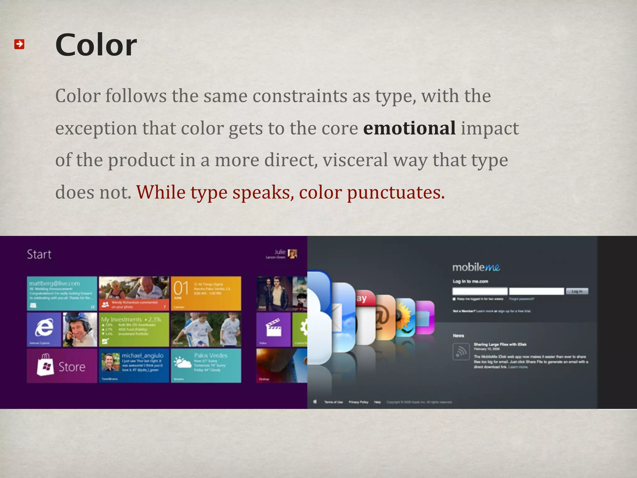
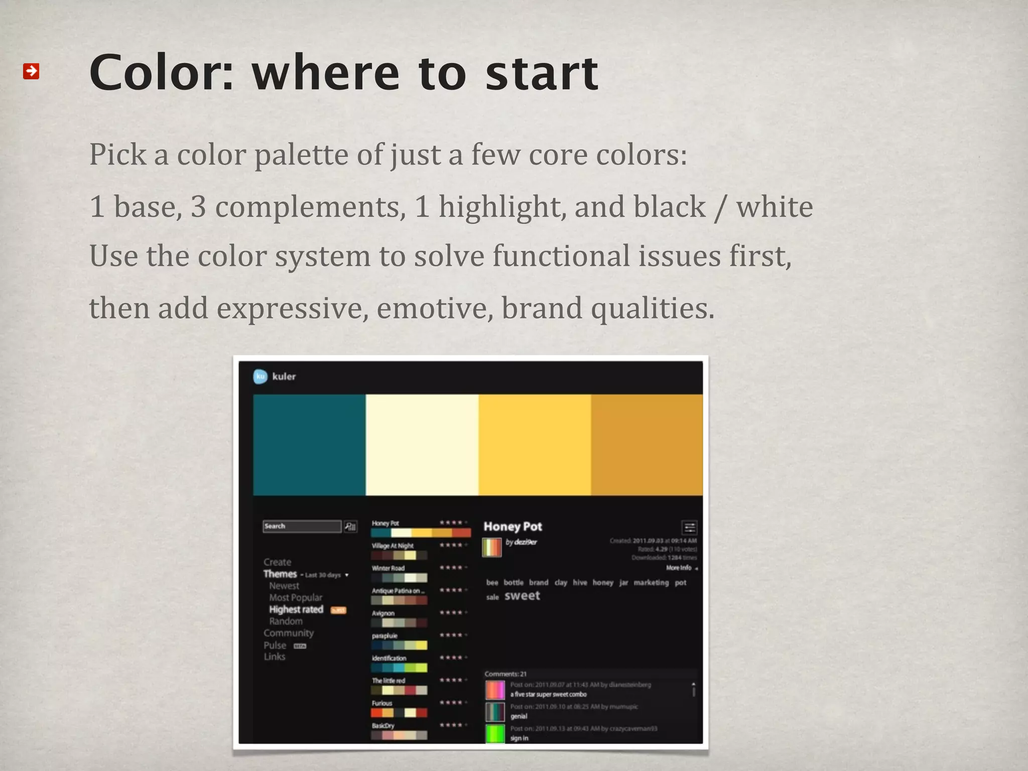
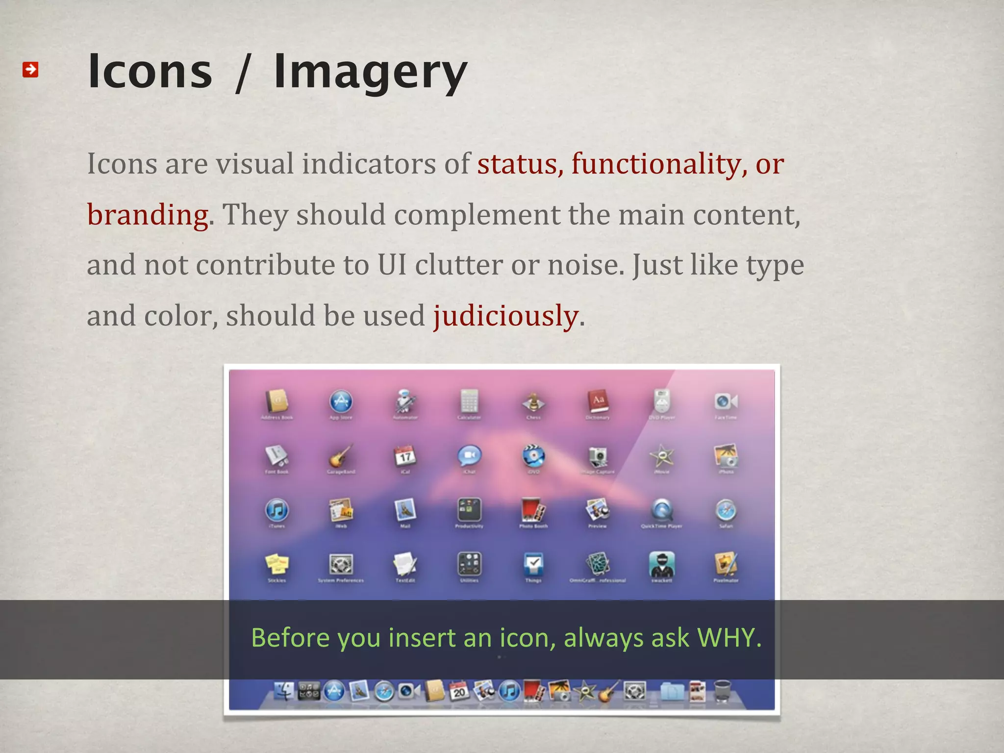
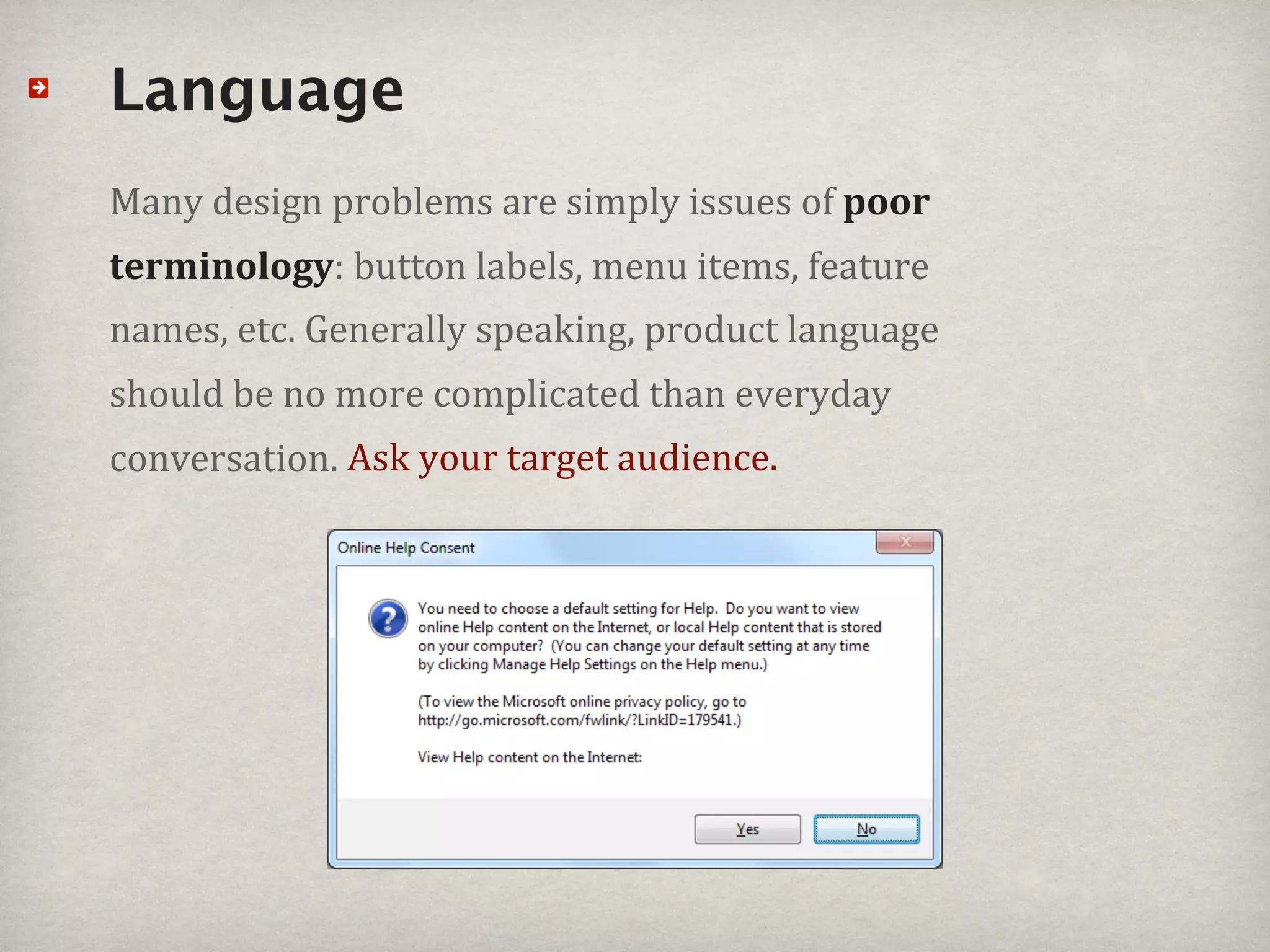
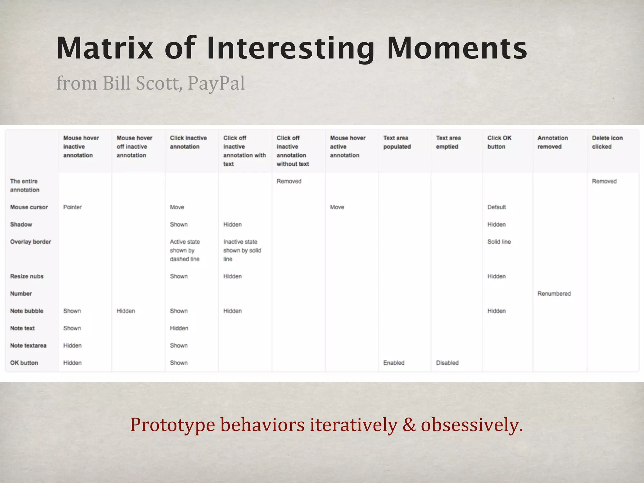
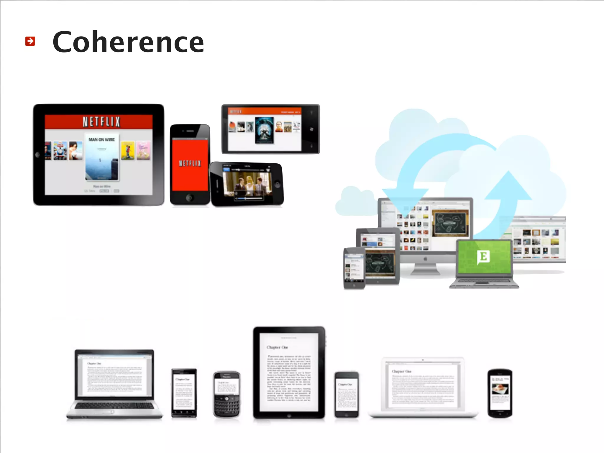
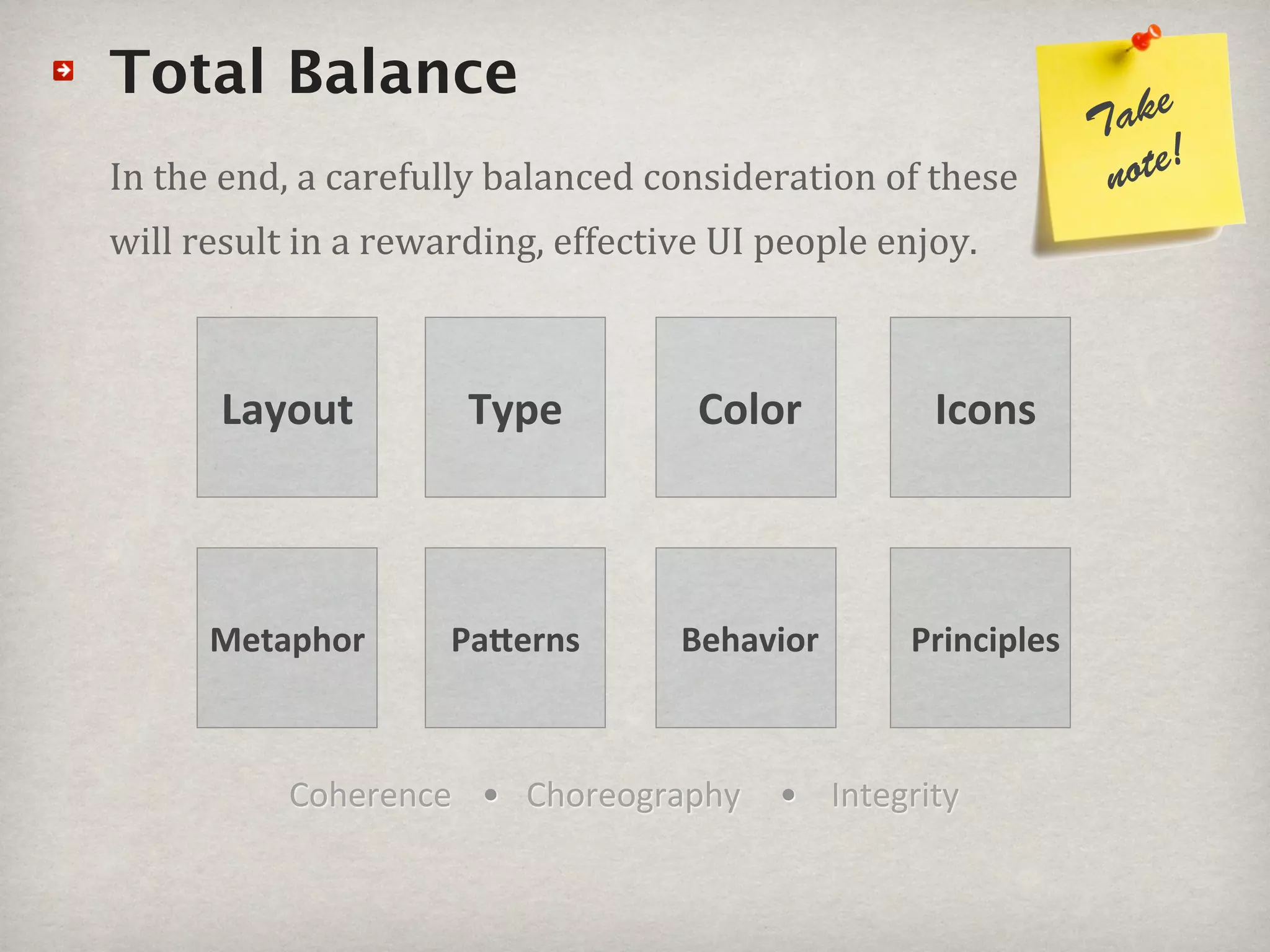
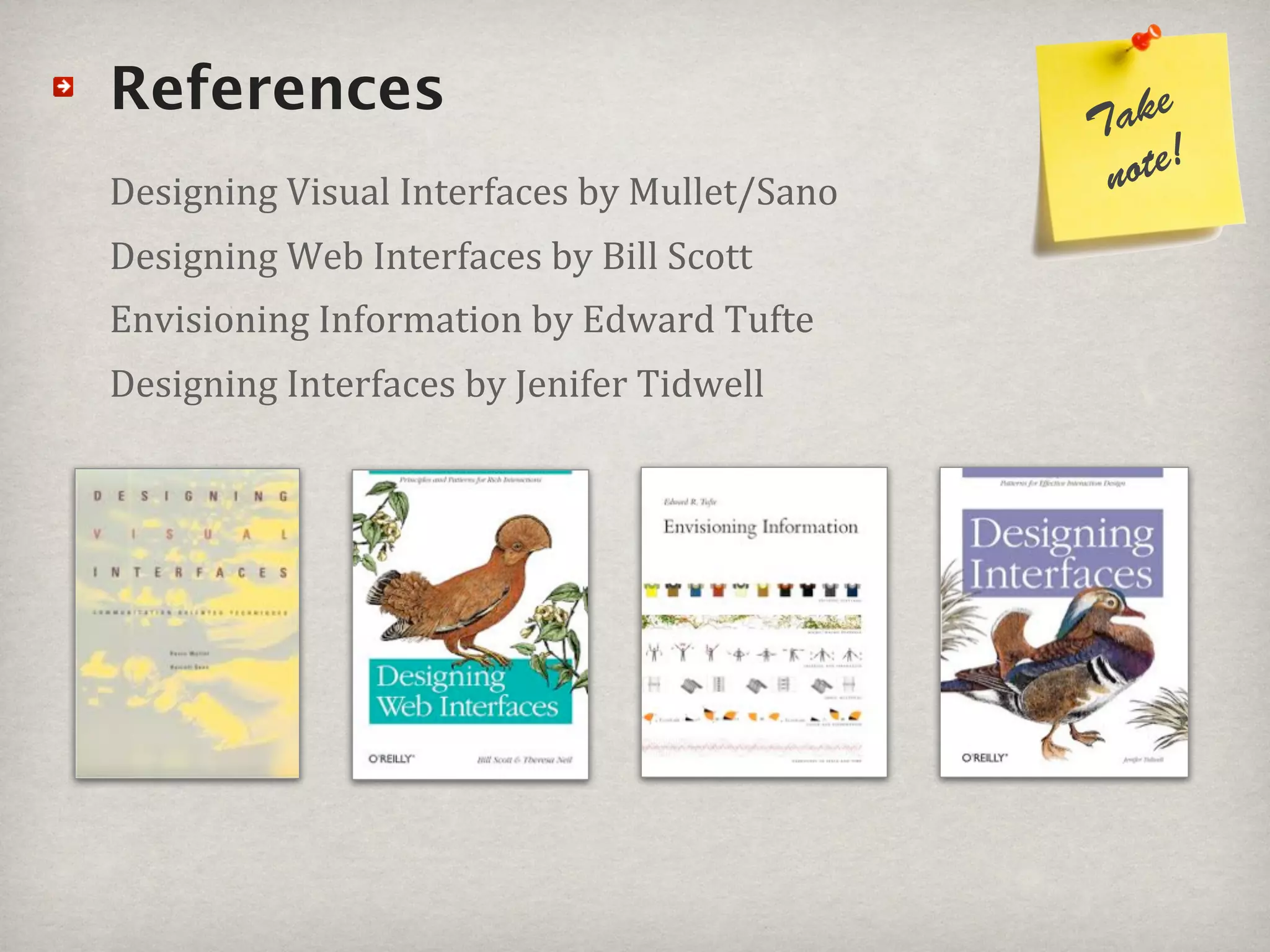
This document provides an overview of UI design fundamentals. It discusses key principles like grids and layouts, typography, color, icons, language, behavior, and coherence. It emphasizes keeping designs simple, focused and easy to use. Examples are given of design dos and don'ts. References for further reading on design are also provided, along with contact information for the author.
For more resources, visit DigitalArtTeacher.com.
There are four techniques that can be used to create an effective layout for any number of publications; posters, flyers, business cards, even websites!
They may be called by the acronym: CRAP.
Contrast, Repetition, Alignment, Proximity.
Contrast is what makes the design pop!
Presentatie mfconnect Museum Boerhaave en TwitterVera Bartels
Deze presentatie heb ik gegeven tijdens de conferentie Connect van MuseumFuture op 12 november 2010 in Zeist. De presentatie geeft een korte introductie op het twittergebruik van @museumboerhaave en een workshop gedeelte
iMinds 2011, Wim De Waele, IBBT, Past Present Futureimec.archive
IBBT, the Interdisciplinary Institute for Broadband Technology, is an independent research institution founded by the Flemish government in 2004. Our mission: to create a lasting and positive impact on society through innovation in ICT.
http://www.ibbt.be
http://www.ibbtstrategy.be
1 Pixel to the Left: Why Visual Design Details MatterEmily Rawitsch
Although we have all heard someone passionately declare, “UX is not UI,” visual design is a fundamental part of the user experience. Good design is in the details. It builds trust. It creates hierarchy of information. It makes buttons look clickable. It has the power to transform a functional experience into a delightful experience.
So how we can ensure that the visual details we design are brought to life as intended? Can moving an object 1 pixel to the left really make a difference? In an attempt to find a common language between designers and developers, we will discuss what details are worth fighting for versus when to let go.
An introductory workshop on UX design, taught to design thinking students at the Hasso-Plattner-Institut School of Design Thinking in Potsdam, Germany.
Companion website: http://paperandcode.weebly.com
Software used in the workshop: Sketch, Invision
Slides from my 2013 Breaking Development conference workshop. We explore the tools and techniques behind building your own icon fonts, covering the entire process from sketching icon concepts to properly deploying your font. Topics cover include: designing icons, considerations for designing font glyphs, setting up Illustrator templates, working with Glyphs, exporting fonts, creating web fonts, and using icon fonts semantically.
UI/UX Designer in the year 2020 | Developers Day Nov.19Lena Lekkou
What it's like to be a designer in the current year, what difficulties we all face and what soft skills everyone should invest in the following years so that they become future-proof in their discipline.
Learn to quickly build a set of icons, a logo, a newsletter banner or even a mockup for your app. We'll cover everything you need to know to build your graphical assets:
- Latest and coolest resources for the best pictures, icons, colours, fonts, and patterns.
- Demo of Sketch, a popular graphical tool used in startups, to refine your icons, change their colour and shape, export them, and customise any assets (logo, icons, newsletter banner, etc.)
- General knowledge about standard UI components and how they are built.
- Designer tricks and secrets (how to build a nice shadow? Add a filter to a cover pic? resize pictures with different proportions? Create masks? etc..).
Designing Windows 8 application - Microsoft Techdays 2013Markus Jönsson
Presenting the design and UX paradigms when designing for Windows 8. The presentation is focused around the 5 design principles from the Microsoft design guidelines for Windows 8 applications.
The presentation was performed during the Microsoft TechDays 2013 in Helsinki, Finland by Markus Jönsson & Arturs Polis.
User Experience Design, or UX Design, is often a mystifying term thrown around in sales pitches, conferences, client engagements, and the like, but what does it really entail?
Any successful application is always built, at its core, around problem solving. Take a look through the presentation to see how we approach UX Design here at Quick Left. We’ll help navigate through all the buzz words, and get down to real world examples of successful user experience design.
This is part one of a two part series. Part two coming soon.
Unicorns are considered to be the rare person who can do both design and development. But, why are they considered rare? Because consider design and development to be separate disciplines.
In this talk, I explore the spectrum of design and development, how designers can be empowered by learning about development, and how developers can be empowered by learning about design.
I gave this talk at the Big Design Conference in Addison, TX on September 6, 2014.
12. Complexity lack of careful diligence
&
extraneous redundancy Craftsmanship
Too many fonts Too many icons
Too many colors No hierarchy
Too many lines Everything emphasized
Overdone effects No useful groupings
13. Every button, icon, text, tab, menu item is another visual &
cognitive signal that a user must process & learn, thus
increasing complexity and error! Even for a split second.
22. Ta ke
note!
Patterns#books#to#keep#nearby!
Bill#Scott Jenifer#Tidwell Erin#Malone
23. Principles
A principles provides a governing basis for decision-
making and foundation for evolution.
Principles are your lighthouse for guidance when lost.
30. ake
Do’s#&#Don’ts T
note!
Don’t clutter the screen with noise
Don’t use every font or color in the palette
Don’t fill every inch of the screen with “stuff”
Don’t be verbose and redundant
Don’t have slow irritating performance
Don’t leave users hanging with no exit
Don’t be painful and frustrating
31. ake
Do’s#&#Don’ts T
note!
Do leverage a good metaphor
Do use well-defined, clean grid layouts
Do use fonts sparingly (No more than 3+)
Do apply color judiciously (No more than 5+)
Do use clear, concise language (Read vs scan)
Do use icons purposefully (Do you really need them?)
Do create clear behaviors with feedback
45. Color: where to start
Pick#a#color#palette#of#just#a#few#core#colors:#
1#base,#3#complements,#1#highlight,#and#black#/#white
Use#the#color#system#to#solve#functional#issues#_irst,#
then#add#expressive,#emotive,#brand#qualities.
53. Total Balance ke
Ta
In#the#end,#a#carefully#balanced#consideration#of#these# note!
will#result#in#a#rewarding,#effective#UI#people#enjoy.
Layout Type Color Icons
Metaphor Pa4erns Behavior Principles
Coherence • Choreography • Integrity
54.
55. “The key to good design is not Metro or any other
language or principle. The key to good design is to be
able to execute good design judgment.”
Erik Stolterman, HCI Professor,
Indiana University
56. References ke
Ta
Designing#Visual#Interfaces#by#Mullet/Sano note!
Designing#Web#Interfaces#by#Bill#Scott
Envisioning#Information#by#Edward#Tufte#
Designing#Interfaces#by#Jenifer#Tidwell