Principles of Design:
The Core Basics
That Every Marketer Should Know
27.07.2016
What Defines
Effective Design for Marketing?
2016 DESIGN BEST PRACTICES GUIDE
OUTLINE FOR TODAY’S WORKSHOP
Principles of Design Session
• Design Definition & Importance
• 4 Basic Principles of Design
• Color Wheel
• Typography
• 2016 Web Design Trends
• Additional Terminology
WHO PUT YOU IN CHARGE HERE?
Credentials for the Speaker
15 Years of International Marketing Experience
Nikki Johnson
LinkedIn Profile: linkedin.com/in/nikkijohnsonhqo
• VP of Copywriting - Hotel / Travel Marketing Agency
• TIG Global – Washington, DC
• Founder / CEO / President - My Own Three Companies
• HQO SEO, LLC – Washington, DC
• Copywriting / SEO consultancy for small and medium-size businesses
• Plugin Group – Washington, DC
• White-label marketing services / partnership with ad agencies
• Galileo Tech Media – New York, NY
• Data-driven marketing for Fortune 500 brands and enterprise companies
• Marketing Director - Multilingual, International Firm
• Binary.com – Kuala Lumpur / Cyberjaya, Malaysia
A QUICK WORD FROM OUR SPONSOR
Many Thanks to Binary.com for Hosting This Design Workshop
Still Hiring Senior Talent!
> Careers Page:
• https://www.binary.com/careers?l=EN
> Open Positions:
• https://www.binary.com/open-positions?l=EN
> To Apply:
• hr@binary.com
LET’S GET ONE THING STRAIGHT FIRST
Today’s Meetup Will Not Magically Turn You Into a Designer
Learning How to Design Takes Much More Training and Practice
• This session will cover fundamental theory and design principles
• Learning the practical skills of designing is entirely separate matter
• Many online courses are available
to start delving more specific areas, such as:
• Graphic Design
• Web Design
• UX Design
• Photoshop
• Etc.
• Then it comes down to steady practical application
• At this stage, it might be best to leave design to trained professionals?
OUR MISSION FOR TODAY
Why Are We Here?
Objective of this Session:
• Provide the tools needed to work more effectively with designers, by:
• Highlighting some of the most basic design principles
• Walking through current trends
• Equipping you with the necessary terminology
to express feedback more constructively
• Seriously, I won’t even pretend to be a designer!
• Make no mistake: I’m a marketer
• Nevertheless, there are certain basic concepts
that my entire marketing team has needed to learn,
to work with our designers efficiently in producing content
• Our goal is to share these simple principles with you
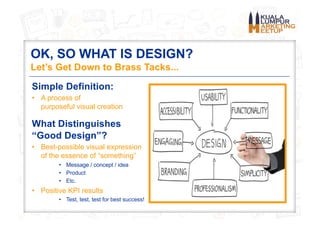
OK, SO WHAT IS DESIGN?
Let’s Get Down to Brass Tacks...
Simple Definition:
• A process of
purposeful visual creation
What Distinguishes
“Good Design”?
• Best-possible visual expression
of the essence of “something”
• Message / concept / idea
• Product
• Etc.
• Positive KPI results
• Test, test, test for best success!
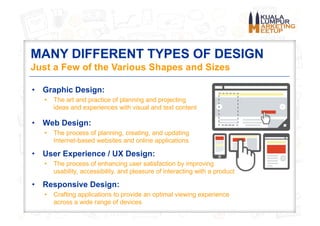
MANY DIFFERENT TYPES OF DESIGN
Just a Few of the Various Shapes and Sizes
• Graphic Design:
• The art and practice of planning and projecting
ideas and experiences with visual and text content
• Web Design:
• The process of planning, creating, and updating
Internet-based websites and online applications
• User Experience / UX Design:
• The process of enhancing user satisfaction by improving
usability, accessibility, and pleasure of interacting with a product
• Responsive Design:
• Crafting applications to provide an optimal viewing experience
across a wide range of devices
IMPORTANCE OF DESIGN IN MARKETING
Design: Step 1 of a 2-Step Process
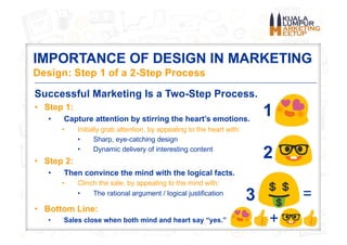
Successful Marketing Is a Two-Step Process.
• Step 1:
• Capture attention by stirring the heart’s emotions.
• Initially grab attention, by appealing to the heart with:
• Sharp, eye-catching design
• Dynamic delivery of interesting content
• Step 2:
• Then convince the mind with the logical facts.
• Clinch the sale, by appealing to the mind with:
• The rational argument / logical justification
• Bottom Line:
• Sales close when both mind and heart say “yes.” +
=
1
2
3
WHAT WE’VE LEARNED
Trial by Fire, Now in Full Blaze at Binary.com!
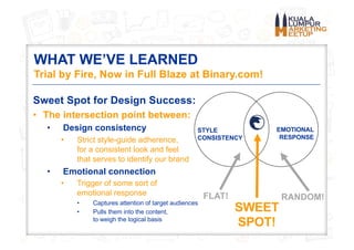
Sweet Spot for Design Success:
• The intersection point between:
• Design consistency
• Strict style-guide adherence,
for a consistent look and feel
that serves to identify our brand
• Emotional connection
• Trigger of some sort of
emotional response
• Captures attention of target audiences
• Pulls them into the content,
to weigh the logical basis
STYLE
CONSISTENCY
EMOTIONAL
RESPONSE
SWEET
SPOT!
FLAT! RANDOM!
HIGHLY RECOMMENDED READING
One Very Helpful Resource
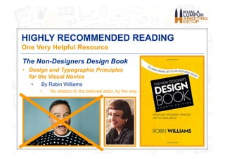
The Non-Designers Design Book
• Design and Typographic Principles
for the Visual Novice
• By Robin Williams
• No relation to the beloved actor, by the way
The 4 Basic Design Principles
Concepts Used to Arrange Structural Elements
THE 4 BASIC DESIGN PRINCIPLES
OMG, How on Earth Will You Ever Remember Them?
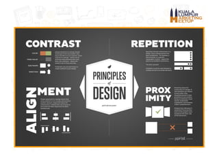
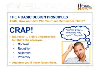
CRAP!
• No, really … highly unglamorous,
but that’s the acronym…
• Contrast
• Repetition
• Alignment
• Proximity
• And now you’ll never forget them.
Awwww, CRAP...
what were they
again? Oh yeah...
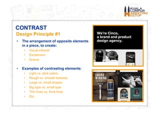
CONTRAST
• The arrangement of opposite elements
in a piece, to create:
• Visual interest
• Excitement
• Drama
• Examples of contrasting elements:
• Light vs. dark colors
• Rough vs. smooth textures
• Large vs. small shapes
• Big type vs. small type
• Thin lines vs. thick lines
• Etc.
Design Principle #1
WORKING WITH CONTRAST
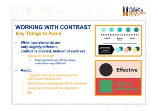
• When two elements are
only slightly different,
conflict is created, instead of contrast
• Above all, be bold!
• If two elements are not the same,
make them very different!
• Avoid:
• Trying to contrast a semi-heavy line
with a semi-heavier line
• Setting brown text against black headlines
• Using two or more similar typefaces
• Etc.
Key Things to Avoid
REPETITION
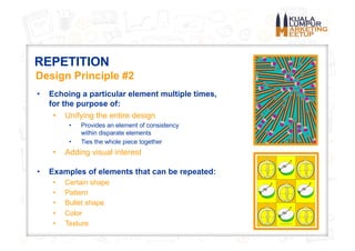
• Echoing a particular element multiple times,
for the purpose of:
• Unifying the entire design
• Provides an element of consistency
within disparate elements
• Ties the whole piece together
• Adding visual interest
• Examples of elements that can be repeated:
• Certain shape
• Pattern
• Bullet shape
• Color
• Texture
Design Principle #2
WORKING WITH REPETITION
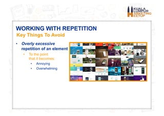
• Overly excessive
repetition of an element
• To the point
that it becomes:
• Annoying
• Overwhelming
Key Things To Avoid
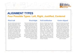
ALIGNMENT
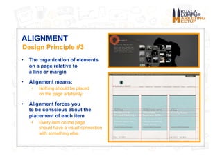
• The organization of elements
on a page relative to
a line or margin
• Alignment means:
• Nothing should be placed
on the page arbitrarily.
• Alignment forces you
to be conscious about the
placement of each item
• Every item on the page
should have a visual connection
with something else.
Design Principle #3
ALIGNMENT TYPES
Four Possible Types: Left, Right, Justified, Centered
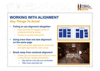
WORKING WITH ALIGNMENT
• Failing to use alignment altogether
• Quite possibly the biggest cause of
unpleasant-looking design
• Creates a visually messy look
• Using more than one text alignment
on the same page
• Don’t use center alignment for some text
and right-alignment for other areas
• Break away from centered alignment
• Unless you are consciously trying to create
a more formal, sedate presentation
• May feel the most safe and comfortable
• Often looks downright dull
Key Things To Avoid
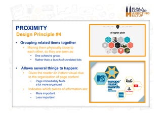
PROXIMITY
• Grouping related items together
• Moving them physically close to
each other, so they are seen as:
• One cohesive group
• Rather than a bunch of unrelated bits
• Allows several things to happen:
• Gives the reader an instant visual clue
to the organization of page content
• Page immediately feels
a lot more organized
• Indicates which pieces of information are:
• More important
• Less important
Design Principle #4
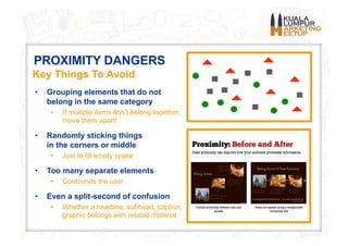
PROXIMITY DANGERS
• Grouping elements that do not
belong in the same category
• If multiple items don’t belong together,
move them apart!
• Randomly sticking things
in the corners or middle
• Just to fill empty space
• Too many separate elements
• Confounds the user
• Even a split-second of confusion
• Whether a headline, subhead, caption,
graphic belongs with related material
Key Things To Avoid
Color Wheel
The Science Behind the Color Spectrum
COLOR WHEEL: MOST COMMON VERSION
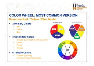
• 3 Primary Colors
• Red
• Yellow
• Blue
• 3 Secondary Colors
• Created by mixing two primary colors
• Green
• Purple
• Orange
• 6 Tertiary Colors
• Created by mixing
primary and secondary colors
Based on Red / Yellow / Blue Model
COMPLEMENTARY COLORS
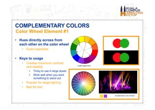
• Hues directly across from
each other on the color wheel
• Exact opposites
• Keys to usage
• Creates maximum contrast
and stability
• Tricky to use in large doses
• Work well when you want
something to stand out
• Popular for stage lighting
• Bad for text
Color Wheel Element #1
TRIAD COLOR SCHEME
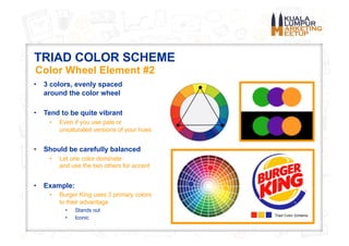
• 3 colors, evenly spaced
around the color wheel
• Tend to be quite vibrant
• Even if you use pale or
unsaturated versions of your hues
• Should be carefully balanced
• Let one color dominate
and use the two others for accent
• Example:
• Burger King uses 3 primary colors
to their advantage
• Stands out
• Iconic
Color Wheel Element #2
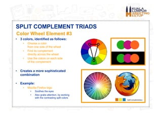
SPLIT COMPLEMENT TRIADS
• 3 colors, identified as follows:
• Choose a color
from one side of the wheel
• Find its complement
directly across the wheel
• Use the colors on each side
of the complement
• Creates a more sophisticated
combination
• Example:
• Mozilla Firefox logo
• Soothes the eyes
• Also grabs attention, by working
with the contrasting split colors
Color Wheel Element #3
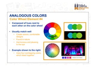
ANALOGOUS COLORS
• Composed of hues next to
each other on the color wheel
• Usually match well
• Create serene, comfortable
designs
• Found in nature
• Harmonious and pleasing
to the eye
• Example shown to the right:
• Uses four overlapping colors,
which bleed together
Color Wheel Element #4
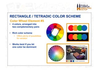
RECTANGLE / TETRADIC COLOR SCHEME
• 4 colors, arranged into
two complementary pairs
• Rich color scheme
• Offers plenty of possibilities
for variation
• Works best if you let
one color be dominant
Color Wheel Element #5
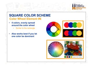
SQUARE COLOR SCHEME
• 4 colors, evenly spread
around the color wheel
• Similar to the rectangle
• Also works best if you let
one color be dominant
Color Wheel Element #6
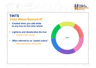
TINTS
• Created when you add white
to any hue on the color wheel
• Lightens and desaturates the hue
• Making it less intense
• Often referred to as “pastel colors”
• Many feel calmer and quieter
Color Wheel Element #7
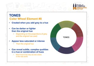
TONES
• Created when you add grey to a hue
• Can be darker or lighter
than the original hue
• Depending on the proportions of grey
and the original hue used
• Appear less saturated or intense
• Than the original hue
• Can reveal subtle, complex qualities
in a hue or combination of hues
• More true to the way we see colors
in the real world
Color Wheel Element #8
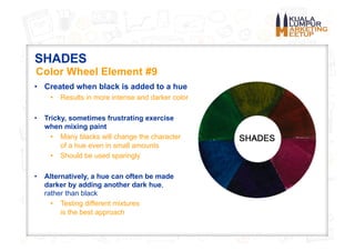
SHADES
• Created when black is added to a hue
• Results in more intense and darker color
• Tricky, sometimes frustrating exercise
when mixing paint
• Many blacks will change the character
of a hue even in small amounts
• Should be used sparingly
• Alternatively, a hue can often be made
darker by adding another dark hue,
rather than black
• Testing different mixtures
is the best approach
Color Wheel Element #9
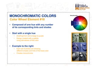
MONOCHROMATIC COLORS
• Composed of one hue with any number
of its corresponding tints and shades
• Start with a single hue
• Anything from red to beige to purple
• Design created with a palette
using derivatives of that color
• Example to the right:
• Each set of photos are showing
different shades and tints of the base color
• Creates monochrome
Color Wheel Element #10
WARM COLORS VS. COOL COLORS
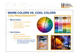
• Warm Colors
• Contain some red or yellow
• Vivid, energetic
• Tend to advance in space /
come to the front
• Cool Colors
• Contain some blue
• Give an impression of calm
• Recede into the background
• Sometimes, you have to use more
of a cool color to make an impact
or contrast effectively
Color Wheel Element #11
CMYK VS. RGB / PRINT VS. WEB
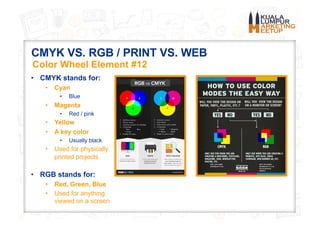
• CMYK stands for:
• Cyan
• Blue
• Magenta
• Red / pink
• Yellow
• A key color
• Usually black
• Used for physically
printed projects
• RGB stands for:
• Red, Green, Blue
• Used for anything
viewed on a screen
Color Wheel Element #12
Typographic Styles
The Taxonomy of Fonts & Typefaces
TYPOGRAPHIC STYLES
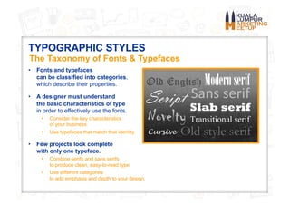
• Fonts and typefaces
can be classified into categories,
which describe their properties.
• A designer must understand
the basic characteristics of type
in order to effectively use the fonts.
• Consider the key characteristics
of your business.
• Use typefaces that match that identity.
• Few projects look complete
with only one typeface.
• Combine serifs and sans serifs
to produce clean, easy-to-read type.
• Use different categories
to add emphasis and depth to your design.
The Taxonomy of Fonts & Typefaces
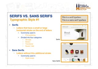
SERIFS VS. SANS SERIFS
• Serifs
• Letters that have a small or large
horizontal stroke on the end of letters
• Commonly used in:
• Print publishing
• Divided into four categories
• Old style
• Modern
• Transitional
• Square / slab
• Sans Serifs
• Letters without this additional stroke
• Commonly used in:
• Digital design
Typographic Style #1
Serifs
Sans Serifs
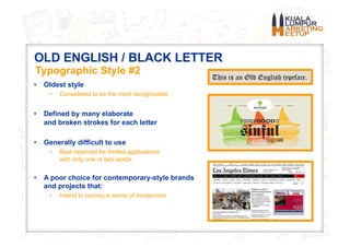
OLD ENGLISH / BLACK LETTER
• Oldest style
• Considered to be the most recognizable
• Defined by many elaborate
and broken strokes for each letter
• Generally difficult to use
• Best reserved for limited applications
with only one or two words
• A poor choice for contemporary-style brands
and projects that:
• Intend to convey a sense of modernism
Typographic Style #2
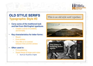
OLD STYLE SERIFS
• Carry some of the traditional look
and feel from Old English typefaces
• Creates a sense of credibility
and formality
• Key characteristics for letter forms:
• Round
• Even strokes
• Very little or no contrast
between thick and thin strokes
• Often used in:
• Print publishing
• Digital design at larger point sizes
• Such as 18 points or higher
Typographic Style #3
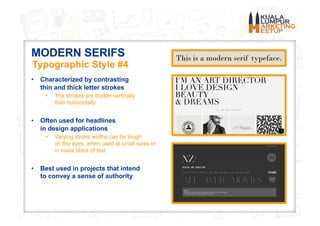
MODERN SERIFS
• Characterized by contrasting
thin and thick letter strokes
• The strokes are thicker vertically
than horizontally
• Often used for headlines
in design applications
• Varying stroke widths can be tough
on the eyes, when used at small sizes or
in mass block of text
• Best used in projects that intend
to convey a sense of authority
Typographic Style #4
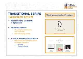
TRANSITIONAL SERIFS
• Most commonly used serifs
in digital work
• Each letter contains:
• The sharp horizontal stroke
from each letter
• Also has varying strokes
• Is used in a variety of applications
• Most notably as Times New Roman,
the default typeface in:
• MS Word
• Adobe Photoshop
Typographic Style #5
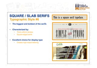
SQUARE / SLAB SERIFS
• The biggest and boldest of the serifs
• Characterized by:
• Thick uniform strokes
• Square-edged serifs
• Excellent choice for display type
• Creates high-impact lettering
Typographic Style #6
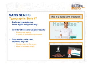
SANS SERIFS
• Preferred type category
of the digital design industry
• All letter strokes are weighted equally
• Easy to read against
a variety of contrasting backgrounds
• Sans serifs can be used
at almost any size
• Render nicely on the screen
• Great for any web project
Typographic Style #7
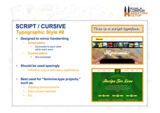
SCRIPT / CURSIVE
• Designed to mirror handwriting
• Script letters
• Connected to each other
within each word
• Cursive letters
• Not connected
• Should be used sparingly
• Difficult to read in text-heavy applications
• Best used for “feminine-type projects,”
such as:
• Wedding announcements
• Baby-shower websites
• Etc.
Typographic Style #8
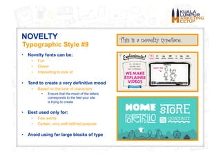
NOVELTY
• Novelty fonts can be:
• Fun
• Clever
• Interesting to look at
• Tend to create a very definitive mood
• Based on the look of characters
• Ensure that the mood of the letters
corresponds to the feel your site
is trying to create
• Best used only for:
• Few words
• Certain, very well-defined purpose
• Avoid using for large blocks of type
Typographic Style #9
Web Design Trends In 2016
A Handful of Increasingly Popular Tactics
2016 Web Design Trends
• As technology changes, design has
to adapt to meet new needs.
• Design is thus highly dynamic.
• Tactics must be adjusted to
accommodate both form and function.
• User experience is the central focus
of the most relevant design trends.
• Above all, web content needs to be:
• Responsive
• Accessible
• Simple to use
• Focused on enhancing user satisfaction
Increasingly Popular Tactics
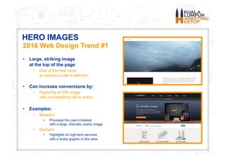
HERO IMAGES
• Large, striking image
at the top of the page
• One of the best ways
to capture a user’s attention
• Can increase conversions by:
• Featuring an HD image
with a compelling call to action
• Examples:
• Maaemo
• Provokes the user’s interest
with a large, dramatic scenic image
• Element
• Highlights its high-tech services
with a sharp graphic in this area
2016 Web Design Trend #1
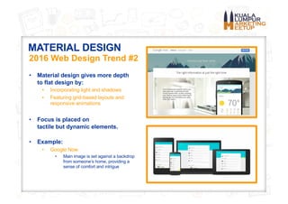
MATERIAL DESIGN
• Material design gives more depth
to flat design by:
• Incorporating light and shadows
• Featuring grid-based layouts and
responsive animations
• Focus is placed on
tactile but dynamic elements.
• Example:
• Google Now
• Main image is set against a backdrop
from someone’s home, providing a
sense of comfort and intrigue
2016 Web Design Trend #2
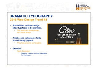
DRAMATIC TYPOGRAPHY
• Streamlined, minimal design
allow typefaces to be dramatic.
• Can produce a strong impact,
as a visual accent
• Artistic, and calligraphic fonts
are becoming popular.
• They feel personal and tangible.
• Example:
• Austin Eastciders
• Uses big, cursive, and bold typography
for the header
2016 Web Design Trend #3
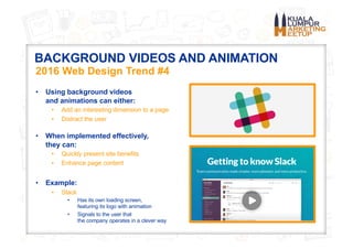
BACKGROUND VIDEOS AND ANIMATION
• Using background videos
and animations can either:
• Add an interesting dimension to a page
• Distract the user
• When implemented effectively,
they can:
• Quickly present site benefits
• Enhance page content
• Example:
• Slack
• Has its own loading screen,
featuring its logo with animation
• Signals to the user that
the company operates in a clever way
2016 Web Design Trend #4
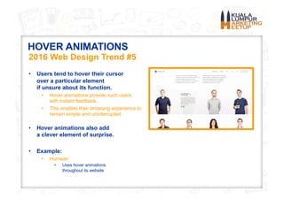
HOVER ANIMATIONS
• Users tend to hover their cursor
over a particular element
if unsure about its function.
• Hover animations provide such users
with instant feedback.
• This enables their browsing experience to
remain simple and uninterrupted.
• Hover animations also add
a clever element of surprise.
• Example:
• Humaan
• Uses hover animations
throughout its website
2016 Web Design Trend #5
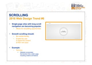
SCROLLING
• Single-page sites with long scroll
navigation are becoming popular.
• Allows for storytelling opportunities
• Smooth scrolling should:
• Be mobile-friendly
• Enable the user
to digest the content
at their own pace
• Example:
• Technics
• Website incorporates
this function into a static page,
including creative animations
2016 Web Design Trend #6
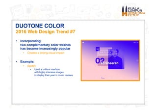
DUOTONE COLOR
• Incorporating
two complementary color washes
has become increasingly popular
• Creates a strong visual impact
• Example:
• Spotify
• Used a brilliant interface
with highly intensive images,
to display their year in music reviews
2016 Web Design Trend #7
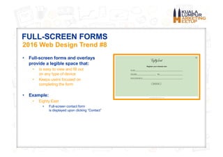
FULL-SCREEN FORMS
• Full-screen forms and overlays
provide a legible space that:
• Is easy to view and fill out
on any type of device
• Keeps users focused on
completing the form
• Example:
• Eighty East
• Full-screen contact form
is displayed upon clicking “Contact”
2016 Web Design Trend #8
ADDITIONAL RESOURCES
Other Helpful Links to Explore
ADDITIONAL DESIGN RESOURCES
• 50 Design Terms Explained Simply For Non-Designers:
• https://designschool.canva.com/blog/graphic-design-terms/
• 14 Best Online Graphic Design Courses for Beginners:
• http://www.skilledup.com/articles/best-online-graphic-design-courses
• 10 Best Free Online Design Courses for Web Designers:
• http://justcreative.com/2015/07/02/10-best-free-online-courses-for-web-designers/
• 75 Best Photoshop Tutorials:
• http://www.digitalartsonline.co.uk/features/illustration/75-best-photoshop-tutorials-tips/
• 25 Best UX Tutorials You Have to Watch in 2016:
• http://1stwebdesigner.com/best-ux-design-tutorials/
Other Helpful Links to Explore
OTHER MARKETING RESOURCES
From Your Friends at Kuala Lumpur Marketing Meetup
• Join Us for More Free Workshops!
• SEO Bootcamp:
• Saturday, August 20, 10 AM – 4 PM
Binary.com, Cyberjaya
• Many More Marketing / IT Subjects:
• Check the Calendar:
• http://www.meetup.com/
Kuala-Lumpur-Marketing-Meetup/
• Follow Us!
• Facebook:
• https://www.facebook.com/Kuala-Lumpur-Marketing-Meetup-203684033319402/
• LinkedIn:
• https://www.linkedin.com/company/7591769
• Peatix:
• http://kuala-lumpur-marketing-meetup.peatix.com/group/33386/
Thanks for Attending
Today’s Design Principles Workshop!
See You Next Time! Bring Along Some Friends!