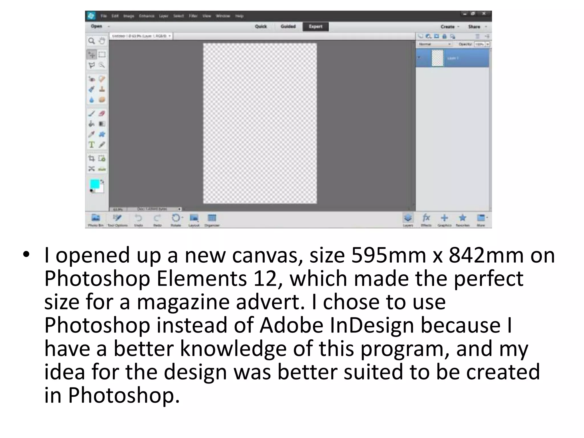
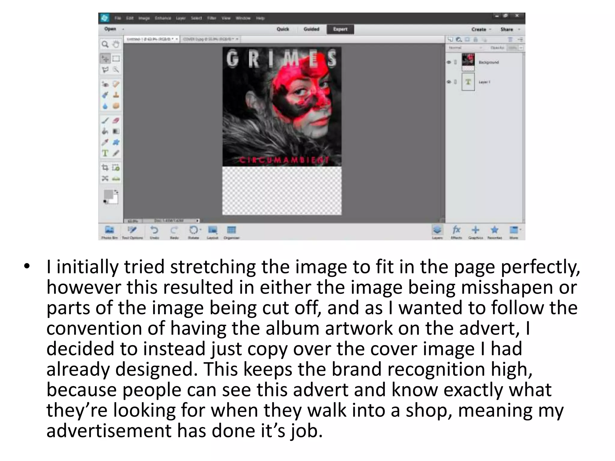
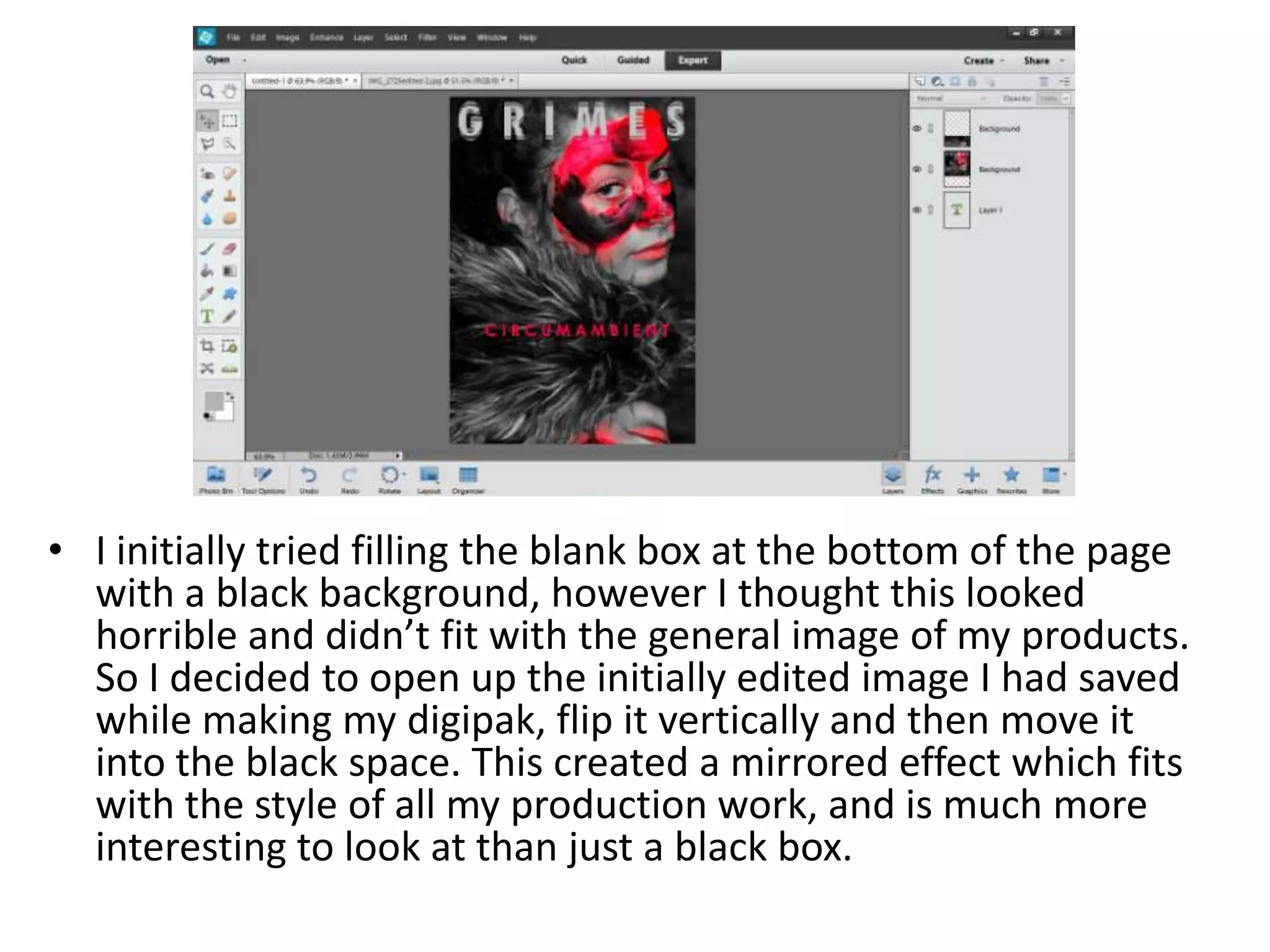
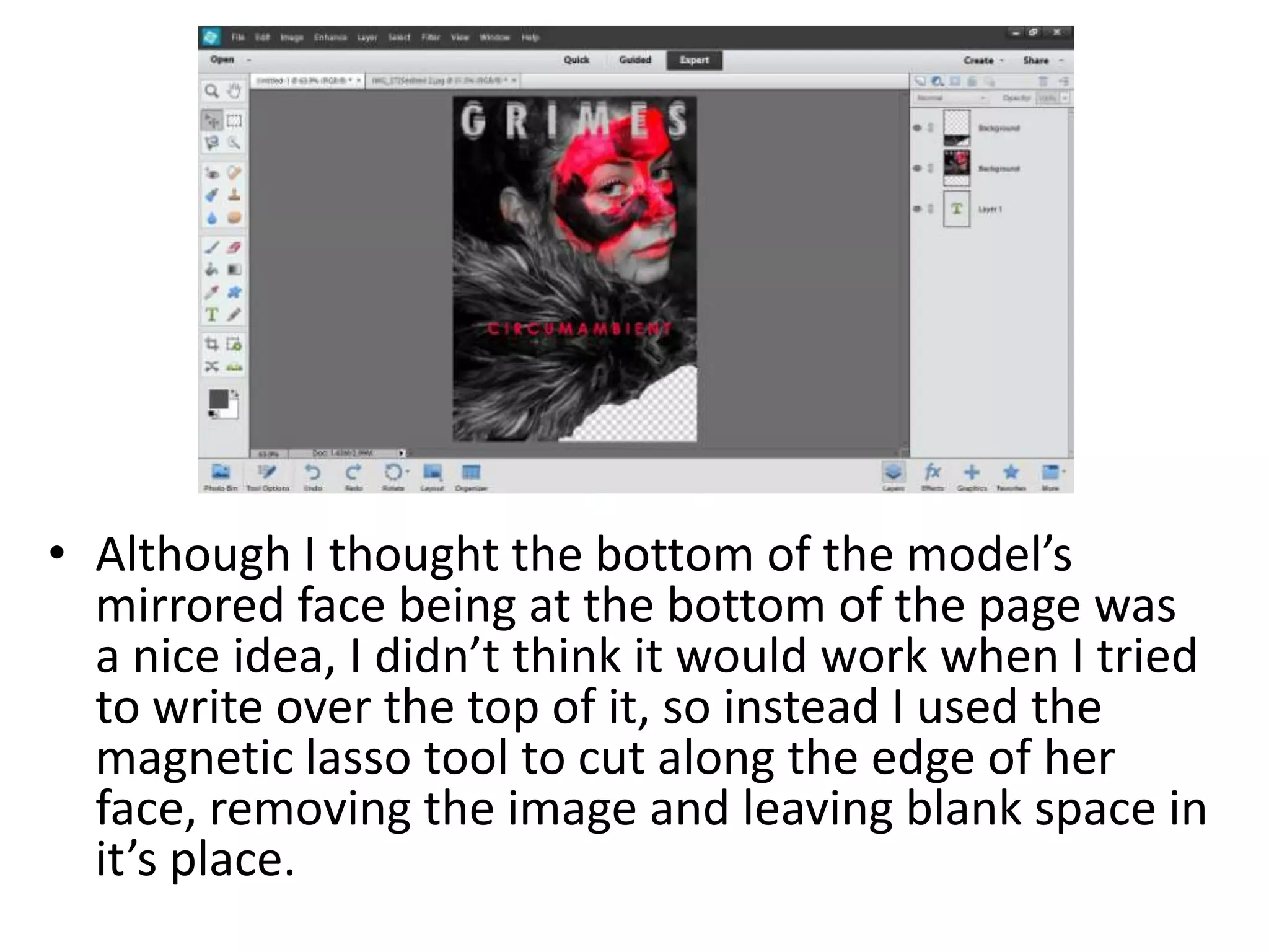
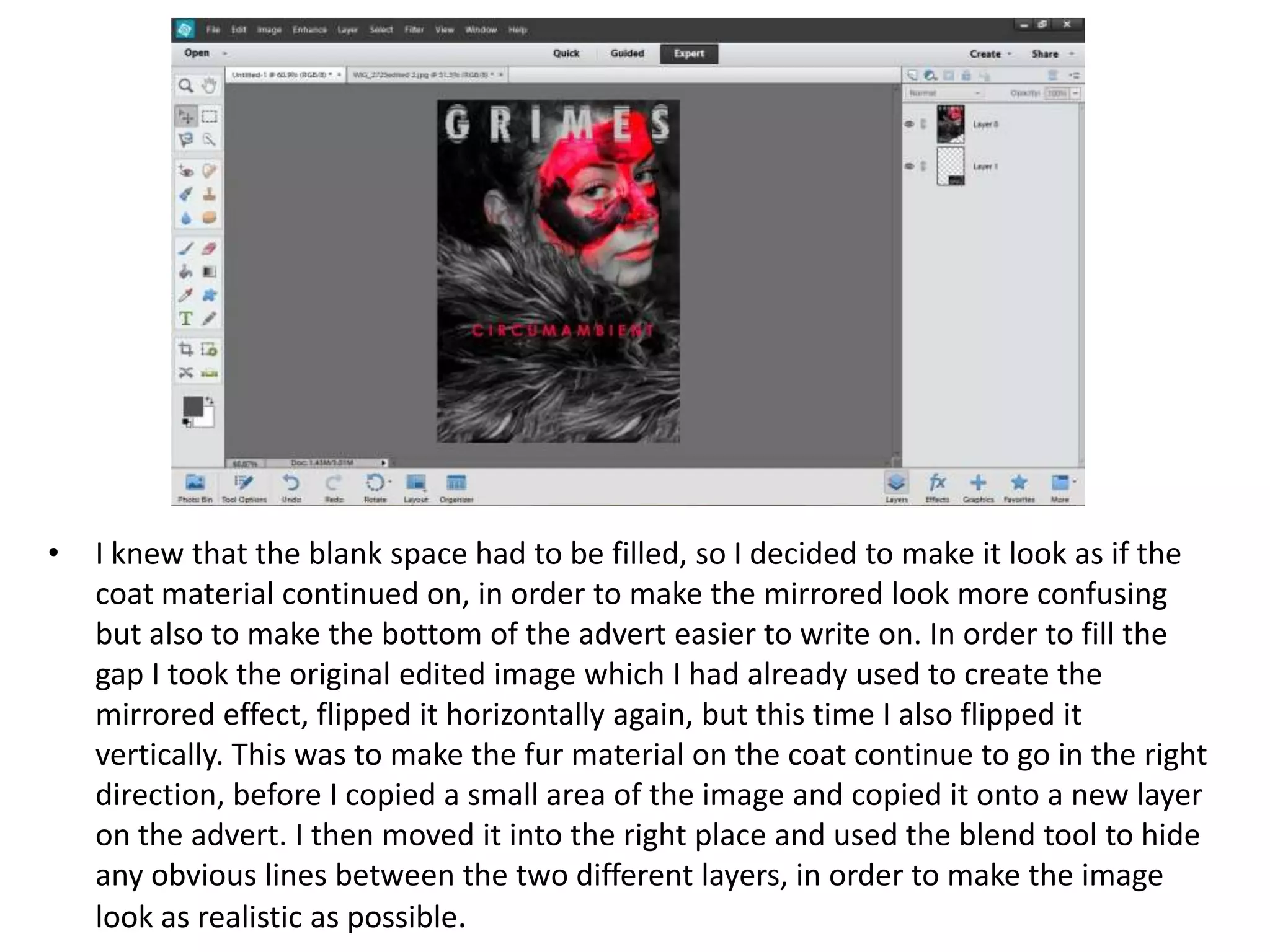
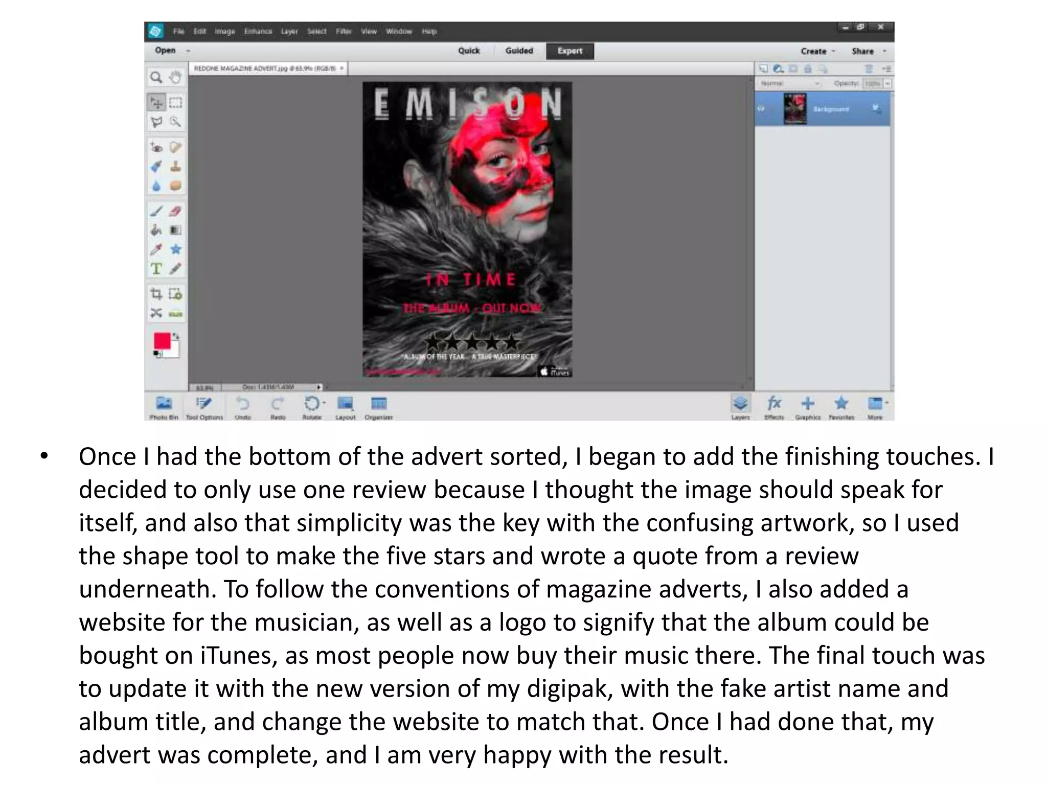
Editing my Magazine Advert
• I opened up a new canvas, size 595mm x 842mm on
Photoshop Elements 12, which made the perfect
size for a magazine advert. I chose to use
Photoshop instead of Adobe InDesign because I
have a better knowledge of this program, and my
idea for the design was better suited to be created
in Photoshop.
• I initially tried stretching the image to fit in the page perfectly,
however this resulted in either the image being misshapen or
parts of the image being cut off, and as I wanted to follow the
convention of having the album artwork on the advert, I
decided to instead just copy over the cover image I had
already designed. This keeps the brand recognition high,
because people can see this advert and know exactly what
they’re looking for when they walk into a shop, meaning my
advertisement has done it’s job.
• I initially tried filling the blank box at the bottom of the page
with a black background, however I thought this looked
horrible and didn’t fit with the general image of my products.
So I decided to open up the initially edited image I had saved
while making my digipak, flip it vertically and then move it
into the black space. This created a mirrored effect which fits
with the style of all my production work, and is much more
interesting to look at than just a black box.
• Although I thought the bottom of the model’s
mirrored face being at the bottom of the page was
a nice idea, I didn’t think it would work when I tried
to write over the top of it, so instead I used the
magnetic lasso tool to cut along the edge of her
face, removing the image and leaving blank space in
it’s place.
• I knew that the blank space had to be filled, so I decided to make it look as if the
coat material continued on, in order to make the mirrored look more confusing
but also to make the bottom of the advert easier to write on. In order to fill the
gap I took the original edited image which I had already used to create the
mirrored effect, flipped it horizontally again, but this time I also flipped it
vertically. This was to make the fur material on the coat continue to go in the right
direction, before I copied a small area of the image and copied it onto a new layer
on the advert. I then moved it into the right place and used the blend tool to hide
any obvious lines between the two different layers, in order to make the image
look as realistic as possible.
• Once I had the bottom of the advert sorted, I began to add the finishing touches. I
decided to only use one review because I thought the image should speak for
itself, and also that simplicity was the key with the confusing artwork, so I used
the shape tool to make the five stars and wrote a quote from a review
underneath. To follow the conventions of magazine adverts, I also added a
website for the musician, as well as a logo to signify that the album could be
bought on iTunes, as most people now buy their music there. The final touch was
to update it with the new version of my digipak, with the fake artist name and
album title, and change the website to match that. Once I had done that, my
advert was complete, and I am very happy with the result.

Editing my magazine advert

  • 1.
  • 2.
    • I openedup a new canvas, size 595mm x 842mm on Photoshop Elements 12, which made the perfect size for a magazine advert. I chose to use Photoshop instead of Adobe InDesign because I have a better knowledge of this program, and my idea for the design was better suited to be created in Photoshop.
  • 3.
    • I initiallytried stretching the image to fit in the page perfectly, however this resulted in either the image being misshapen or parts of the image being cut off, and as I wanted to follow the convention of having the album artwork on the advert, I decided to instead just copy over the cover image I had already designed. This keeps the brand recognition high, because people can see this advert and know exactly what they’re looking for when they walk into a shop, meaning my advertisement has done it’s job.
  • 4.
    • I initiallytried filling the blank box at the bottom of the page with a black background, however I thought this looked horrible and didn’t fit with the general image of my products. So I decided to open up the initially edited image I had saved while making my digipak, flip it vertically and then move it into the black space. This created a mirrored effect which fits with the style of all my production work, and is much more interesting to look at than just a black box.
  • 5.
    • Although Ithought the bottom of the model’s mirrored face being at the bottom of the page was a nice idea, I didn’t think it would work when I tried to write over the top of it, so instead I used the magnetic lasso tool to cut along the edge of her face, removing the image and leaving blank space in it’s place.
  • 6.
    • I knewthat the blank space had to be filled, so I decided to make it look as if the coat material continued on, in order to make the mirrored look more confusing but also to make the bottom of the advert easier to write on. In order to fill the gap I took the original edited image which I had already used to create the mirrored effect, flipped it horizontally again, but this time I also flipped it vertically. This was to make the fur material on the coat continue to go in the right direction, before I copied a small area of the image and copied it onto a new layer on the advert. I then moved it into the right place and used the blend tool to hide any obvious lines between the two different layers, in order to make the image look as realistic as possible.
  • 7.
    • Once Ihad the bottom of the advert sorted, I began to add the finishing touches. I decided to only use one review because I thought the image should speak for itself, and also that simplicity was the key with the confusing artwork, so I used the shape tool to make the five stars and wrote a quote from a review underneath. To follow the conventions of magazine adverts, I also added a website for the musician, as well as a logo to signify that the album could be bought on iTunes, as most people now buy their music there. The final touch was to update it with the new version of my digipak, with the fake artist name and album title, and change the website to match that. Once I had done that, my advert was complete, and I am very happy with the result.