This magazine cover analysis summarizes the key design elements of a music magazine cover featuring the band Lostprophets. It describes the unusual placement of the masthead over the main image, the selling lines advertising an upcoming tour and magazine extras, the use of multiple images and colors to attract readers, and buttons and fonts used to emphasize important information. Overall, the cover breaks conventions to stand out visually and promote the band and magazine content.
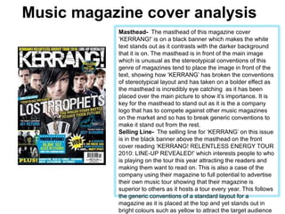
1. Music magazine cover analysis Masthead- The masthead of this magazine cover ‘KERRANG!’ is on a black banner which makes the white text stands out as it contrasts with the darker background that it is on. The masthead is in front of the main image which is unusual as the stereotypical conventions of this genre of magazines tend to place the image in front of the text, showing how ‘KERRANG’ has broken the conventions of stereotypical layout and has taken on a bolder effect as the masthead is incredibly eye catching as it has been placed over the main picture to show it’s importance. It is key for the masthead to stand out as it is the a company logo that has to compete against other music magazines on the market and so has to break generic conventions to make it stand out from the rest. Selling Line- The selling line for ‘KERRANG’ on this issue is in the black banner above the masthead on the front cover reading ‘KERRANG! RELENTLESS ENERGY TOUR 2010: LINE-UP REVEALED!’ which interests people to who is playing on the tour this year attracting the readers and making them want to read on. This is also a case of the company using their magazine to full potential to advertise their own music tour showing that their magazine is superior to others as it hosts a tour every year. This follows the generic conventions of a standard layout for a magazine as it is placed at the top and yet stands out in bright colours such as yellow to attract the target audience of teenagers to Kerrang.
2. Music magazine cover analysis Main Image- The main image is of the whole of the band ‘Lostprophets’ and yet the lead singer ‘Ian Watkins’ is placed right in the centre and is more forward than the rest of the band, showing his importance. The shot used for the photo is a Mid-shot, the generic type for a magazine, and The angle of the photo is slightly a low angle shot to emphasize the power of the band with their expressions of determination on their face to show that they mean business, which pairs with their cover line “THE WELSH STARS BATTLE TO SAVE THEIR FUTURE” which attracts the eye as the text is yellow on a black background to catch the eye of the reader. Other Images- There are a few other small images placed on the front cover. This is an unusual convention as not many music magazines place extra images on the front cover as they could draw attention away from the main image, however, Having the extra images allows the cover to advertise and sell the magazine as it reveals in a small caption next to the pictures reading “POSTER SPECIAL!” attracting the readers attention to the free extra’s the magazine has to offer. The images allow the readers to get a greater insight to the content of the magazine and draws in more visual attention as a young audience is more likely to be attracted by images rather than a lot of text and also, a more teenage audience would be more interested in posters than adults.
3. Music magazine cover analysis Colour Scheme- The colour scheme of the magazine is Yellow, Black, Blue & White. The cover used 4 different colours instead of the usual 3 to attract more attention, and catch the eye of readers. The white and black harmonize with the main image and background as the band are dressed in all black and the background is a plain white. All black and white text also compliment the masthead as they follow the colour scheme. There is no yellow or blue in the main image, which shows how the magazine has used contrasting colours to important parts of the cover. Button- There are two buttons on the front cover; the first is the selling line of Kerrang! magazine in a button on the right under the masthead which reads “MASSIVE 7-DAY ROCK GUIDE” in a yellow font to emphasise its importance. The button looks like a sticker slapped on carelessly to emphasize the genre of the magazine, a sort of unorganized The second button is for a prize as it says in bold letters ‘WIN!’ in bright colours again showing the colour scheme helping to emphasize the importance of the competition and attract the readers attention by putting the prizes in alternate colours too. A star shaped stamp or sticker is exciting and commonly is used in competitions.
4. Music magazine cover analysis Selling Line- In this front cover, the selling lines are mainly names of artists that are being featured in the magazine and the extra images also work as a point of sales. The Cover line is the name of the magazines main feature, ‘LOSTPROPHETS’. The font of it is largest out of all other selling lines as it is important for the main story to attract the reader into the main story of the magazine. Explanatory- The explanatory text are quotes from interviews within the magazine such as “THIS IS ALL WE HAVE!” to interest people to read further into the story. Quotes allow the reader to know that there are interviews inside the magazine, and allows the reader to connect with the interviewee before further reading. Font- On this front cover, there are at least 5 types of font which is unusual for a front cover as usually, magazines tend to stick to 3 types; keeping a simple yet professional and neat look. This magazine cover breaks conventions to create a different effect to the magazine without making it look messy, creating a new and individual effect.