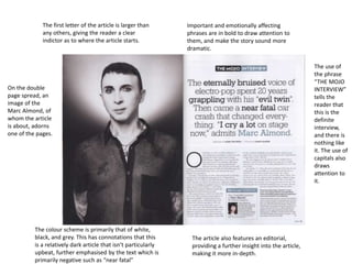
1. The first letter of the article is larger than
any others, giving the reader a clear
indictor as to where the article starts.
Important and emotionally affecting
phrases are in bold to draw attention to
them, and make the story sound more
dramatic.
The use of
the phrase
“THE MOJO
INTERVIEW”
tells the
reader that
this is the
definite
interview,
and there is
nothing like
it. The use of
capitals also
draws
attention to
it.
On the double
page spread, an
image of the
Marc Almond, of
whom the article
is about, adorns
one of the pages.
The colour scheme is primarily that of white,
black, and grey. This has connotations that this
is a relatively dark article that isn’t particularly
upbeat, further emphasised by the text which is
primarily negative such as “near fatal”
The article also features an editorial,
providing a further insight into the article,
making it more in-depth.
2. Again we see a
common feature of
double spreads. That
being a main image
taking up a whole
page.
The layout uses black text against a white
background. This is a common feature seen in indie
music magazines as it allows for the text to stand out
more, as well as be easily visible.
The text used for the
title is all in capitals to
draw attention to it. It
also is a pull quote,
telling the reader what
sort of character the
interviewee is. The use
of alliteration seen in
“book” and “blur”, as
well as “vomiting” and
“vicodin” make it
catchier, and a better
title.
The man on the main
image is seen looking up
to face the reader. This
implies that he is a
character with a shady
past.
The stubble on the man
further connote his
murky past. The fact that
he isn’t clean shaven
deliberately gives us an
insight into his life.
The man is shown is shown to be
wearing what appears to be a vneck top, but this only shows off his
skin, making him appear more
vulnerable, especially given his
pose and insight into his life.
It is clear to see when a
new section of the
article starts as the very
first letter of it is seen to
be in a larger font than
the rest.
3. The headline on the
main image is larger
than any other text on
the page (bar the
introductory ‘A’) which
makes it the first thing
the reader sees upon
opening the double page
spread.
Again a large capital font
is used to show the
reader the start of the
article. This is clearly a
feature of music
magazines.
The title “IN GOOD
HEALTH” is presented in
orange and white, the
colours of the drink in
the man’s hand, as well
as orange being the
same colour as the top
the man is wearing.
The fact that the man in the main image is
holding two drinks and doing a direct gaze
makes it seem as if the reader is in this
traditional West London pub with him for a
drink. This makes the article seem a lot
more inviting and engaging.
On the right page, a
quote from the article is
used. This is important
information as it will
likely be the first thing
the reader sees when
viewing the right page
thanks to it’s position.
The band are seen
performing in the
bottom right hand
corner. This is clearly not
a major part of the
article, but still relevant.