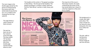
1. The main image on the
double page spread has the
person of interest facing
the camera with their
whole body facing directly
at it. It is a medium shot
showing from her hips
upwards.
The page follows a
colour scheme of
black and pink.
The text has
been set out in
four columns
across the page.
The drop capital
‘W’ has been
placed to the
left of the
double page
spread showing
where to start
The headline of this article is ‘The gospel according
to Nicki Minaj’. The first part of the headline ‘The
gospel according to’ is written in black, bold font.
And the ‘Nicki Minaj’ is written in bold, sharp, pink
font.
The strap-line of this issue is
‘Bow down mortals, the newly
crowned Day-Glo queen of hip
hop stands before you’ shows it’s
a hip hop magazine as they seen
her as royalty.
The background is a
simple, plain light
pink colour. The
artist is known for
her favourite colour
being pink; this may
be to reflect her
tastes.
The pink adds to
the feminine,
youthful and
beauty image we
see from the font.
2. The text columns
look tidy as they're
all in black, having
the pink, makes it
stand out more
The pink on
the page
makes it seem
more feminist,
as pink is a
girly colour.
There is different
title breaks at the
start of each
column, makes it
easier to read.
The pictures are
very similar, but
plain. As its
simple it stands
out more.
The text
doesn’t look so
text heavy. It
looks light and
easy to read.
Having two
picture so
similar to each
other makes it
look really
nice and
professional
3. The only two
colours used on
the double page
spread, this and as
it is a grey theme
these two colour
really stand out
bold.
Her name is the
only part of the
text that in in a
different
colour, showing
the
importance.
Also making it
very eye-catchy
The main image of
her is in a bright
dominant colour,
also making it eyecatchy
The smaller images of her,
looks like she's dancing.
These images are in black
and white so it doesn’t take
views of the main image.
The smaller images makes her seem
as a crazy, fun outgoing person by her
poses, but the main image suggest
that she is innocent.
There is a lot of
text but it is
layered out so
that it doesn't
look as text
heavy as it is.
The same
font is used
for the main
text, and the
same for the
pull quote
and the
introduction
‘NOW’ is the
only other text
that has colour.