1. Text placed on the
magazine are possibly
the highlights out of it
for the target
audience to look at.
Logo at the top right
corner.
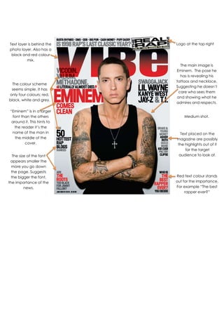
The main image is
Eminem. The pose he
has is revealing his
tattoos and necklace.
Suggesting he doesn’t
care who sees them
and showing what he
admires and respects.
Text layer is behind the
photo layer. Also has a
black and red colour
mix.
The colour scheme
seems simple. It has
only four colours; red,
black, white and grey.
“Eminem” is in a larger
font than the others
around it. This hints to
the reader it’s the
name of the man in
the middle of the
cover.
The size of the font
appears smaller the
more you go down
the page. Suggests
the bigger the font,
the importance of the
news.
Medium shot.
Red text colour stands
out for the importance.
For example “The best
rapper ever?”