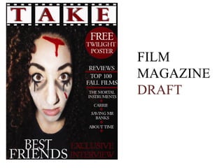
2. The masthead is shown in the template
of a film strip, with a bold black and
white outline. The text ‘TAKE’ is shown
in capital, block letters in a dark red to
stand out against the black. I put a slight
shadow to the left hand side of the text to
show depth to the text.
3. I used quite a plain picture
of the actress and edited it
to have a dark background
to blend in. I then edited
her facial features to be
bold and stand out; with
pale skin against the black
colour theme. The image
uses a black, red and white
colour which then matches
the theme of the magazine
cover.
4. I used a circle template in the
right hand corner of the
magazine and filled it with
the dark red, to stand out
against the background, with white
text of ‘FREE twilight poster’. The
word ‘FREE’ is written in capitals to
draw attention from the reader, with
the two other words slightly smaller
to fit into the small space.
5. Down the right hand side of the
cover I put a few coverlines, to
intrigue the reader as to what’s
inside. I used white, bold yet
quite small text to stand out. The
first two coverlines are shown in
a bolder font with a red line to
separate them, the next four are
references to films with a small
diamond symbol separating
them.
6. I put the title of the film ‘Best Friends’
in white at the bottom of the image to
show its connection, with the white
contrasting against the blackness around
it. I then put a text box next to the title
with dark red writing ‘Exclusive
Interview’ in smaller, block capitals to
entice the audience further.