
Recommended
More Related Content
What's hot
What's hot (13)
Viewers also liked
Similar to Nicki Minaj colour scheme analysis
Similar to Nicki Minaj colour scheme analysis (20)
Recently uploaded
Recently uploaded (20)
Nicki Minaj colour scheme analysis
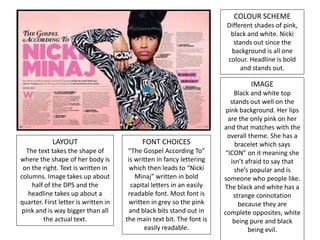
- 1. COLOUR SCHEME Different shades of pink, black and white. Nicki stands out since the background is all one colour. Headline is bold and stands out. IMAGE Black and white top stands out well on the pink background. Her lips are the only pink on her and that matches with the overall theme. She has a bracelet which says “ICON” on it meaning she isn’t afraid to say that she’s popular and is someone who people like. The black and white has a strange connotation because they are complete opposites, white being pure and black being evil. LAYOUT The text takes the shape of where the shape of her body is on the right. Text is written in columns. Image takes up about half of the DPS and the headline takes up about a quarter. First letter is written in pink and is way bigger than all the actual text. FONT CHOICES “The Gospel According To” is written in fancy lettering which then leads to “Nicki Minaj” written in bold capital letters in an easily readable font. Most font is written in grey so the pink and black bits stand out in the main text bit. The font is easily readable.
- 2. COLOUR SCHEME Black, white and red. The contrasting white is on a black background for the headline. The red is the only colour and the rest is quite dull. IMAGE She is showcasing different style – emo. She’s looking at the camera and posing in a laid back way and leaning forward. She’s the only colour on the page apart from a tiny bit of text that is red. Her make-up is supposed to be bold and make her stand out. The image is the first thing you see on the page. Casually dressed and hair is intentionally messy. FONT CHOICES Information is tiny and difficult to read – seems unimportant. Headline is large, in all capitals and some letters are bigger than others. Headline stands out and the font is simplistic – block letters. LAYOUT Majority of the page is headline and picture. Draws your attention to everything but the actual information. Simple columns are used to display the information. The headline is quite messy and isn’t in line with the other text.
- 3. COLOUR SCHEME Dark and gloomy – has a saturated tone to the article. The colour scheme seems to show how he is, easy going and simple which matches the simple colours. The colours don’t stand out, maybe the writer wanted people to focus on the information rather than the guy. The main colours are green and black which matches the hues of brown on the artist. The main colour is back which implies fear, evil and death, and the headline kind of links to it. IMAGE He looks like an indie musician wearing casual clothes to show he’s easy going. Past his large thick glasses he is looking directly at the camera in a menacing kind of way, also he doesn’t look like he wants to be there. He is shown as the subject because the background is blank. He has a kind of rugged look. The camera is looking down on him which may show he is weak. He looks very ordinary. FONT CHOICES Headline is basic text, easily readable and appeals to older audiences, because of the language used. The headline is a quote from the artist which shows a personal insight to what his life is like. The words are supposed to shock the reader. LAYOUT Half and half – image and then article. Headline takes up half of one of the pages. The text is small and in four columns which looks smart. Some letters in the headline are bigger than the others.
- 4. COLOUR SCHEME The colour scheme of this one links with the whole Q magazine which has a red logo. A big, red J is taking up half the page and the photograph of him is red and black. There’s barely any other colour, so they obviously want the picture to stand out as well as the J which signifies Jay-Z since his name begins with J. The red and blue colours imply that he is powerful, but is calm. IMAGE Jay-Z looks quite serious which could imply he is serious about music and his passions. He is wearing sun glasses so you can’t see his eyes. This could mean he doesn’t want people to focus on him, rather he wants people to focus on his music. The chain around his neck could show that he is a very wealthy man since it looks expensive. FONT CHOICES The font choice is simple but smart looking. There’s a large J across the page. The main paragraphs have big letters at the start to draw attention. The tiny writing in the article means they can fit a lot of information. LAYOUT It fills the space which makes it look smart and clean. Half of the DPS is an image of Jay-Z, which shows he’s important and that the article is about him. The information is in columns and half the page is of information making it important.
- 5. This photograph is in black and white, where as the other page has light pink on it. It seems he doesn’t want the focus to be so much on him himself, rather his story and what he has to say. We are drawn to the colour which is on the writing page and there’s also a bit of text that is in red. XMC in the photograph looks like he doesn’t know the picture is being taken and also doesn’t care all that much about how he looks. Maybe it is implying that he’s had a hard life in the past and no longer cares for others opinions, he just wants to be himself. “Man on the verge of a nervous breakthrough” implies he was in a bad place and the audience will want to find out how life has got a bit better for him, therefore wanting to read the article. “Breakthrough” shows that XMC is quite popular now but wasn’t beforehand. The thing on the page that stands out to me is the black area here on the right. The writing is in white and red which contrasts on the black background here. It is also a promotion of tickets to see XMC on tour, which if the audience liked him, then they would be very excited about the promotion. The writer is trying to bring the audience in and make them have a chance to win something that wouldn’t normally be a prize of a competition. The light pink “X” on the page could indicate that the writer does not want the audience to follow in the writers footsteps: therefore giving people the information to not do that. It could also indicate the first letter of his stage name. “A few years ago I was hanging on the edge of a cliff. I know where that cliff is and I’m not going over.” This quotation makes the audience think that he was on the verge of leaving this world. The whole point of this article is to make sure that people don’t follow in his footsteps up to the point where it gets too much to handle. The masthead is in bold and in very easy font. It’s the writing that stands out the most on the page. The masthead makes people want to read on in the article to find out what the artist has to say. The font for the rest of the article is a little bit more fancy which may imply the writer is quite proud of himself. The page number and what I believe to be the magazines name is written at the very bottom of the page with the writing on. These two bright colours (blue and pink) are something that will catch your eye. Page numbers need to be noticed well so you can find exactly what you are looking for.