
Recommended
More Related Content
What's hot
What's hot (20)
Viewers also liked
Similar to Media target audience presentation
Similar to Media target audience presentation (20)
More from DarcyB16
More from DarcyB16 (20)
Recently uploaded
Recently uploaded (20)
Media target audience presentation
- 1. Language The target audience for Q magazine is slightly older than most magazines of its type, aimed at an age of about 25 to 45 year olds it means the magazine can afford to be more expensive, because most of the readers have more highly paid jobs. The Q magazine should appeal to an audience of both genders. The plug line “the ultimate festival guide” implies that the target audience enjoy festival going and generally socialising, these are the types of things you would expect to see in a younger psychographic. One of the standfirst lines connotes the target audience described because it says “ Their most explosive interview ever”. Now, although it uses energetic language such as “explosive” which would captivate a younger target audience, it still uses Standard English, with effective adjectives. This is very different to a magazine which would appeal to an even younger audience such as “Top of the Pops” where they might use slang instead. This is why that piece of text appeals to the mentioned target audience. The cover story “Drugs, Death and Sting” is a particular piece of text that would, encompass the demographic of this magazine. Starting with the words themselves, “Drugs and Death” this is language more associated with the Rock and Roll, Alternative Rock and Roll and perhaps indie. Which in turn are genres that younger people would enjoy. Furthermore “Sting” is an artists they are likely to be referring to from “The Police” a band that is more commonly known to people at a age of 25 to 45 years old. The pull quote from one of the cover stories, “ They’d stab me to get to the top” will appeal to the said target audience because of language like “stab”. Now, this does not connote that young people around the age of 25 are violent, however it does infer a more brash persona to the magazine that, in turn, would appeal to a the target audience The word “bang” within the standfirst under Arctic Monkeys is in keeping with this magazines use of volatile vocabulary such as “explosive and stab”. So in a sense it creates a house style with the language that would appeal to the target audience. .
- 2. Colour The magazine creates a house style that is first seen in the masthead “Q” the well-matched red and white is then seen consistently through the rest of the magazine. These bright a poppy colours will comply with the target audience of 25 to 45 year olds because they are dynamic, active and chic.
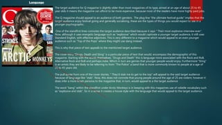
- 3. Images There is a single image on this front cover that fills the entire A4 page. Four artists are shown, the lead singer is positioned in the foreground, within a midshot, this creates an effect of importance, the leader singer being the most important. The three other artists are situated in the background, also in a midshot, the fact that they are in the background, implies a gang style result connoting unity. The readers will pick up on this. The image is also given this draw-effect, This in turn creates a individual and different view of the image, it could relate to the time when monarchs were painted, so this image has connotations of sovereigns. The multiple participants nonchalant expression gives the artists an edge of ascendency. The High-key lighting intensifies the colours of the page making them more striking to the reader of males and females between 25 and 45 years old. Costume, the clothing is typically indie this will again be alluring to the target audience because
- 4. Content There are several cover stories on this magazine. These cover stories include a variety of artists such as: “Sting, Fleet Foxes, the Stokes and Arctic Monkeys. The layout coveys this sense of status. The most important or most popular artists always take centre of the cover whereas the less popular artists, seem to be shown at the sides. For a magazine that claims to musically orientated, the content on this cover speaks different volumes, after reading the cover lines the magazine implies more of a gossip style mantra “they'd stab me to get to the top” This elusive and “want to read on” style is typical of gossip magazines. Lines that add to this include “Drugs! Death! Sting!” Again, this scandalous vocabulary connotes the chittery nature.
- 5. The same target audience still applies to the contents page. Directed at an age range of about 25 to 45 year olds of both genders. This younger target audience will appreciate the more informal language that still is Standard English such as “and so it begins”. There is also a comical element infused into the text “The all important facial hair table” this trendy remark tries to pull off a joke were in which they imply that a facial hair table, which in itself sounds mildly funny, is as important as the rest of the articles, this amusing component will not appeal to the elderly, because conventionally throughout magazines they prefer a more formal tone, which the language from this contents page does not posses. The standfirst under the “Ten Commandments”, again, will appeal to the younger target audience with the brash line “Prison-a good thing”. This outrageous sentence will tug at the curiosity of the younger viewers, who conventionally, will look for a degree of excitement in the language. The standfirst for the section on Radiohead also incorporates humour with the line “one which feature Thom Yorke actually smiling” once more this technique has been used to incorporate its target audience. Language
- 6. Colour A house style is very much created through the continued use of the same colour, these colours are Black, white and red. The white on the contents page denotes chicness and a modern feel to the magazine, this up-to-date, style will be what the target audience of 25 to 45 year olds would favour the most. The red provides a theme of vitality and life, these more poppy colours will be further associated with a younger generation close to the age of this magazines audience, o the other hand it also implies aggression, which ties in with the menacing image. The black just provides a contrast to the white helping it stand out. All of these colours connote masculinity, which obviously will help it sell to a male target audience.
- 7. Images The only image used on this contents page is one of “The Verve” lead singer Richard Ashcroft. He is posed in an intimidating stance, with a demonic expression, with untidy hair, this intense persona put across by the image is one the younger target audience will like. The low-key lighting reinforces the sinister look. The semi-formal clothing is very individual, and therefore it ties in with the indie genre. The dark blazer has denotations of a funeral and death, this is leaning to the indie-rock scene style. All of these things will draw in the target audience.
- 8. Content The image used will appeal more specifically, to an older, male target audience, due to the subject in the image being an person within the said bracket. A modern font shows the magazine is up-to-date, this contemporary typography, however still help this contents page appeal to an audience of 25 to 45 year olds. The inclusion of interviews and composition of “100 Greatest albums” articles of particular indie and indie-rock artists helps put across the genre of the magazine. The target audience is probably more male leading because of the masculine colours of Red blue and white. The contents page is very text light, with the majority of the page filled with a large image. This visually based page will also appeal to a younger target audience.
- 9. Language The target audience for Q is males and females aged 25 a 45, as previously mentioned, the people in this category are more likely to have a higher paying occupation , and so Q magazine can afford to be more expensive. The language through out the whole of the double page spread is very informal. The dialogue during interview contains a large about of profanity. This rebellious language will appeal to the younger target audience explained above. Anyone older is more likely to find it rude or unnecessary. Coupled with this, the language is aggressive, “We’ve booted the door off its hinges”. This sounds very animated, and “BOOTED” is very informal and even slightly colloquial. This outrageous text is what the target audience will be more interested in. The is a humorous factor in the text that the target audience would find engaging, for example the pull quote underneath the photograph.
- 10. Colour The colour scheme is very neutral, the two main colours are white and light blue. The passive and relaxed colours provide contrast to the more aggressive and blasphemous language, this way the emotions portrayed on the page are balanced. This easy-going tabloid effect will captivate the younger target audience.
- 11. Images On this Q double page spread there are two main images one of the lead vocalists from the band Oasis, Noel Gallagher, and the second seems to be a group photo of the band in practise. The first one, of Noel, covers the entire page and acts almost as a backdrop to the spread. The image is a long shot because the subject takes up most of the frame, this creates a focus on the artist. A yellowy sepia style tone has been used this connotes age and nostalgia, the target audience who like the indie-rock scene will like prefer the effect due to its individualism. The second photograph is a group image which is a cut away shot, this focusses on the rest of the band. The boarder of the image has been given a polaroid style, these types of photograph are common at festivals, therefore this effect will appeal to the younger target audience you, we can presume like, to socialise.
- 12. Content As with the contents page for this task, the double page spread is vey masculine, the subjects, within the both images, are inside the age range of the target audience which is 25 to 45,again making it appeal with greater extent to the specific audience. The fonts are more male leaning this perhaps shows that this particular double page spread will appeal to a male audience with more success. In addition the lively texts and dialogue will seem more attractive to the said target audience. Because the page is largely image based and text light, this approach will be more enticing to the age range.