SlideShare a Scribd company logo
1 of 4
The double page spread above is taken from the Blender magazine, which is a magazine aimed at RnB and Hip hop fans. After analysing this i
will be able to recognise general conventions of double page spreads so that i can take them in to consideration when creating my own music
magazine.


Layout conventions – The main image takes up half of the page, and the text takes up the other half. This is conventional for music magazine
double page spreads. Also, the main heading is ‘Girl girl girl’ which is positioned at the top, half of it is cut off. Below the main heading we see a
few sentences which gives an overview of what is going to feature in the article, it is larger than other texts so it stands out and it persuades
audiences to keep reading. There is also an article summary/teaser at the bottom of the page. There are other conventions displayed on the
page such as the page numbers, magazine name, website and date of issue. Each section of text in the article has a subheading in bold font
which makes it easier to refer too and well layed out.


Colour scheme – A simple colour scheme is displayed with the use of only two colour: black and white. Both these colours go well as black text
on white background stands out the most. Both colours are also very sophisticated, and therefore we can tell it is aimed at an older audience
because younger audiences would find it boring, unattractive and too serious. There is a slight hint of pink under Katy Perry in the top. This
adds to the importance of the artists name as the colour scheme is black and white all over but a pink is used to grab attention. Audiences
almost instantly see the pink line, as it is not a normal line but sharp scribbles as if someone has drawn it on, perhaps a child. This suggests the
unique and personality of the artist and also her childish personality. It also implies on her girlyness, hence the title in display font: ‘Girl Girl
Girl’.


Main image – The main image is of the artist Katy Perry. It is conventionally positioned of the right half of the page and it is the first thing the
audiences lay eyes on. Her hair is short, curled and has a bow tie in it, this reflects on her child looks and personality as you dont see many
adults wearing ribbons on their heads. In contrast she is wearing a short, revealing outfit which displays most of her body. Audiences are able
to see her hour-glass figure and envy her beauty. Her facial expression looks playful, fun and quirky which supports her child-like image. She is
also kept it simple with jewellary by wearing two black bracelets which reinforce the colour scheme. As well as jewellery we can see that she is
wearing make up, despite her fist covering her face we are able to see her lipstick outline which attracts the audience. The background of the
image is of a largy letter ‘K’ and half of another letter, showing the importance of who she is.


Pose of main image - Katy’s pose says a lot about her personality. She is in a pose where both her fists are clenched as if she was about to
have a fight. This reflects on her confidence and strength, and shows that she is not scared. She breaks the stereotype of girls being weak. The
pose also anchors the text “The breakthrough star...” It shows that she is literally breaking through the year with her songs and popularity.
There is a subheading in the next which is “How do people hate Kerry Perry. Let us count the ways” this tells us that she is not liked by
indivuiduals and there are many reasons for it, nevertheless she does not care about what people think and her pose supports this. However,
her pose looks playful, supported by her facial expressions. This juxtaposes the serious tone of colour with the playful, fun side of the image.
Also, her leg position is very feminine as her leg is raised up and her skin is revealing, this attracts audience and does not make her look too
manly.


Mode of address – We are able to tell that the magazine is aimed at an elder audience through the language it uses. In the summary of the
article at the top, it says ‘hot pants and pornographic origamis’. ‘pornographic’ is not a word that I used by a younger audience, also it relates
to the genre of magazine aswell as Hip hop/Pop usually use terms like that. There are also other terms in this article that would not be
understood or suitable for younger audiences, for example: homophobic, misogynistic and “ lesbploitational.”
Double page spread 2

More Related Content

What's hot

Analysis of double page Spread
Analysis of double page SpreadAnalysis of double page Spread
Analysis of double page Spread
SeadaM97
 
Double page spread 1 amy
Double page spread 1 amyDouble page spread 1 amy
Double page spread 1 amy
amywalster
 
Double page analysis
Double page analysisDouble page analysis
Double page analysis
arnellgrace
 
Front Cover Overview
Front Cover OverviewFront Cover Overview
Front Cover Overview
rebeccadahl98
 
Evaluation Question Two
Evaluation Question TwoEvaluation Question Two
Evaluation Question Two
James Herbert
 

What's hot (19)

Language analysis in music magazines
Language analysis in music magazinesLanguage analysis in music magazines
Language analysis in music magazines
 
Jess Glynne Digipak Analysis
Jess Glynne Digipak AnalysisJess Glynne Digipak Analysis
Jess Glynne Digipak Analysis
 
Q dps
Q dpsQ dps
Q dps
 
Textual analysis of cd’s
Textual analysis of cd’sTextual analysis of cd’s
Textual analysis of cd’s
 
Analysis of double page Spread
Analysis of double page SpreadAnalysis of double page Spread
Analysis of double page Spread
 
Double page spread 1 amy
Double page spread 1 amyDouble page spread 1 amy
Double page spread 1 amy
 
Evidence of Contents Page Photoshoot
Evidence of Contents Page PhotoshootEvidence of Contents Page Photoshoot
Evidence of Contents Page Photoshoot
 
Feature article analysis
Feature article analysisFeature article analysis
Feature article analysis
 
Bmth poster analysis
Bmth poster analysisBmth poster analysis
Bmth poster analysis
 
Presentation1
Presentation1Presentation1
Presentation1
 
Double page analysis
Double page analysisDouble page analysis
Double page analysis
 
Analysis of my own music magazine
Analysis of my own music magazineAnalysis of my own music magazine
Analysis of my own music magazine
 
Front Cover Overview
Front Cover OverviewFront Cover Overview
Front Cover Overview
 
Music magazine double page spreads
Music magazine double page spreadsMusic magazine double page spreads
Music magazine double page spreads
 
Analysis of my own music magazine
Analysis of my own music magazineAnalysis of my own music magazine
Analysis of my own music magazine
 
Analysis of double page spreads
Analysis of double page spreadsAnalysis of double page spreads
Analysis of double page spreads
 
Analysis of contents pages
Analysis of contents pagesAnalysis of contents pages
Analysis of contents pages
 
Analysis of front covers
Analysis of front coversAnalysis of front covers
Analysis of front covers
 
Evaluation Question Two
Evaluation Question TwoEvaluation Question Two
Evaluation Question Two
 

Viewers also liked

Questionaire
QuestionaireQuestionaire
Questionaire
bhavzz03
 
A case study
A case studyA case study
A case study
bhavzz03
 
Evaluation pdf
Evaluation pdfEvaluation pdf
Evaluation pdf
bhavzz03
 
Questionnaire analysis
Questionnaire analysisQuestionnaire analysis
Questionnaire analysis
bhavzz03
 
A case study
A case studyA case study
A case study
bhavzz03
 
Questionnaire analysis
Questionnaire analysisQuestionnaire analysis
Questionnaire analysis
bhavzz03
 
Contents page overview
Contents page overviewContents page overview
Contents page overview
bhavzz03
 
Questionnaire analysis
Questionnaire analysisQuestionnaire analysis
Questionnaire analysis
bhavzz03
 
A case study
A case studyA case study
A case study
bhavzz03
 
Questionnaire analysis
Questionnaire analysisQuestionnaire analysis
Questionnaire analysis
bhavzz03
 
Evaluation new
Evaluation newEvaluation new
Evaluation new
bhavzz03
 
A case study
A case studyA case study
A case study
bhavzz03
 

Viewers also liked (18)

Questionaire
QuestionaireQuestionaire
Questionaire
 
Pump jeans
Pump jeansPump jeans
Pump jeans
 
Overview
OverviewOverview
Overview
 
WEP
WEPWEP
WEP
 
A case study
A case studyA case study
A case study
 
Evaluation pdf
Evaluation pdfEvaluation pdf
Evaluation pdf
 
Tugasan
TugasanTugasan
Tugasan
 
Questionnaire analysis
Questionnaire analysisQuestionnaire analysis
Questionnaire analysis
 
A case study
A case studyA case study
A case study
 
Questionnaire analysis
Questionnaire analysisQuestionnaire analysis
Questionnaire analysis
 
Contents page overview
Contents page overviewContents page overview
Contents page overview
 
Questionnaire analysis
Questionnaire analysisQuestionnaire analysis
Questionnaire analysis
 
A case study
A case studyA case study
A case study
 
Questionnaire analysis
Questionnaire analysisQuestionnaire analysis
Questionnaire analysis
 
Evaluation new
Evaluation newEvaluation new
Evaluation new
 
Bluetooth
BluetoothBluetooth
Bluetooth
 
User account
User accountUser account
User account
 
A case study
A case studyA case study
A case study
 

Similar to Double page spread 2 (20)

Music magazine Analysis
Music magazine AnalysisMusic magazine Analysis
Music magazine Analysis
 
Front Cover Analysis
Front Cover AnalysisFront Cover Analysis
Front Cover Analysis
 
Music magazine analysis
Music magazine analysis Music magazine analysis
Music magazine analysis
 
Codes and conventions media studies
Codes and conventions  media studiesCodes and conventions  media studies
Codes and conventions media studies
 
Music magazine analysis
Music magazine analysis Music magazine analysis
Music magazine analysis
 
Music magazine analysis
Music magazine analysisMusic magazine analysis
Music magazine analysis
 
Textual analysis
Textual analysisTextual analysis
Textual analysis
 
Music double page spreads
Music double page spreadsMusic double page spreads
Music double page spreads
 
Double page spread
Double page spreadDouble page spread
Double page spread
 
Double page spread
Double page spreadDouble page spread
Double page spread
 
Double page spread
Double page spreadDouble page spread
Double page spread
 
Feature Article Analysis
Feature Article AnalysisFeature Article Analysis
Feature Article Analysis
 
Double page spread 2
Double page spread 2Double page spread 2
Double page spread 2
 
Annotations of double page spreads
Annotations of double page spreadsAnnotations of double page spreads
Annotations of double page spreads
 
Annotations of double page spreads
Annotations of double page spreadsAnnotations of double page spreads
Annotations of double page spreads
 
Magazine Analysis
Magazine Analysis Magazine Analysis
Magazine Analysis
 
Magazine Analysis
Magazine Analysis Magazine Analysis
Magazine Analysis
 
Front Cover Analysis
Front Cover AnalysisFront Cover Analysis
Front Cover Analysis
 
Double page spread
Double page spreadDouble page spread
Double page spread
 
Magazine Cover Analysis
Magazine Cover AnalysisMagazine Cover Analysis
Magazine Cover Analysis
 

More from bhavzz03

Beyonce billboard
Beyonce   billboardBeyonce   billboard
Beyonce billboard
bhavzz03
 
Beyonce billboard
Beyonce   billboardBeyonce   billboard
Beyonce billboard
bhavzz03
 
Beyonce billboard
Beyonce   billboardBeyonce   billboard
Beyonce billboard
bhavzz03
 
Contents page overview
Contents page overviewContents page overview
Contents page overview
bhavzz03
 
Beyonce billboard
Beyonce   billboardBeyonce   billboard
Beyonce billboard
bhavzz03
 
Alicia essence
Alicia   essenceAlicia   essence
Alicia essence
bhavzz03
 
Questionnaire
QuestionnaireQuestionnaire
Questionnaire
bhavzz03
 
Questionnaire
QuestionnaireQuestionnaire
Questionnaire
bhavzz03
 
Questionnaire
QuestionnaireQuestionnaire
Questionnaire
bhavzz03
 

More from bhavzz03 (13)

Overview
OverviewOverview
Overview
 
Overview
OverviewOverview
Overview
 
Beyonce billboard
Beyonce   billboardBeyonce   billboard
Beyonce billboard
 
Beyonce billboard
Beyonce   billboardBeyonce   billboard
Beyonce billboard
 
Beyonce billboard
Beyonce   billboardBeyonce   billboard
Beyonce billboard
 
Contents page overview
Contents page overviewContents page overview
Contents page overview
 
Blender
BlenderBlender
Blender
 
Overview
OverviewOverview
Overview
 
Beyonce billboard
Beyonce   billboardBeyonce   billboard
Beyonce billboard
 
Alicia essence
Alicia   essenceAlicia   essence
Alicia essence
 
Questionnaire
QuestionnaireQuestionnaire
Questionnaire
 
Questionnaire
QuestionnaireQuestionnaire
Questionnaire
 
Questionnaire
QuestionnaireQuestionnaire
Questionnaire
 

Double page spread 2

  • 1.
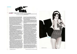
  • 2. The double page spread above is taken from the Blender magazine, which is a magazine aimed at RnB and Hip hop fans. After analysing this i will be able to recognise general conventions of double page spreads so that i can take them in to consideration when creating my own music magazine. Layout conventions – The main image takes up half of the page, and the text takes up the other half. This is conventional for music magazine double page spreads. Also, the main heading is ‘Girl girl girl’ which is positioned at the top, half of it is cut off. Below the main heading we see a few sentences which gives an overview of what is going to feature in the article, it is larger than other texts so it stands out and it persuades audiences to keep reading. There is also an article summary/teaser at the bottom of the page. There are other conventions displayed on the page such as the page numbers, magazine name, website and date of issue. Each section of text in the article has a subheading in bold font which makes it easier to refer too and well layed out. Colour scheme – A simple colour scheme is displayed with the use of only two colour: black and white. Both these colours go well as black text on white background stands out the most. Both colours are also very sophisticated, and therefore we can tell it is aimed at an older audience because younger audiences would find it boring, unattractive and too serious. There is a slight hint of pink under Katy Perry in the top. This adds to the importance of the artists name as the colour scheme is black and white all over but a pink is used to grab attention. Audiences almost instantly see the pink line, as it is not a normal line but sharp scribbles as if someone has drawn it on, perhaps a child. This suggests the unique and personality of the artist and also her childish personality. It also implies on her girlyness, hence the title in display font: ‘Girl Girl Girl’. Main image – The main image is of the artist Katy Perry. It is conventionally positioned of the right half of the page and it is the first thing the audiences lay eyes on. Her hair is short, curled and has a bow tie in it, this reflects on her child looks and personality as you dont see many adults wearing ribbons on their heads. In contrast she is wearing a short, revealing outfit which displays most of her body. Audiences are able to see her hour-glass figure and envy her beauty. Her facial expression looks playful, fun and quirky which supports her child-like image. She is
  • 3. also kept it simple with jewellary by wearing two black bracelets which reinforce the colour scheme. As well as jewellery we can see that she is wearing make up, despite her fist covering her face we are able to see her lipstick outline which attracts the audience. The background of the image is of a largy letter ‘K’ and half of another letter, showing the importance of who she is. Pose of main image - Katy’s pose says a lot about her personality. She is in a pose where both her fists are clenched as if she was about to have a fight. This reflects on her confidence and strength, and shows that she is not scared. She breaks the stereotype of girls being weak. The pose also anchors the text “The breakthrough star...” It shows that she is literally breaking through the year with her songs and popularity. There is a subheading in the next which is “How do people hate Kerry Perry. Let us count the ways” this tells us that she is not liked by indivuiduals and there are many reasons for it, nevertheless she does not care about what people think and her pose supports this. However, her pose looks playful, supported by her facial expressions. This juxtaposes the serious tone of colour with the playful, fun side of the image. Also, her leg position is very feminine as her leg is raised up and her skin is revealing, this attracts audience and does not make her look too manly. Mode of address – We are able to tell that the magazine is aimed at an elder audience through the language it uses. In the summary of the article at the top, it says ‘hot pants and pornographic origamis’. ‘pornographic’ is not a word that I used by a younger audience, also it relates to the genre of magazine aswell as Hip hop/Pop usually use terms like that. There are also other terms in this article that would not be understood or suitable for younger audiences, for example: homophobic, misogynistic and “ lesbploitational.”