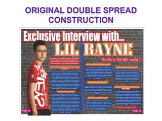
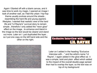
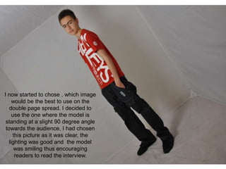
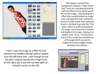
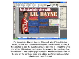
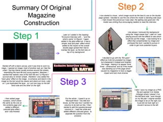
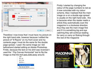
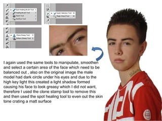
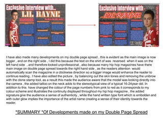
Again I Started off with a blank canvas, and it
was time to work my magic, I opened an image I
took of another wall, as I feel the urban / hip-hop
      theme usually evolves around the streets ,
     resembling the hard life and young aspirers
 lifestyles. I wanted that realistic view of the hard
    life and “Lil Rayne's” survival story to remain
  simple , therefore I only added the “neon glow”
   effect on the image , to enhance and blend in
the image so the text would be clearer and stand
   out more. Later on I just duplicated the layer ,
  so I put one copy on the left hand side and the
                   other on the right.


                                                     Later on I added in the heading “Exclusive
                                                     Interview with…” and the artist’s name “Lil
                                                   Rayne”, I again added in the glow effect as it
                                                 was a simple, bold and plain effect which added
                                                  to the impact of the overall double page spread
                                                 then had to overlap the layer, so the text was on
                                                                top of my background
I now started to chose , which image
     would be the best to use on the
   double page spread. I decided to
     use the one where the model is
 standing at a slight 90 degree angle
 towards the audience, I had chosen
     this picture as it was clear, the
   lighting was good and the model
      was smiling thus encouraging
      readers to read the interview.
Like always I removed the
                                                     background using the “magic eraser
                                                     tool”. Later on I was playing around
                                                     with the effects to see which would
                                                    be suit the image , I was looking for a
                                                     effect that complimented my image
                                                     and portrayed the look I wanted to
                                                    pursue in order to get more potential
                                                    buyers. I decided to go with the “film
                                                      grain” effect as it did not pixelated
                                                     my image , but sharpened it instead
                                                    and brighten the image , helping it to
                                                     appear more three – dimensional,
                                                    and as if the model was standing out
                                                         of the page which caused my
                                                      magazine to have a bigger impact
                                                             and look more diverse.

    I later I save my image as a PNG file and
opened it on Adobe InDesign where I placed
it on the left-hand side , even though on my
  flat plan I original wanted the image to be
on the right, but it just did not look right so I
            moved it across to the left.
For the article , I typed it up on “Microsoft Word “ into little text
  boxes, as that was how I wanted my columns to be laid out like, I
then started to add the question/answer columns in , I kept the white
and added different coloured glows , to separate the questions from
the answers. I then added page numbers, which where the same as
 the one on the contents page and added a different coloured glow
                        effect – and I was finished
Summary Of Original                                                                                                     Step 2
                 Magazine                                                                                     I now started to chose , which image would be the best to use on the double
                                                                                                             page spread. I decided to use the one where the model is standing side ways
                                                                                                                 , I had chosen this picture as it was clear, the lighting was good and the

                Construction                                                                                         model was smiling thus encouraging readers to read the interview.


                                                                                                                                                  Like always I removed the background


               Step 1                                                Later on I added in the heading
                                                                   “Exclusive Interview with…” and the
                                                                     artist’s name “Lil Rayne”, I again
                                                                   added in the glow effect as it was a
                                                                                                                                               using the “magic eraser tool”. Later on I was
                                                                                                                                               playing around with the effects to see which
                                                                                                                                               would be suit the image , I was looking for a
                                                                                                                                                 effect that complimented my image and
                                                                   simple, bold and plain effect which                                           portrayed the look I wanted to pursue in
                                                                    added to the impact of the overall                                              order to get more potential buyers.
                                                                     double page spread then had to
                                                                   overlap the layer, so the text was on
                                                                            top of my background


                                                                                                                  I decided to go with the “film grain”
                                                                                                               effect as it did not pixelated my image ,
                                                                                                                but sharpened it instead and brighten
                                                                                                                the image , helping it to appear more
  Started off with a blank canvas, and it was time to work my                                                 three – dimensional, and as if the model
 magic, I opened an image I took of another wall, as I feel the                                                  was standing out of the page which
  urban / hip-hop theme usually evolves around the streets ,                                                   caused my magazine to have a bigger
   resembling the hard life and young aspirers lifestyles. I                                                         impact and look more diverse.
  wanted that realistic view of the hard life and “Lil Rayne's”
  survival story to remain simple , therefore I only added the
“neon glow” effect on the image , to enhance and blend in the
image so the text would be clearer and stand out more. Later
  on I just duplicated the layer , so I put one copy on the left
              hand side and the other on the right.
                                                                   Step 3
                                                                                                                                                           I later I save my image as a PNG
                                                                                                                                                               file and opened it on Adobe
                                                                                                                                                              InDesign where I placed it on
                                                                                                                                                            the left-hand side , even though
    I then added page                                                   For the article , I typed it up on                                                  on my flat plan I original wanted
  numbers, which where                                                  “Microsoft Word “ into little text                                                  the image to be on the right, but
 the same as the one on                                              boxes, as that was how I wanted my                                                         it just did not look right so I
  the contents page and                                                columns to be laid out like, I then                                                      moved it across to the left.
     added a different                                                started to add the question/answer
  coloured glow effect –                                               columns in , I kept the white and
    and I was finished                                                added different coloured glows , to
                                                                        separate the question from the
                                                                                    answers
After my audience feedback I realised that there where some issues
        raised within my Double Page Spread – For example…

• The text on the main image of “Lil Rayne” was revered and made
  the double page spread look unprofessional.
• The page numbers are in a “outer glow” of pink which is not part of
  my colour scheme of red, black and blue
• There where also a few gaps on the DPS where a signature, logo of
  more questions could have been placed , therefore the double page
  spread would look more full and would support the idea that my
  music magazine “Amplify” is monthly magazine that is affordable
  and is a great value for money
Firstly I started by changing the
                                                        colour of the page numbers to red as
                                                        it now coincides with my colour
                                                        scheme. Also I realised that the main
                                                        image on a on a double age spread
                                                        is usually on the right hand side , this
                                                        is because when the reader reads a
                                                        article they automatically scan the
                                                        magazine in a clockwise direction
                                                        thus they see the main image first
                                                        and if it is something big and eye
                                                        catching they will continue reading
Therefore I now know that I must have my picture on     for carry or carry on flicking through
the right hand side, however because I edited the       the rest of the magazine
picture of “lil Rayne” on my front cover and my
contents page I must do the same for the double
page spread. I used the same image as I did
beforehand started editing on Adobe Photoshop.
Firstly ,because the text on his shirt was reversed I
used the “ Flip Canvas Horizontal” tool to flip the
image so that the text was right away around.
                                                        Main Image on
                                                        right hand side
I again used the same tools to manipulate, smoothen
and select a certain area of the face which need to be
balanced out , also on the original image the male
model had dark circle under his eyes and due to the
high key light this created a light shadow formed
causing his face to look greasy which I did not want,
therefore I used the clone stamp tool to remove this
and then used the spot healing tool to even out the skin
tone crating a matt surface
Since on my front cover I used the font “ Pristina” to give the overall graffiti effect
  to my urban hip –hop music magazine, I created a theme of continuity by also
   using this same font on my double page spread, but added a two outer glow
effects to make to more eye-catching .the second outer glow colour was orange
 even though my audience feedback suggested that hip-hop was a pop colour ,
 there where still many people who suggested that orange illustrates happiness
and joy and I believe that this colour would be good as it would portray a fun and
          happy ambience thus enhancing people to read my magazine.
I wanted to give my double spread a unique edge I did this by adding a signature
of “lil Rayne “ this made caused my DPS to look more authentic and makes it the
interview officially exclusive. For this I wanted a good handwritten type font
which was not available adobe InDesign or did not suit the look I wished to
pursue , therefore I went onto a site called http://www.dafont.com/ there I was
ale to find a good smooth style of handwritten text which clear showed the artists
name , I then saved the image as a JPEG file and opened it onto Adobe
Photoshop

                                                              Here I changed the
                                                              colour from black to
                                                              white , so it would
                                                              stand out and then
                                                              placed it at the bottom
                                                              of the article.


The final adjustments , I made where just
rearranging the strap lines and changing
the position of the text/images to make m
DPS more distinctive
I have also made many developments on my double page spread , this is evident as the main image is now
bigger , and on the right side , I did this because the text on the shirt of was reversed when it was on the
left hand side , and therefore looked unprofessional , also because many hip hop magazines have there
main image on double page spread towards the right hand side , as the readers attention would
automatically scan the magazine in a clockwise direction so a bigger image would enhance the reader to
continue reading . I have also edited the picture , by balancing out the skin tones and removing the unibrow
with the clone stamp tool, as a result this made the audience aware that the model was looking directly into
the camera , the added tattoo on the neck adds to the stereotypical view of a typical 16-24year old. In
addition to this have changed the colour of the page numbers from pink to red as it corresponds to my
colour scheme and illustrates the continuity displayed throughout my hip hop magazine , the added
signature give the audience a sense of authenticity , while the hand written type font which is embolden and
with outer glow implies the importance of the artist name creating a sense of their identity towards the
reader.


      *SUMMARY *Of Developments made on my Double Page Spread

Double Page Spread Construction - AMPLIFY

  • 3.
    Again I Startedoff with a blank canvas, and it was time to work my magic, I opened an image I took of another wall, as I feel the urban / hip-hop theme usually evolves around the streets , resembling the hard life and young aspirers lifestyles. I wanted that realistic view of the hard life and “Lil Rayne's” survival story to remain simple , therefore I only added the “neon glow” effect on the image , to enhance and blend in the image so the text would be clearer and stand out more. Later on I just duplicated the layer , so I put one copy on the left hand side and the other on the right. Later on I added in the heading “Exclusive Interview with…” and the artist’s name “Lil Rayne”, I again added in the glow effect as it was a simple, bold and plain effect which added to the impact of the overall double page spread then had to overlap the layer, so the text was on top of my background
  • 4.
    I now startedto chose , which image would be the best to use on the double page spread. I decided to use the one where the model is standing at a slight 90 degree angle towards the audience, I had chosen this picture as it was clear, the lighting was good and the model was smiling thus encouraging readers to read the interview.
  • 5.
    Like always Iremoved the background using the “magic eraser tool”. Later on I was playing around with the effects to see which would be suit the image , I was looking for a effect that complimented my image and portrayed the look I wanted to pursue in order to get more potential buyers. I decided to go with the “film grain” effect as it did not pixelated my image , but sharpened it instead and brighten the image , helping it to appear more three – dimensional, and as if the model was standing out of the page which caused my magazine to have a bigger impact and look more diverse. I later I save my image as a PNG file and opened it on Adobe InDesign where I placed it on the left-hand side , even though on my flat plan I original wanted the image to be on the right, but it just did not look right so I moved it across to the left.
  • 6.
    For the article, I typed it up on “Microsoft Word “ into little text boxes, as that was how I wanted my columns to be laid out like, I then started to add the question/answer columns in , I kept the white and added different coloured glows , to separate the questions from the answers. I then added page numbers, which where the same as the one on the contents page and added a different coloured glow effect – and I was finished
  • 7.
    Summary Of Original Step 2 Magazine I now started to chose , which image would be the best to use on the double page spread. I decided to use the one where the model is standing side ways , I had chosen this picture as it was clear, the lighting was good and the Construction model was smiling thus encouraging readers to read the interview. Like always I removed the background Step 1 Later on I added in the heading “Exclusive Interview with…” and the artist’s name “Lil Rayne”, I again added in the glow effect as it was a using the “magic eraser tool”. Later on I was playing around with the effects to see which would be suit the image , I was looking for a effect that complimented my image and simple, bold and plain effect which portrayed the look I wanted to pursue in added to the impact of the overall order to get more potential buyers. double page spread then had to overlap the layer, so the text was on top of my background I decided to go with the “film grain” effect as it did not pixelated my image , but sharpened it instead and brighten the image , helping it to appear more Started off with a blank canvas, and it was time to work my three – dimensional, and as if the model magic, I opened an image I took of another wall, as I feel the was standing out of the page which urban / hip-hop theme usually evolves around the streets , caused my magazine to have a bigger resembling the hard life and young aspirers lifestyles. I impact and look more diverse. wanted that realistic view of the hard life and “Lil Rayne's” survival story to remain simple , therefore I only added the “neon glow” effect on the image , to enhance and blend in the image so the text would be clearer and stand out more. Later on I just duplicated the layer , so I put one copy on the left hand side and the other on the right. Step 3 I later I save my image as a PNG file and opened it on Adobe InDesign where I placed it on the left-hand side , even though I then added page For the article , I typed it up on on my flat plan I original wanted numbers, which where “Microsoft Word “ into little text the image to be on the right, but the same as the one on boxes, as that was how I wanted my it just did not look right so I the contents page and columns to be laid out like, I then moved it across to the left. added a different started to add the question/answer coloured glow effect – columns in , I kept the white and and I was finished added different coloured glows , to separate the question from the answers
  • 8.
    After my audiencefeedback I realised that there where some issues raised within my Double Page Spread – For example… • The text on the main image of “Lil Rayne” was revered and made the double page spread look unprofessional. • The page numbers are in a “outer glow” of pink which is not part of my colour scheme of red, black and blue • There where also a few gaps on the DPS where a signature, logo of more questions could have been placed , therefore the double page spread would look more full and would support the idea that my music magazine “Amplify” is monthly magazine that is affordable and is a great value for money
  • 9.
    Firstly I startedby changing the colour of the page numbers to red as it now coincides with my colour scheme. Also I realised that the main image on a on a double age spread is usually on the right hand side , this is because when the reader reads a article they automatically scan the magazine in a clockwise direction thus they see the main image first and if it is something big and eye catching they will continue reading Therefore I now know that I must have my picture on for carry or carry on flicking through the right hand side, however because I edited the the rest of the magazine picture of “lil Rayne” on my front cover and my contents page I must do the same for the double page spread. I used the same image as I did beforehand started editing on Adobe Photoshop. Firstly ,because the text on his shirt was reversed I used the “ Flip Canvas Horizontal” tool to flip the image so that the text was right away around. Main Image on right hand side
  • 10.
    I again usedthe same tools to manipulate, smoothen and select a certain area of the face which need to be balanced out , also on the original image the male model had dark circle under his eyes and due to the high key light this created a light shadow formed causing his face to look greasy which I did not want, therefore I used the clone stamp tool to remove this and then used the spot healing tool to even out the skin tone crating a matt surface
  • 11.
    Since on myfront cover I used the font “ Pristina” to give the overall graffiti effect to my urban hip –hop music magazine, I created a theme of continuity by also using this same font on my double page spread, but added a two outer glow effects to make to more eye-catching .the second outer glow colour was orange even though my audience feedback suggested that hip-hop was a pop colour , there where still many people who suggested that orange illustrates happiness and joy and I believe that this colour would be good as it would portray a fun and happy ambience thus enhancing people to read my magazine.
  • 12.
    I wanted togive my double spread a unique edge I did this by adding a signature of “lil Rayne “ this made caused my DPS to look more authentic and makes it the interview officially exclusive. For this I wanted a good handwritten type font which was not available adobe InDesign or did not suit the look I wished to pursue , therefore I went onto a site called http://www.dafont.com/ there I was ale to find a good smooth style of handwritten text which clear showed the artists name , I then saved the image as a JPEG file and opened it onto Adobe Photoshop Here I changed the colour from black to white , so it would stand out and then placed it at the bottom of the article. The final adjustments , I made where just rearranging the strap lines and changing the position of the text/images to make m DPS more distinctive
  • 13.
    I have alsomade many developments on my double page spread , this is evident as the main image is now bigger , and on the right side , I did this because the text on the shirt of was reversed when it was on the left hand side , and therefore looked unprofessional , also because many hip hop magazines have there main image on double page spread towards the right hand side , as the readers attention would automatically scan the magazine in a clockwise direction so a bigger image would enhance the reader to continue reading . I have also edited the picture , by balancing out the skin tones and removing the unibrow with the clone stamp tool, as a result this made the audience aware that the model was looking directly into the camera , the added tattoo on the neck adds to the stereotypical view of a typical 16-24year old. In addition to this have changed the colour of the page numbers from pink to red as it corresponds to my colour scheme and illustrates the continuity displayed throughout my hip hop magazine , the added signature give the audience a sense of authenticity , while the hand written type font which is embolden and with outer glow implies the importance of the artist name creating a sense of their identity towards the reader. *SUMMARY *Of Developments made on my Double Page Spread