Pedagogía en Educación de Párvulos - Proyecto Innovación Metodológica, Santiagocdd2012
Programa de Innovación Metodológica 2012: Mapas Conceptuales para aumentar la comprensión de textos en cursos teóricos.
Carrera de Pedagogía en Educación de Párvulos
Universidad del Desarrollo, Centro de Desarrollo de la Docencia
Unit 8 - Information and Communication Technology (Paper I).pdfThiyagu K
This slides describes the basic concepts of ICT, basics of Email, Emerging Technology and Digital Initiatives in Education. This presentations aligns with the UGC Paper I syllabus.
Introduction to AI for Nonprofits with Tapp NetworkTechSoup
Dive into the world of AI! Experts Jon Hill and Tareq Monaur will guide you through AI's role in enhancing nonprofit websites and basic marketing strategies, making it easy to understand and apply.
Francesca Gottschalk - How can education support child empowerment.pptxEduSkills OECD
Francesca Gottschalk from the OECD’s Centre for Educational Research and Innovation presents at the Ask an Expert Webinar: How can education support child empowerment?
The Roman Empire A Historical Colossus.pdfkaushalkr1407
The Roman Empire, a vast and enduring power, stands as one of history's most remarkable civilizations, leaving an indelible imprint on the world. It emerged from the Roman Republic, transitioning into an imperial powerhouse under the leadership of Augustus Caesar in 27 BCE. This transformation marked the beginning of an era defined by unprecedented territorial expansion, architectural marvels, and profound cultural influence.
The empire's roots lie in the city of Rome, founded, according to legend, by Romulus in 753 BCE. Over centuries, Rome evolved from a small settlement to a formidable republic, characterized by a complex political system with elected officials and checks on power. However, internal strife, class conflicts, and military ambitions paved the way for the end of the Republic. Julius Caesar’s dictatorship and subsequent assassination in 44 BCE created a power vacuum, leading to a civil war. Octavian, later Augustus, emerged victorious, heralding the Roman Empire’s birth.
Under Augustus, the empire experienced the Pax Romana, a 200-year period of relative peace and stability. Augustus reformed the military, established efficient administrative systems, and initiated grand construction projects. The empire's borders expanded, encompassing territories from Britain to Egypt and from Spain to the Euphrates. Roman legions, renowned for their discipline and engineering prowess, secured and maintained these vast territories, building roads, fortifications, and cities that facilitated control and integration.
The Roman Empire’s society was hierarchical, with a rigid class system. At the top were the patricians, wealthy elites who held significant political power. Below them were the plebeians, free citizens with limited political influence, and the vast numbers of slaves who formed the backbone of the economy. The family unit was central, governed by the paterfamilias, the male head who held absolute authority.
Culturally, the Romans were eclectic, absorbing and adapting elements from the civilizations they encountered, particularly the Greeks. Roman art, literature, and philosophy reflected this synthesis, creating a rich cultural tapestry. Latin, the Roman language, became the lingua franca of the Western world, influencing numerous modern languages.
Roman architecture and engineering achievements were monumental. They perfected the arch, vault, and dome, constructing enduring structures like the Colosseum, Pantheon, and aqueducts. These engineering marvels not only showcased Roman ingenuity but also served practical purposes, from public entertainment to water supply.
Read| The latest issue of The Challenger is here! We are thrilled to announce that our school paper has qualified for the NATIONAL SCHOOLS PRESS CONFERENCE (NSPC) 2024. Thank you for your unwavering support and trust. Dive into the stories that made us stand out!
Palestine last event orientationfvgnh .pptxRaedMohamed3
An EFL lesson about the current events in Palestine. It is intended to be for intermediate students who wish to increase their listening skills through a short lesson in power point.
Instructions for Submissions thorugh G- Classroom.pptxJheel Barad
This presentation provides a briefing on how to upload submissions and documents in Google Classroom. It was prepared as part of an orientation for new Sainik School in-service teacher trainees. As a training officer, my goal is to ensure that you are comfortable and proficient with this essential tool for managing assignments and fostering student engagement.
Macroeconomics- Movie Location
This will be used as part of your Personal Professional Portfolio once graded.
Objective:
Prepare a presentation or a paper using research, basic comparative analysis, data organization and application of economic information. You will make an informed assessment of an economic climate outside of the United States to accomplish an entertainment industry objective.
How to Make a Field invisible in Odoo 17Celine George
It is possible to hide or invisible some fields in odoo. Commonly using “invisible” attribute in the field definition to invisible the fields. This slide will show how to make a field invisible in odoo 17.
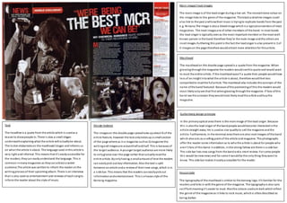
1. Main image/Inset images
The mainimage is of the leadsinger during a live set. The monochrome colour on
the image links to the genre of the magazine. The blackandwhite images could
also link to the past andhowtheir music is tryingto replicate bands from the past
e.g. Nirvana.The image is alsoa bleedimage whichis a typicalconventionof most
magazines. The inset imagesare of other members of the band. In most bands
the lead singer is typicallyseenas the most important member or the most well-
known person inthe band therefore they’re the main image andthe others are
inset images.Furthering this point is the fact the leadsinger is also present in 3 of
4 imageson the page therefore wouldattract more attentionfor thisarticle.
House style
The typographyof the mastheadis similar to the kerrang logo. It’s familiar for the
readers andlinks in with the genre of the magazine. The typographyis also sans
seriffont meaningit’s easier to read. Alsothe colours usedare dark whichreflect
the genre of the magazine as it links to rock music, whichis oftendescribed as
being darker.
Guttenberg design principle
In the primaryoptical area there is the mainimage of the lead singer. Because
this is alsothe lead singer of the bandpeople wouldbecome interestedinthe
article straight away. He is usedas star qualityto sell the magazine andthe
article. Furthermore, in the terminal area there are alsoinset images ofthe band
which alsoacts as a selling point of the article andmagazine. The photographs
offer the reader some informationas to whothe article is about for people who
aren’t fans of this band. Inaddition, inthe strong fallow are there is a side bar.
The side bar lists new songs from the bandanda short review. For some people
this would be newnews and for some it wouldbe the only thing theywant to
know. This side bar makes it easilyaccessible for the reader.
Masthead
The mastheadon this double page spreadis a quote from the magazine. When
glancingthroughthe magazine the readers wouldseethis quote and would want
to read the entire article. If the mastheadwasn’t a quote then people wouldhave
less of an insight intowhat the article is about, therefore wouldfeel less
compelledto readthe fullarticle. The masthead also includes the acronym of the
name ofthe band featured. Because ofthe positioningof this the readers would
most likelyonlysee that first whenglancing throughthe magazine. If fans ofthis
band see the acronym theywouldmost likelyreadthe article andbuythe
magazine.
Design balance
The imageson this double page spreadtake upabout ¾ of the
entire feature, however the text onlytakesup a smallsection
of the page where as ina magazine suchas Q magazine the
writingandimagesare aroundhalfandhalf. This is because of
the target audience. A younger target audience are more likely
to onlyglance over the page rather thanactuallyreadthe
entire article. Byonlyhaving a smallamount of text the readers
can easilypick out keyinformation. Also the text is split
betweenanarticle anda reviewof their new songs, which is in
a side bar. This means that the readers caneasilypickout
informationandentertainment. Thisis a house style of the
Kerrang magazine.
Text
The headline is a quote from the article which is usedas a
teaser to drawpeople in. There is also a small slogan
underneathexplaining what the article will actuallybe about.
The kicker elaborateson the masthead/slogan and informs us
on what the article is about. The language used inthis article is
very light andinformal. This means that it’s easilyaccessible for
the readers;theycan easilyunderstand the language. This is
common inmanymagazines as theycanattract a wider
audience.The article was writtento inform the reader onthe
writingprocessof their upcoming album. There is aninterview
that is also used as entertainment and reviews of eachsongto
inform the reader about the style of music.
2. The
Main image/Inset images
The mainimage depicts EdSheeranon a bedwith his guitar, whichis the same
guitar he uses ontour andinhisvideos. The lightingis clamandreflects the type of
music he creates. Byusing the singer inthe mainimage fans ofhis wouldbe
encouragedto readit. And for people whoare unfamiliar withhim or hiswork they
can easilyunderstandthat the article will be about him as it is the largest image on
the page and it is a bleedimage. Usinga bleed image is a typical conventionfor
magazinesto use whencreatinga double page spread.
The inset images include another image of him withLondon as the background.
London is the first cityof the UK;this couldinsinuate that he is the number 1 or the
best performer of thisgenre. The inset image is usedto break the text and
sometimes they’re usedto elaborate onsome ofthe informationinthe article.
House style
The colour scheme usedon this double page spreadis a typicalconventionusedin
this magazine. The redwhite and black are generallyused is all issues. This is done
to reinforce the brandandto make readers familiar withthe magazine’s style. The
typographyused is the serif font. Thistype offont style is usedthroughout the
magazine. It is more sophisticatedandwouldappeal to their target audience more.
The serif font is also used inthe logoof the magazine meaningthat the audience
are alreadyfamiliar withthis style of writing.
Guttenberg design principle
In the primaryoptical area there is the mainimage with a captionto explainwhat is
happening inthe image. There is alsothe Q logo. Thishelps to reinforce the
magazine’s brand andto make it familiar withthe audience. Inthe terminal optical
area there is an interviewwiththe artist. Thisallows the magazine to offer both
entertainment andinformative articles onthe same page, this create a page break.
Furthermore, inthe strongfallow area there is the mast headof the interview and
an inset image to draw the reader to an area that is typicallyonlyglancedover. In
the weak fallowarea there is alsothe start of the interview.
Masthead
The mastheadis the name ofthe artist. This gives informationto the reader, as it is
tellingthem who is in the image. Fans of thisartist will most likelyrecognise the
name and therefore feel compelledto readthisarticle because of this. The
mastheadworks insync with the mainimage encourage his fans to readit. Along
with the masthead there is alsoa star rating sopeople who don’t know ofthis artist
wouldalso become interestedbecause it is sucha highrating. This ensures people
will read the article.
Text
The kicker is one sentence ‘Fresh-facedwunderkindaces his
debut’ thisis also pairedwitha graphic of the 4 stars. This
informs the reader that the album is successful andit’s worth
listening. There is use of colloquial language throughout the
article. This makes the article seemfriendlier, where as if the
same content was coveredinThe Guardian for example then
it wouldn’t have this kindof language. To reinforce thisthere
is also use of elisionthroughout the article to make it appeal
more to the audience. The informationin the article is a
review about this artist’s debut album. In thisarticle it also
talks about the lyrics andsome of the artist’s backstoryto
make the reader familiar withhim. The purpose of thisarticle
is to inform the reader about the album andartist. However
there is alsoan interviewwith the artist which offers
entertainment to the reader, therefore would appeal to a
wider range of people.
Design balance
The double page spreadis split into 3 sections. The image
takes uparound1/2 of the article. This is because the key
signifier encourages fans of this artist to buyandreadthe
article. The article itselfis also split. The mainimage andthe
mainarticle work together andthenthe side bar alsoincludes
another part of the article that offers the entertainment side.
This means that the audience caneasily differentiate between
the two different types ofarticles. There is also a use of pull
quotes inthe article. These are usedto give the audience a
‘teaser’ as to what will be in the article. This encourages the
audience to readthe article to elaborate onthe pull quote and
to find out what it’s about. It acts as anenigma code for the
audience. The layout ofthis page is a house style of the review
articlesfor the Q magazine. The inset images are also used to
balance out the amount of text usedin the article makingit
more enjoyable to read.