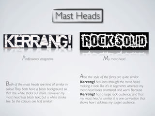
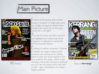
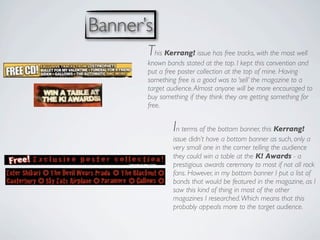
EVALUATION QUESTION 5

 “                                         ”
  How did you attract/address your audience?
Mast Heads


            Professional magazine                                 My mast head

                                                Also, the style of the fonts are quite similar.
                                                Kerrang! has lines through the mast head,
Both of the mast heads are kind of similar in   making it look like it’s in segments, whereas my
colour. They both have a black background, so   mast head looks shattered and worn. Because
that the white sticks out more. However my      Kerrang! has a large rock audience, and that
mast head has black text, but a white stroke    my mast head is similar, it is one convention that
line. So the colours are half similar!          shows how I address my target audience.
Main Picture
             In terms of the picture, both of them
             contain a musician on stage with some
             sort of light coming from behind them
             making them stand out on the page -
             almost like a 3D effect.

             The way that they are both musicians
             also highlights the musical side of the
             magazine, as opposed to stories that
             are not musically related.

             Clothing is another convention I followed
             to address my target audience. Both
             musicians are wearing smart clothes,
             which is rocky and would appeal to the
             rock audience. The singer I chose is also
             wearing a smart shirt with jeans (although
My Product   you can’t see the jeans) which also hints    Issue of Kerrang!
             at rock - again appealing to my chosen
             target audience.
Banner’s
       This Kerrang! issue has free tracks, with the most well
       known bands stated at the top. I kept this convention and
       put a free poster collection at the top of mine. Having
       something free is a good was to ‘sell’ the magazine to a
       target audience. Almost anyone will be more encouraged to
       buy something if they think they are getting something for
       free.


               In terms of the bottom banner, this Kerrang!
               issue didn’t have a bottom banner as such, only a
               very small one in the corner telling the audience
               they could win a table at the K! Awards - a
               prestigious awards ceremony to most if not all rock
               fans. However, in my bottom banner I put a list of
               bands that would be featured in the magazine, as I
               saw this kind of thing in most of the other
               magazines I researched. Which means that this
               probably appeals more to the target audience.
Main Story
   Title
The band name Intro Out, which is the main story
heading of my magazine (below) shows the same
conventions as the Kerrang! magazines’ (above).
                                                            Both titles also have a slogan underneath.
                                                            For my title, is was a slogan for the band;
They are both slanted and when on the rest of the           ‘Crank It Up!’ and for the Kerrang! page
                                                            it was ‘Rou and Itch tell it like it is’. Both are
magazine, they are both kind of in the bottom left corner
                                                            aimed to try and get the target audience
of the page - which is how they are similar. They are not
                                                            interested in the magazine and want to
the same colours of text however, because of the other
                                                            buy it. So having a rememberable and eye-
colours around the page. My page is dominated by black
                                                            catching slogan is important to help
so it was sensible to have a black and white text. Also
                                                            address the target audience.
black and white was my main text colour pallet for all my
pages. The main colour around the Kerrang! page was
blue.
Stories
                                         I tried to keep the layout of the
                                         stories the same, although most
                                         magazine covers I found only
                                         had about three stories on the
                                         cover, including the one with an
                                         extra picture. I think that the
                                         stars and circles are also
                                         included as stories, which is why
                                         it doesn’t seem like there are
                                         many stories. On my cover, I
                                         didn’t have stars or circles, only
                                         the stories. But I believe that
because I have written the ‘Massive Milton Keynes’ part in a different and outstanding font, it acts in a similar
way in terms of attracting the target audience. Also, although each story is of a different importance and the
magazine company would want different stories to attract the target audience to different levels of interest,
there aren’t that many varieties of fonts. Even though a magazine would want the full interest of their target
audience, it is a bad idea to overflow their heads with different fonts, because then it gets messy and hard to
read. I think I have more than the average variety of fonts, but because the ‘mud, sweat and beers!’ title looks
similar to the other anchorage text and that the Intro Out title looks similar to the mast head font, I think I’ve
subtly hidden this in a sneaky way. In a way, I think my style of magazine would look relatively good messy and
would still attract the right target audience, possible even being a unique selling point.
Colours
From looking at the other Kerrang! magazines, it can be seen that each one has a main colour scheme and
commonly one other colour. For example in the Fall Out Boy magazine, the main colour scheme is orange and
black, but there is a bit of orange in the free posters bit as well, matched by the shirt he is wearing. I followed
this convention, but only used the colour scheme and no other colours. This could also be something else to
improve on - I could maybe put the ‘Massive Milton Keynes’ bit in a different colour. Using an extra colour breaks
the page up a bit and keeps it interesting for the reader. Although I still feel that I’m addressing my target
audience in the right way and that my magazine would fit in well with the other Kerrang! issues.
Other Points
These are the main ways in which my magazine addresses the target audience I have chosen, compared to the
                           ways that Kerrang! have done it to their target audience.
       I used these conventions throughout my        Also using black and red as the main
       magazine, on the contents page and            colour scheme, along with black and
       the double page spread.                       white for the text font throughout, keeps
       For example, I used the same style            good continuity and therefore addresses
                                                     my target audience in the correct way.
       mast head when I wrote Rock Solid on
       the contents page, and when
       abbreviating it to just RS. I also kept the
       Intro Out text the same when using it
       on the double page spread.

Evaluation question 5

  • 1.
    EVALUATION QUESTION 5 “ ” How did you attract/address your audience?
  • 2.
    Mast Heads Professional magazine My mast head Also, the style of the fonts are quite similar. Kerrang! has lines through the mast head, Both of the mast heads are kind of similar in making it look like it’s in segments, whereas my colour. They both have a black background, so mast head looks shattered and worn. Because that the white sticks out more. However my Kerrang! has a large rock audience, and that mast head has black text, but a white stroke my mast head is similar, it is one convention that line. So the colours are half similar! shows how I address my target audience.
  • 3.
    Main Picture In terms of the picture, both of them contain a musician on stage with some sort of light coming from behind them making them stand out on the page - almost like a 3D effect. The way that they are both musicians also highlights the musical side of the magazine, as opposed to stories that are not musically related. Clothing is another convention I followed to address my target audience. Both musicians are wearing smart clothes, which is rocky and would appeal to the rock audience. The singer I chose is also wearing a smart shirt with jeans (although My Product you can’t see the jeans) which also hints Issue of Kerrang! at rock - again appealing to my chosen target audience.
  • 4.
    Banner’s This Kerrang! issue has free tracks, with the most well known bands stated at the top. I kept this convention and put a free poster collection at the top of mine. Having something free is a good was to ‘sell’ the magazine to a target audience. Almost anyone will be more encouraged to buy something if they think they are getting something for free. In terms of the bottom banner, this Kerrang! issue didn’t have a bottom banner as such, only a very small one in the corner telling the audience they could win a table at the K! Awards - a prestigious awards ceremony to most if not all rock fans. However, in my bottom banner I put a list of bands that would be featured in the magazine, as I saw this kind of thing in most of the other magazines I researched. Which means that this probably appeals more to the target audience.
  • 5.
    Main Story Title The band name Intro Out, which is the main story heading of my magazine (below) shows the same conventions as the Kerrang! magazines’ (above). Both titles also have a slogan underneath. For my title, is was a slogan for the band; They are both slanted and when on the rest of the ‘Crank It Up!’ and for the Kerrang! page it was ‘Rou and Itch tell it like it is’. Both are magazine, they are both kind of in the bottom left corner aimed to try and get the target audience of the page - which is how they are similar. They are not interested in the magazine and want to the same colours of text however, because of the other buy it. So having a rememberable and eye- colours around the page. My page is dominated by black catching slogan is important to help so it was sensible to have a black and white text. Also address the target audience. black and white was my main text colour pallet for all my pages. The main colour around the Kerrang! page was blue.
  • 6.
    Stories I tried to keep the layout of the stories the same, although most magazine covers I found only had about three stories on the cover, including the one with an extra picture. I think that the stars and circles are also included as stories, which is why it doesn’t seem like there are many stories. On my cover, I didn’t have stars or circles, only the stories. But I believe that because I have written the ‘Massive Milton Keynes’ part in a different and outstanding font, it acts in a similar way in terms of attracting the target audience. Also, although each story is of a different importance and the magazine company would want different stories to attract the target audience to different levels of interest, there aren’t that many varieties of fonts. Even though a magazine would want the full interest of their target audience, it is a bad idea to overflow their heads with different fonts, because then it gets messy and hard to read. I think I have more than the average variety of fonts, but because the ‘mud, sweat and beers!’ title looks similar to the other anchorage text and that the Intro Out title looks similar to the mast head font, I think I’ve subtly hidden this in a sneaky way. In a way, I think my style of magazine would look relatively good messy and would still attract the right target audience, possible even being a unique selling point.
  • 7.
    Colours From looking atthe other Kerrang! magazines, it can be seen that each one has a main colour scheme and commonly one other colour. For example in the Fall Out Boy magazine, the main colour scheme is orange and black, but there is a bit of orange in the free posters bit as well, matched by the shirt he is wearing. I followed this convention, but only used the colour scheme and no other colours. This could also be something else to improve on - I could maybe put the ‘Massive Milton Keynes’ bit in a different colour. Using an extra colour breaks the page up a bit and keeps it interesting for the reader. Although I still feel that I’m addressing my target audience in the right way and that my magazine would fit in well with the other Kerrang! issues.
  • 8.
    Other Points These arethe main ways in which my magazine addresses the target audience I have chosen, compared to the ways that Kerrang! have done it to their target audience. I used these conventions throughout my Also using black and red as the main magazine, on the contents page and colour scheme, along with black and the double page spread. white for the text font throughout, keeps For example, I used the same style good continuity and therefore addresses my target audience in the correct way. mast head when I wrote Rock Solid on the contents page, and when abbreviating it to just RS. I also kept the Intro Out text the same when using it on the double page spread.