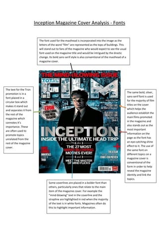
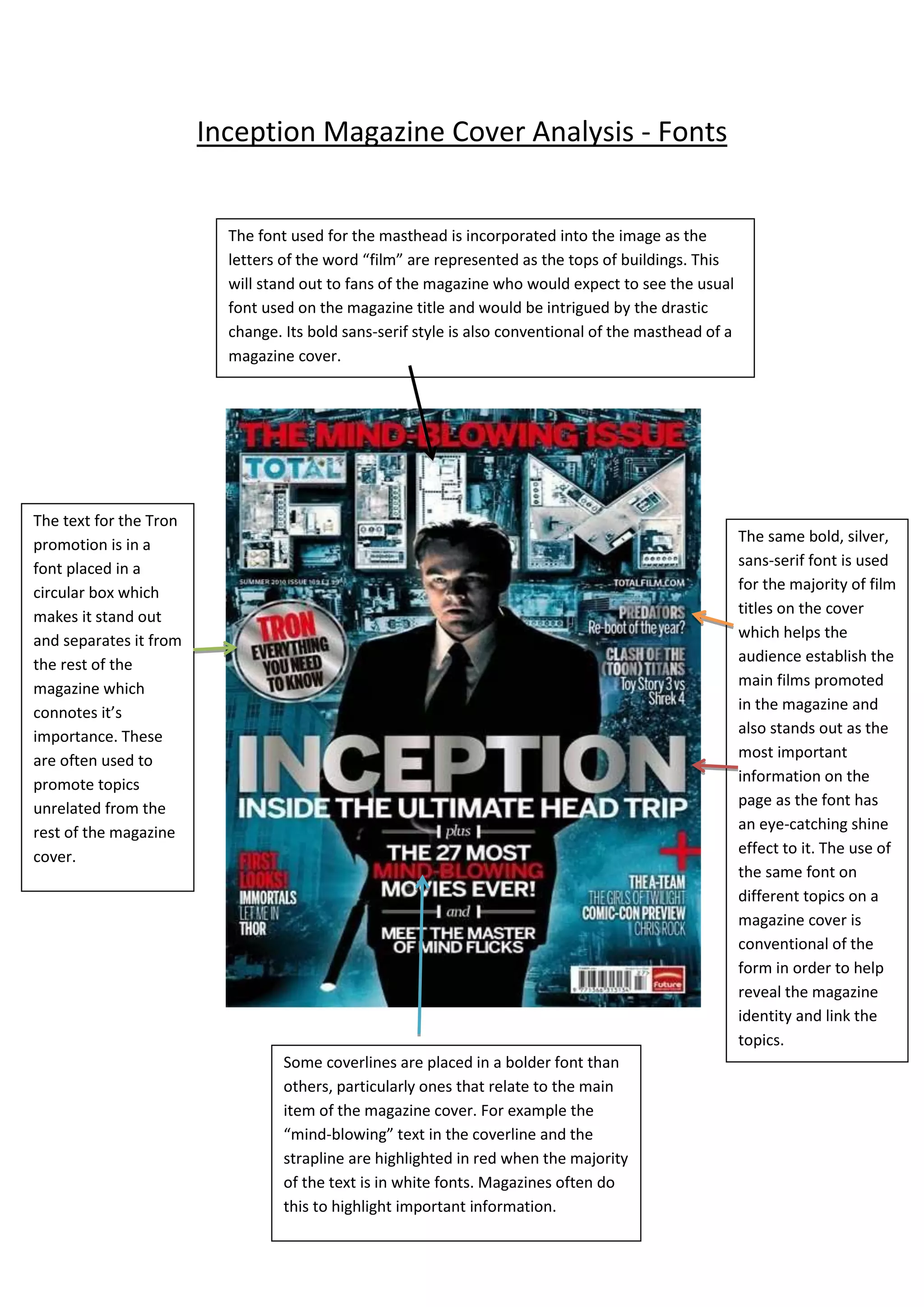
The font used for the magazine title on the cover is incorporated into the image as building tops, standing out to fans accustomed to the usual font. Its bold sans-serif style is conventional for magazine mastheads. The font used to promote "Tron" is in a circular box, separating it and denoting its importance. The same bold, silver sans-serif font is used for most film titles, helping readers identify the main films while standing out as important information. Bolder fonts are used for some coverlines like "mind-blowing" to highlight key information, a common magazine design technique.