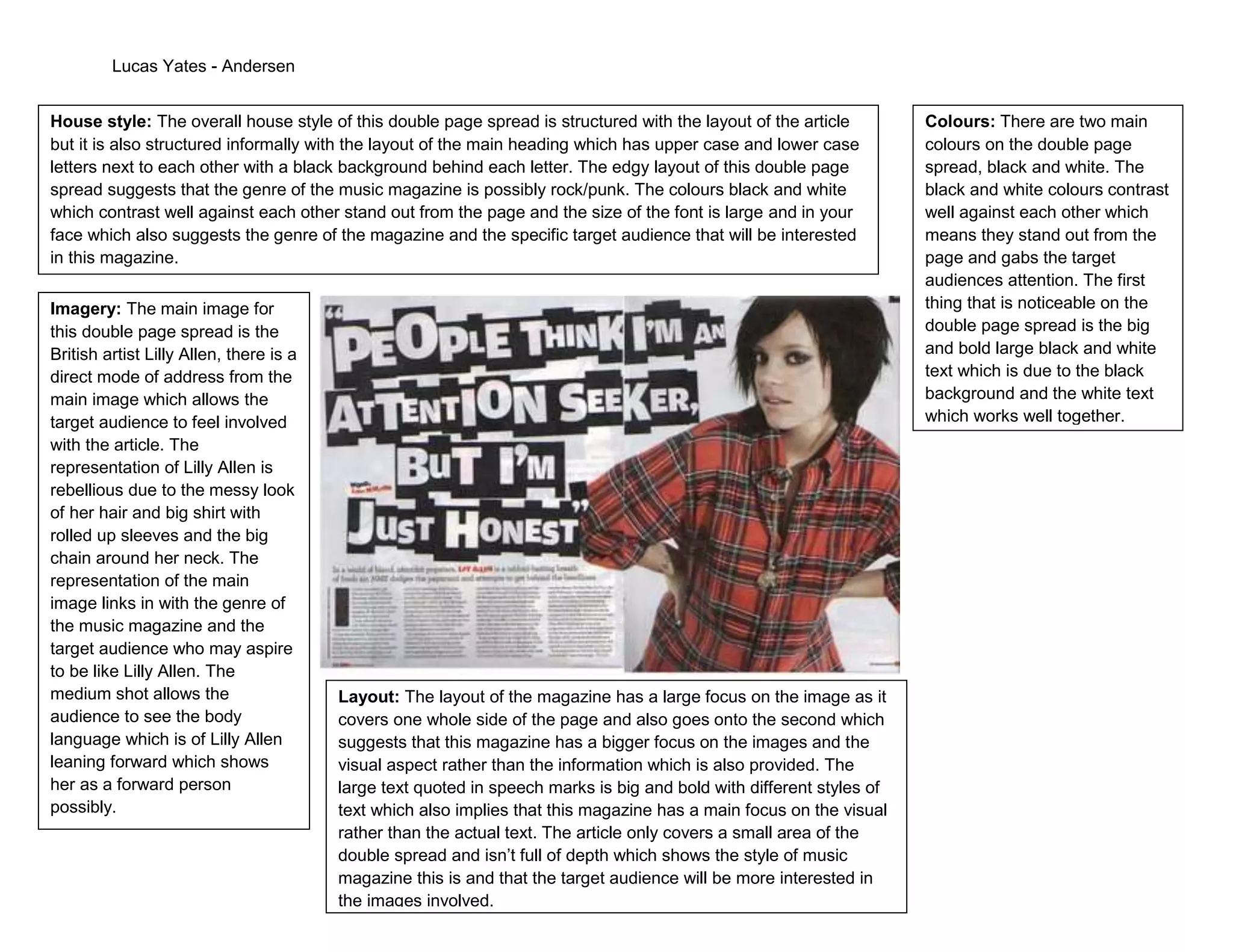
Lucas Yates - Andersen


House style: The overall house style of this double page spread is structured with the layout of the article          Colours: There are two main
but it is also structured informally with the layout of the main heading which has upper case and lower case          colours on the double page
letters next to each other with a black background behind each letter. The edgy layout of this double page            spread, black and white. The
spread suggests that the genre of the music magazine is possibly rock/punk. The colours black and white               black and white colours contrast
which contrast well against each other stand out from the page and the size of the font is large and in your          well against each other which
face which also suggests the genre of the magazine and the specific target audience that will be interested           means they stand out from the
in this magazine.                                                                                                     page and gabs the target
                                                                                                                      audiences attention. The first
Imagery: The main image for                                                                                           thing that is noticeable on the
this double page spread is the                                                                                        double page spread is the big
British artist Lilly Allen, there is a                                                                                and bold large black and white
direct mode of address from the                                                                                       text which is due to the black
main image which allows the                                                                                           background and the white text
target audience to feel involved                                                                                      which works well together.
with the article. The
representation of Lilly Allen is
rebellious due to the messy look
of her hair and big shirt with
rolled up sleeves and the big
chain around her neck. The
representation of the main
image links in with the genre of
the music magazine and the
target audience who may aspire
to be like Lilly Allen. The
medium shot allows the                   Layout: The layout of the magazine has a large focus on the image as it
audience to see the body                 covers one whole side of the page and also goes onto the second which
language which is of Lilly Allen         suggests that this magazine has a bigger focus on the images and the
leaning forward which shows              visual aspect rather than the information which is also provided. The
her as a forward person                  large text quoted in speech marks is big and bold with different styles of
possibly.                                text which also implies that this magazine has a main focus on the visual
                                         rather than the actual text. The article only covers a small area of the
                                         double spread and isn’t full of depth which shows the style of music
                                         magazine this is and that the target audience will be more interested in
                                         the images involved.

Double Page Spread Analysis 1

  • 1.
    Lucas Yates -Andersen House style: The overall house style of this double page spread is structured with the layout of the article Colours: There are two main but it is also structured informally with the layout of the main heading which has upper case and lower case colours on the double page letters next to each other with a black background behind each letter. The edgy layout of this double page spread, black and white. The spread suggests that the genre of the music magazine is possibly rock/punk. The colours black and white black and white colours contrast which contrast well against each other stand out from the page and the size of the font is large and in your well against each other which face which also suggests the genre of the magazine and the specific target audience that will be interested means they stand out from the in this magazine. page and gabs the target audiences attention. The first Imagery: The main image for thing that is noticeable on the this double page spread is the double page spread is the big British artist Lilly Allen, there is a and bold large black and white direct mode of address from the text which is due to the black main image which allows the background and the white text target audience to feel involved which works well together. with the article. The representation of Lilly Allen is rebellious due to the messy look of her hair and big shirt with rolled up sleeves and the big chain around her neck. The representation of the main image links in with the genre of the music magazine and the target audience who may aspire to be like Lilly Allen. The medium shot allows the Layout: The layout of the magazine has a large focus on the image as it audience to see the body covers one whole side of the page and also goes onto the second which language which is of Lilly Allen suggests that this magazine has a bigger focus on the images and the leaning forward which shows visual aspect rather than the information which is also provided. The her as a forward person large text quoted in speech marks is big and bold with different styles of possibly. text which also implies that this magazine has a main focus on the visual rather than the actual text. The article only covers a small area of the double spread and isn’t full of depth which shows the style of music magazine this is and that the target audience will be more interested in the images involved.