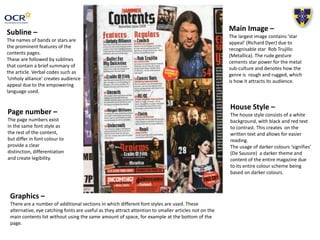
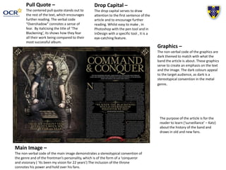
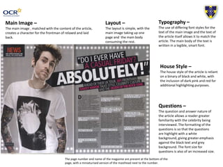
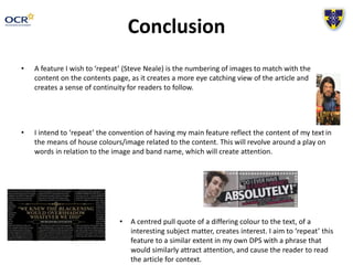
This document analyzes the design elements of a music magazine contents page and double page spread (DPS). It discusses the use of prominent band/artist names on the contents page followed by brief article summaries. Dark colors like black and red are used for text against a white background for readability. Larger images feature recognizable stars to attract audiences. Additional sections use different eye-catching fonts. Pull quotes and drop caps are used to draw readers in. Graphics match related articles in tone. Page numbers are distinguished from body text. Questions in interviews are highlighted for emphasis. Consistency is created through matching typography and layouts to article subjects. Centered pull quotes in different colors also attract readers.